This tweet is five years old today; five years since I left a job paying me much more than I deserved to go do something I loved instead. It has been an extraordinarily weird half-decade and while not without its crises of money and confidence I have enjoyed it very, very much. https://twitter.com/IneffectiveMath/status/615525208514887680">https://twitter.com/Ineffecti...
In honour of the day, I& #39;ve decided to make a long thread here of all of my worst viz from those five years, just for the fun of roasting myself. Possibly there will be some good viz too, I promise nothing.
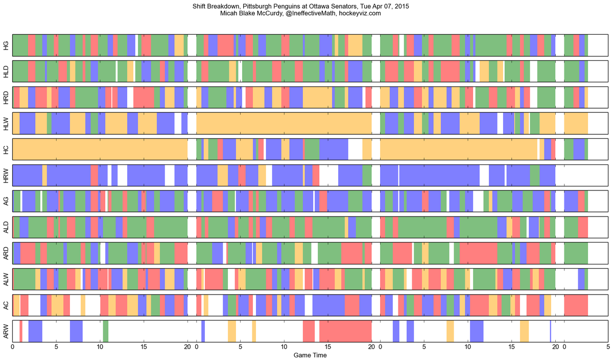
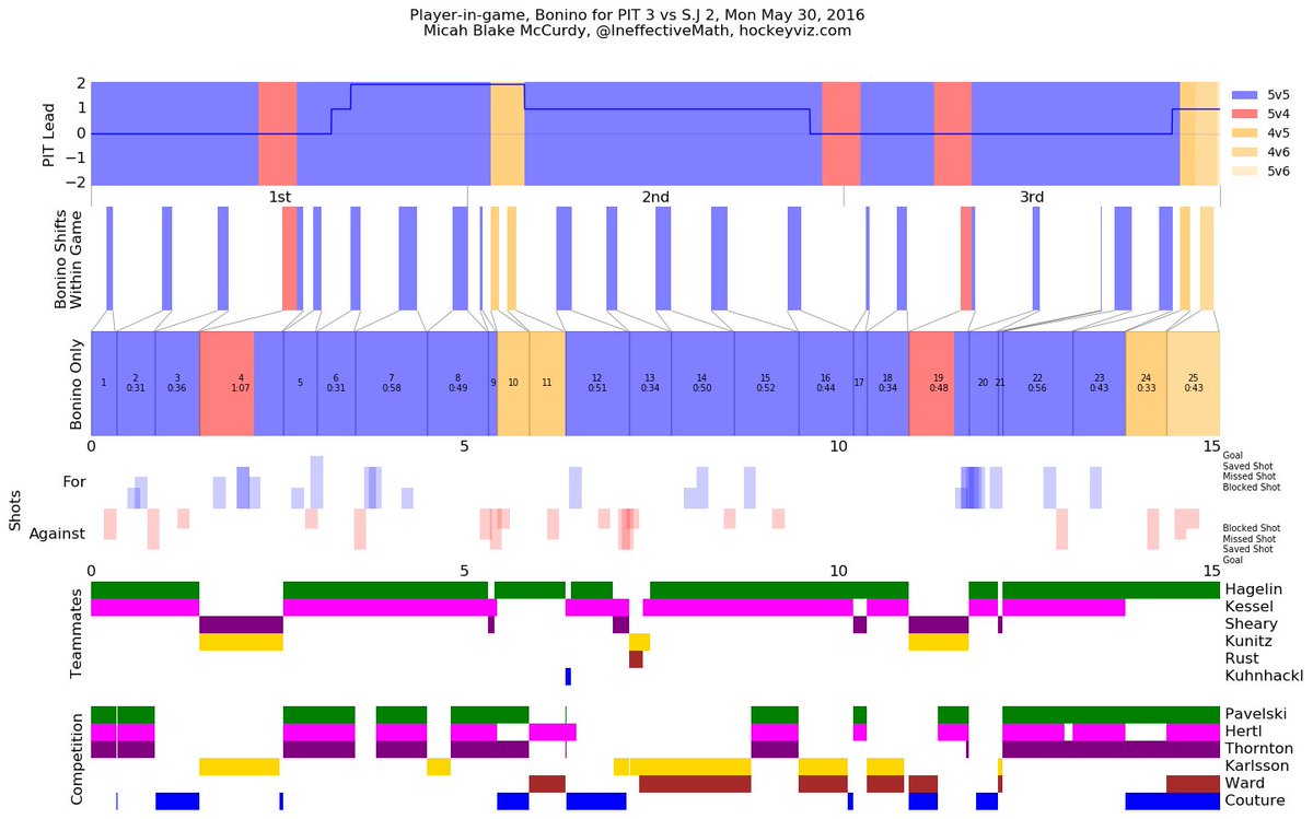
First up, this single-game shift chart thing that never made it out of a handful of drafts. Those are matplotlib colour defaults at the time; it& #39;s AGGRESSIVELY not colourblind-safe, looks like I"m sequencing the genes of an inbred teddy bear.
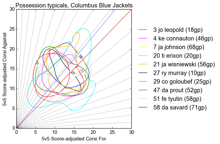
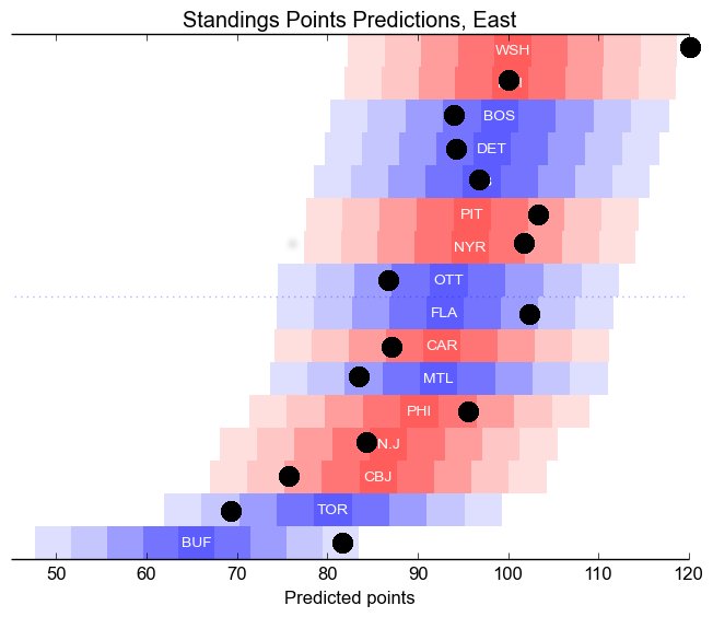
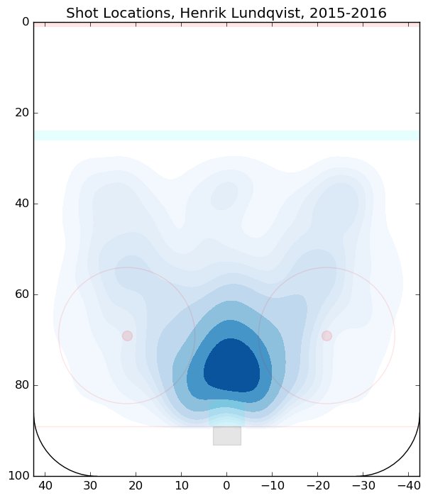
I went on a kick for trying to show distributions instead of point averages that backfired constantly. I think these contours are 50% inside/outside markers. Needless to say it looks like a kid put rubber bands on a gourd. Catch that awful two-letter-name disambiguation too.
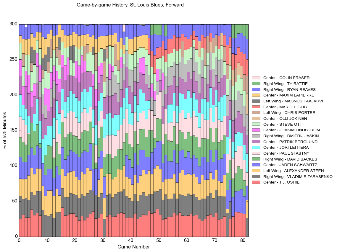
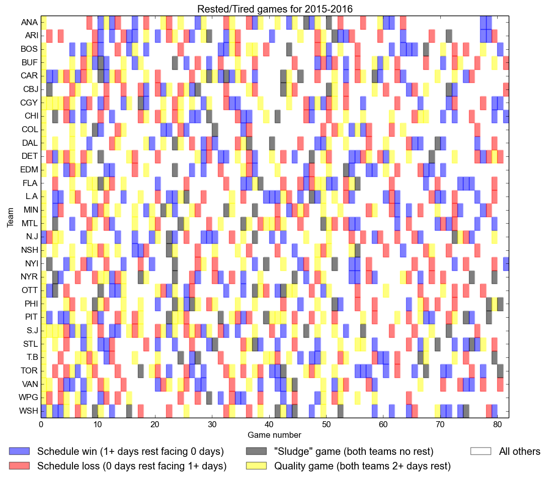
I still make a version of this on the site but every time I look at it I think of those old bead curtains that people used to hang in doorways because it& #39;s fun interior decorating to annoy the shit out of yourself? apparently?? Also who needs to mark a chart with a season.
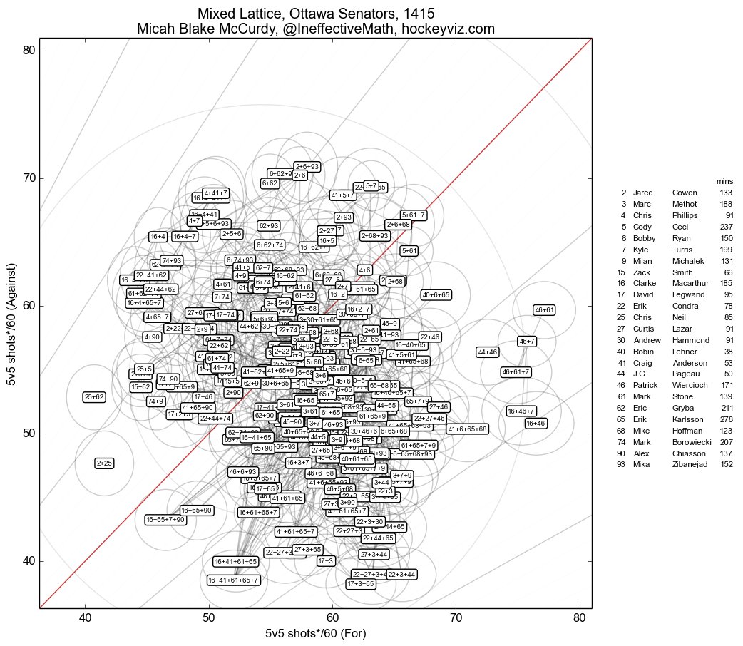
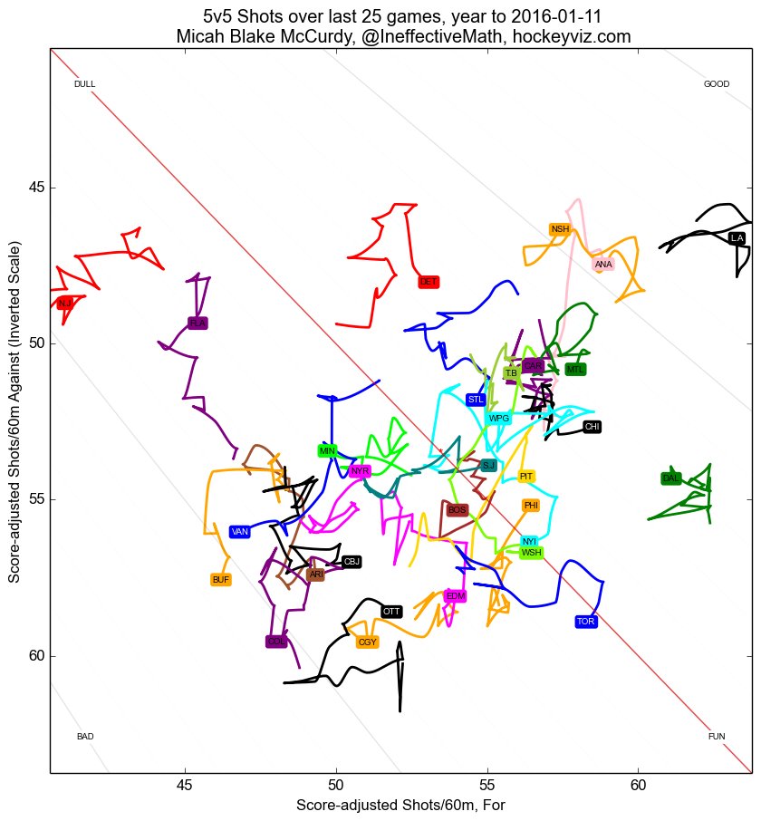
Not all of my awful viz is exotic chart styles. I can also fuck up a simple x/y scatter. Not satisfied with vomiting a combinatorial monstrosity onto the page with "lines to guide the eye", apparently also we need uncertainty ovals. Because, why not. "Mixed Lattice" lol
(When I switched to hockeyviz full-time my son, now about to turn six, was ten months old, so going through old stuff is full of baby pictures of him. If there are delays in the thread it& #39;s because I& #39;m slowly turning in a puddle, he was so cute!!)
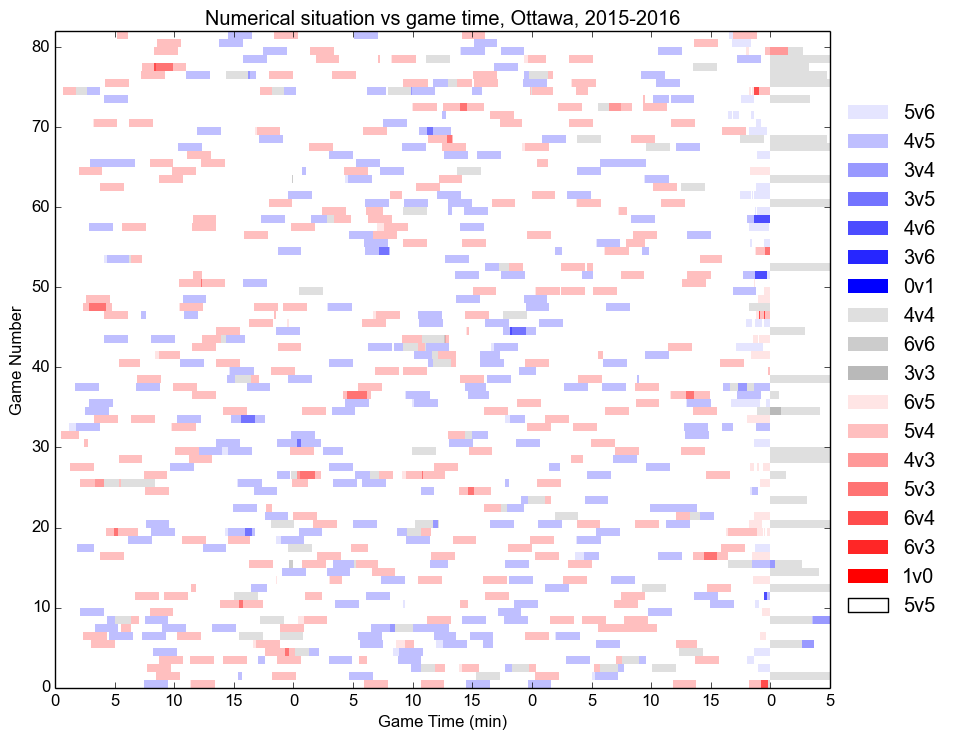
I don& #39;t know why you& #39;re upset with me, the 5v4 salmon is TOTALLY different from the 5v3 burnt amethyst. Also time goes 0 5 10 15 0 5 10 15, that& #39;s why everything feels so cursed recently.
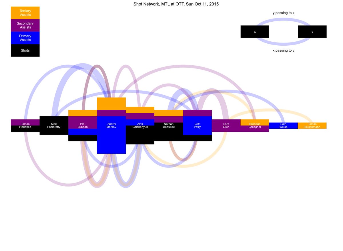
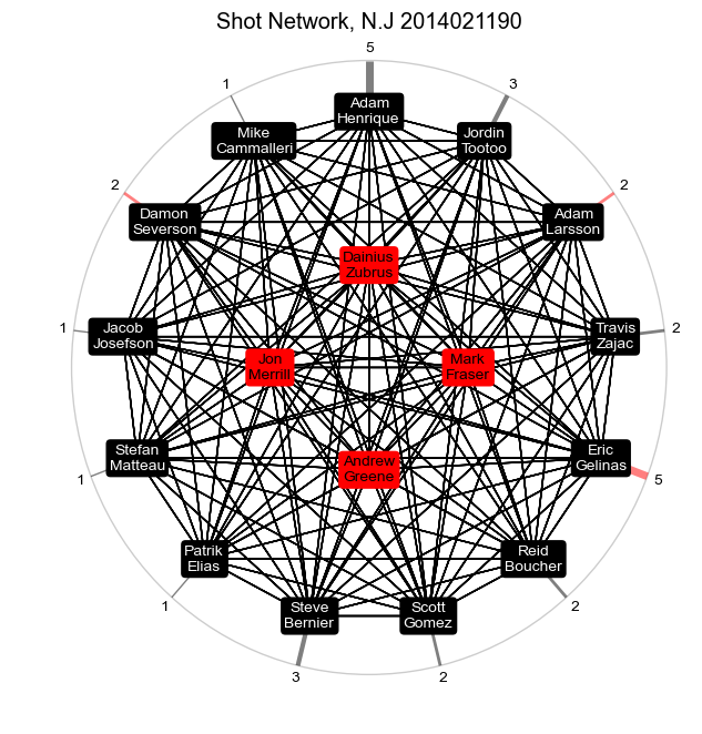
I made a ton of these (from @ShutdownLine& #39;s data mostly) and someday I& #39;ll revive them but the aesthetic is just hysterical. Like mid-century modern lego star destroyers, only they zap you if you touch them. Also they& #39;re spinning.
If you grab hold of this one and say "HOCKEY POWER MAKE UP" you& #39;ll transform into a crime-fighting super-hero in a cute outfit.
Some old stuff is fun just because of what a long road it& #39;s been to get it to where it is today. This chart alone has absorbed a staggering number of hours of work.
Sometimes you summon ba& #39;al. Or possibly coronavirus.
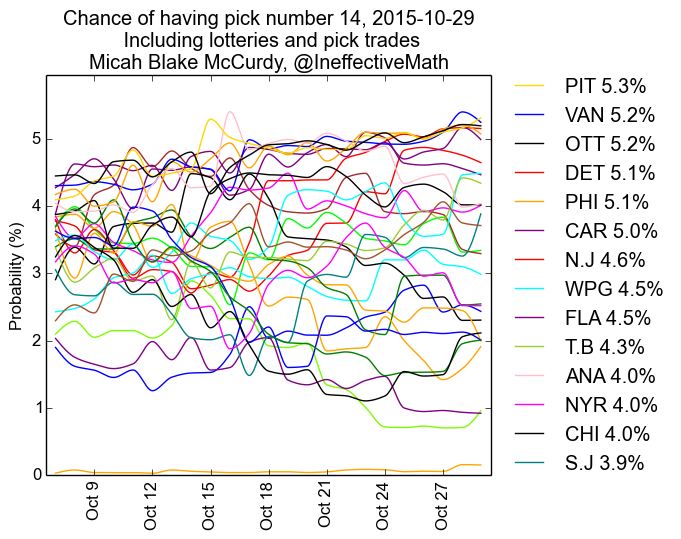
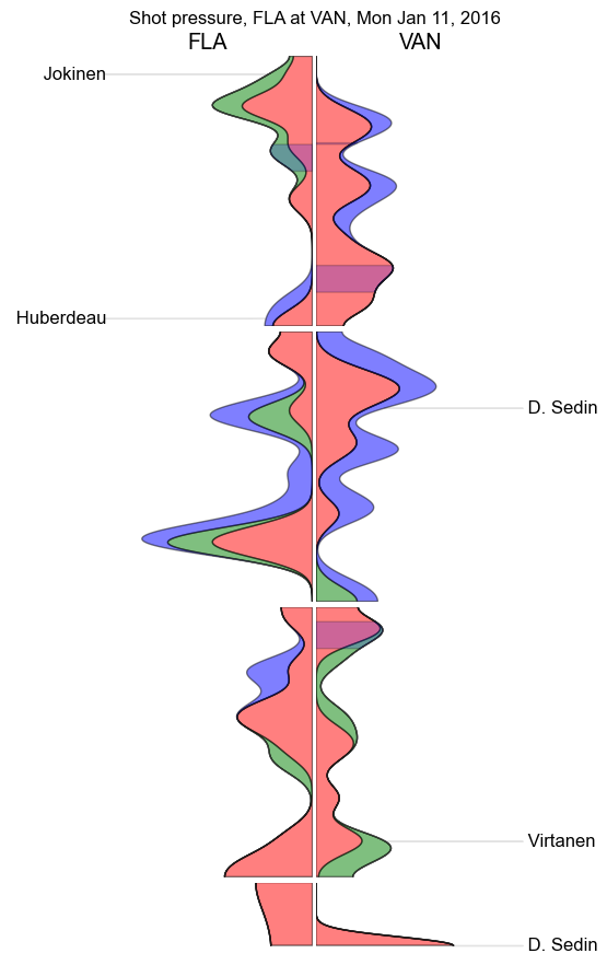
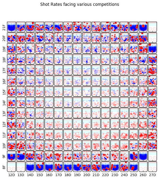
Legibility is for suckers. Just unfocus your eyes like it& #39;s a reflecting pool filled with rainbow noodles.
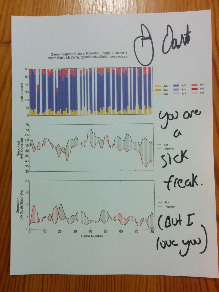
tbt that time I got an extremely why-am-I-doing-a-book-tour-to-nowhere James Duthie to sign a Luongo chart in a suburban halifax chapters. I don& #39;t know a better approach for goalies than the blank white stripes but it always looks like static on the wire to me.
Early versions of the "bite off more than you can chew" game detail. It& #39;s a shift chart, that& #39;s all, but AGGRESSIVE with the colours and somehow not enough signposting and /also/ not enough whitespace?
I actually made this in a linux version of paint because I lost the source code somehow. It looks like you printed out one of my charts and repeatedly shot it with a bb gun, which, fair.
They don& #39;t teach you in school that the best aspect ratio for your "I literally put these bar charts in a blender and spun & #39;em" viz is 7 to 1, horizontal. That guttering is a disgrace, and the legend takes a third of the plot. Also, the home/away division is completely pointless.
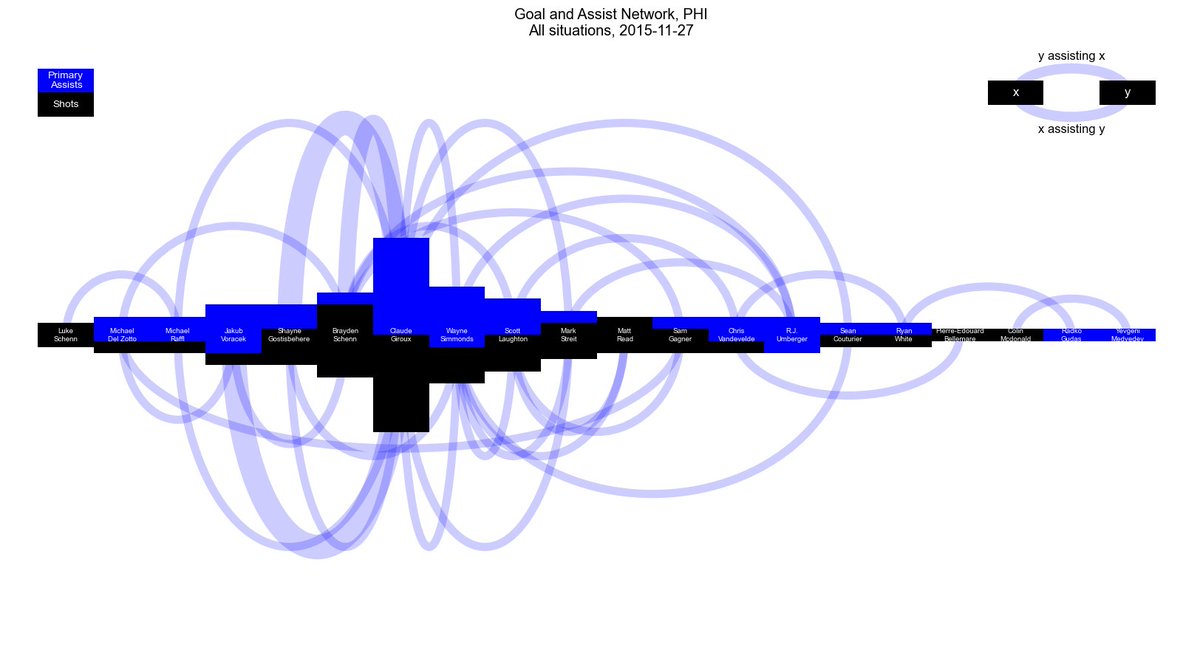
One of the recurring motifs is the dayglo litebrite. Again the faint suggestion that if you touch the graph you& #39;ll be wounded mentally somehow.
I really like the information density here but the combination of the smoothing algorithm and the colour choices are just a guy following you around going druuuugggssssss
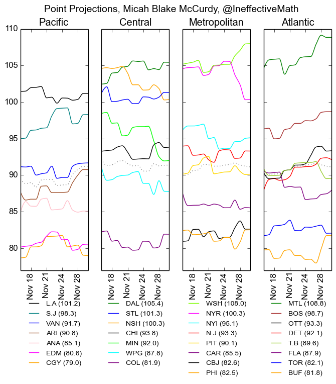
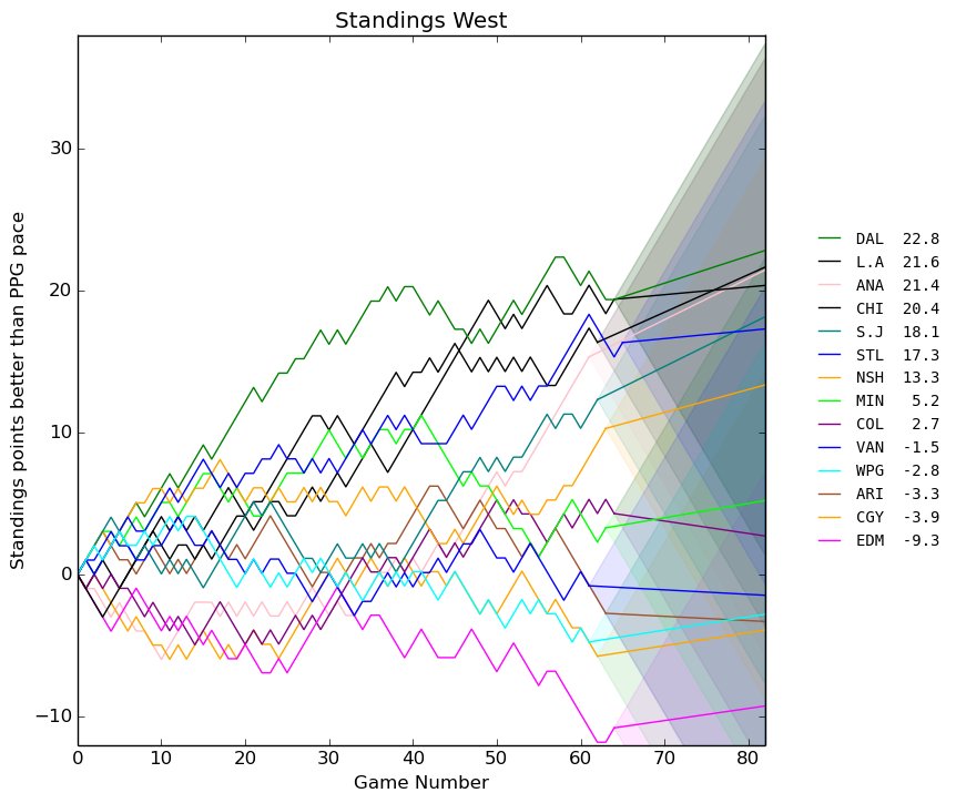
They don& #39;t tell you that nhl teams are actually undergoing brownian motion at all times. Even after I "fixed" this chart, and it became beloved by lots of people, it& #39;s still one of my most-hated charts too.
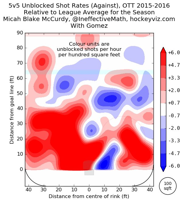
The relative-to-average charts from before I figured out how to make tanaka contours are physically painful to look at now. And I was so proud of them at the time.
You may remember June 29th (the following year) for other reasons: https://twitter.com/TSNBobMcKenzie/status/748238297273610240">https://twitter.com/TSNBobMcK...
Back to awful viz, though; if the previous attempt to summon great and terrible evil didn& #39;t succeed, you could try again: It kinda looks like an eye without a pupil.

 Read on Twitter