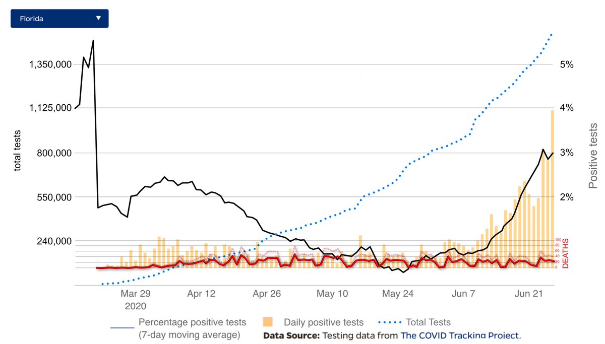
in contrast to GROUPTHINKING FOOLS WHO BELIEVE EVERY NUM w/o question/understanding & R PLEASED w FEARMONGERING/DISTORTING/BERATING PPL WHO HAVE INTIMATE UNDERSTANDING OF HOW DATA WORKS I made this chart
U wont find it in media
real data analysts know EXACTLY WHATS GOING ON /1
U wont find it in media
real data analysts know EXACTLY WHATS GOING ON /1
Interesting that MASKS were optional at the beginning of this chart but now COMMUNISTS FIFEDOM IDIOT POLITICIANS want people to wear them or face a MISDEMEANOR here in south florida and its far better for society to get this HERD IMMUNITY OVER WITH
YOU ARE BEING DECIEVED FOLKS
YOU ARE BEING DECIEVED FOLKS
take away is that AS PEOPLE VOLUTARILY TEST we find that there are lots and lots of people who have HAD #CORONAVIRUS and very few people sick with it and even fewer DYING FROM IT and that DEATHS ARE DROPPING even despite 50% of deaths being incorrectly allocated to coronavirus
Here in this chart you can see the more realistically ACTUAL #CORONAVIRUS DEATHS in FLORIDA compared to the reported deaths to #CORONAVIRUS and then the number of total tests and the total people who have been exposed to and had #CORONAVIRUS

 Read on Twitter


