Since I& #39;ve seen alot of whitewashing recently, and people continue to say its just & #39;Bad Lighting& #39;-
Here is a thread on how to avoid & #39;Bad Lighting& #39;:
Here is a thread on how to avoid & #39;Bad Lighting& #39;:
Firstly, I& #39;d say that mistakes are okay, if its your first offence. If you genuinely accidentally whitewash a charter, Fix it, Say sorry, and DO BETTER, Don& #39;t brush it off, font fix it and don& #39;t say anything, Just Fix it, apologize and do better in future works.
Alright starting off:
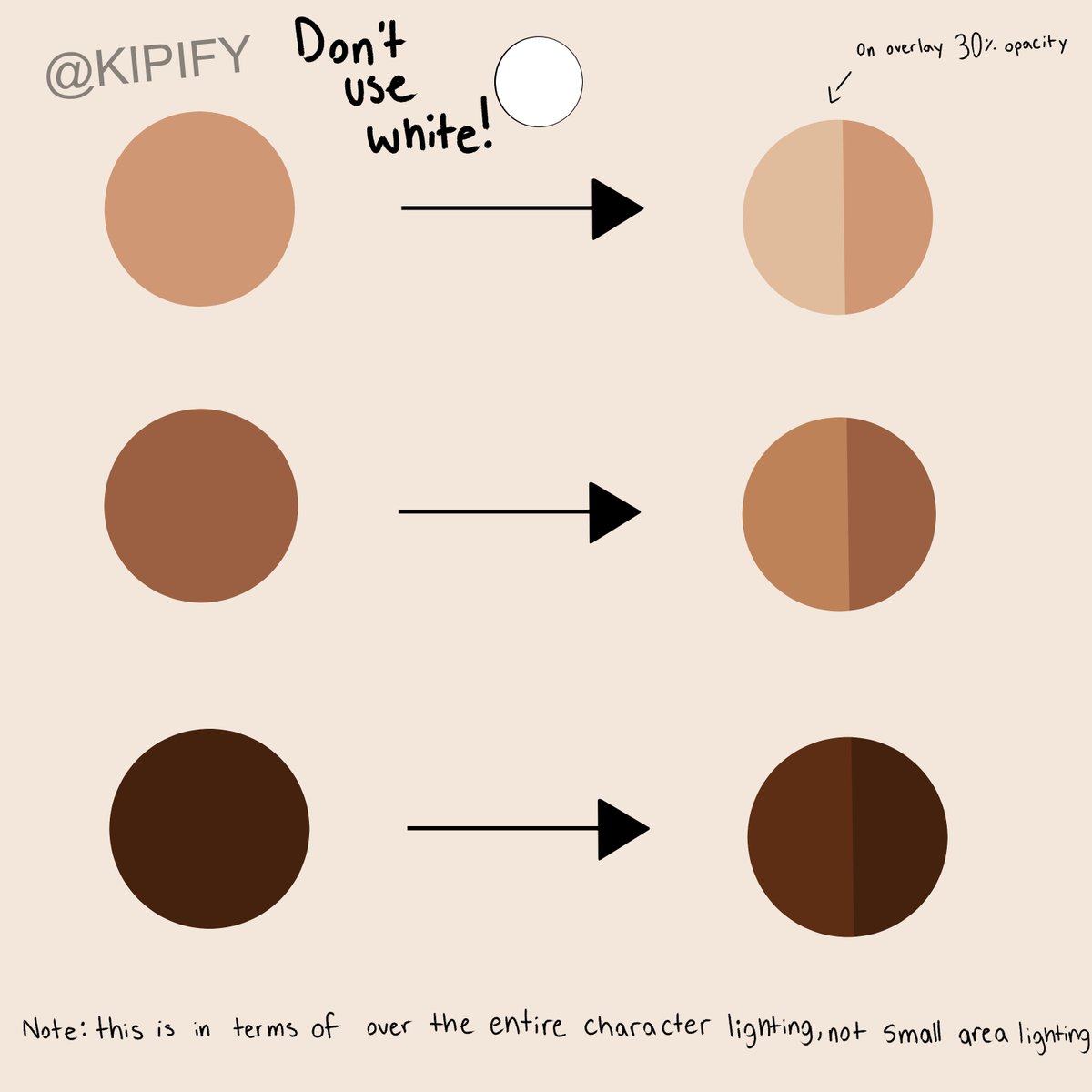
DONT USE WHITE AS HIGHLIGHT
Yes there is some causes where if your only doing small area lighting like a lil on the arms n stuff it could be okay but using white is a big no no when doing a & #39;over the entire drawing& #39; lighting.+
DONT USE WHITE AS HIGHLIGHT
Yes there is some causes where if your only doing small area lighting like a lil on the arms n stuff it could be okay but using white is a big no no when doing a & #39;over the entire drawing& #39; lighting.+
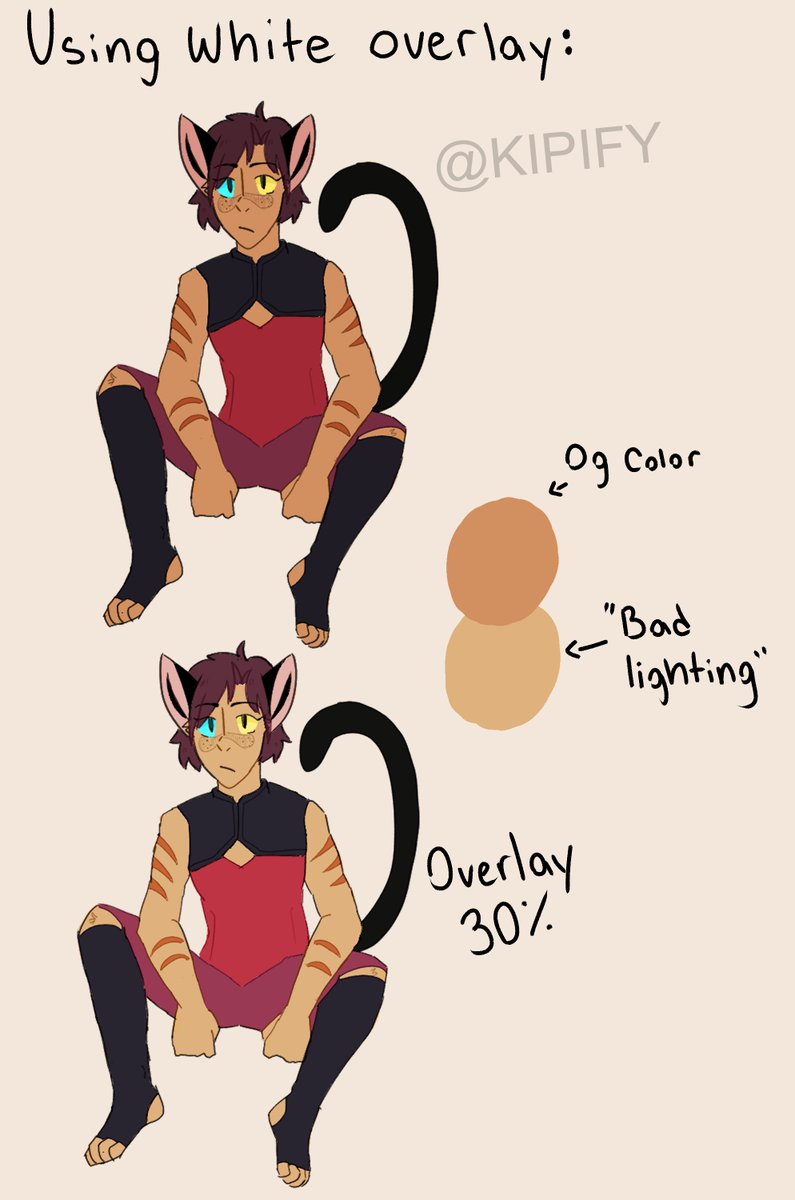
The diffrence white makes on a character is huge, It changes the entire skin tone, (Im using the opacity setting of what ive seen & #39;bad lighting& #39; look on other characters)
It takes a completely POC and makes them white/very light skin compared to their normal tones.
It takes a completely POC and makes them white/very light skin compared to their normal tones.
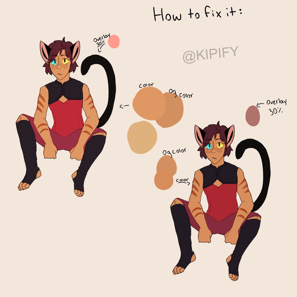
So now your wondering, & #39;but i liked the vibrancy of the white, how would i avoid using white but get the same vibrancy??& #39;
Simple, Use Pink, Red, a lighter version of diffrent colors, Just not white.
Simple, Use Pink, Red, a lighter version of diffrent colors, Just not white.
Addionally, Yes i know some tablets and computer monitors have a saturation issue, Mine has that exact same issue. Every time i draw a POC I always color pick off another artist who has the colors correct.
But if you do try and eyeball the colors please, when ur done+
But if you do try and eyeball the colors please, when ur done+
SEND THE DRAWING TO URSELF,
Look at it from your phone, That& #39;s how most people look at your art, If the colors look to light on your phone, simply darken them up and resend. Yes it takes more time but its so helpful once you know how to do it.
Look at it from your phone, That& #39;s how most people look at your art, If the colors look to light on your phone, simply darken them up and resend. Yes it takes more time but its so helpful once you know how to do it.

 Read on Twitter


