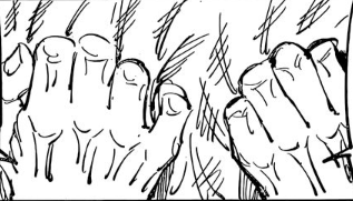
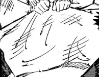
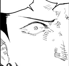
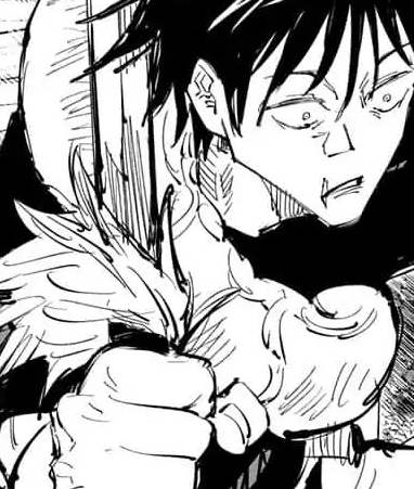
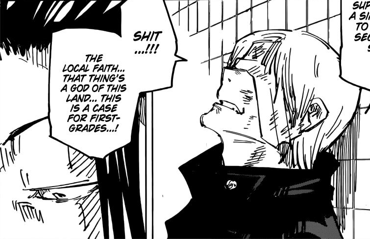
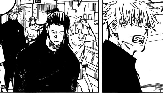
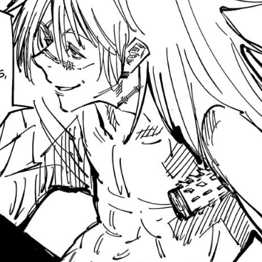
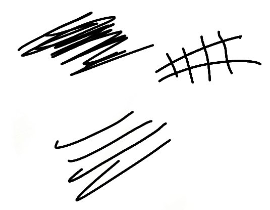
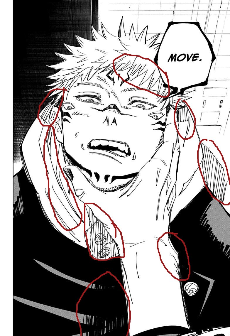
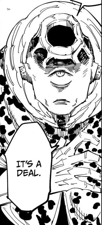
Looked through Jujutsu Kaisen chapters to check the art & it really looks like a rough draft of a manga. The lines are really chunky and imprecise and for any kind of shading he just does these two lines and a bunch of skribbles crossing between. It& #39;s like Togashi rough sketches.
Like yeah it& #39;s the series& #39; style to be "rough & sketchy" but despite the spreads you can definitely see the lack of polish or consistency beyond stylistic "choice" unlike CSM f.ex. I see this a lot in fanartists when they do quick sketches. I& #39;d put it on the lower end of WSJ art.
I know most people will just say "looks cool to me" but I hope you understand what I& #39;m saying about the technical aspect of the art. The shading and definition in the panels is really skribbly & poorly defined for the most part. It definitely feels very early stage/inexperienced.
It& #39;s kinda like this

 Read on Twitter