"A logo (abbreviation of logotype, from Greek: λόγος, romanized: logos, lit. & #39;word& #39; and Greek: τύπος, romanized: typos, lit. & #39;imprint& #39;) is a graphic mark, emblem, or symbol used to aid and promote public identification and recognition." (Wikipedia)
Actually, there& #39;s two types of logo: a logotype and logogram.
Logotype is a logo that based on a type/typography of a text or the brand& #39;s name.
Logogram is a logo that used pictures, images, or icons.
(That& #39;s the simple explanation of it)
Logotype is a logo that based on a type/typography of a text or the brand& #39;s name.
Logogram is a logo that used pictures, images, or icons.
(That& #39;s the simple explanation of it)
A brand could use both the logogram and logotype or just use one of them.
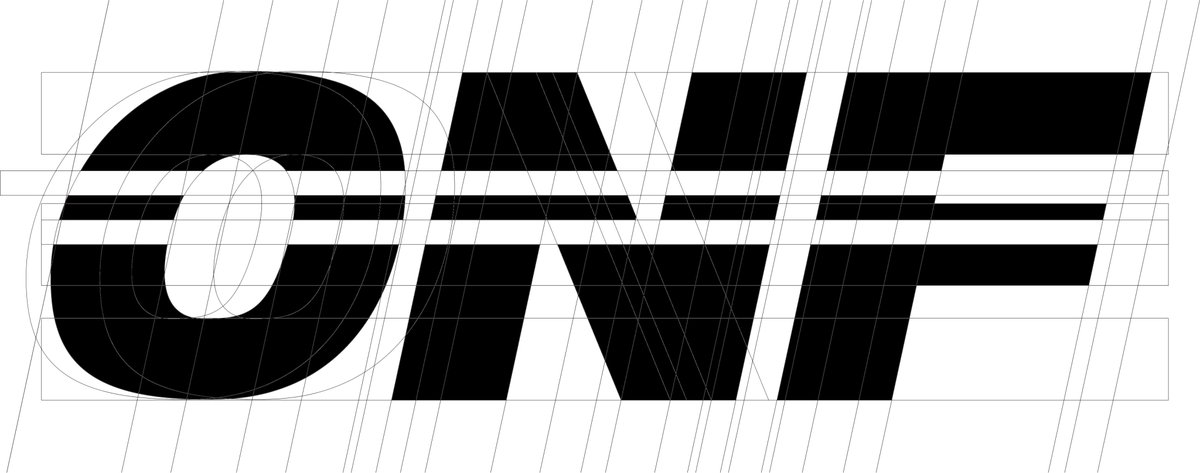
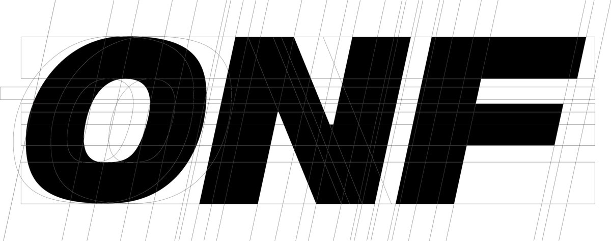
Here, ONF is just using a logotype. But the logotype itself also appears as their logogram because the logo has their name, ONF, but it also appears as an image.
Here, ONF is just using a logotype. But the logotype itself also appears as their logogram because the logo has their name, ONF, but it also appears as an image.
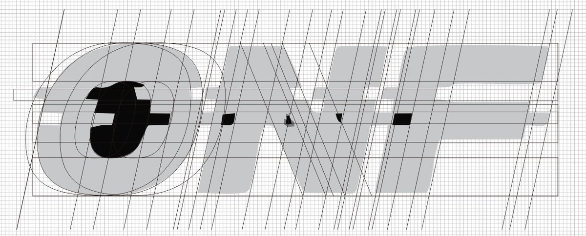
First of all, because I couldn& #39;t find an HD image for this logo, I tried to trace and remaster the logo. So it& #39;s possible to have some miscalculation especially on the distortion effect, but I tried my best so the probability of the mistake is low (I hope).
One of the reasons I make this thread is that I found this logo is interesting. It really represents ONF as a group and matches their concept very well.
Another reason is its uniqueness and the meaning behind it.
Another reason is its uniqueness and the meaning behind it.
1. Typeface
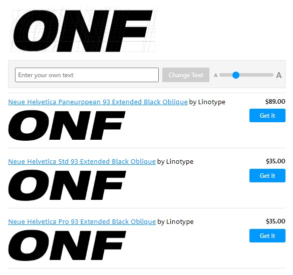
ONF uses a sans-serif type and the most similar typeface I (or the machine) could found is Neue Helvetica but it still appears different, so it& #39;s possible that it& #39;s a customized font, special for ONF.
ONF uses a sans-serif type and the most similar typeface I (or the machine) could found is Neue Helvetica but it still appears different, so it& #39;s possible that it& #39;s a customized font, special for ONF.
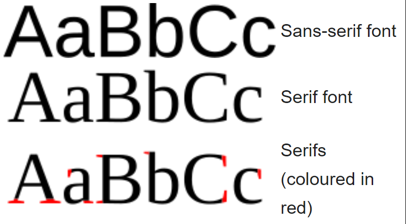
"In typography and lettering, a sans-serif letterform is one that does not have extending features called "serifs" at the end of strokes." (Wikipedia)
"Sans serif fonts give off a feeling of being casual, informal, friendly, and very approachable." (Impactbnd)
"Sans serif fonts give off a feeling of being casual, informal, friendly, and very approachable." (Impactbnd)
From a personal view, a sans-serif type also gives off a sophisticated and modern feeling. It also appears to be a simple and easy look. For some uses, it also makes a fresh image.
That matches with the futuristic and modern concept of ONF.
That matches with the futuristic and modern concept of ONF.
2. Uppercase
Besides the uses, because ONF is an abbreviation, it also has the meaning of being big and strong.
"In general, uppercase sends along with a message of strength, stability, and reliability." (designbeep)
Besides the uses, because ONF is an abbreviation, it also has the meaning of being big and strong.
"In general, uppercase sends along with a message of strength, stability, and reliability." (designbeep)
3. Bold
It& #39;s not strong enough just by using an uppercase, they show a stronger image by making it bold.
"Thick lines on the other hand appear difficult to break. They suggest strength and give emphasis to nearby elements." (vanseodesigns)
It& #39;s not strong enough just by using an uppercase, they show a stronger image by making it bold.
"Thick lines on the other hand appear difficult to break. They suggest strength and give emphasis to nearby elements." (vanseodesigns)
4. Italic
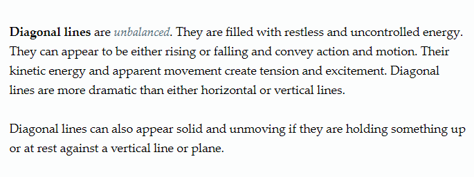
Italic or diagonal line shows the dynamic of the logo, it makes the logo appear to have a motion and direction.
I interpret this as ONF will not just stay here and always move forward.
Italic or diagonal line shows the dynamic of the logo, it makes the logo appear to have a motion and direction.
I interpret this as ONF will not just stay here and always move forward.
5. Distortion (translation)
In mathematics, it& #39;s called translation.
"Translation is a term used in geometry to describe a function that moves an object a certain distance. The object is not altered in any other way. It is not rotated, reflected, or re-sized." (study(dot)com)
In mathematics, it& #39;s called translation.
"Translation is a term used in geometry to describe a function that moves an object a certain distance. The object is not altered in any other way. It is not rotated, reflected, or re-sized." (study(dot)com)
The number is different for each line, but it& #39;s 15 points and 20 points for left translation (the above part) and 25 points and 30 points for the right translation (the below part).
It doesn& #39;t have an exact pattern on the numbers, it just appeared as visually pleasing I guess.
It doesn& #39;t have an exact pattern on the numbers, it just appeared as visually pleasing I guess.
As I said above that ONF is moving. In this aspect, they also include gesture lines to show it.
"Gesture lines are quick and rough continuous lines used to capture form and movement. They are generally used when studying the shape and motion of the human form." (vanseodesigns)
"Gesture lines are quick and rough continuous lines used to capture form and movement. They are generally used when studying the shape and motion of the human form." (vanseodesigns)
But by this, the distortion also could mean glitch, which is an effect often found in futuristic concepts like the digital concept which also appears on ONF concept.
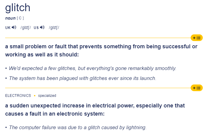
But the glitch meaning that I found on dictionary is kinda different. (Cambridge Dictionary)
But the glitch meaning that I found on dictionary is kinda different. (Cambridge Dictionary)
I interpret this as "yes we are trying our best, but we know we& #39;re not perfect yet, but we always try to move on from this and even try to be better by the time."
.
(((we know they are growing well until now, aren& #39;t we?)))
.
(((we know they are growing well until now, aren& #39;t we?)))
6. Color
We know they haven& #39;t announced their official color yet.
But the way they use black and white is just perfect. It represents on and off team color. It could also represent the yin-yang since their concept is a dystopia.
We know they haven& #39;t announced their official color yet.
But the way they use black and white is just perfect. It represents on and off team color. It could also represent the yin-yang since their concept is a dystopia.
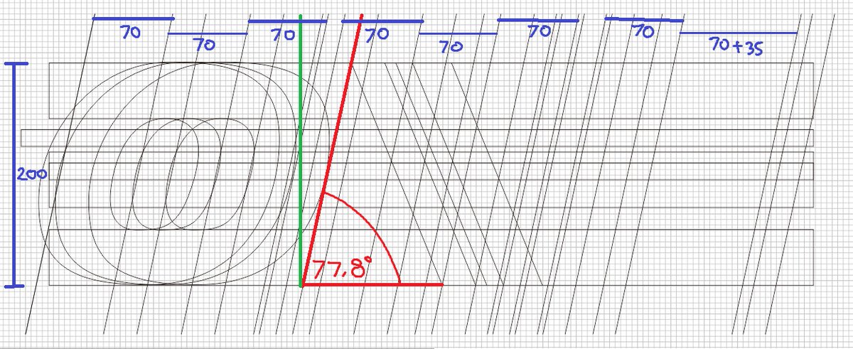
7.
It blew my mind when I discovered this.
I made the height into 200 so I could make an easy calculation for the width and I found out this scale is 7 based.
The way they typed on7off for stylizing on/off on their username ...
It blew my mind when I discovered this.
I made the height into 200 so I could make an easy calculation for the width and I found out this scale is 7 based.
The way they typed on7off for stylizing on/off on their username ...
The angle itself, I wrote it as 77.8° but it made me think "What if the actual angle was 77.777...°"
We have learned this in school that the number of 5 and above will be rounded up. So it& #39;s actually possible.
We have learned this in school that the number of 5 and above will be rounded up. So it& #39;s actually possible.

 Read on Twitter