INTRODUCTION TO TECHNICAL ANALYSIS:
Volume two: Japanese Candlesticks, and Volumetric Analysis
Thread https://abs.twimg.com/emoji/v2/... draggable="false" alt="👇" title="Rückhand Zeigefinger nach unten" aria-label="Emoji: Rückhand Zeigefinger nach unten">
Volume two: Japanese Candlesticks, and Volumetric Analysis
Thread
“In the 1700s, a Japanese man named Homma discovered that, while there was a link between price and the supply and demand of rice, the markets were strongly influenced by the emotions of traders” -Investopedia
In most charts that you see on twitter, the price will be represented as Candlesticks, opposed to just the stereotypical line.
Candlesticks are beneficial in that they tell more of the story behind what exactly is going on behind the scenes.
Candlesticks are beneficial in that they tell more of the story behind what exactly is going on behind the scenes.
Over time, they become intuitive with experience. But for beginners, they can be confusing, and difficult to understand how exactly to digest the information being transmitted.
But Japanese Candlesticks are your friend, and it’s actually very simple...
But Japanese Candlesticks are your friend, and it’s actually very simple...
There are mainly two different kinds of candles: bullish(up), bearish(down), and Doji (but we& #39;ll get to that later).
Two aspects of a candle’s anatomy... the body and the shadow, (commonly referred to as the wicks).
See graphic above for reference.
Two aspects of a candle’s anatomy... the body and the shadow, (commonly referred to as the wicks).
See graphic above for reference.
The top and bottom of the body shows where the instrument opened, and closed in the given time frame. The “shadow” (or the wicks), show the overall high and low of the instrument in the given time frame.
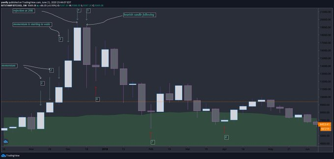
We’re going to be looking at $BTC from November 2017 to November 2019 to help illustrate the information that transmits from Japanese Candlesticks
Take a look at Candle 1. The only wick printed is present on the bottom of the candle.
This is showing that it wants to stay range bound upwards. By there not being a wick at the top of the candle, this is expressing that price action wants to be upward bound.
This is showing that it wants to stay range bound upwards. By there not being a wick at the top of the candle, this is expressing that price action wants to be upward bound.
Candle 2 is still looking very solid.
Even length wicks at the top and bottom of the candle indicate that the price action was stabilizing within that price range
Even length wicks at the top and bottom of the candle indicate that the price action was stabilizing within that price range
In Candle 3. The price really started to shoot upwards.
See how the wick is significantly longer at the top of the candle?
This indicates that the instrument is starting to wain in momentum and is hinting towards a retrace. Revealing desires to be lower range bound.
See how the wick is significantly longer at the top of the candle?
This indicates that the instrument is starting to wain in momentum and is hinting towards a retrace. Revealing desires to be lower range bound.
Candle 4 is practically a mirror image of Candle 1.
There is no wick at the bottom of the candle, but a wick of significant length at the top.
This indicates a rejection at 20K.
Second candle hinting towards wanting to go back down. Momentum is starting to reverse.
There is no wick at the bottom of the candle, but a wick of significant length at the top.
This indicates a rejection at 20K.
Second candle hinting towards wanting to go back down. Momentum is starting to reverse.
Candle 5, as hinted towards in Candle 3 and Candle 4, prints a very dramatic rejection all the way down to 11K.
Yes there is a longer wick at the bottom but what’s important to note is that the open was much higher than the close.
Open and closing levels are the most significant aspects of a candle. That is what dictates a bullish candle, from a bearish one.
Wicks come second.
Open and closing levels are the most significant aspects of a candle. That is what dictates a bullish candle, from a bearish one.
Wicks come second.
KEY NOTE: Japanese Candlesticks are not, “validated”, until the next candle stick prints.
If you look back at some of the previous candlesticks before Candle 1...
You will see some candles showing bearish momentum, but that is quickly proven false by the Candle printed after.
If you look back at some of the previous candlesticks before Candle 1...
You will see some candles showing bearish momentum, but that is quickly proven false by the Candle printed after.
Another KEY PATTERN to watch for in Japanese Candlesticks is what is known as a DOJI candle.
Doji candles are a very tell tale, reliable sign of momentum reversal. The graphic above does an excellent job of showing this.
Doji candles are a very tell tale, reliable sign of momentum reversal. The graphic above does an excellent job of showing this.
Doji candles are candles that open and close around the same price, and have very large wicks.
Take a look at the chart above. I labeled some of the doji candles in this trend cycle.
Although it’s an obvious downtrend on the HTF, you can see significant bounces upwards following Doji candles being printed on the chart at Candle 6., Candle 7., and Candle 8.
Although it’s an obvious downtrend on the HTF, you can see significant bounces upwards following Doji candles being printed on the chart at Candle 6., Candle 7., and Candle 8.
Doji candles are one of the MOST IMPORTANT PATTERNS you should keep an eye out for when performing your own Technical Analysis.
Again, we are going to be using $btc to illustrate significance of volume when trading
$btc , although it is the highest market cap (total $ going in and out of the instrument) out of all of crypto. The daily volume in $btc is nothing compared to something like $SPY
$btc , although it is the highest market cap (total $ going in and out of the instrument) out of all of crypto. The daily volume in $btc is nothing compared to something like $SPY
The higher the market cap, (thus the higher the trading volume) the cleaner the PATTERNS, the cleaner the TA.
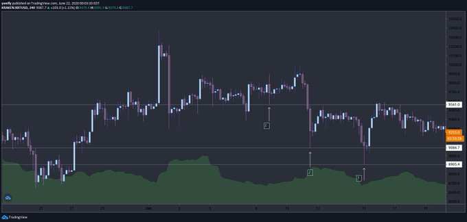
Looking at the chart above, i’ve labeled a couple “scammy wicks”. Bitcoin is a great trading instrument but it is infamous for wicks such as these.
Looking at the chart above, i’ve labeled a couple “scammy wicks”. Bitcoin is a great trading instrument but it is infamous for wicks such as these.
Looking at the chart above, i’ve labeled a couple “scammy wicks”. Bitcoin is a great trading instrument but it is infamous for wicks such as these.
I drew horizontal lines to illustrate the dirtyness of the support and resistance levels. Yes it still lines up but its not clean.
I drew horizontal lines to illustrate the dirtyness of the support and resistance levels. Yes it still lines up but its not clean.
This is very important to remember when attempting to trade low volume instruments need to set GENEROUS stop losses to avoid being scammed out of your position.
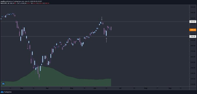
For comparison here is a screenshot of $SPY showing much cleaner TA.
TA is never exact but this is obviously much cleaner than the previous example.
TA is never exact but this is obviously much cleaner than the previous example.
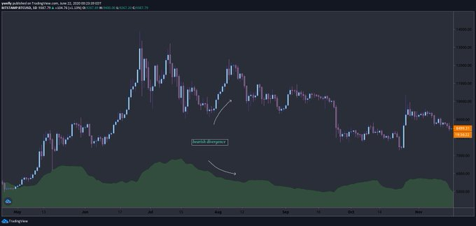
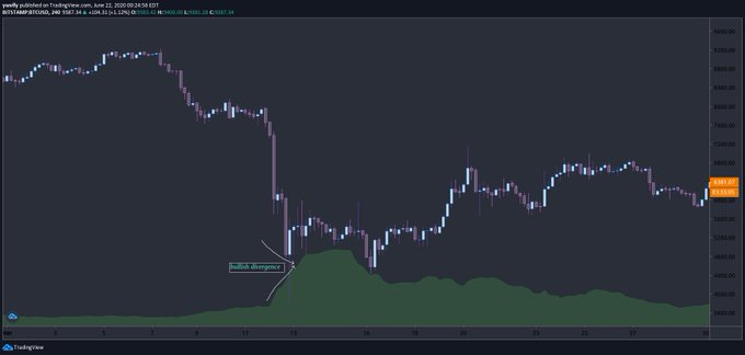
Volume is one of my favorite indicators to predict future price action of an instrument. Above are two examples of bearish volumetric divergence and bullish volumetric divergence.
Bearish volumetric divergence is when the price of a stock is increasing while the volume is decreasing. Think supply/demand.
Bullish volumetric divergence is when the price of a stock is decreasing but the volume is increasing. Think supply/demand.
Bullish volumetric divergence is when the price of a stock is decreasing but the volume is increasing. Think supply/demand.
Volume is an indicator of “vitality” of an instrument. I.e. you really know an instrument has no future when price is DUMPING and there is no volume following.
AGAIN, think supply/demand.
Bearish volumetric divergence is the money saying “yeah this is over priced. I’m not getting value buying at these prices.”
Bullish volumetric divergence is the money saying, “Man, this is cheap! I’m loading up while this is on a discount!”
Bearish volumetric divergence is the money saying “yeah this is over priced. I’m not getting value buying at these prices.”
Bullish volumetric divergence is the money saying, “Man, this is cheap! I’m loading up while this is on a discount!”
How much volume is escalating in Bullish volumetric divergence is a VERY TELLING indicator of how strong the bounce upwards will be.
IMPORTANT KEY NOTE
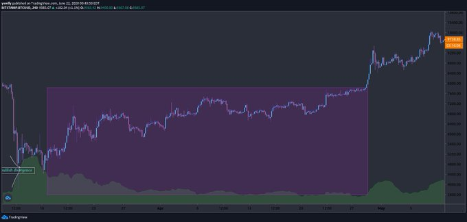
There is no such thing as a perfect indicator. Although volumetric divergence is a very reliable indicator, there are examples of instruments RISING in price at low volume, continuing to rise, and vice-versa.
There is no such thing as a perfect indicator. Although volumetric divergence is a very reliable indicator, there are examples of instruments RISING in price at low volume, continuing to rise, and vice-versa.
The above graphic is shown to illustrate the fact that volume is steady decreasing for a long time, but price is steady increasing. Price does not retrace at the end of the rectangle. But instead KICKS up WITH a kick up in volume!
It’s best to look for volumetric divergence in narrow time frames. Although the volume is steady decreasing in the above example it’s not dramatic enough to represent any sort of significance.
The only thing I would argue patterns such as this represents is overall indecision by traders. It keeps going up, but people aren’t sure if they believe in the uptrend. Took until the end of the rectangle in the above example for the money to start believing in the trend.
I really appreciate you guys showing me love on these. It makes me very happy to be providing value to others, and helping fellow traders on their journey towards financial freedom.
Keep showing love and I will keep them coming. I& #39;m planning on this to be a long lasting series. Again, I am very open to feedback! If you would like to reach out for ANY REASON, please do NOT hesitate to DM!

 Read on Twitter


