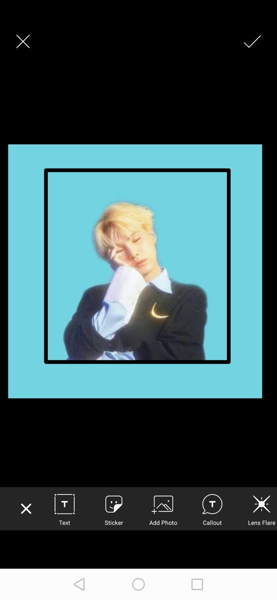
This thread is divided into 3 parts: 1) typefaces 2) photo positions 3) application of both.
It will be quick and easy, I just will note the dos and don& #39;ts, and the reason why these stuff should be learned and applied correctly. So let& #39;s start!
It will be quick and easy, I just will note the dos and don& #39;ts, and the reason why these stuff should be learned and applied correctly. So let& #39;s start!
TYPEFACES:
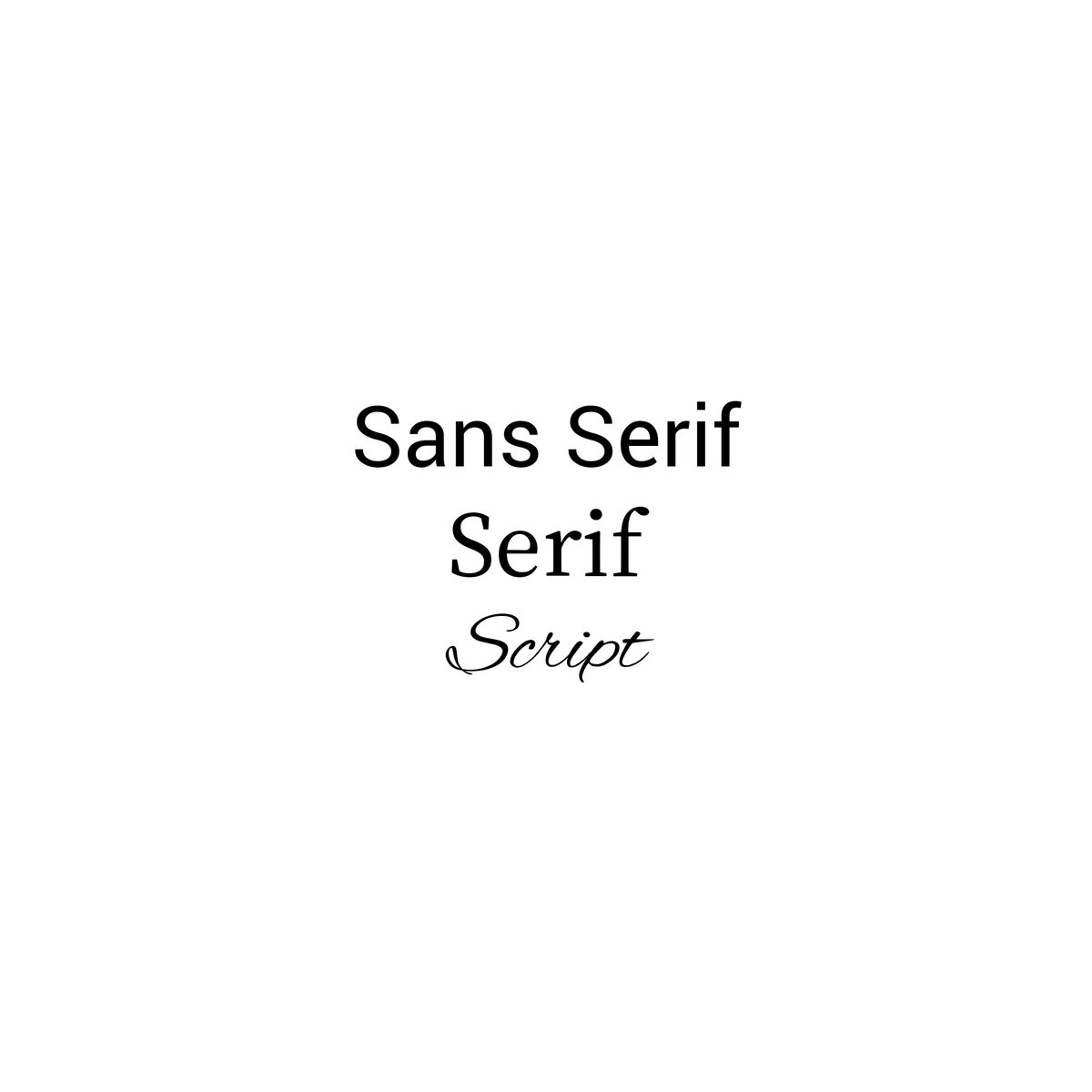
There are different types of typefaces but I only listed the most used typefaces in editing, writing and lettering.
1. San Serif - bold face, straight lines
2. Serif - tails, different thin and thickness
3. Script - cursive, flowing
There are different types of typefaces but I only listed the most used typefaces in editing, writing and lettering.
1. San Serif - bold face, straight lines
2. Serif - tails, different thin and thickness
3. Script - cursive, flowing
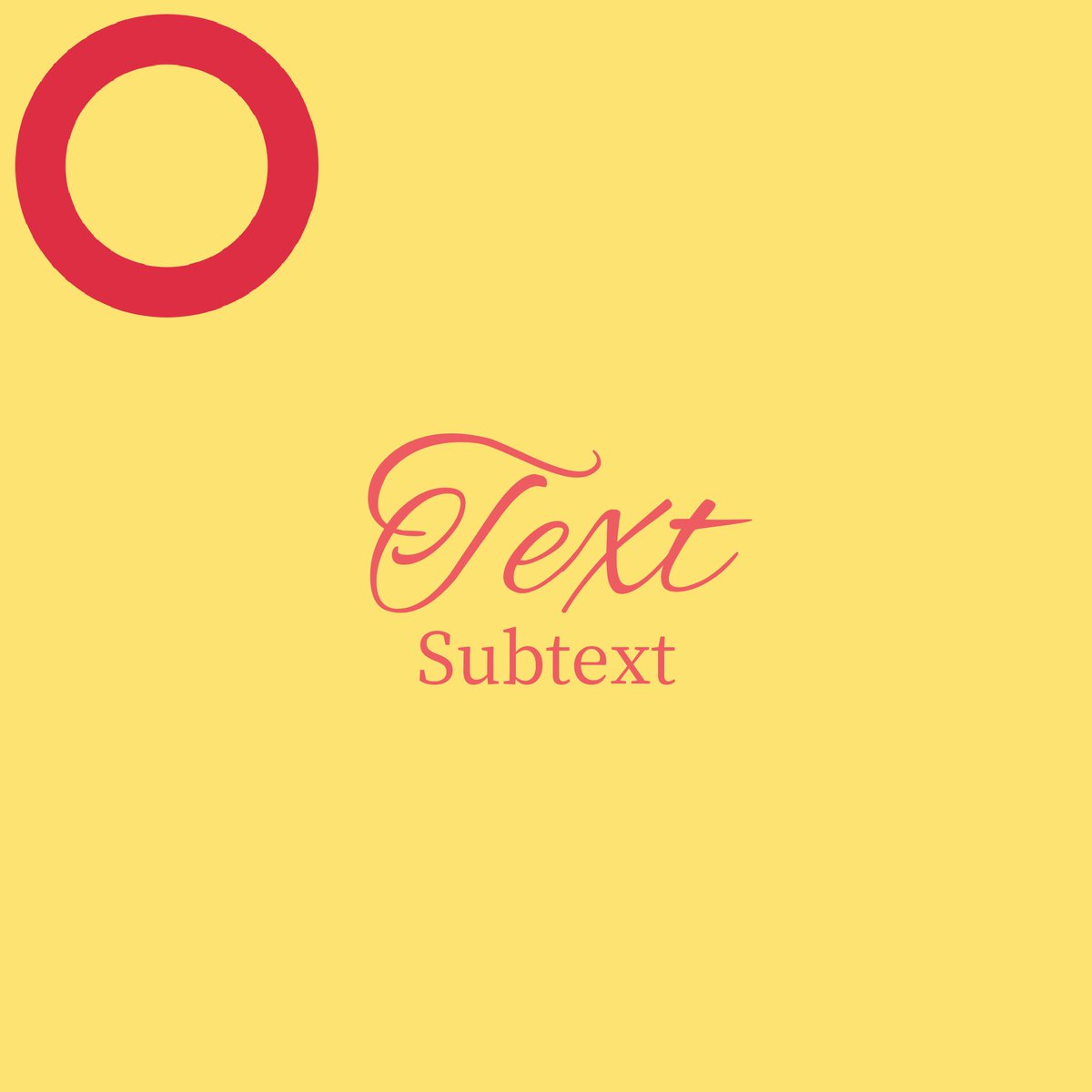
These types are usually used in combinations e.g. Bebas Neue and Times New Roman. They are typically used in opposites rather than similar, it is in the way you will use them that they should complement each other than outshine the other.
Legend: O - correct, X - incorrect
Ex:
Legend: O - correct, X - incorrect
Ex:
On this topic, we should also talk about color combinations. Contrasting colors is not always bad especially when you will be putting text over a certain background.
e.g. When your background is light, use a dark color for your text.
Examples:
e.g. When your background is light, use a dark color for your text.
Examples:
PHOTO POSITIONS:
This is typically the error for some aspiring editors in here, I have noticed this quite a few times and it& #39;s time to educate you guys about this.
Remember that if your png image is cropped awkwardly at some angles, try to conceal them as much as possible!
This is typically the error for some aspiring editors in here, I have noticed this quite a few times and it& #39;s time to educate you guys about this.
Remember that if your png image is cropped awkwardly at some angles, try to conceal them as much as possible!
Don& #39;t let the edges show as they are really not that pleasing to the eyes.
I will show you below the different ways you can do to remedy the ugly edges on your png image.
Examples:
I will show you below the different ways you can do to remedy the ugly edges on your png image.
Examples:

 Read on Twitter