Here& #39;s the situation with COVID in NC:
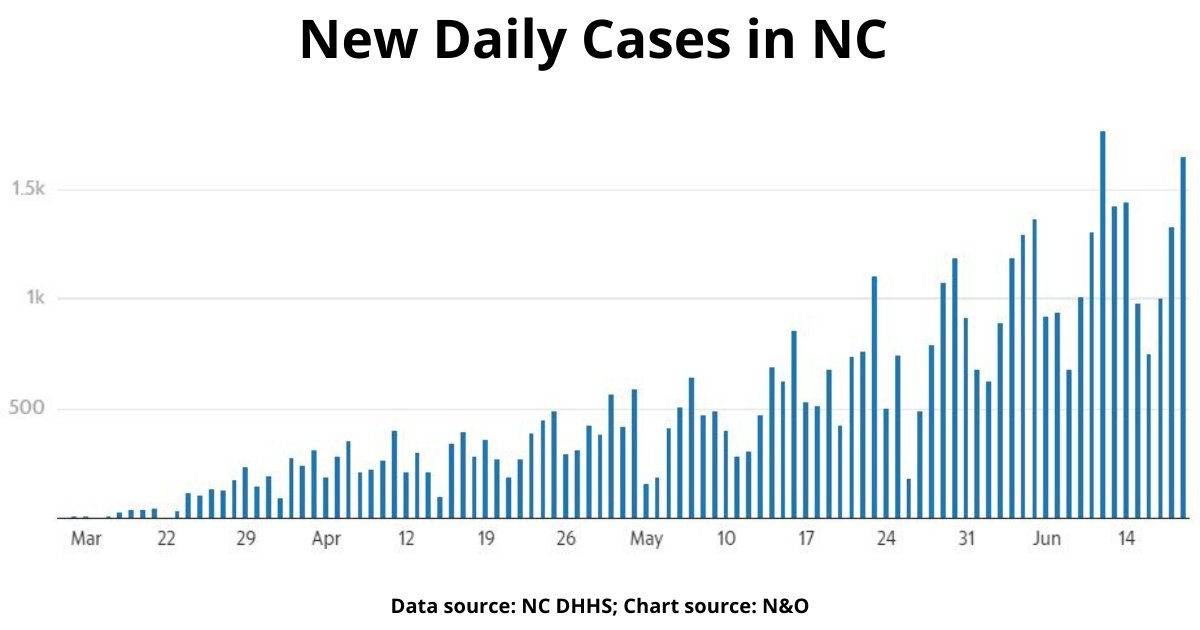
The biggest number that everyone follows is new daily cases.
And that chart certainly looks discouraging.
/thread/ #ncpol #covid19
The biggest number that everyone follows is new daily cases.
And that chart certainly looks discouraging.
/thread/ #ncpol #covid19
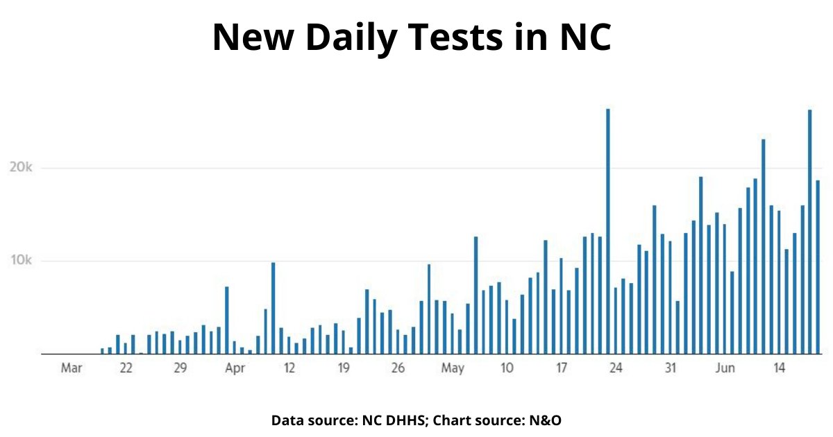
BUT then you follow it with data about new daily testing, and you see that a lot of the increase in new daily cases seems to reflect the increase in testing.
It’s become a common observation that more testing leads to more (confirmed) cases, and that appears to be true here.
It’s become a common observation that more testing leads to more (confirmed) cases, and that appears to be true here.
You might say, "Well Jeff, both those charts look pretty messy. It& #39;s hard to tell if cases really are going up relative to testing."
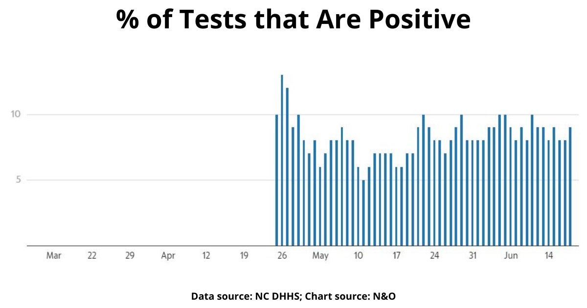
Ok, but take a look at this chart that shows the overall percentage of tests that are coming back positive:
Ok, but take a look at this chart that shows the overall percentage of tests that are coming back positive:
That should control for the increase in testing, and it’s been flat.
That’s good. It means that even though we& #39;re testing more, we& #39;re not seeing a greater share of positive results.
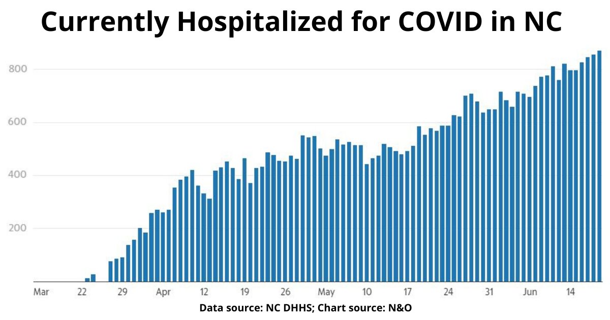
BUT here’s the problem. If you look at the hospitalization number, you see a steady increase.
That’s good. It means that even though we& #39;re testing more, we& #39;re not seeing a greater share of positive results.
BUT here’s the problem. If you look at the hospitalization number, you see a steady increase.
That’s not from an increase in testing. That’s more people getting sick.
I should also note that there’s a question about this data.
Now that people are going back to hospitals for routine procedures, they’re all being tested when they arrive. And some of those folks are ...
I should also note that there’s a question about this data.
Now that people are going back to hospitals for routine procedures, they’re all being tested when they arrive. And some of those folks are ...
... testing positive. So now they& #39;re in the hospital with COVID. And it’s unclear to what extent they’re being included in this number.
In short, we need to make sure we are measuring people who are hospitalized *for* COVID, not *with* COVID.
In short, we need to make sure we are measuring people who are hospitalized *for* COVID, not *with* COVID.
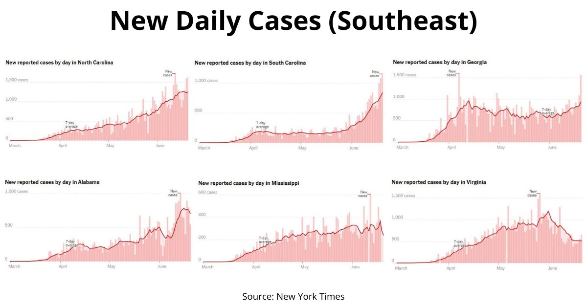
Then there’s the regional picture.
If you zoom out and look at our surrounding states, their daily new cases are all going up - except Virginia, a striking counter-example.
If you zoom out and look at our surrounding states, their daily new cases are all going up - except Virginia, a striking counter-example.
It& #39;s reasonable to assume there& #39;s more testing happening in each of these states, but at a minimum this picture shows us that community spread is ongoing throughout our region.
And if we zoom in on the hottest hot spot in North Carolina - Mecklenburg County, where I live - it shows a clear rebounding of hospitalization rates to their highest levels yet.
Compare that to what this chart looked like the day Phase 2 began on May 22 (where I put a red arrow).
That& #39;s back when we saw a "sustained leveling" in hospitalization.
That& #39;s back when we saw a "sustained leveling" in hospitalization.
A similar, statewide trend of curve flattening is what made us comfortable enough to leave Phase 1 four weeks ago.
That trend of hospitalization flattening appears to have been short-lived, assuming, again, accuracy of the underlying data.
That trend of hospitalization flattening appears to have been short-lived, assuming, again, accuracy of the underlying data.
In summary, when it comes to COVID growth, we wanted negative, we settled for flat, and it appears we got linear.
But we don& #39;t have exponential - at least not yet.
But we don& #39;t have exponential - at least not yet.
P.S. - My thanks to @newsobserver and @theobserver for frequently updating their charts with data from NC DHHS and making it free to everyone. That& #39;s a genuine public service.

 Read on Twitter