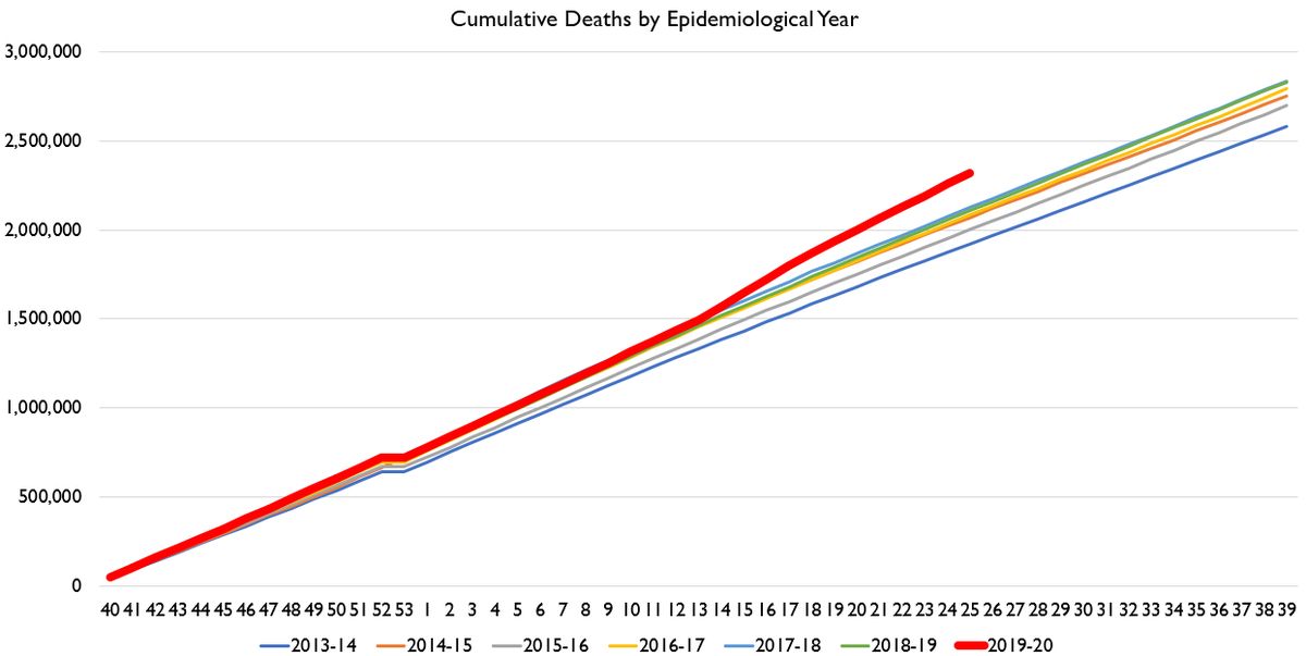
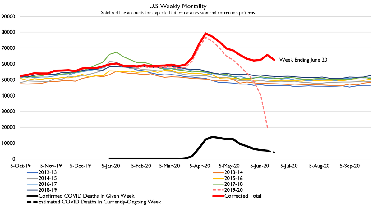
We have new mortality data for the US. What it shows is very interesting.
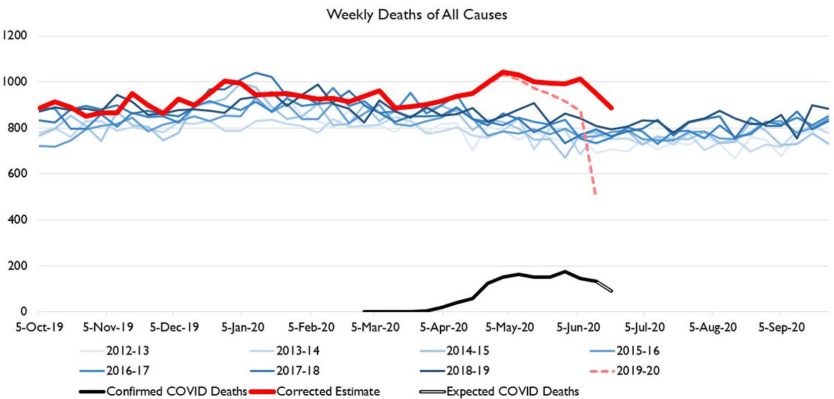
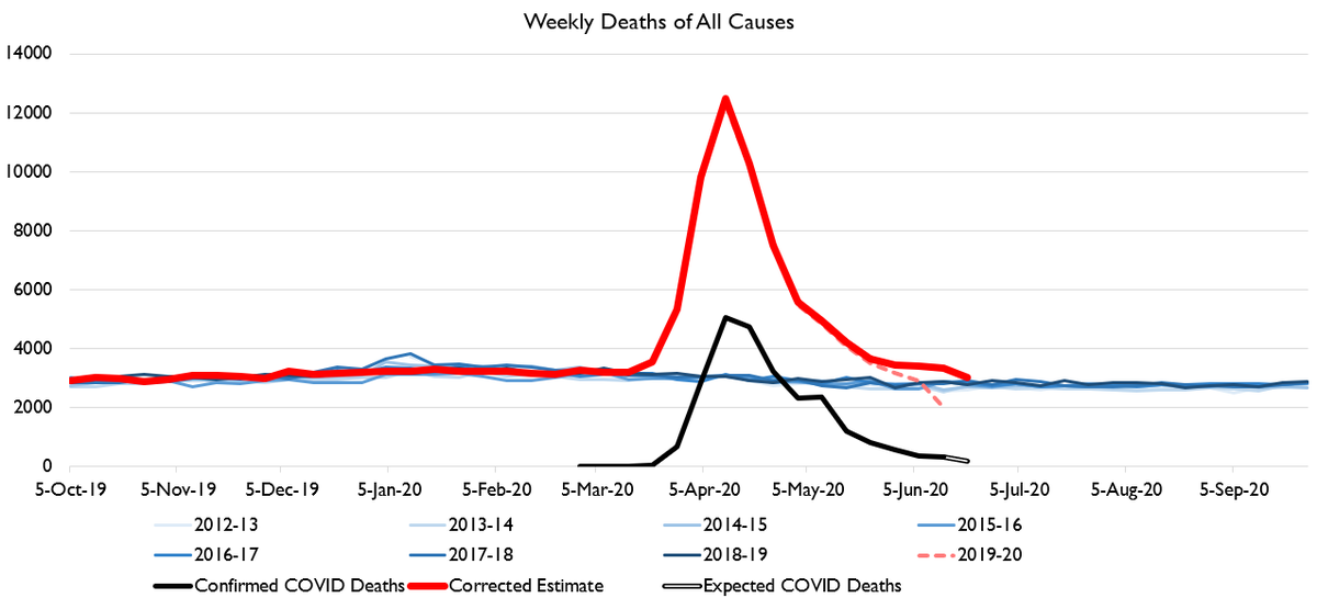
To start with, here& #39;s the raw data. Note the little bump in the last week with reported data (latest week is imputed from seasonality and COVID death trends). That& #39;s a very low-reliability estimate from very limited early reports.... but still interesting.
The bump doesn& #39;t arise from one or two states. It& #39;s present across tons of states. Which is why even though it& #39;s from VERY limited and incomplete, I& #39;m inclined to think it at least suggests deaths did not decline in that week. That& #39;s consistent with no decline in prior week too.
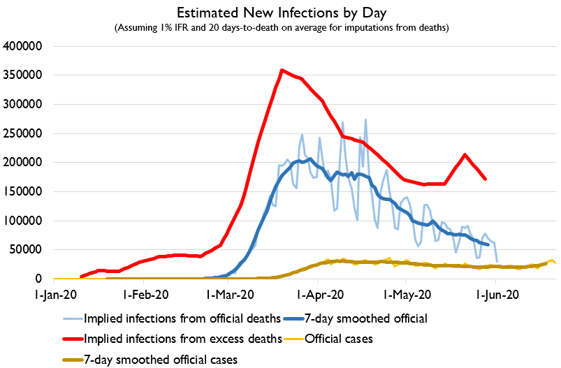
The true pandemic death toll today is probably 200,000 or more. Yikes.
To make matters worse, it looks like we are entering a second wave of transmission, perhaps driven by everybody sitting in cool indoor environments with AC.
GET OUTSIDE PEOPLE.
GET OUTSIDE PEOPLE.
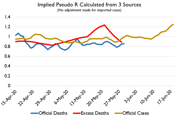
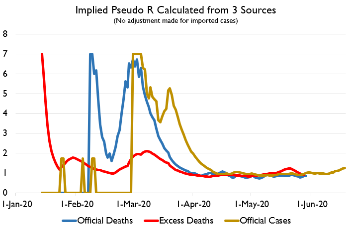
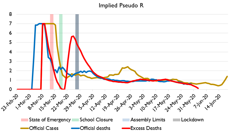
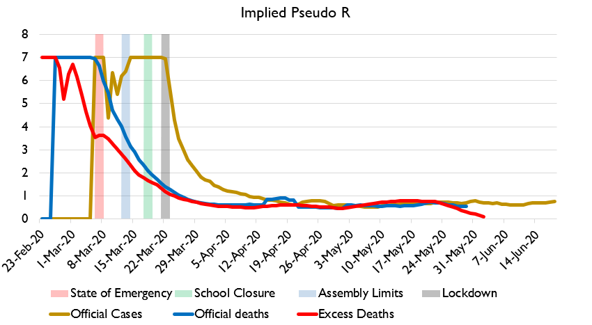
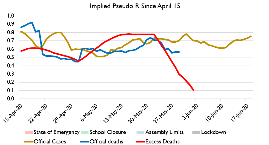
Here& #39;s the infection and R estimate data. Nationwide R value (i.e. new infections divided by estimated active infections) has EXPLODED since June 5-10. Based on case count data, it& #39;s up to 1.2 again.
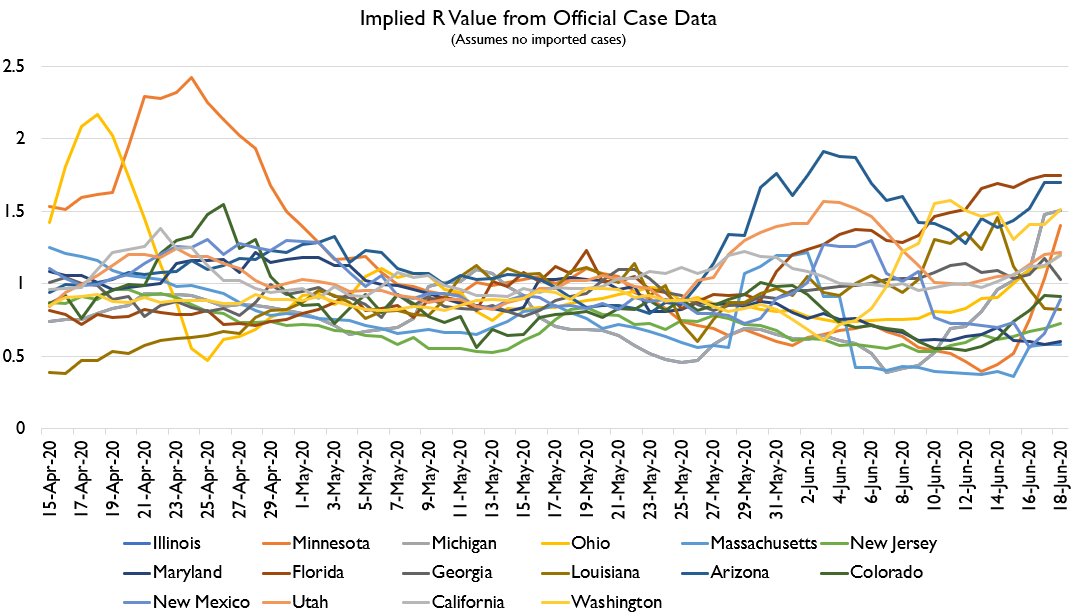
One of the largest increases has come in Minnesota.
Y& #39;all, get outside... but maybe not in, like, huge gatherings of shouting people.
Y& #39;all, get outside... but maybe not in, like, huge gatherings of shouting people.
What& #39;s so disappointing about this is that Minnesota& #39;s case counts were plummeting. R was very low. They were THIS CLOSE to ending their epidemic.
Now they& #39;re going for a second wave.
Now they& #39;re going for a second wave.
I& #39;m a bit irritated at the line we& #39;re seeing about the rise in R being driven by just this state or that state. Here& #39;s a selection of states. R is rising in MANY places!
We are seeing rises in places where people are probably cooped up in AC a lot now (Florida, Arizona), but also places where they really aren& #39;t, like Washington and Michigan.
And while I highlighted Minnesota due to the possibility of protests spreading COVID-19.... I don& #39;t actually see any obvious-nationwide correlated between media-reported major protest states and change in R.
Seems likely that what& #39;s actually happening is as people are returning to normal in a variety of ways and as people spend more time indoors, the highly-random spread of COVID via isolated-but-dangerous superspreading events is resuming.
I& #39;ve seen this point raised: treatment may be improving, and also new cases are skewing younger. In both cases, this would death-based epidemic measures would understate infections, and that rising R would have a smaller impact on mortality. https://twitter.com/Biomaven/status/1274917987267555328">https://twitter.com/Biomaven/...
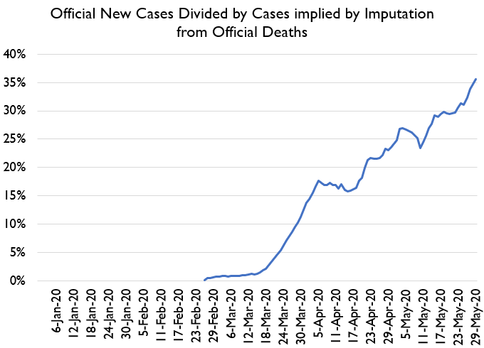
However, I am VERY skeptical of this claim. I don& #39;t really buy that new infections are actually younger. I just think we are testing a larger share of new infections. Here& #39;s a guess at what share of new infections are being caught.
I& #39;ve seen a lot of people saying that New York hasn& #39;t had any increase in infections recently. That... doesn& #39;t seem entirely correct?

 Read on Twitter

