hey thanks for 50 f0llowers. as celebration i decided to do a guide on TECHNICAL ANALYSIS.
Introduction to Technical Analysis, volume 1. Support, resistance, cycles, and trends.
Thread https://abs.twimg.com/emoji/v2/... draggable="false" alt="👇" title="Rückhand Zeigefinger nach unten" aria-label="Emoji: Rückhand Zeigefinger nach unten">
Introduction to Technical Analysis, volume 1. Support, resistance, cycles, and trends.
Thread
TECHNICAL ANALYSIS (TA) is the art of looking for patterns in charts, with the goal of being able to get an idea of how the instrument will behave in the future.
There are many, many different ways to do TA, in this thread im going to be focusing on foundational concepts.
There are many, many different ways to do TA, in this thread im going to be focusing on foundational concepts.
Support/Resistance
One of the most important patterns to recognize in TA is the phenomenon of support and resistance. It’s best described with graphics…
One of the most important patterns to recognize in TA is the phenomenon of support and resistance. It’s best described with graphics…
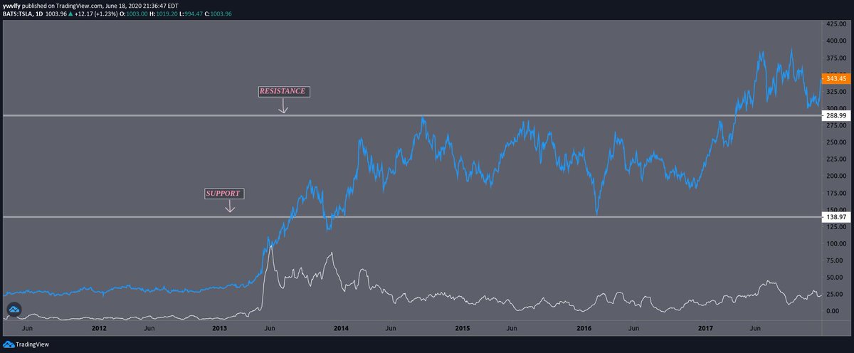
From JAN 2014-APR 2017 $TSLA was in a sideways trend between the $139 (support) level and the $283 (resistance) level.
It’s obvious to recognize that the price bounced around between the two levels for quite some time before it broke through the resistance in April of 2017…
It’s obvious to recognize that the price bounced around between the two levels for quite some time before it broke through the resistance in April of 2017…
But TA (technical analysis) is more detailed than that.
In the next diagram we will be further examining the behaviour of $TSLA’s price action as it approaches the two levels, as well as elaborating on the nuances of support and resistance as a pattern.
In the next diagram we will be further examining the behaviour of $TSLA’s price action as it approaches the two levels, as well as elaborating on the nuances of support and resistance as a pattern.
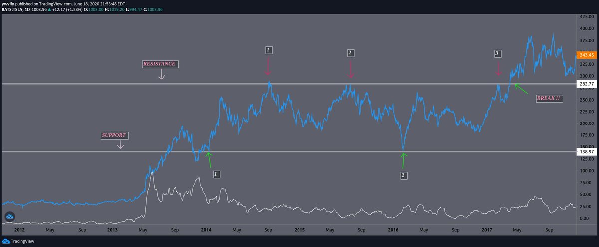
Support and Resistance gets weaker each time it is tested.
Think of it like a wall. The price action is a battering ram... Each time the battering ram slams into the wall, the wall gets weaker. Eventually, all support and resistance will break if it keeps getting re-tested.
Think of it like a wall. The price action is a battering ram... Each time the battering ram slams into the wall, the wall gets weaker. Eventually, all support and resistance will break if it keeps getting re-tested.
I labeled each time the support and resistance was tested in the example above.
Notice that the support was tested twice, the resistance was tested three times, until it was finally weak enough to allow a breakthrough.
Notice that the support was tested twice, the resistance was tested three times, until it was finally weak enough to allow a breakthrough.
It’s important to note as well that, the higher the time frame we can identify support/resistance, the stronger the wall is. This is why it’s important to always start your TA from a HTF (higher time frame) and incrementally make your way down.
Note how the support/resistance isn’t precise. TA is never precise. TA is an artform, NOT a science. This is why it’s important to think of support/resistance as zones (this is why i made the lines thick).
An important idea to keep in mind → the higher the market cap ($ amount flowing in and out of the instrument), the more precise the patterns are.
This is $TSLA ‘s history from JUN 2014 - JUN 2019, and all it’s cycles labeled. Or, at least one way to draw them.
I focused on lower time frames than the previous illustration just to show how cyclical trading can be. It would be considered that $TSLA was in a sideways trend throughout the HTF.
Note how since the cycles are illustrated on LTFs (lower time frames) in this example, the cycles vary frequently, and regularly. Some cycles last for 12+ months, some only last for 1, or less. Every trend continues until it is invalidated.
Peep how each cycle has its own support and resistance. When these are broken, that is when a trend is invalidated.
This is a good demonstration of HTFs versus LTFs. the higher the time frame, the more significant the patterns.
ALSO, see how the resistance starts to function as support in the later dates on the chart? It’s not too clean in this example, but it’s something to keep in mind. Previous resistance → next support.
that about does it for this chapter.
Let me know if you guys enjoyed this format. Im planning on adding on more chapters in the future. I’m open to criticism,
please don’t hesitate to DM!
Let me know if you guys enjoyed this format. Im planning on adding on more chapters in the future. I’m open to criticism,
please don’t hesitate to DM!

 Read on Twitter


