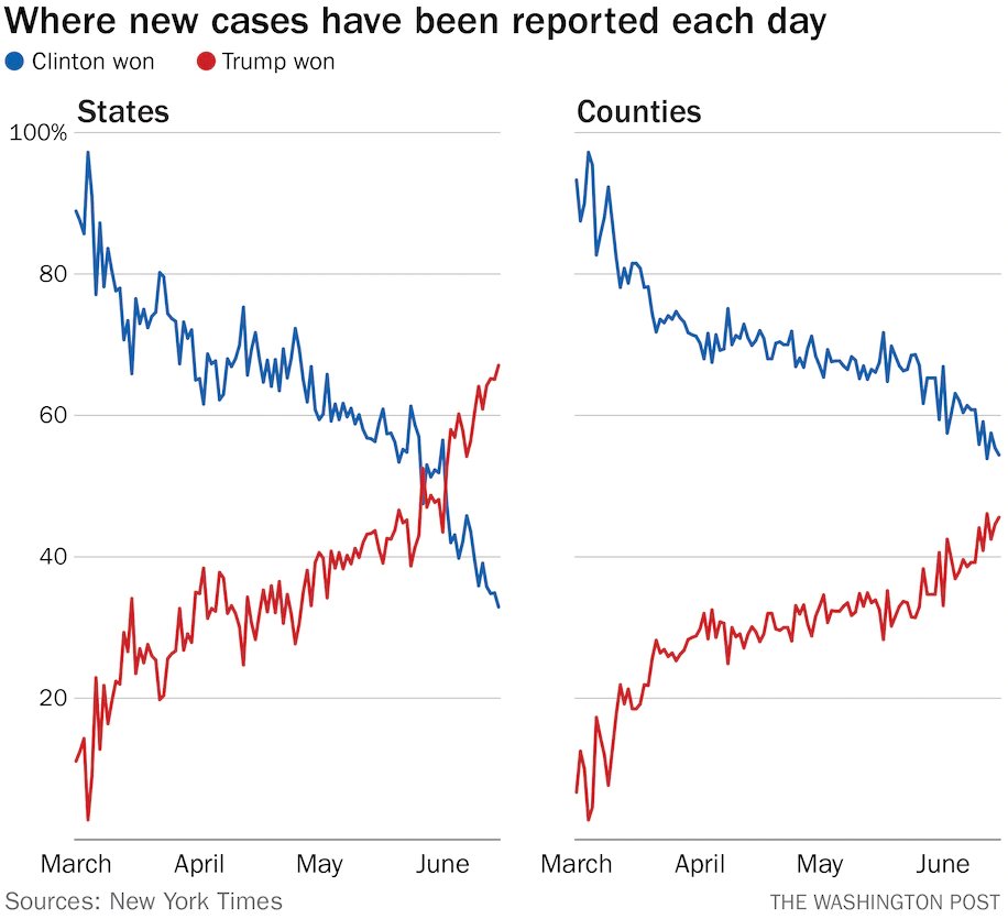
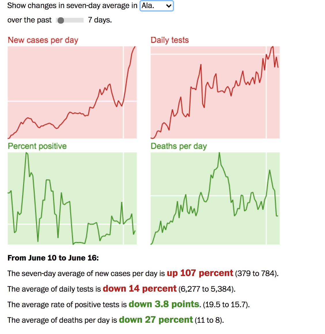
This graphic is stunning. Here is the wider story. https://www.washingtonpost.com/politics/2020/06/17/coronavirus-has-come-trump-country/">https://www.washingtonpost.com/politics/...
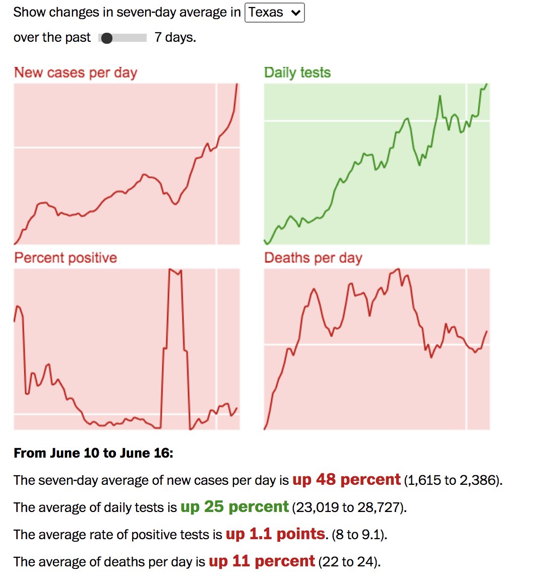
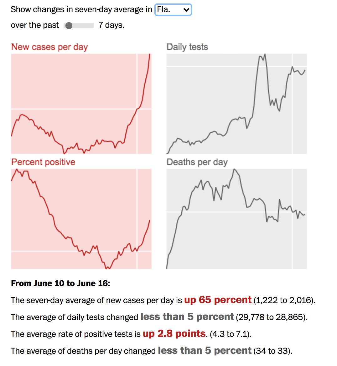
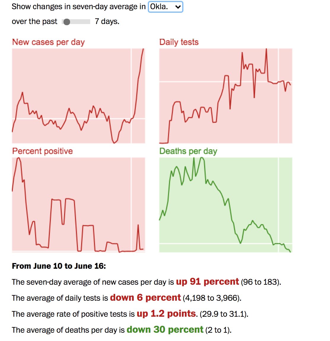
They also allow you to see how rate of new cases compares to testing, deaths, and percent positive by state with a slider over time.
Cases over the last week are going up faster than testing in Texas.
Oklahoma, soon to be site of Trump& #39;s Tulsa rally, actually had testing go down, even as cases are rising.
Some readers think that this could reflect the movement from more densely populated areas to less densely populated areas. There may be something to that since densely populated areas tended to be blue. It would be interesting to see how highly correlated those indicators are.
I don& #39;t think one should necessarily conclude from this blue states handled or are handling COVID better, given large death toll in New York. What we can say is that they were affected first & the trajectory of new infections has increasingly moved to states & counties Trump won.
States and counties that saw this as other& #39;s people problems in urban coastal states, counties, and cities may find themselves facing a public health emergency in a political environment in which the president has downsized federal action and signaled the problem isn& #39;t severe.
If anyone is a new follower or reading this thread, you might find my essay from April on why the international response to COVID has been so anemic to be of interest. It& #39;s from a political science perspective, but readers might find it to be of interest. https://www.e-ir.info/2020/04/26/what-international-relations-tells-us-about-covid-19/">https://www.e-ir.info/2020/04/2...
I& #39;m also curating a series on COVID on the academic blog Duck of Minerva with entries on the response around the world. https://duckofminerva.com/tag/covid19 ">https://duckofminerva.com/tag/covid...

 Read on Twitter