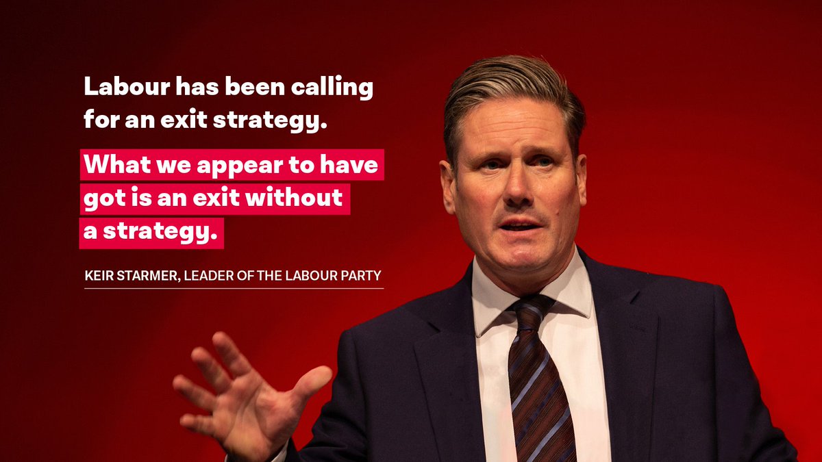
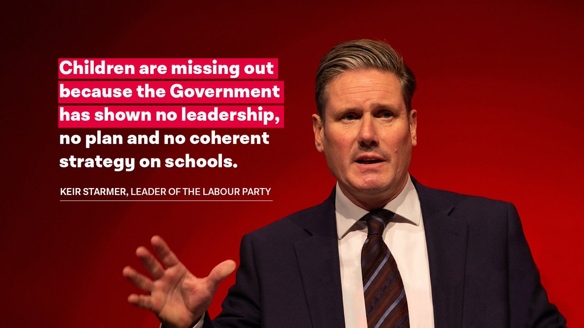
Why The Labour Party& #39;s Social Media Posts Suck (A thread)
Over the last few weeks, the social media output from @UKLabour has been awful. A series of inconsistent and poorly designed images have been put out to promote the party’s policy positions.
The party’s social media game needs desperate improvement if it is to compete with the Tories in 2024. It cannot continue to post sloppy designs on its Twitter account. But these posts speak to a wider problem in the party’s brand.
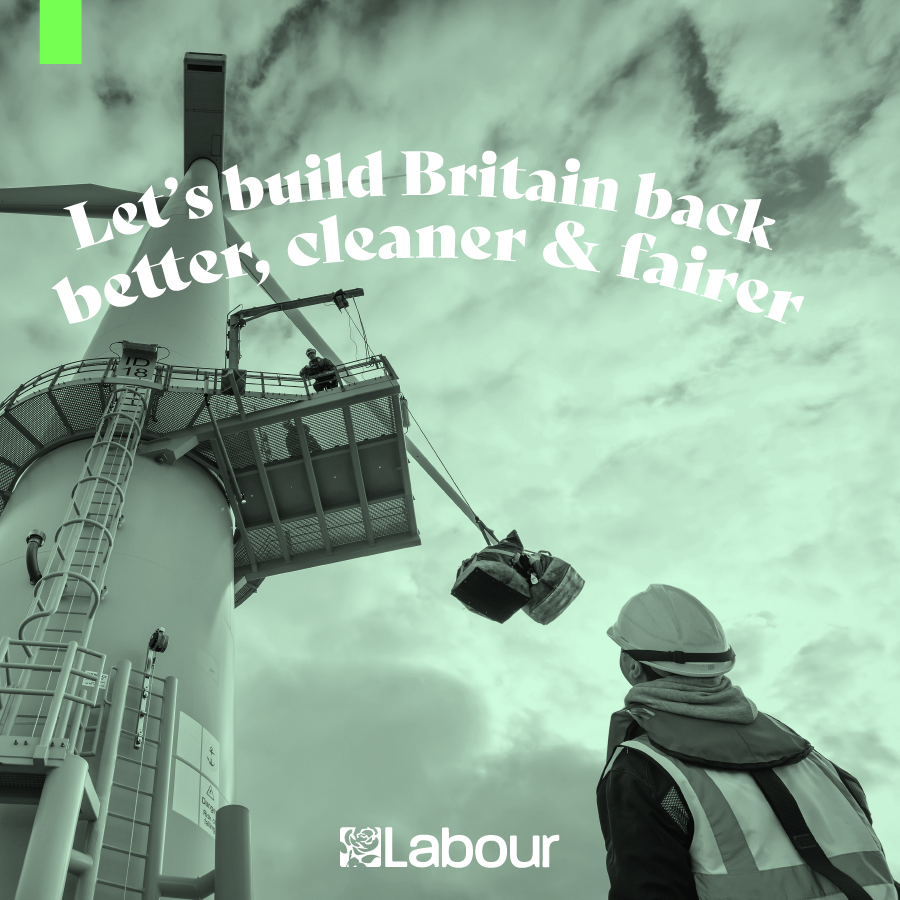
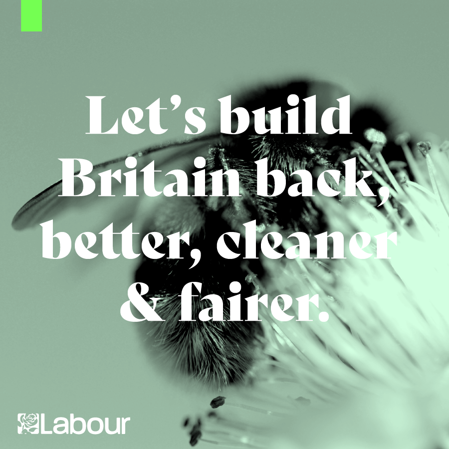
The key issue with these posts is the clear lack of consistent brand guidelines on social media posts. They all feature different typefaces, a new one seemingly cropping up each time there is a new policy to tweet about.
If you took the Labour logo away from most of these posts, you’d have no clue they were connected to the party.
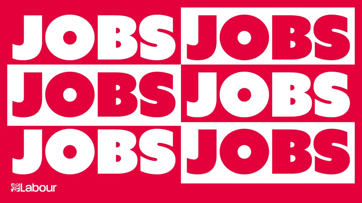
This Jobs post for instance. If you took away the logo this would make even less sense than it already does. Aside from the unforgivable misalignment on the bottom row, the other issue is the typeface, Azo Sans (I think) is not a party font.
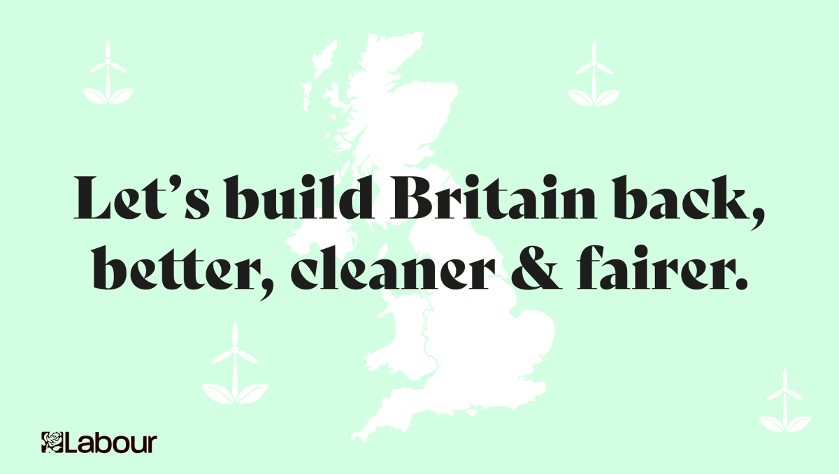
This is a recurring theme; we also have the Build Britain Back posts. The slogan doesn’t make any sense, the map of the UK doesn’t stand out against the light green and the Serif font does not fit the party brand at all. Serifs are more traditional, not modern, or forward-looking
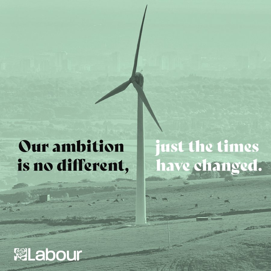
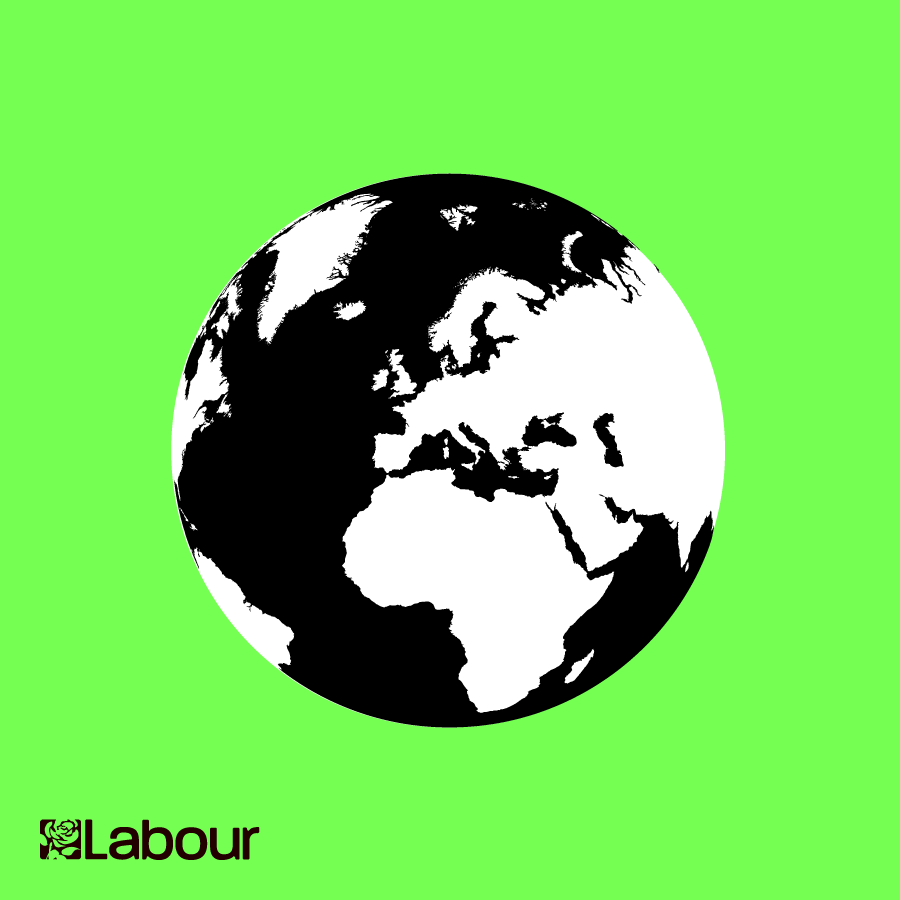
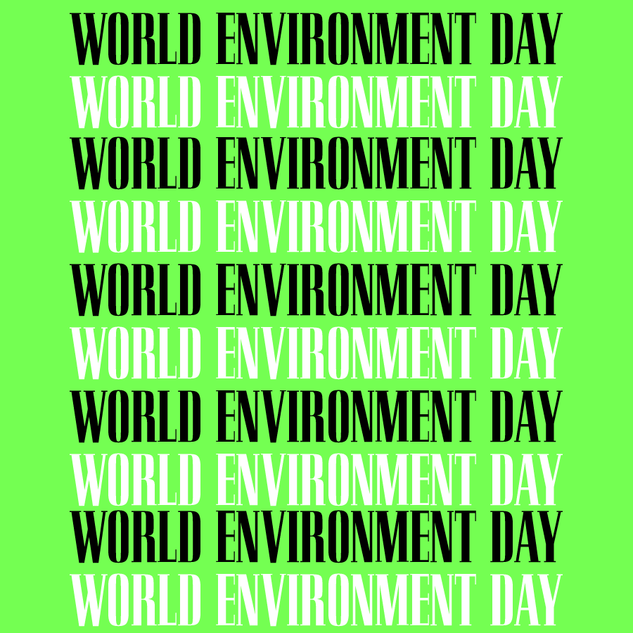
Then, out of nowhere, a completely different green when talking about world environment day. Once again, a new typeface, and once again it’s not a party face.
Once again, a thick and thin serif font, with an illustration style in the corner that doesn’t usually appear in party promotion. The less said about the background colour the better.
Another new typeface, this time it’s HWT Artz. Why is the Labour logo now a different size? Why is it in the centre rather than left-aligned?
You get the point. There is no consistency between these posts. They all feature different typefaces, none of which are party faces. They all have different layouts and colour schemes. The party has a typeface problem and a clear lack of direction in its brand.
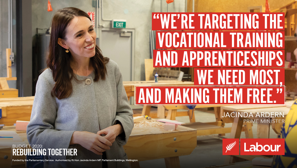
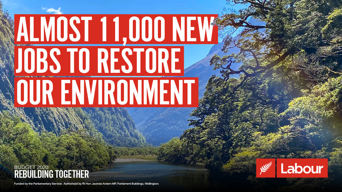
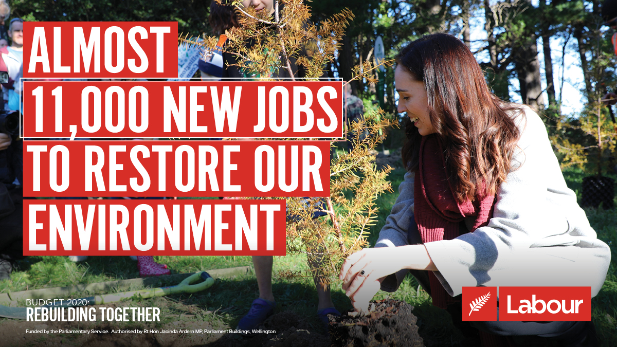
To see how to do it properly we have to look at our sister party across the globe. @nzlabour has a far more coherent social media presence. Relevant imagery with bold type in Alternate Gothic No1, highlighted in red. Consistent in layout. (Also 10/10 logo, way better than ours)
Anyway, back to the UK. Labour is in desperate need of a rebrand. We have had the same logo since Gordon Brown became leader in 2007. It’s far past time for a new one, with clear rules and guidance on party typefaces and social media posts.
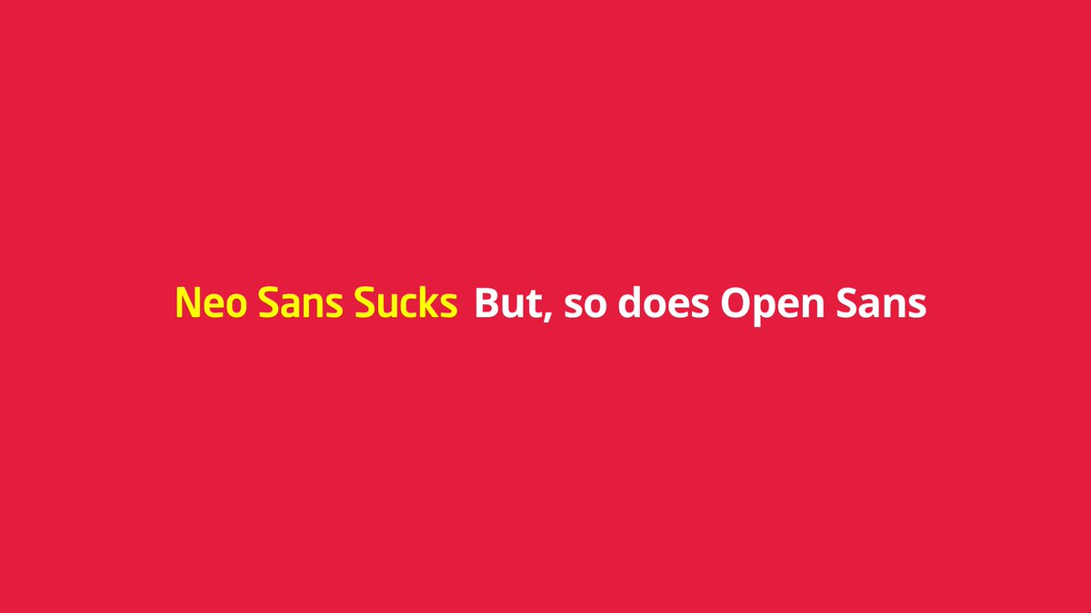
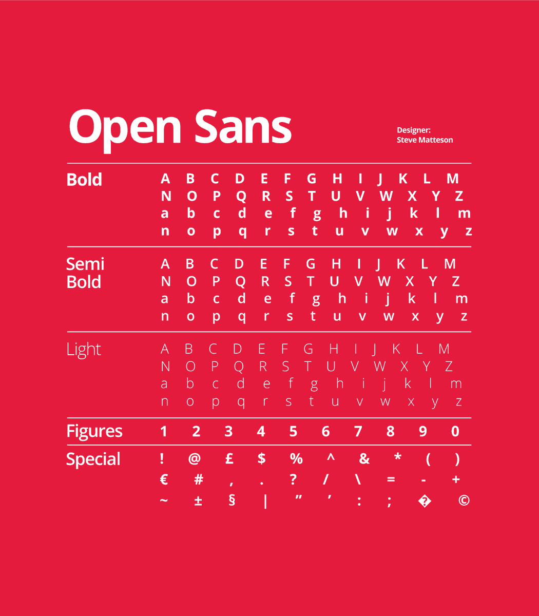
Since the 2007 rebrand, there have been 2 key party typefaces. Neo Sans and Open Sans. They both suck. Neo Sans still crops up every election on campaign material, and open sans is supposed to be the current party typeface.
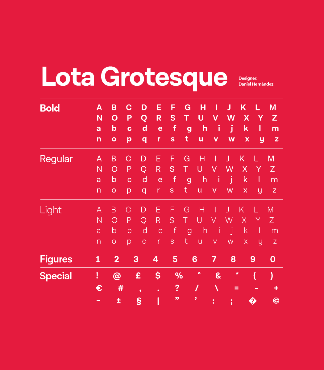
Open sans is boring. It looks dull and uninspiring. Despite the Visual Identity Guidelines stating it is the party’s typefaces, it is overshadowed much of the time by another font. Lota Grotesque.
On a lot of Labour’s online material, primarily its website and video output, Lota Grotesque takes centre stage. Rightly so in my opinion. It is more modern, legible, and exciting than open sans. But why is it not the party’s main typeface?
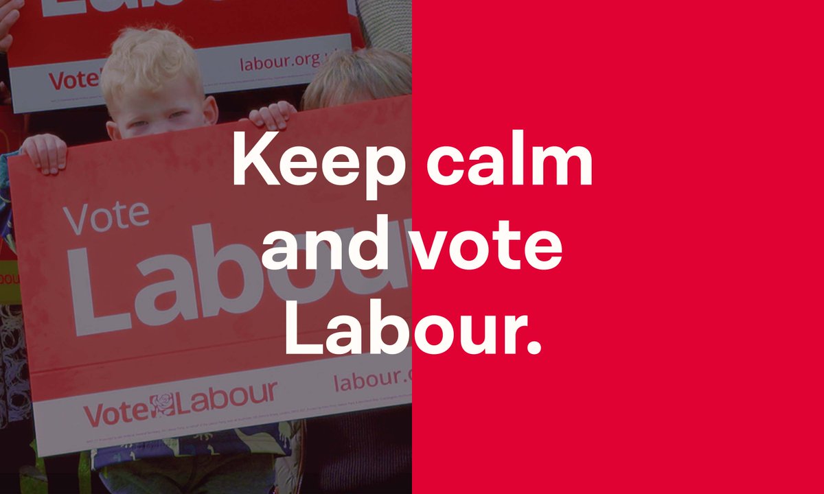
Labour desperately needs new guidelines on typefaces. Is it Neo Sans, Open Sans, or Lota Grotesque? This needs to be applied to a clear and consistent format for social media posts. As social media becomes ever more important in politics and elections, so too does good design.
Thank god for @LabourDesign, they might just save us from this mess! It& #39;s actually embarrassing when compared to the New Zealand Party!
P.S. For the love of God, use some different pictures of @Keir_Starmer
In addition to my thread yesterday, here is a look at the
@TheGreenParty& #39;s Visual Brand Guideline. Labour take note, something like this would benefit the party hugely.
https://www.greenparty.org.uk/assets/logos/visual-identity/2019.11%20GPVisualBrandGuidelines_v1.pdf">https://www.greenparty.org.uk/assets/lo...
@TheGreenParty& #39;s Visual Brand Guideline. Labour take note, something like this would benefit the party hugely.
https://www.greenparty.org.uk/assets/logos/visual-identity/2019.11%20GPVisualBrandGuidelines_v1.pdf">https://www.greenparty.org.uk/assets/lo...
Additionally, the Lib Dems also use Open Sans as their typeface. Labour has to stand out against the other parties. That can& #39;t be done when using the same typeface. (They also have a decent style guide)

 Read on Twitter