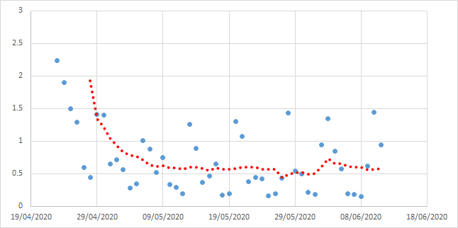
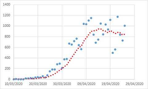
So just finished my dinner and was still pondering this graph. Its amazing how constant the in decline in rate of death due to Covid-19 has been in the UK. And I wondered what I could do with it and what it means. Here it is again in its unprocessed glory. (1)
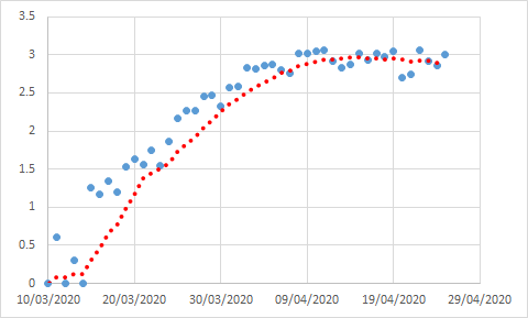
So basically its the number of deaths on day (n) divided by the number on day (n-23), the peak day people dying would have caught it. If it goes above one, deaths are going up, if it stays below one, deaths are going down. Following me? (2)
...because 23 isn& #39;t divisible by 7 and our reporting in the UK is just weird, the red line is the 7 day average of the data to smooth out that daily scatter. And what amazes me here is just how static that line is, how constant that rate of decline has been. (3)
...thats obviously better than it going up. But we need it to be going down to get out of this any time soon. And it occurred to me that we can start doing some extrapolations (4)
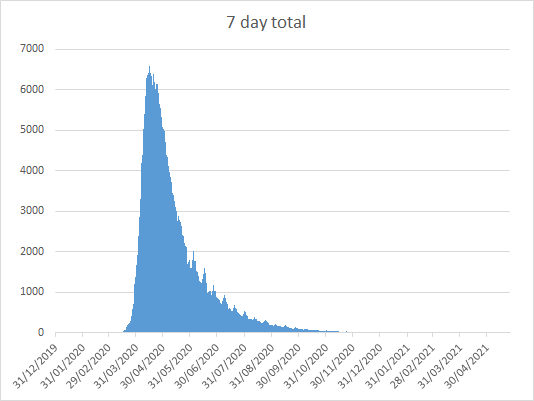
...so assuming it stays level, which will likely be the case unless we sort out the complete hell of our failing testing and contact tracing, when do we come out of it? Here& #39;s an extrapolation (5)
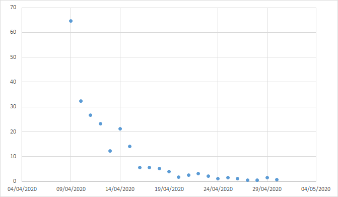
...this is the number of people killed by Covid-19 in the UK in each 7 days up to the stated date, extrapolating the average rate of decline for the last 30 days forward until, well, its gone... (6)
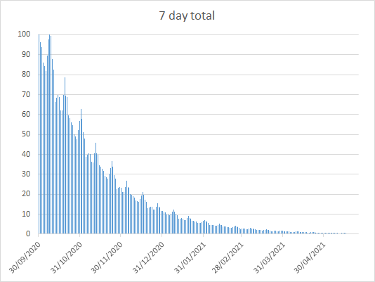
And its terrible. It means we& #39;ve got to remain deeply vigilant, going along as we are now, for months. Here& #39;s the end of September until the end of April next year, again 7 day totals of fatalities for each day. (7)
The question we need to be asking is what -else- we& #39;re going to do to reduce the infection rate further. Without contact tracing and tightly isolating people who are infectious, or without a vaccine, we& #39;re not out of this by a very, very long way. (8)
...because unless we do get rid of this, any return to normality means it can come back. (fin)
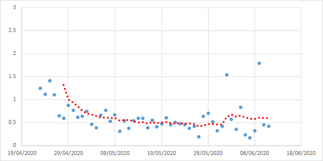
Addendum to this thread - responding to comments. Firstly, what if we divide by 21 days ago instead of 23, won& #39;t there be less scatter? Yes, there will, but the -average- will be less accurate because the published 23 day peak seems robust. But here it is anyway... (9)
This does give a lower average approximation of R based on fatalities (0.53), but it also shows R rising to an average of 0.61 over the last 9 days since the fatality rate upticked, whereas the 23 day model shows it reverting to where it was. Be careful what you wish for (10)
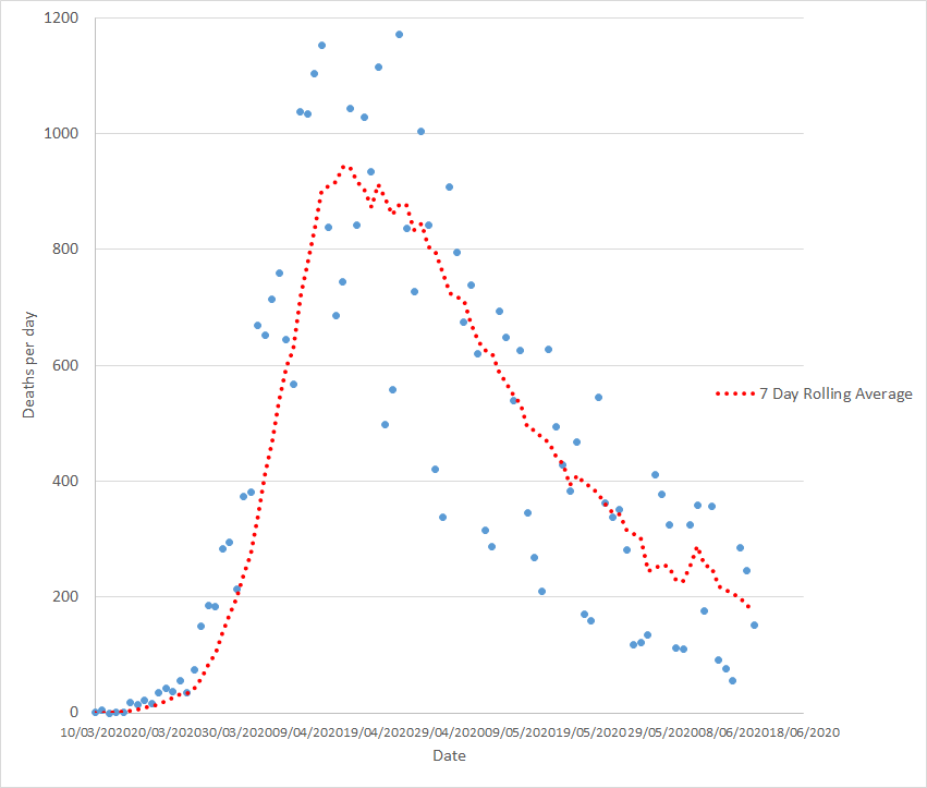
The other question is whether or not we can predict what an earlier lockdown woult havemeant. Lockdown happened on the 23rd March. Here& #39;s what the curve looks like for the increasing number of deaths in the UK: (11)
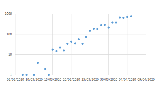
The interesting part of that line isn& #39;t the messy bit at the top or the straight bit in the middle, its the exponential line at the bottom. Exponentials are the bits the likes of me (microbiologists) are most comfortable with, we& #39;re odd like that (12)
...although those of us who have done a lot of work with filamentous organisms are quite happy with linear growth too - but thats another story. (13)
We& #39;re looking for a straight line when we log it. Its that simple. And up until the 23rd of March, there it is. Gun barrel straight. And from that point we& #39;ve got a curve as the rate of increase starts to fall. That curve is a nice and simple one, we& #39;ll come to that later (14)
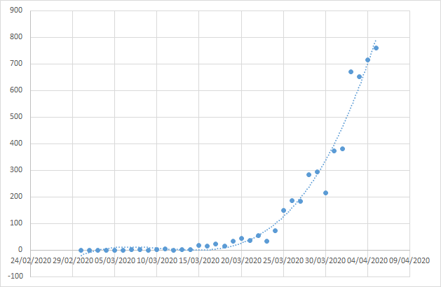
Closer look. You can basically put a straight line on exponential growth of the number of deaths until the end of March, which you& #39;d expect. (15)
Now you can& #39;t get a rational R value from fatalities during that early exponential period, its just too fast, and testing, reporting, even causes of death are all over the place early on. It a mess. But perhaps if we look at the subsequent curve we might see something useful (16)
Until about the 9th of April the rate of rise is exponential, the line is about straight, and then it plateaus and we start to get to a point where we go down to the R value you get in lockdown. Remember, the peak time to die is 23 days after catching it but its a broad peak (17)
...and this is what it looks like for that period it takes to get to the R value as calculated from fatalities of about 0.6. This is that big lump of infection working its way through the peak death day towards the new R (18)
Now of course what makes this complicated is we locked down on he 23rd of March but we had measures to get people distancing, encourage hand washing etc. for days before that. and the result is the real R value starts to slow before that (19)
...we see that from the fact that fatalities more or less plateau around the 9th of April but start trending down around the 19th. We can see lockdown works but the timing of its impact is hard to see because the peak of deaths is broad and the lockdown start mushy (20)
But this should be enough. Out of time for now but will look at this again later and try to calculate result 1 week, 2 weeks and 3 weeks (when I was saying we needed to lock down!) earlier lockdown. (21)
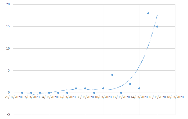
Lets assume we locked down one week earlier. This is what we& #39;d have been looking at in terms of the deaths per day until that point. 43 dead until that date. (22)
Now we know that the lockdown was wooly, there was & #39;advice& #39; for a few days about staying home if you were ill. So the time until the death rate starts to flatten isn& #39;t 23 days, its about 16. And that also gives us quite a prolonged peak too... (23)
But its about 22 days when our rolling average total reaches its peak on the 14th of April. A rather pleasing fit with what we know to be the 23 days it takes for someone to die on average, and the plateau of the maximum death rate runs through until the 23rd. 9 days (23)
Geting to that peak, which remember remained linear so probably would again, looks like this. And after that we& #39;re extrapolating rather. But we don& #39;t wander along with up to 1000 people a day dying, its about 750 (24)
After that for specific numbers you& #39;re really crystal ball gazing. Maybe I& #39;ll come back to this and see if I can find a mathematical fit for that later. First though, I was saying we should lock down a fortnight earlier, because thats when it was VERY clear we had to (25)
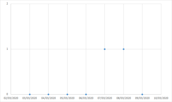
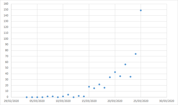
Two fatalities by that point. A blessedly light total so far but in fairness quite a dull graph. (26)
And extrapolating forward as far as we have for the others, we reach 150 deaths per day. Or thereabouts. (27)
So before we do anything else with this data - just at the peak, just for those 9 days at the top of the curve, shutting down a week earlier would have saved at 200-300 people per day - and its only as small a number as that because people were already distancing (28)

 Read on Twitter