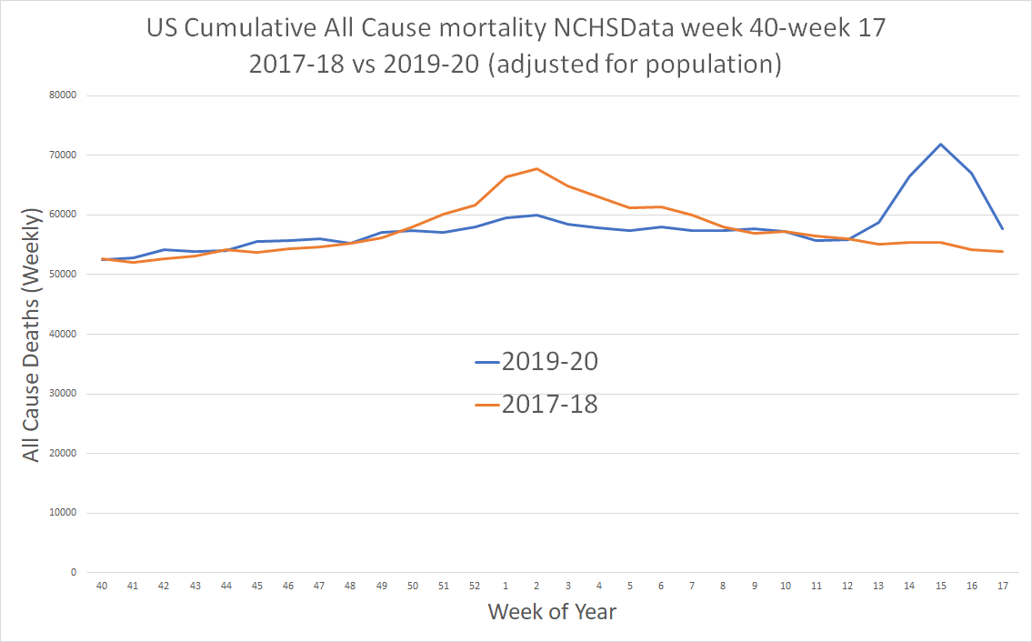
when compared to 2017-18 (a baddish, but far from crisis level flu season) 2019-20 shows a curve with a v different shape.
it was extremely mild early and had almost no peak where it generally does. then, it had a late peak that played catchup, right to the same level as 17-18.
it was extremely mild early and had almost no peak where it generally does. then, it had a late peak that played catchup, right to the same level as 17-18.
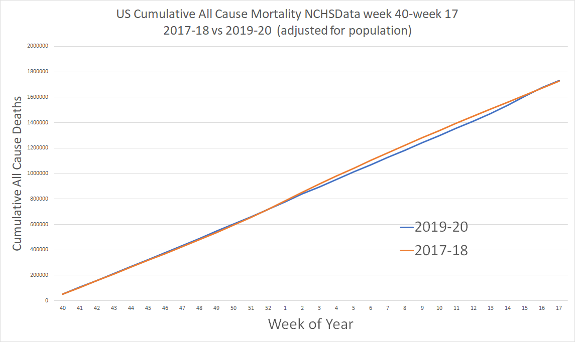
eyeballing the area under curves is notoriously difficult. it is that area under the curve that shows cumulative deaths.
vs 2017-18 excess deaths were deeply negative this season until week 13. then, they caught up rapidly to what is all but the same level.
this is cumulative
vs 2017-18 excess deaths were deeply negative this season until week 13. then, they caught up rapidly to what is all but the same level.
this is cumulative
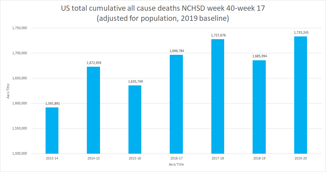
also note how small that variance actually looks when you do not use a zoomed scale. deaths this season are 0.3% higher than 2017-18 when adj for population. it& #39;s a sliver.
also note the shift in timing. that allows graphs like this to look scary.
but they aren& #39;t.
also note the shift in timing. that allows graphs like this to look scary.
but they aren& #39;t.
that spike is just moving the peak to a time when the typical baseline is low.
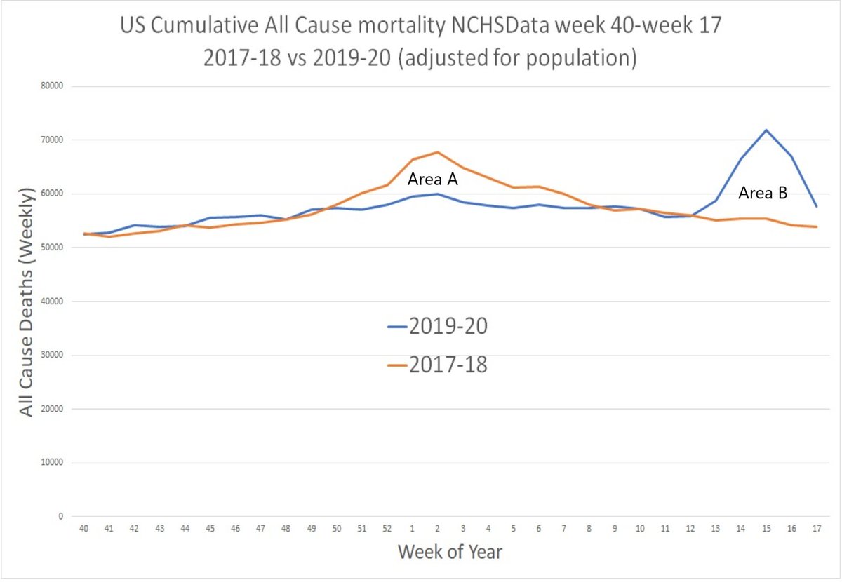
so "excess deaths" look large. but really, they were just shifted. it draws your eye and you miss how far below normal it was dec-feb.
it turns out that area A = area B with remarkable precision
so "excess deaths" look large. but really, they were just shifted. it draws your eye and you miss how far below normal it was dec-feb.
it turns out that area A = area B with remarkable precision
overall deaths are 5,569 higher (0.3%) than 2017-18.
they are 2% higher than a flu year like 2016-17 that no one even noticed.
this does NOT make covid look like some lethal plague.
it makes it look like a baddish (but not crisis level) flu.
they are 2% higher than a flu year like 2016-17 that no one even noticed.
this does NOT make covid look like some lethal plague.
it makes it look like a baddish (but not crisis level) flu.
what does this all tell us?
it tells us lots of people in 2019-20 outlived their predicted lifespan in a year with a baddish flu.
then covid hit them and the yr as a whole reverted to mean.
a flu like disease ran hot through a high risk population flu had left alone this yr.
it tells us lots of people in 2019-20 outlived their predicted lifespan in a year with a baddish flu.
then covid hit them and the yr as a whole reverted to mean.
a flu like disease ran hot through a high risk population flu had left alone this yr.
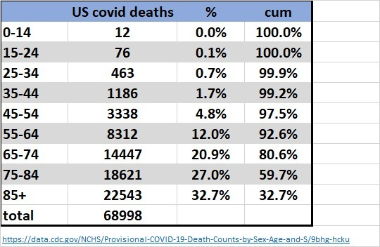
we see this very clearly in the age data.
the US is in a panic because cannot read actuarial tables of death graphs.
had no one even named covid19, this just would have been a "huh, what a late flu year" year.
the US is in a panic because cannot read actuarial tables of death graphs.
had no one even named covid19, this just would have been a "huh, what a late flu year" year.
it also leads to a really interesting question:
how much of the IFR from covid is driven by the existence of a much larger than usual high risk population?
had it come after a stronger flu culling, might IFR be half this?
how much of the IFR from covid is driven by the existence of a much larger than usual high risk population?
had it come after a stronger flu culling, might IFR be half this?
the data on this is provocative as well.
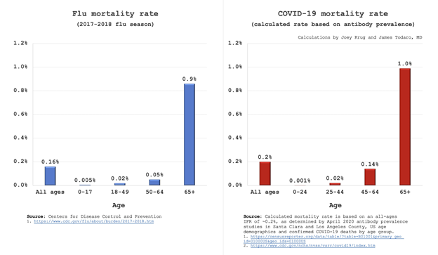
IFR for any but the old looks like a flu. the only group where it& #39;s worse are the old and high risk.
and we had an extremely large cohort of them for mar-apr this year.
so which was does causality flow?
IFR for any but the old looks like a flu. the only group where it& #39;s worse are the old and high risk.
and we had an extremely large cohort of them for mar-apr this year.
so which was does causality flow?
does COV affect the old with greater force than flu, or did it have a large cohort of high risk folks who were statistically supposed to have died already (and whose risk rises daily)
if you& #39;ll pardon the metaphor, was covid an expert player, or did it play the game on "easy"?
if you& #39;ll pardon the metaphor, was covid an expert player, or did it play the game on "easy"?
this also provides evidence that deaths caused by covid are being overcounted.
70k deaths on top of flu would be a NASTY season. 2017-18 was only 60k.
but overall deaths look the same, so this seems to imply we& #39;re definitionally just shifting them from one bucket to another
70k deaths on top of flu would be a NASTY season. 2017-18 was only 60k.
but overall deaths look the same, so this seems to imply we& #39;re definitionally just shifting them from one bucket to another
if these were not other deaths being re-categorized but new deaths, we& #39;d expect to see all cause be significantly higher from such a high reported count.
but the ~70k covid deaths thru wk 17 do not look to have added nearly enough to overall.
this points to reclassification
but the ~70k covid deaths thru wk 17 do not look to have added nearly enough to overall.
this points to reclassification
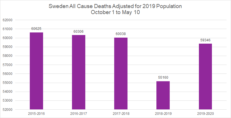
we see this same trend in sweden, though it is even more pronounced.
this season was the second lowest for overall deaths in the last 5.
perhaps reports of sweden& #39;s terrible COV travails have been exaggerated.
this season was the second lowest for overall deaths in the last 5.
perhaps reports of sweden& #39;s terrible COV travails have been exaggerated.
some notes:
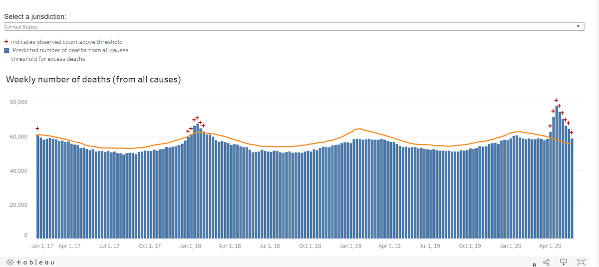
this US data is not complete in the last few weeks so i avoided using them and stopped at week 17 to prevent the incomplete data from making it look low.
@EthicalSkeptic
@BrendanEich
this US data is not complete in the last few weeks so i avoided using them and stopped at week 17 to prevent the incomplete data from making it look low.
@EthicalSkeptic
@BrendanEich

 Read on Twitter