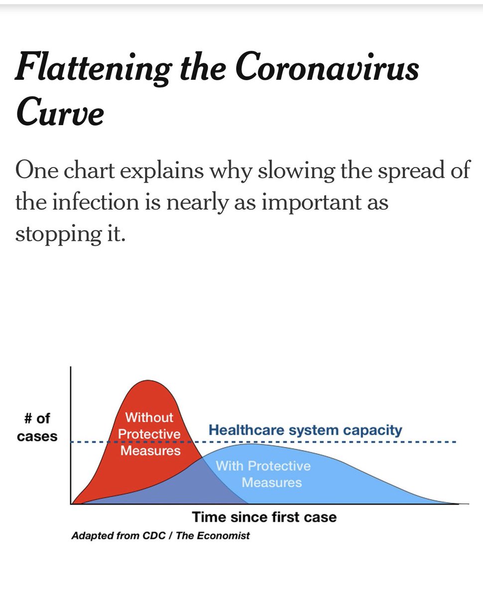
In the early days of the pandemic, we all became familiar with the phrase “flattening the curve.” It was used so often it became cliche. This image published by @nytimes on 3/27 is characteristic of the graphics that were flying around traditional and social media.
That graphic was essentially a generic representation of what a chart of new daily cases would look like in a geographic area, with and without efforts to mitigate spread of the virus.
Creating a real life chart chronicling Oklahoma City’s pandemic experience takes more than graphic design. It is actually a work of art created by the actions of 1.4 million people over the course of ten weeks.
I thought you might like to see the work of our community began to create on March 15th, the day we confirmed our first case of local spread in the OKC metro.
On 3/15, we declared an emergency in OKC.
On 3/17, we closed high-risk places.
On 3/15, we declared an emergency in OKC.
On 3/17, we closed high-risk places.
On 3/24, the Governor closed non-essential businesses.
On 3/28, we issued shelter in place for OKC.
The virus takes 2-3 weeks to manifest itself, so that’s how long it can take to see the results of your collective actions.
On 3/28, we issued shelter in place for OKC.
The virus takes 2-3 weeks to manifest itself, so that’s how long it can take to see the results of your collective actions.
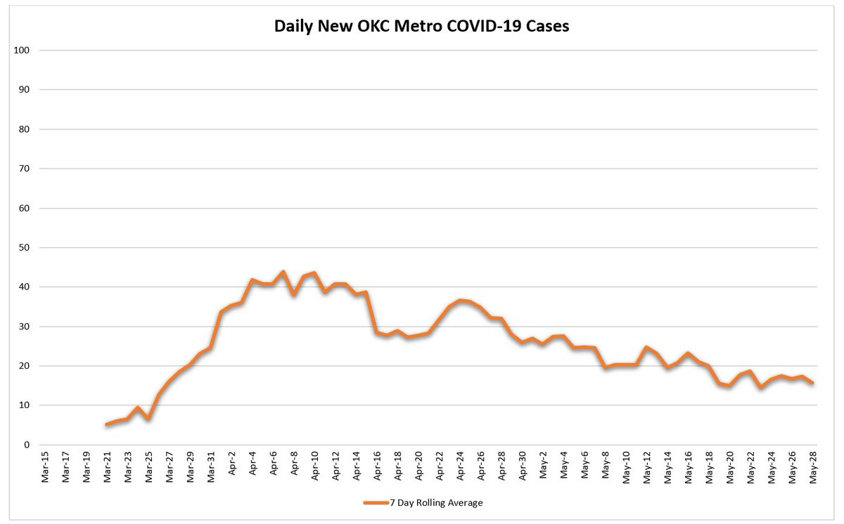
With ten weeks of the pandemic behind us, we can now see the beautiful results we collectively created. Below is a chart of our metro’s new daily cases from 3/15 through this past week, the real life version of the generic chart that circulated in March.
This is about as textbook a flattened curve as you can imagine in real life, and you can see clearly when the effects of our collective actions hit. Is there a long road ahead? Absolutely, but there is nothing wrong with saying, job well done, OKC.
Have a great weekend, wash your hands, keep your distance & wear a mask  https://abs.twimg.com/emoji/v2/... draggable="false" alt="😷" title="Face with medical mask" aria-label="Emoji: Face with medical mask"> in public situations where social distancing is difficult.
Be well, OKC.
(Thanks to @JD__Baker for making the chart)
Be well, OKC.
(Thanks to @JD__Baker for making the chart)

 Read on Twitter


