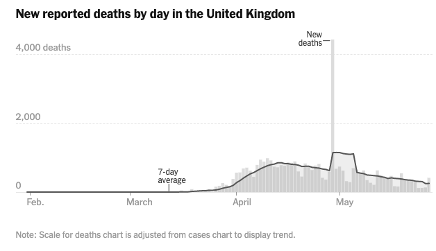
(1) The wrong way to account for accounting errors in #COVID19 deaths, by the @nytimes.
When the UK made a large correction in past death tolls, it actually meant that prior numbers had been too low for a long time. Plotting it as a spike is misleading.
When the UK made a large correction in past death tolls, it actually meant that prior numbers had been too low for a long time. Plotting it as a spike is misleading.
(2) Also, the 7d moving average (that the @nytimes should plot at the middle of the interval, not the end of the interval) provides a misleading trend for 7 days.
Can someone please get them to shift their curve so a value going Sunday to Saturday is plotted on Wednesday& #39;s date!
Can someone please get them to shift their curve so a value going Sunday to Saturday is plotted on Wednesday& #39;s date!
(3) So the big spike should actually be a small adjustment to all past values, and shouldn& #39;t impact the observed rate the very next day.
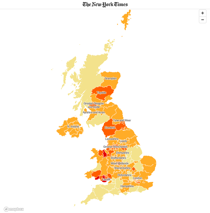
This error in analysis also makes hot spots come and go quickly at times they didn& #39;t exist.
This error in analysis also makes hot spots come and go quickly at times they didn& #39;t exist.
(4) I have referred to these distortions as "accounting adjustments", but it& #39;s important to be able to recognize them and understand their impact.
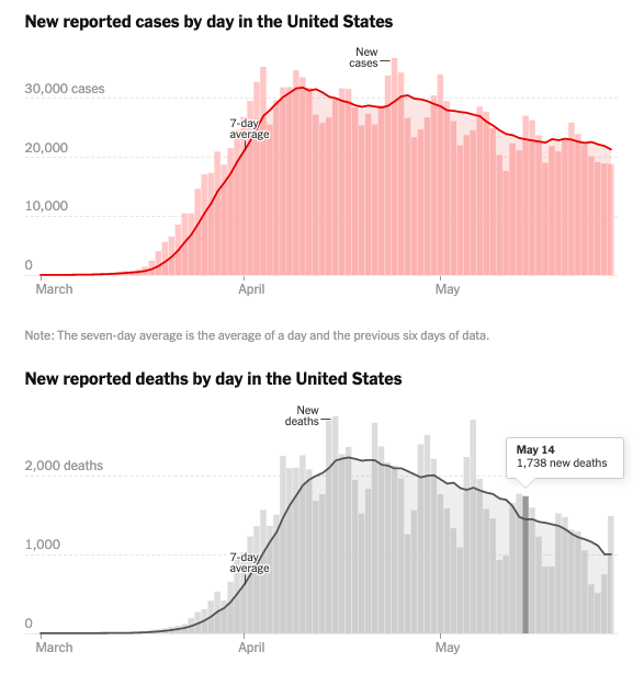
We also have massive "weekend effects" in our counts. I recommend ignoring variations that aren& #39;t seen in 7-day averages.
We also have massive "weekend effects" in our counts. I recommend ignoring variations that aren& #39;t seen in 7-day averages.
(5) To understand the trends, we must not read meaning in noise. Cases and Deaths are dropping precipitously every weekend and rebounding come Monday. This trend is meaningless noise.
(6) The more you know, the more you understand. Sorry if I& #39;m preaching to the choir.
I love the NY Times charts visually, but they do mislead at times.
Credits:
@nytimes
I love the NY Times charts visually, but they do mislead at times.
Credits:
@nytimes
(7) PS: I know a lot of technical observers are well aware of these obvious facts, but I would like to see plots that integrate our understanding.
Plots that show the impact of "misattributed deaths", that eliminate meaningless noise, and generate accurate short term trends.
Plots that show the impact of "misattributed deaths", that eliminate meaningless noise, and generate accurate short term trends.
(8) People seem to have settled for the status quo plots, and they are highly flawed. Enough said, I& #39;m going back to sleep.
(9) PPS: The antibody study in New York State showed 2.4M to 3.0M infections occurred when only 200,000 to 300,000 confirmed cases were recorded.
So Infections are running 8X to 15X confirmed cases. Integrate that into your plots, like our best modelers do.
So Infections are running 8X to 15X confirmed cases. Integrate that into your plots, like our best modelers do.
(10) In this thread I estimated Exposures from Daily Death data for New York. https://twitter.com/39Magilla/status/1262076840740622336">https://twitter.com/39Magilla...
(11) I& #39;m not sure I analyzed that study closely enough. Here is a thread with dates and percentages, which could be used to tighten my 8X to 15X estimate. https://twitter.com/39Magilla/status/1256754671429070849">https://twitter.com/39Magilla...

 Read on Twitter


