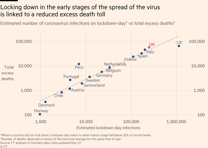
this data is literally made up.
this is not just bad methodology.
it& #39;s invented numbers.
all the higher end "estimated lockdown day infections" are wrong.
look at the UK: they locked down 3/23.
cases were 5683
cases TODAY are 267k.
this reads higher than that 2 mo ago
this is not just bad methodology.
it& #39;s invented numbers.
all the higher end "estimated lockdown day infections" are wrong.
look at the UK: they locked down 3/23.
cases were 5683
cases TODAY are 267k.
this reads higher than that 2 mo ago
spain locked down march 14.
they had 5232 cases. this says ~200k. that& #39;s about what they have today.
so did italy (started as early as the 8th)
cases were 17.660. this claims they were ~300k.
france: 3/17: cases 6633 vs 100k on chart
https://web.archive.org/web/20200314051136/https://www.worldometers.info/coronavirus/">https://web.archive.org/web/20200...
belgium, 3/17: 1058 cases. ~40k on chart.
it goes on and on. the whole top end of this chart is made up numbers invented to generate correlation fit.
(and that correlation would disprove their thesis anyhow even if the data were valid) https://twitter.com/boriquagato/status/1265978999341109251?s=20">https://twitter.com/boriquaga...
it goes on and on. the whole top end of this chart is made up numbers invented to generate correlation fit.
(and that correlation would disprove their thesis anyhow even if the data were valid) https://twitter.com/boriquagato/status/1265978999341109251?s=20">https://twitter.com/boriquaga...
denmark was 804. that looks about right.
so it& #39;s not even like they grabbed a bad series.
they anchored the low end in reality then made up numbers for the high end.
this is looking like either fraud or rank incompetence.
either way, they cooked the numbers.
so it& #39;s not even like they grabbed a bad series.
they anchored the low end in reality then made up numbers for the high end.
this is looking like either fraud or rank incompetence.
either way, they cooked the numbers.
i& #39;ve seen a lot of bad analysis on covid, but this sort of creating "facts" out of whole cloth is rare
@FinancialTimes should retract this piece immediately
it& #39;s made up data to drive a made up correlation
what a black eye for them.
how did completely fake facts pass review?
@FinancialTimes should retract this piece immediately
it& #39;s made up data to drive a made up correlation
what a black eye for them.
how did completely fake facts pass review?
thanks to @oliverbeige who first noticed the data looked wrong.
@kerpen
@AlistairHaimes
@AlexBerenson
@MarkChangizi
@kerpen
@AlistairHaimes
@AlexBerenson
@MarkChangizi

 Read on Twitter


