this started out as a list of my favourite fonts and then i realised i have very strong emotions towards Some fonts and i made this instead
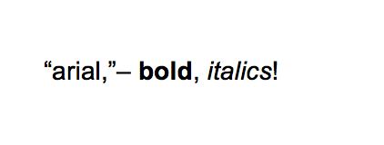
a classic! it& #39;s sexy. it& #39;s neat. it feels contained. professional but casual. i think about it on a hourly basis. if i could keep a font as a lifetime friend i would probably choose arial. dependable and versatile
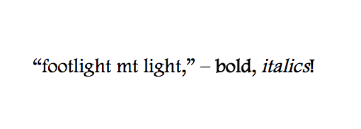
ok so. plenty of books i read growing up had this font, but most notably, it was the font in the first book i ever read where they swore a lot and i was like :OOOO??? i think about this font regularly too, i like the parallel slant of the quo marks and its sweet spicy italics
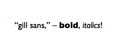
i have had a luvhate r-ship w this font for yrs. it was in an eng textbook of mine in 5th/6th grade so i "hated" it but i had a morbid fascination that eventually morphed into LOVE. its a v high maintanence font tho, it requires a Specific Aesthetic i think. its bold is too BIG
i think about this font so much bc its the font in jacqueline wilson& #39;s books i read growing up. it always felt so BRITISH and so fake, like the "perfect white upper middle class suburban dream". quotation marks a lil 2 perfect. its malicious italics feel like theyre mocking u
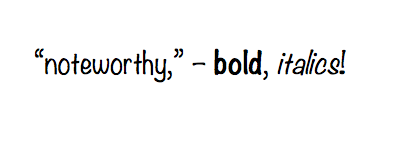
SO FUCKIG UGLY I THINK ABOUT IT SO MUCH IT LOOKS LIKE THE WAY THIS AMPHIBIAN-LOOKING SKINNY 5& #39;7 DEBATER BOY I ALMOST DATED SOUNDED LIKE. I READ IT IN A BOOK ONCE. ITS SO JAGGED AND THEN THE QUO MARKS SEEM TO BE OVERCOMPENSATING. THE EXCLAMATION MARKS R SO WEIRD. SHUT TH FCUK
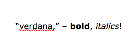
it was in our 2nd/3rd sci books for a couple yrs n it scarred me bc its such a font that stem majors wld think kids like but it jus reminds me of toilet water. the quo marks look like cowards. the bold is 2 wide. i dislike the difference in double story/single story lowercase "a"
this was used in kane chronicles!!!!!! all of the fonts in his books post-percyjackson made me want to read them out loud. they feel Spitty and sharp and sarcastic. good. this one looks like it ate too much yummy food :D the questions marks always felt too shy and timid tho :(
i believe this font was used in a ton of my pirated books growing up, but most notably it was the font used in my copies of the hunger games series. it always feels high-stakes and the italics are so lovely and dramatic. the bold is 2 thick. the question marks feel intense , DEEP
yes, default ao3 font, i believe??? thats it thats the reason. i like this font altho its not on my ao3 skin anymore. i can recall many cursed y/n fics read in this font when i was younger. what a time. its a concise font and i like all its versions n punctuation except ? and !
I THINK AB IT BC 9YO ME USED IT TO WRITE A DIARY IN A WORD DOCU WHERE I GAVE MYSELF SOME WHITE NAME AND USED TO MAKE UP STORIES. LOOK AWAY I AM EMBARRASSED. ITS A TOKEN FONT IDC FOR IT ANYMORE. GOOD QUOTATION MARKS/COMMAS ARE THE ONLY REDEEMING QUALITIES
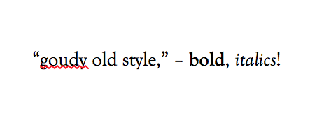
once again me being traumatised by some textbook. english, once again, for MANY YEARS ON END. i grew to be fond of it. im a fan of parallel tilted quotation marks and commas. the bold is just SLIGHTLY too thick. the italics + rest of punctuations are boring
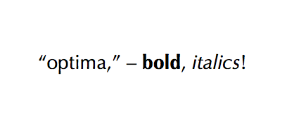
this is on my current ao3 skin. I LIKE PARALLEL SLANTED QUOTATION MARKS I SAY AGAIN. its simple and does the job. it would make a great cousin i think.
end of thread. there are more but im tired and i want to go back to typesetting now. thanks for reading this if ANYONE IS HERE. spread info about whats going on in the black community. thank u https://twitter.com/CoreyPaulMusic/status/1265536293062283264?s=20">https://twitter.com/CoreyPaul...
and this https://twitter.com/ardentlyswift/status/1265742789867982851?s=20">https://twitter.com/ardentlys...

 Read on Twitter