I gave a talk on making maths and stats more accessible at @DataVizLive yesterday. Here& #39;s a quick overview and some pictures.
Lots of complex data work goes on behind the graphs you see. If you oversimplify the graph, you lose people as they can& #39;t see how you got there. But if you overcomplicate, you& #39;ve gone too far, and you lose people that way too.
A graph is kind of like a sausage. You don& #39;t really want to see exactly how the sausage is made, but you& #39;re not going to trust a big cylinder of mystery meat either. But when that balance is right, you can& #39;t get enough of them.
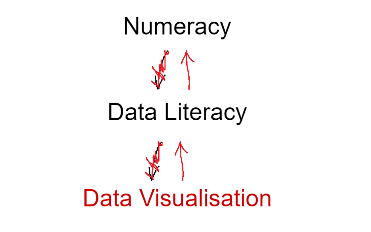
I often hear “oh, it’d be nice to have some good data viz going on, but we need to sort out our numeracy / data literacy first”.
But to me, that sounds like "we don& #39;t trust our people".
But to me, that sounds like "we don& #39;t trust our people".
(it also sounds like "I& #39;d like the sausages, but I& #39;m almost out of ketchup", which would be ridiculous. Sausages find a way. I& #39;ll stop this analogy soon, promise.)
So, yeah, I see it the other way round. You can use data visualisation as a starting point for developing data literacy and numeracy in your organisation.
This is exactly what& #39;s happened with the COVID-19 crisis. @jburnmurdoch & #39;s FT charts have bootstrapped data literacy through exposure to data viz. It was always hard to explain log scales to people who& #39;d never seen them before. Not anymore.
You can do this in your own organisation, and preferably with less depressing data.
1: people will become more data literate through exposure to data visualisation
2: you can help people become more data literate / numerate with targeted sessions, resources, etc.
1: people will become more data literate through exposure to data visualisation
2: you can help people become more data literate / numerate with targeted sessions, resources, etc.
As a simple example of how to use data viz to address numeracy, here& #39;s a sophisticated dashboard of pet ownership in the UK. 25% of Brits have a dog. Nice.
But somebody else at work has taken a screenshot of the dashboard and emailed it round, and it shows that 62.5% of Brits have a dog.
Which is it? Why are the numbers not just the numbers? This sort of inconsistency can be confusing and frustrating.
Turns out both %s are correct depending on the level of analysis. 25% of all people have a dog, and 62.5% of pet owners have a dog. But using a graph like this makes it so much clearer than the donuts, because now we can see the # of people we& #39;re looking at.
Suddenly, a small visual tweak makes the percentages so much more intuitive.
That& #39;s the thing about maths/stats - it& #39;s not fundamentally hard, and people aren& #39;t inherently bad at it. It& #39;s just the way it& #39;s presented.
For a lot of people, concepts/pictures > formulae.
That& #39;s the thing about maths/stats - it& #39;s not fundamentally hard, and people aren& #39;t inherently bad at it. It& #39;s just the way it& #39;s presented.
For a lot of people, concepts/pictures > formulae.
Then I show the same kind of thing with examples from manufacturing data I& #39;ve been working with, looking at K-Nearest Neighbours and Z scores.
I& #39;ve blogged about the KNN stuff with @benjnmoss here:
https://community.alteryx.com/t5/Data-Science-Blog/Alteryx-Your-Discover-Weekly-A-Practical-Application-of-K/ba-p/563359">https://community.alteryx.com/t5/Data-S... https://community.alteryx.com/t5/Data-Science-Blog/Alteryx-Your-Discover-Weekly-A-Practical-Application-of-K/ba-p/564059">https://community.alteryx.com/t5/Data-S...
https://community.alterytwitter.com/t5/Data-Science-Blog/Alteryx-Your-Discover-Weekly-A-Practical-Application-of-K/ba-p/563359
...and I& #39;ve blogged about the Z score stuff here: https://gwilymlockwood.com/2020/04/06/calculating-dynamic-z-scores-in-tableau/">https://gwilymlockwood.com/2020/04/0...
Anyway, it all comes down to this. Don& #39;t waste your time waiting for numeracy and data literacy before investing in your data viz. Rather, use good data viz to drive data literacy and numeracy in your organisation.
Firstly, through exposure. If people care about the thing you& #39;re visualising, the data viz will help drive data literacy in and of itself.
Secondly, through more active measures. There& #39;s no such thing as too much user feedback - ask people how they& #39;re finding it. Run some smaller, targeted sessions with people. Explain things in the release notes. Create some internal resources.
And finally, the MS Paint thing is deliberate. Maths/stats can be intimidating! It still is for me sometimes, and I do it for a living. Expressing it through an easy, accessible medium makes it feel easy and accessible.
[ah balls, forgot to put alt text in the images. I& #39;ll reply to each tweet with an image with the alt text separately]

 Read on Twitter


