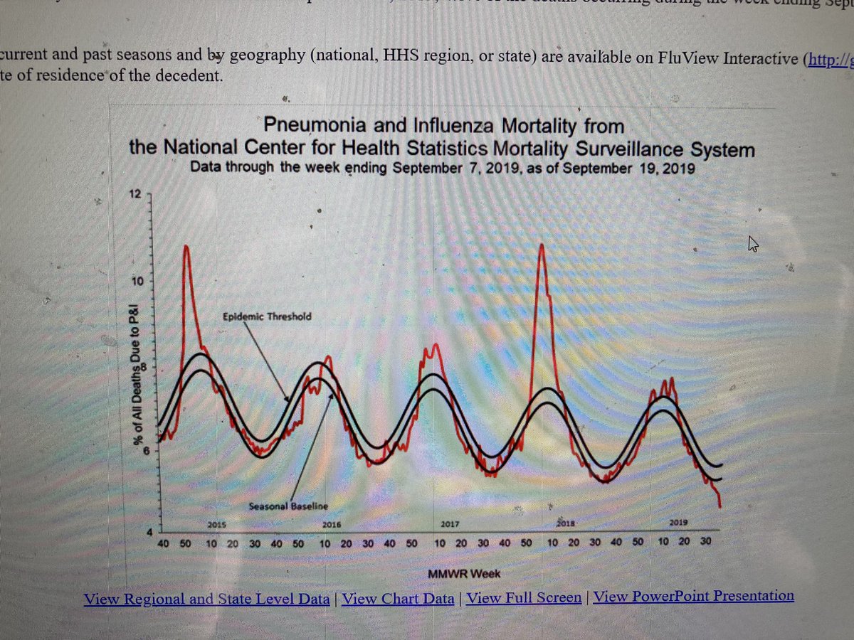
This @cdcgov chart on pneumonia/influenza deaths is stunning: that 2018 peak translates into about 50,000 deaths for the first eight weeks of 2018. Remember how we shut down the country, destroyed our educational system, and @nytimes ran a front page with their names?
Now here’s an updated chart - this looks far worse than it is. The trick is that the designers didn’t set the baseline to zero, so the spike from ~12 percent in 2018 to ~16 in 2020 looks like a near doubling.
(The flu spike is actually a little short of 12%, more like 11. But it also appears to be WIDER than the COVID spike - we will see.)

 Read on Twitter


