Direct mail is IMO an underrated marketing / acquisition channel.
I live in a neighborhood in BK with a disproportionate amount of HENRYs and Yuppies, so tend to get ALL of the millennial-targeted mailers.
This thread will be a running visual history of my DTC mail.
I live in a neighborhood in BK with a disproportionate amount of HENRYs and Yuppies, so tend to get ALL of the millennial-targeted mailers.
This thread will be a running visual history of my DTC mail.
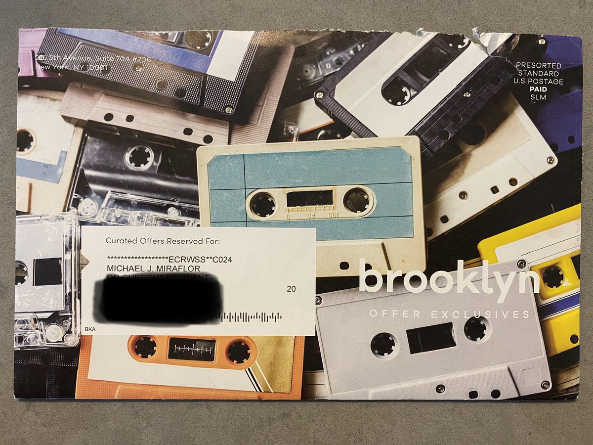
Every month I get one of these mailers, an envelope full of 1-sheet ads from a variety of brands. In the past 2 years this mailer has transformed into a DTC / millennial /modern brand showcase of sorts.
Notice how the cassette tapes make it more “authentically Brooklyn” https://abs.twimg.com/emoji/v2/... draggable="false" alt="🙄" title="Face with rolling eyes" aria-label="Emoji: Face with rolling eyes">
Notice how the cassette tapes make it more “authentically Brooklyn”
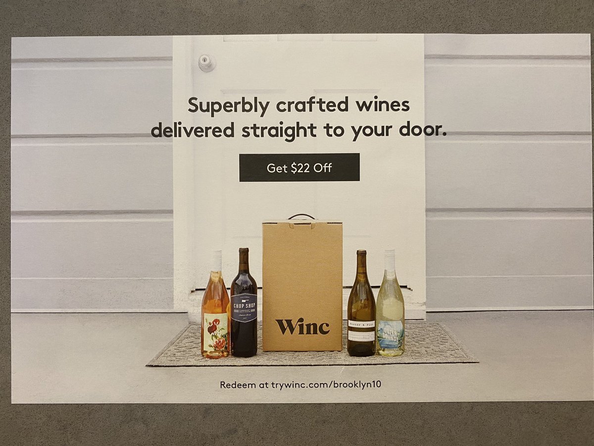
Now for the ads. First up: @WINC
Something about the design of the “Get $22 Off” makes me want to click this piece of paper. It looks like a digital button.
Custom BK URL is a nice touch.
Oh yeah - last I got one of these was in March, so the codes are expired. Sorry.
Something about the design of the “Get $22 Off” makes me want to click this piece of paper. It looks like a digital button.
Custom BK URL is a nice touch.
Oh yeah - last I got one of these was in March, so the codes are expired. Sorry.
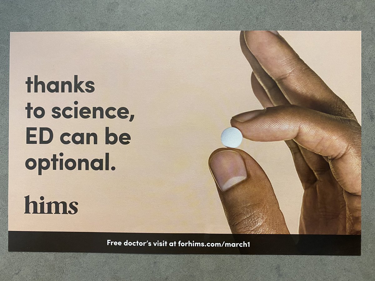
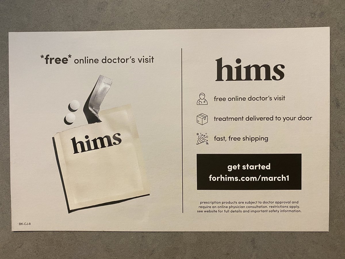
No one will ever accuse @wearehims of a bland ad.
I like how bold and straight to the point it is. Gets the value prop across without drowning the ad in copy (in contrast to mainstream pharma ads).
I like how bold and straight to the point it is. Gets the value prop across without drowning the ad in copy (in contrast to mainstream pharma ads).
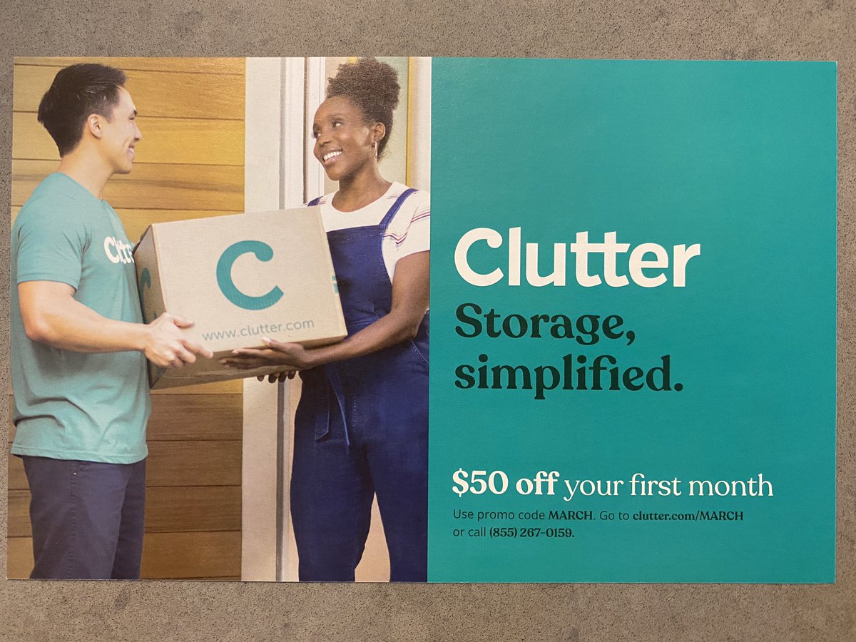
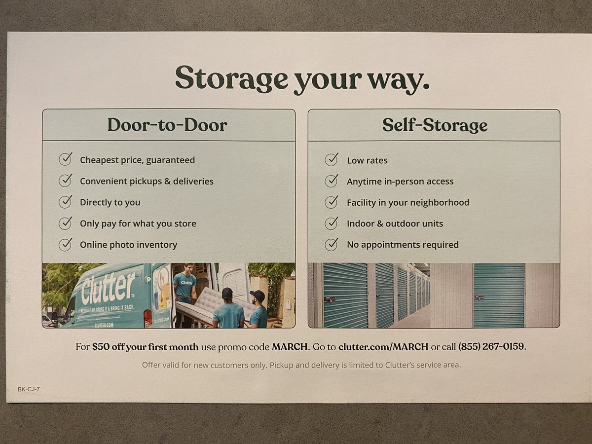
I’m not too familiar with @Clutter, and learned from this ad that they are a combo door to door AND self-storage provider (most competitors are strictly one or the other).
Just like IG ads, these mailers have managers to collapse the funnel to build brand and drive sales/trial.
Just like IG ads, these mailers have managers to collapse the funnel to build brand and drive sales/trial.
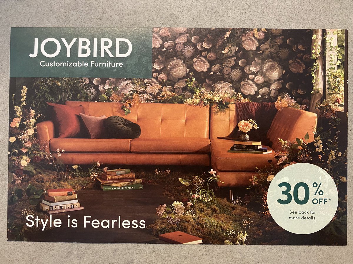
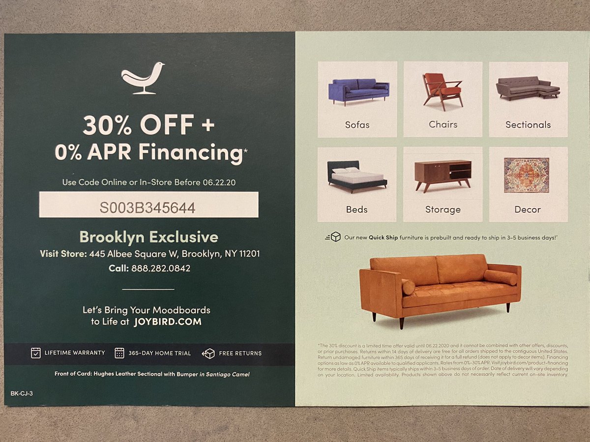
Someone at @wearejoybird read a maximalist design manual and went ham with this photo shoot. I live 2 blocks away from a physical Joybird store, and that nod felt hyperlocal.
Do we think these offer-based ads and hefty discounts ultimately devalue brand? https://abs.twimg.com/emoji/v2/... draggable="false" alt="🤔" title="Thinking face" aria-label="Emoji: Thinking face">
Do we think these offer-based ads and hefty discounts ultimately devalue brand?
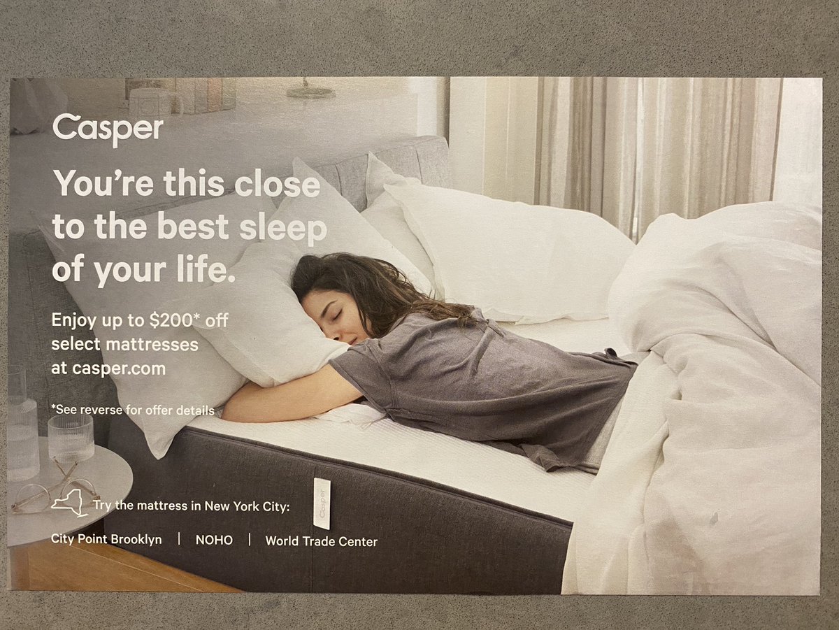
I also live 2 blocks away from a @Casper retail location, so this location-based targeting makes a lot of sense.
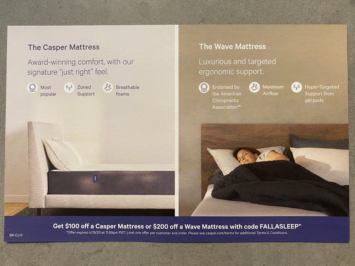
Love how the brand shows the human enjoying their slumber on a higher-end mattress. That, plus the wood head board makes the Wave seem much more premium.
Love how the brand shows the human enjoying their slumber on a higher-end mattress. That, plus the wood head board makes the Wave seem much more premium.
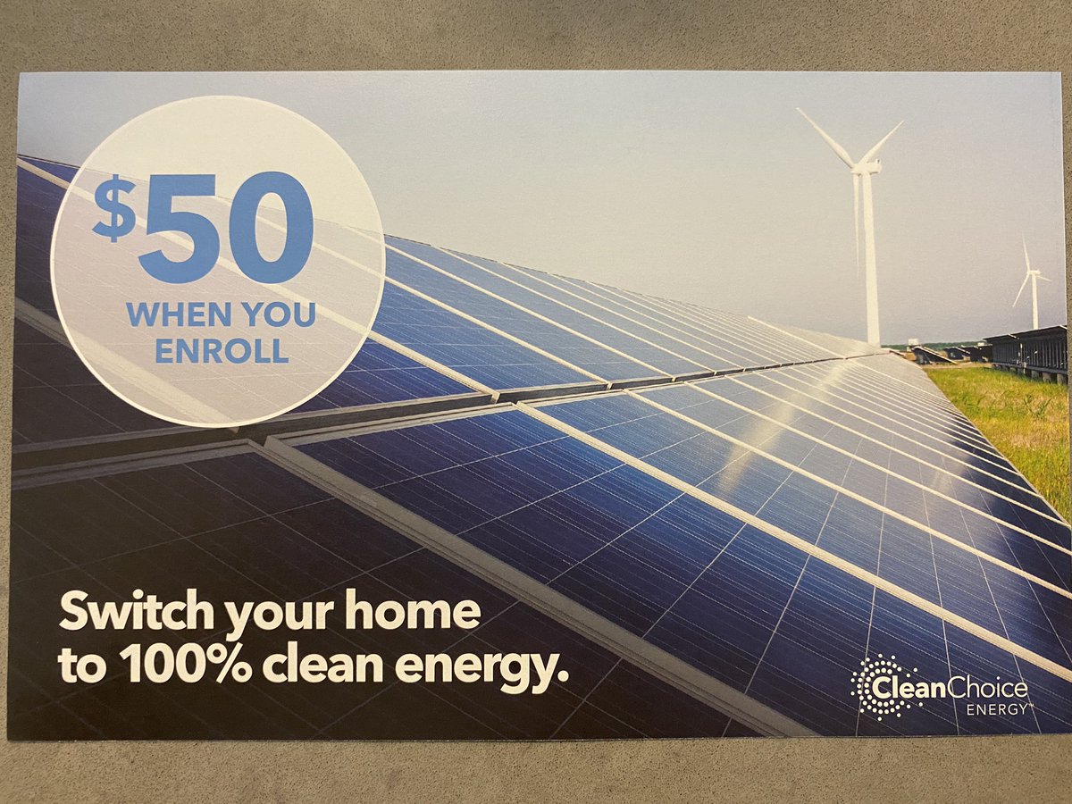
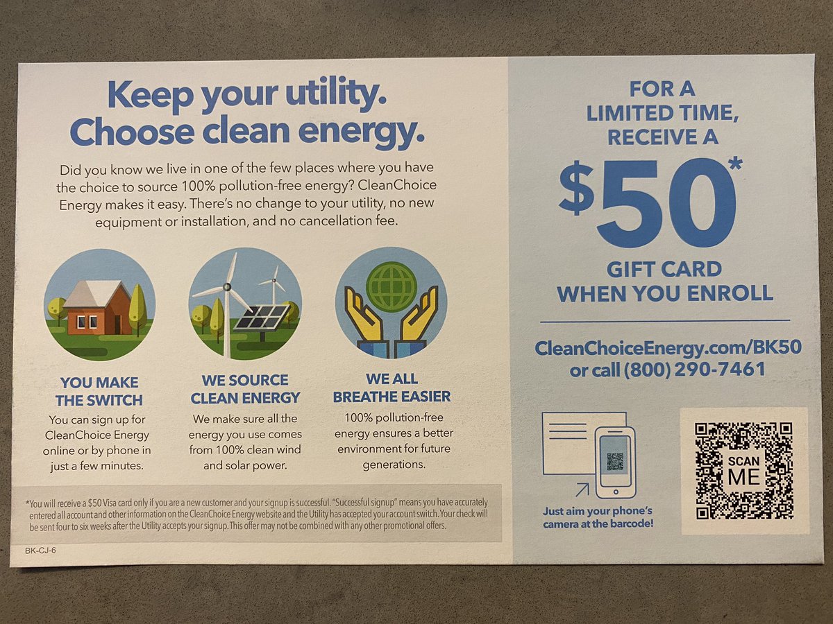
So prior to modern brands taking notice of these mailers, they were full of more pragmatic fare, such as this @CleanChoice ad.
They do a good enough job of creatively fitting in with the other, sexier brands. This is proof that context and design cues are of upmost importance.
They do a good enough job of creatively fitting in with the other, sexier brands. This is proof that context and design cues are of upmost importance.
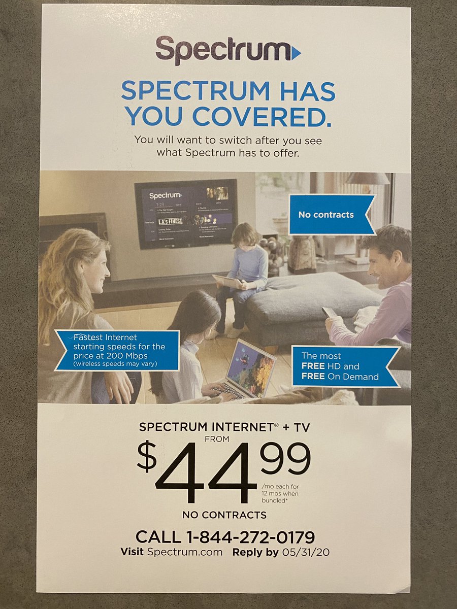
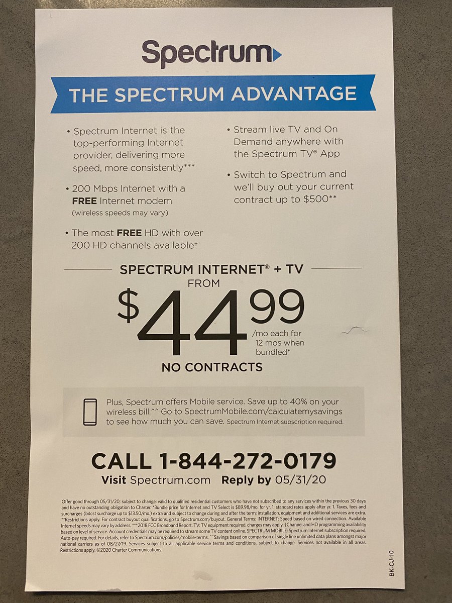
No one evidently gave Spectrum a heads up that they should modify their ad layout to cater to the “millennial direct mail audience” (yes, I’m saying that’s a thing now).
Too much copy, lots of clutter, and confusing / misleading offer. Missed opportunity, all things considered.
Too much copy, lots of clutter, and confusing / misleading offer. Missed opportunity, all things considered.
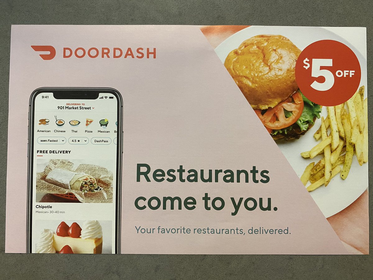
I was getting worried that none of these ads had enough millennial pink in them.
@DoorDash to the rescue. This mailer was pre-Covid, so I’m sure this offers have gotten a lot more aggressive.
@DoorDash to the rescue. This mailer was pre-Covid, so I’m sure this offers have gotten a lot more aggressive.
Thing that stuck out for me in this @Upwork ad: where can I find a custom painted lime green Mac + color coordinated Magic Mouse?  https://abs.twimg.com/emoji/v2/... draggable="false" alt="🤔" title="Thinking face" aria-label="Emoji: Thinking face">
This ad is 4.6/5
This ad is 4.6/5
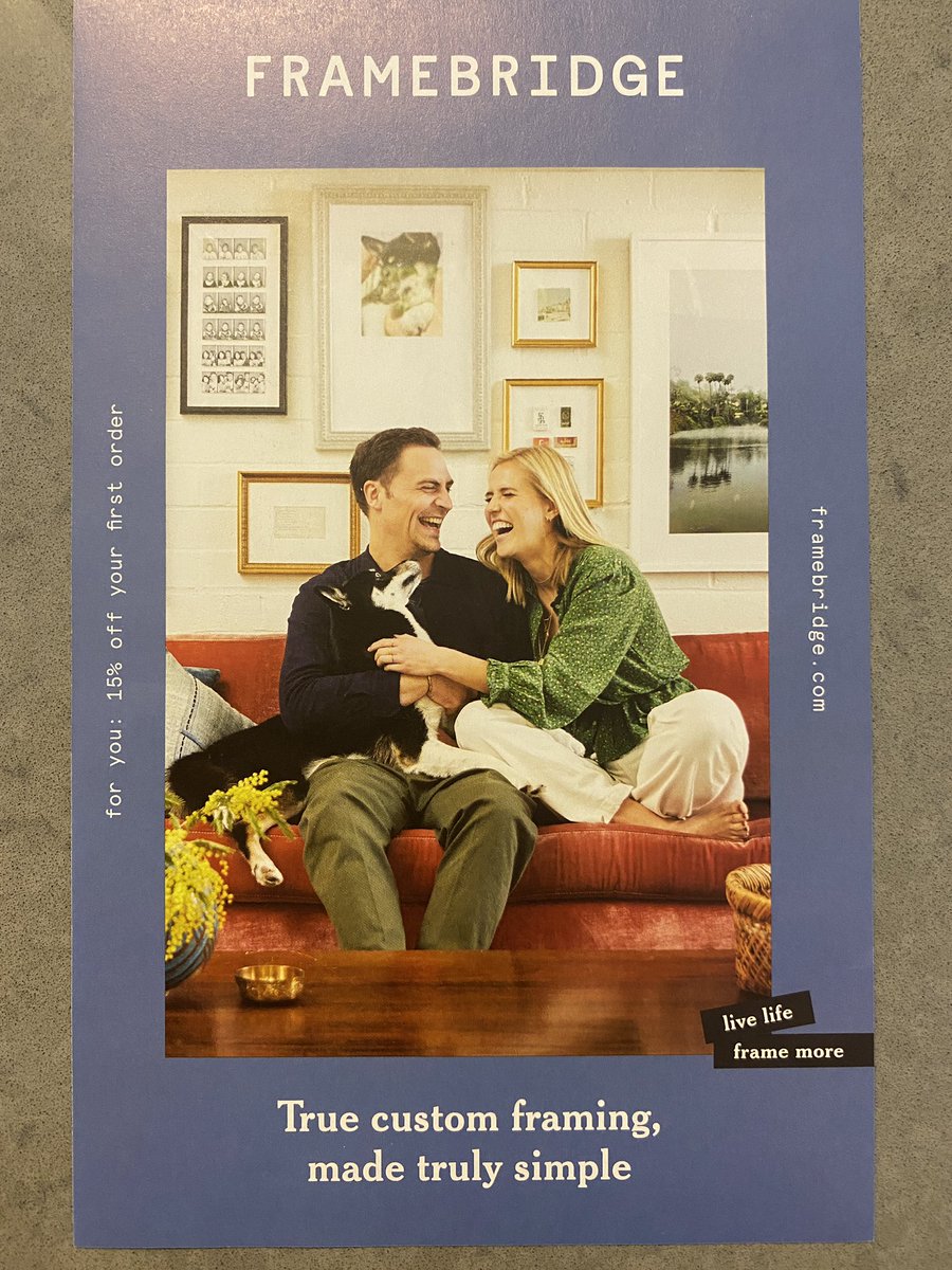
Huge fan of @framebridge and most of my growing art collection has been framed via their service. Here’s my referral code if you want to try (15% off!) http://fbuy.me/pk_7u
Only">https://fbuy.me/pk_7u&quo... ad here to combine vertical + horizontal layout.
I want to hear the joke that is making them https://abs.twimg.com/emoji/v2/... draggable="false" alt="🤣" title="Rolling on the floor laughing" aria-label="Emoji: Rolling on the floor laughing">
Only">https://fbuy.me/pk_7u&quo... ad here to combine vertical + horizontal layout.
I want to hear the joke that is making them
Should I keep doing this Direct Mail / DTC / Modern Brand review thing?
BTW if you’re an marketer or agency person and want a connection to direct mail vendors, please allow me to connect you! (I can use the work  https://abs.twimg.com/emoji/v2/... draggable="false" alt="😬" title="Grimacing face" aria-label="Emoji: Grimacing face">). DM me —
Share Local did the mailer I just reviewed and I really like Pebble Post’s online/offline mailer tech.
Share Local did the mailer I just reviewed and I really like Pebble Post’s online/offline mailer tech.

 Read on Twitter
 " title="Every month I get one of these mailers, an envelope full of 1-sheet ads from a variety of brands. In the past 2 years this mailer has transformed into a DTC / millennial /modern brand showcase of sorts. Notice how the cassette tapes make it more “authentically Brooklyn” https://abs.twimg.com/emoji/v2/... draggable="false" alt="🙄" title="Face with rolling eyes" aria-label="Emoji: Face with rolling eyes">">
 " title="Every month I get one of these mailers, an envelope full of 1-sheet ads from a variety of brands. In the past 2 years this mailer has transformed into a DTC / millennial /modern brand showcase of sorts. Notice how the cassette tapes make it more “authentically Brooklyn” https://abs.twimg.com/emoji/v2/... draggable="false" alt="🙄" title="Face with rolling eyes" aria-label="Emoji: Face with rolling eyes">">

 " title="Someone at @wearejoybird read a maximalist design manual and went ham with this photo shoot. I live 2 blocks away from a physical Joybird store, and that nod felt hyperlocal. Do we think these offer-based ads and hefty discounts ultimately devalue brand? https://abs.twimg.com/emoji/v2/... draggable="false" alt="🤔" title="Thinking face" aria-label="Emoji: Thinking face">">
 " title="Someone at @wearejoybird read a maximalist design manual and went ham with this photo shoot. I live 2 blocks away from a physical Joybird store, and that nod felt hyperlocal. Do we think these offer-based ads and hefty discounts ultimately devalue brand? https://abs.twimg.com/emoji/v2/... draggable="false" alt="🤔" title="Thinking face" aria-label="Emoji: Thinking face">">

 This ad is 4.6/5" title="Thing that stuck out for me in this @Upwork ad: where can I find a custom painted lime green Mac + color coordinated Magic Mouse? https://abs.twimg.com/emoji/v2/... draggable="false" alt="🤔" title="Thinking face" aria-label="Emoji: Thinking face">This ad is 4.6/5">
 This ad is 4.6/5" title="Thing that stuck out for me in this @Upwork ad: where can I find a custom painted lime green Mac + color coordinated Magic Mouse? https://abs.twimg.com/emoji/v2/... draggable="false" alt="🤔" title="Thinking face" aria-label="Emoji: Thinking face">This ad is 4.6/5">
 " title="Huge fan of @framebridge and most of my growing art collection has been framed via their service. Here’s my referral code if you want to try (15% off!) https://fbuy.me/pk_7u&quo... ad here to combine vertical + horizontal layout. I want to hear the joke that is making them https://abs.twimg.com/emoji/v2/... draggable="false" alt="🤣" title="Rolling on the floor laughing" aria-label="Emoji: Rolling on the floor laughing">">
 " title="Huge fan of @framebridge and most of my growing art collection has been framed via their service. Here’s my referral code if you want to try (15% off!) https://fbuy.me/pk_7u&quo... ad here to combine vertical + horizontal layout. I want to hear the joke that is making them https://abs.twimg.com/emoji/v2/... draggable="false" alt="🤣" title="Rolling on the floor laughing" aria-label="Emoji: Rolling on the floor laughing">">


