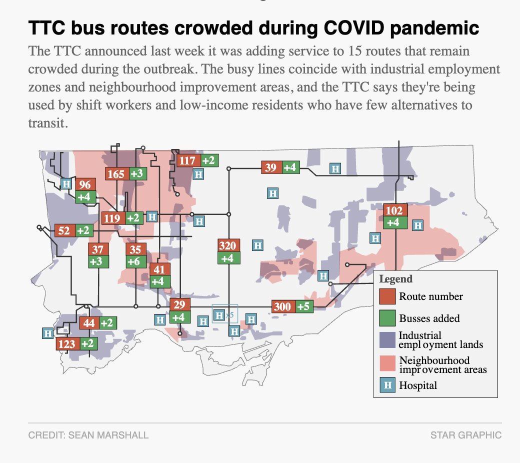
This Toronto COVID-19 map fits with the interpretation that it& #39;s not so much about the people who won& #39;t social distance as it is the people who *can& #39;t*.
There& #39;s pretty decent overlap here:
https://www.thestar.com/news/gta/2020/04/07/whos-still-crowding-into-ttc-buses-amid-the-pandemic-evidence-suggests-many-are-torontos-working-poor.html">https://www.thestar.com/news/gta/...
https://www.thestar.com/news/gta/2020/04/07/whos-still-crowding-into-ttc-buses-amid-the-pandemic-evidence-suggests-many-are-torontos-working-poor.html">https://www.thestar.com/news/gta/...
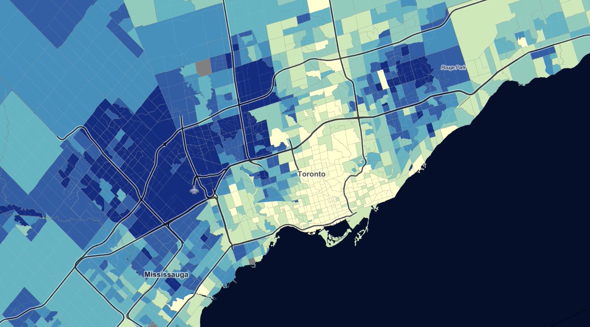
There& #39;s even better overlap here:
This is the latest census data on the percentage of workers employed in manufacturing, left, and transportation, right.
This is the latest census data on the percentage of workers employed in manufacturing, left, and transportation, right.

 Read on Twitter


