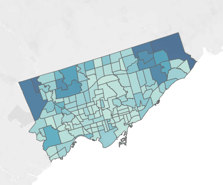
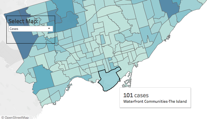
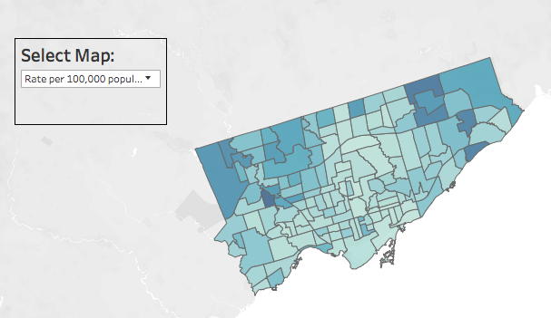
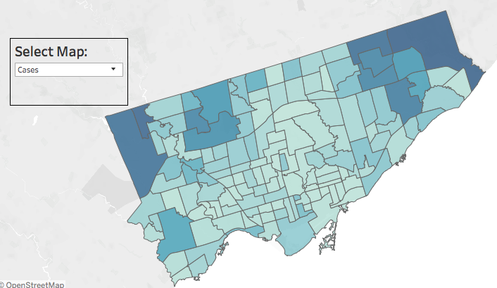
Interactive map of Toronto COVID-10 cases by neighbourhood is now live on the city website. https://www.toronto.ca/home/covid-19/covid-19-latest-city-of-toronto-news/covid-19-status-of-cases-in-toronto/">https://www.toronto.ca/home/covi...
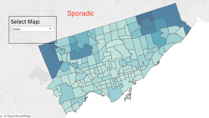
The neighbourhood data shows highest case rates in northwest and northeast areas of the city. The correlation between this map and the city’s income map is striking.
This COVID-19 map is another example of why the City needs to update its neighbourhood definitions. Lumping like seven different communities into “Waterfront Communities - The Island” makes for bad data.
Another comparison: COVID-19 cases by neighbourhood versus @Sean_YYZ’s map of TTC routes that were still experiencing crowding in early days of pandemic. (via http://spacing.ca/toronto/2020/04/01/marhsall-mapping-ttc-crowding-during-a-pandemic/)">https://spacing.ca/toronto/2...
Another notable comparison. https://twitter.com/felixwhitton/status/1265736359731507201">https://twitter.com/felixwhit...
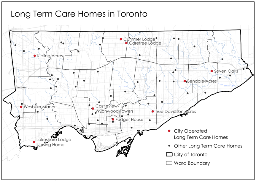
By request, here’s total cases compared to a map of Toronto’s long-term care homes (from 2018). I don’t really see a strong correlation here, though outbreaks at some homes (e.g. Humber Heights in North Etobicoke) would obviously impact neighbourhood numbers.
You can actually filter the city’s map by sporadic cases (spread in community) versus outbreaks (spread in close spaces like long-term care homes & shelters). https://www.toronto.ca/home/covid-19/covid-19-latest-city-of-toronto-news/covid-19-status-of-cases-in-toronto/">https://www.toronto.ca/home/covi...

 Read on Twitter