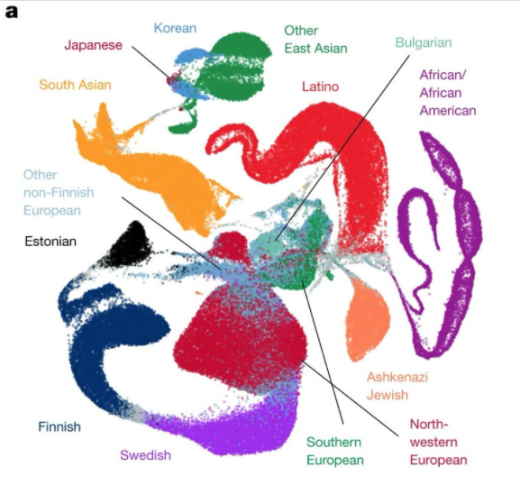
I totally love the GnomAD papers here, https://www.nature.com/articles/s41586-020-2308-7">https://www.nature.com/articles/... but I want to get ahead of the almost inevitable quoting /showing of Figure1 as "showing there is genetic support for ethnic groups".
This is... complex, colourful, and has some labels which one can "imagine" people fitting into - like "Latino" and "African and African American" and "Estonian". It looks messy but informative, and people look quite "distinct" in this space.
First off, what is it? It is the UMAP projection (more on this later) of the first 10 prinicple components of genetic variation of the gnomad samples, coloured by cohort/self identified ethnicity (I suspect this process is messy - gnomAD folk to confirm or not)
So - this is a projection of a ~300,000 meaningful dimensional dataset (human genetic variation works about this level of dimensionality, roughly the "haplotype blocks" - one could claim this >10 million dimension datasets for every SNP but that& #39;s sort of missing) which then>>
<<is projected into a 10 dimensional scheme which has the requirement that each dimension is orthogonal to each other here (principle componets). Each person is now on this 10 dimensional space. Then this 10 dimensional space is further squashed into 2 dimensions by UMAP
UMAP is in the t-SNE family of dimensionality reduction which aims to favour preserving local distance over global distance, and then adds in, at the end, a warping of the 2-dimensional visualisation space (you can use more but it& #39;s hard to make a jpeg of it) to global
UMAPs like t-SNEs take a bit of a knack of reading - basically adjacency is meaningful, global stuff less so. So the exciting shapes of the colours with respect to each other is *very* arbitary - the blobbiness of the colours less so ...BUT...
This favouring of the local over the global, and the fact you can& #39;t split points causes serious headaches in representing genetics, because people are points here and genetics has lots of splits/merges (children/ancestors) in our underlying trees.
This is most clear in the big "Latino" blob which we know is majority recent European ancestry with a big slug of native American and then some recent african ancestry.
So - there is an entirely valid and different way of processing the data which - in particular if you can partion people& #39;s genetic data (which you can - it& #39;s a bit fiddly but doable) - in terms of this plot, split up points
Some of those points processed this way would go next door to European points, and some form their own blob, and indeed some European points would split apart of form different blobs.
Indeed there is no simple way to show the genetic relationships in 2D of a big bunch of people. It just doesn& #39;t fit into 2D. This is one which probably (a) looks nice and (b) fits the labels. The "true" relationship of people& #39;s genetics is something called an ARG
(ARG == Ancestral Recombination Graph) - and it is really a type of tree structure. Here splits and merges come naturally and each "person" can have any appropriate relationship with any other. It is just that we don& #39;t have neat visualisations of this (perhaps impossible!)
There are other aspects to note. The middle bit looking messy and European is because most of the data is from recent European ancestry and so that& #39;s where the dimensionality reduction puts more emphasis. equivalent african dominated dataset would have african mess in the middle
(this goes to the fact this dimensionality reduction and other modelling is sample set dependent)
What do I take from this plot? I mainly take two things (a) it is messy and complicated and (b) individual genetics does not fit into 2 dimensional schemes.
I can forsee some people who say "but look, there are blobs in this complicated dimensionality thing - surely this means something about the relationship of these labels and genetics".
First off, it would be interesting to get a range of different PC loadings at the start (5,10,20,30,100) pre-UMAP and then do different UMAP "blobbiness" parameter just to show how arbitrary this projection is (any chance @dgmacarthur)?
Second I& #39;m serious about the split/merge property of human genetics - which happens all across our history - European "ancestry" is a complex mixture of 3 earlier "ancestries" some of which have relationships down East Africa for example as well out to East Asia.
We are one species, and we freely mate with other individuals in our species. Our genetics is actually quite undiverse, in particular given our global spread, due to our explosive colonisation of the world. Our cultural+behavourial differences vastly outweigh genetic differences
Like all species, our genetics is best represented by a family tree like structure. This complex tree (of all our bits of DNA in all humans) allows for the common place unique mixes that happen. Ticking boxes in forms or labelling by location is not a good proxy for genetics

 Read on Twitter


