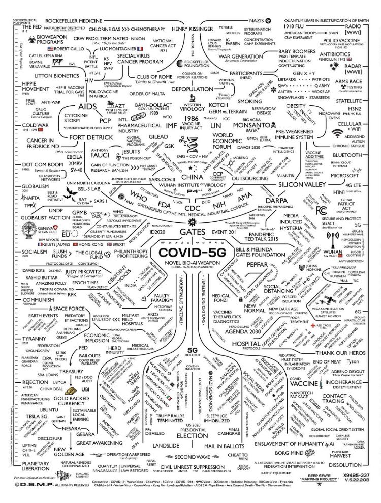
Can we talk about the design of this madness for a minute? Because squeezing this much text into a design while maintaining legibility, balance and flow is not easy to execute.
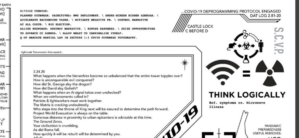
The layout here is so interesting, the balance of the angular design in the top right corner and the angular design in the block of text
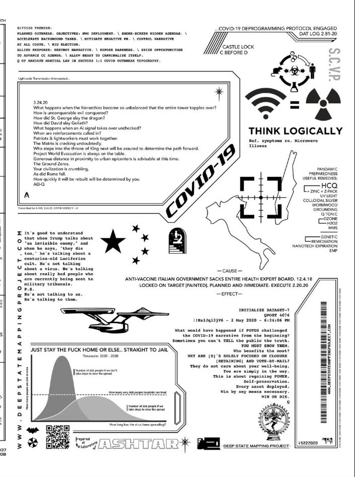
The attention to detail in the margins, like the barcode -besides the little cow (!)  https://abs.twimg.com/emoji/v2/... draggable="false" alt="😂" title="Face with tears of joy" aria-label="Emoji: Face with tears of joy">
 https://abs.twimg.com/emoji/v2/... draggable="false" alt="🤦🏻♀️" title="Woman facepalming (light skin tone)" aria-label="Emoji: Woman facepalming (light skin tone)">
Obviously ignoring the content of this crazy thing, the design here is very nice. It leads your eye down the page, not too much stuff in the negative space. Yes I see the Starship Enterprise  https://abs.twimg.com/emoji/v2/... draggable="false" alt="😂" title="Face with tears of joy" aria-label="Emoji: Face with tears of joy">
But again, completely ignoring the content, the layout is really well done. This is not your typical MS paint boomer design with 15 different yellow and red fonts on a black background.
Maybe there’s some kind of layout app that did all the hard work here? If not, then a pro made this thing.
Thanks to multiple people who pointed me to the artist Dylan Monroe https://deepstatemappingproject.com/ ">https://deepstatemappingproject.com/">...

 Read on Twitter

 https://abs.twimg.com/emoji/v2/... draggable="false" alt="🤦🏻♀️" title="Woman facepalming (light skin tone)" aria-label="Emoji: Woman facepalming (light skin tone)">" title="The attention to detail in the margins, like the barcode -besides the little cow (!) https://abs.twimg.com/emoji/v2/... draggable="false" alt="😂" title="Face with tears of joy" aria-label="Emoji: Face with tears of joy">https://abs.twimg.com/emoji/v2/... draggable="false" alt="🤦🏻♀️" title="Woman facepalming (light skin tone)" aria-label="Emoji: Woman facepalming (light skin tone)">">
 https://abs.twimg.com/emoji/v2/... draggable="false" alt="🤦🏻♀️" title="Woman facepalming (light skin tone)" aria-label="Emoji: Woman facepalming (light skin tone)">" title="The attention to detail in the margins, like the barcode -besides the little cow (!) https://abs.twimg.com/emoji/v2/... draggable="false" alt="😂" title="Face with tears of joy" aria-label="Emoji: Face with tears of joy">https://abs.twimg.com/emoji/v2/... draggable="false" alt="🤦🏻♀️" title="Woman facepalming (light skin tone)" aria-label="Emoji: Woman facepalming (light skin tone)">">
 https://abs.twimg.com/emoji/v2/... draggable="false" alt="🤦🏻♀️" title="Woman facepalming (light skin tone)" aria-label="Emoji: Woman facepalming (light skin tone)">" title="The attention to detail in the margins, like the barcode -besides the little cow (!) https://abs.twimg.com/emoji/v2/... draggable="false" alt="😂" title="Face with tears of joy" aria-label="Emoji: Face with tears of joy">https://abs.twimg.com/emoji/v2/... draggable="false" alt="🤦🏻♀️" title="Woman facepalming (light skin tone)" aria-label="Emoji: Woman facepalming (light skin tone)">">
 " title="Obviously ignoring the content of this crazy thing, the design here is very nice. It leads your eye down the page, not too much stuff in the negative space. Yes I see the Starship Enterprise https://abs.twimg.com/emoji/v2/... draggable="false" alt="😂" title="Face with tears of joy" aria-label="Emoji: Face with tears of joy">" class="img-responsive" style="max-width:100%;"/>


