Since OP spread debates have been occuring as of late, since I& #39;m trying to become more aware of page layout foor my own stuff, and cause I& #39;ve got to blow off some steam in personal life, thought I& #39;d talk about some Oda common elements in his spreads using this. (a thread?)
Just to get out the way, I& #39;m no way an comic master (yet). But one can still use common art principles to deconstruct just about anything.
Just thought it would be good exercise/topical based of the last tweet.
Now that my (lack) of credibility is out of the way start rambling
Just thought it would be good exercise/topical based of the last tweet.
Now that my (lack) of credibility is out of the way start rambling
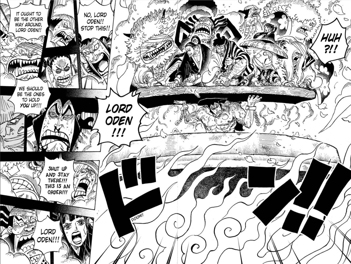
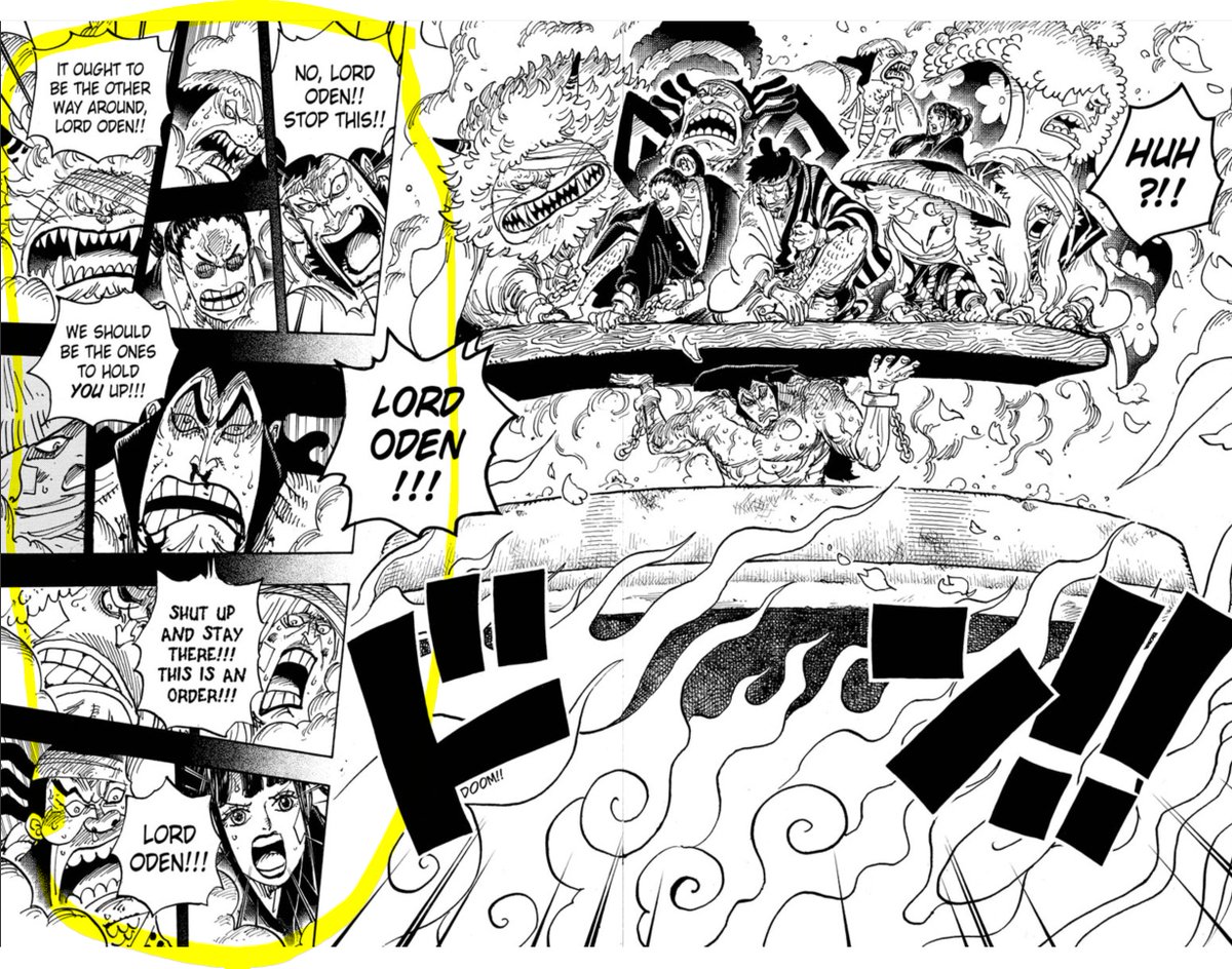
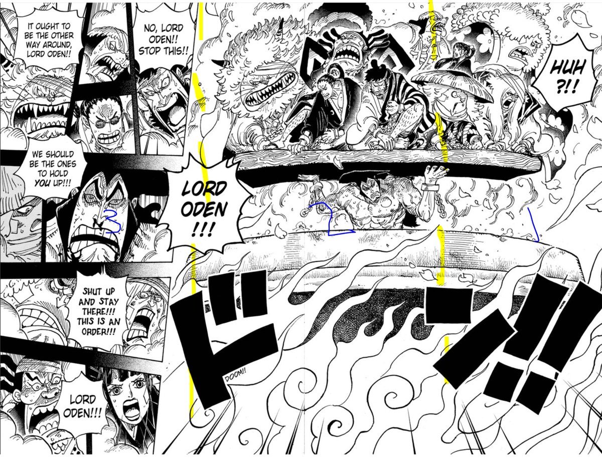
First let& #39;s get into the major element of Oden holding the retainers.
It& #39;s good to contextually note that this is a page flip moment. Good practice is to end pages with "mini cliffhangers" to encourage a turn with the payoff following and boy is this a BIG payoff!
It& #39;s good to contextually note that this is a page flip moment. Good practice is to end pages with "mini cliffhangers" to encourage a turn with the payoff following and boy is this a BIG payoff!
In OP scale speaks volumes. Whether it& #39;s characters or metaphorical moments, size is always played up for epic effect.
So of course the "Legendary Hour" would be displayed like this! A grandiose act for ALL to see, Wano Citizens and Manga Readers alike. So it must take up SPACE!
So of course the "Legendary Hour" would be displayed like this! A grandiose act for ALL to see, Wano Citizens and Manga Readers alike. So it must take up SPACE!
"Technical Detail Eye Candy" is pretty much a given with Full Spread. But when it comes down to it, in greater context of the issue as a whole, its still usually a single panel. A single image.
And if an image isn& #39;t compositionally sound. Blow up means nothing.
And if an image isn& #39;t compositionally sound. Blow up means nothing.
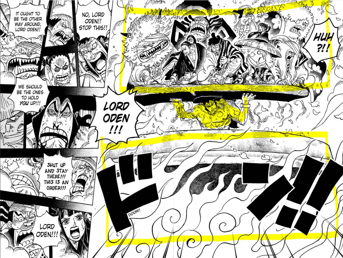
So how does Oda handle that for this singular panel? Well we& #39;ve already talked about overall scale. But even that is further played up by WEIGHT and BALANCE.
Yeah Oden& #39;s doing some major muscle flexing right now. But we only feel that metaphorical/implied weight though the use of visual weight and balance.
Look at the amount of visual space taken up by both the retainers and the pot, both almost equivalent sandwiching Oden smack in the middle. The top figures asymmetrically balance bottom, but even without number addition the weight perfectly puts Oden as a center of visual tension
Oden& #39;s relatively more conserved taking up of space is the only thing breaking up the meeting of these two competing masses making our hero a focal point. (as he should be). A good use of strengthening contextual tension though literal visual language.
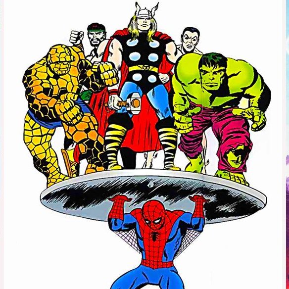
It really is a great moment. A classic Pin-up moment spoken many times in the comic language, but cool to see a OP styled twist nonetheless. But I& #39;m getting ahead of myself.
You might be saying "yeah yeah we get it. The pic is great by itself. But why Oda have to add all this other nonsense? to the side"
Well remember. Cause of the story often every panel counts in OP. But Oda& #39;s not just squeezin in either. It& #39;s all strategic.
Well remember. Cause of the story often every panel counts in OP. But Oda& #39;s not just squeezin in either. It& #39;s all strategic.
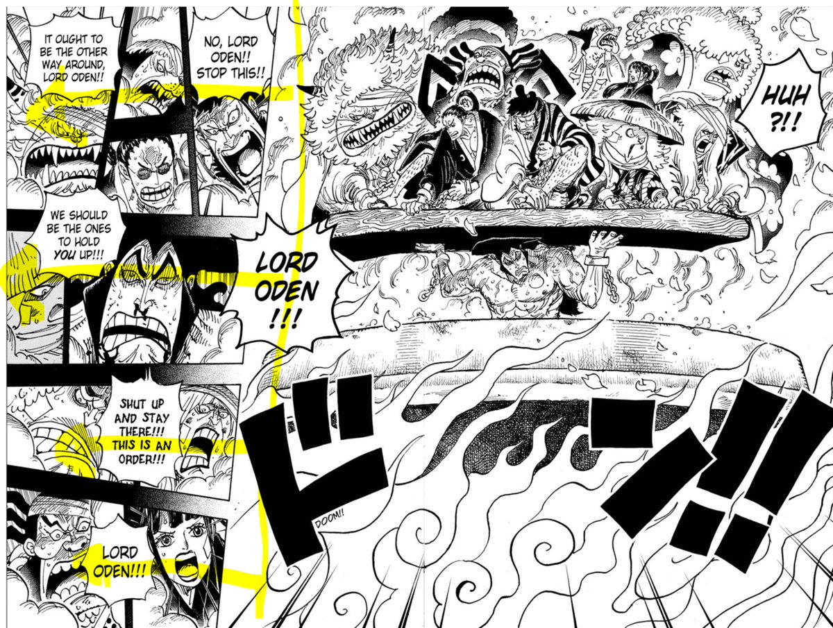
First off, gutter play.
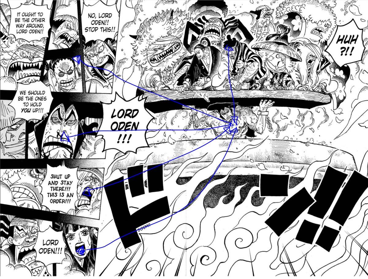
The large pin up panel establishes the setting of the new scene giving context to the immediate following panels and allowing full focus on more expression shots.
Not only they share setting, but also a more connected sense of timing due to "T" overlaps.
The large pin up panel establishes the setting of the new scene giving context to the immediate following panels and allowing full focus on more expression shots.
Not only they share setting, but also a more connected sense of timing due to "T" overlaps.
"T overlaps" is a term coined I believe by Scott McCloud in his comic analysis/tutorial books (check em out)
When paired with the more moment to moment paneling structure of many east comics, you get some serious panel flow. One of the reasons why you can read manga so fast!
When paired with the more moment to moment paneling structure of many east comics, you get some serious panel flow. One of the reasons why you can read manga so fast!
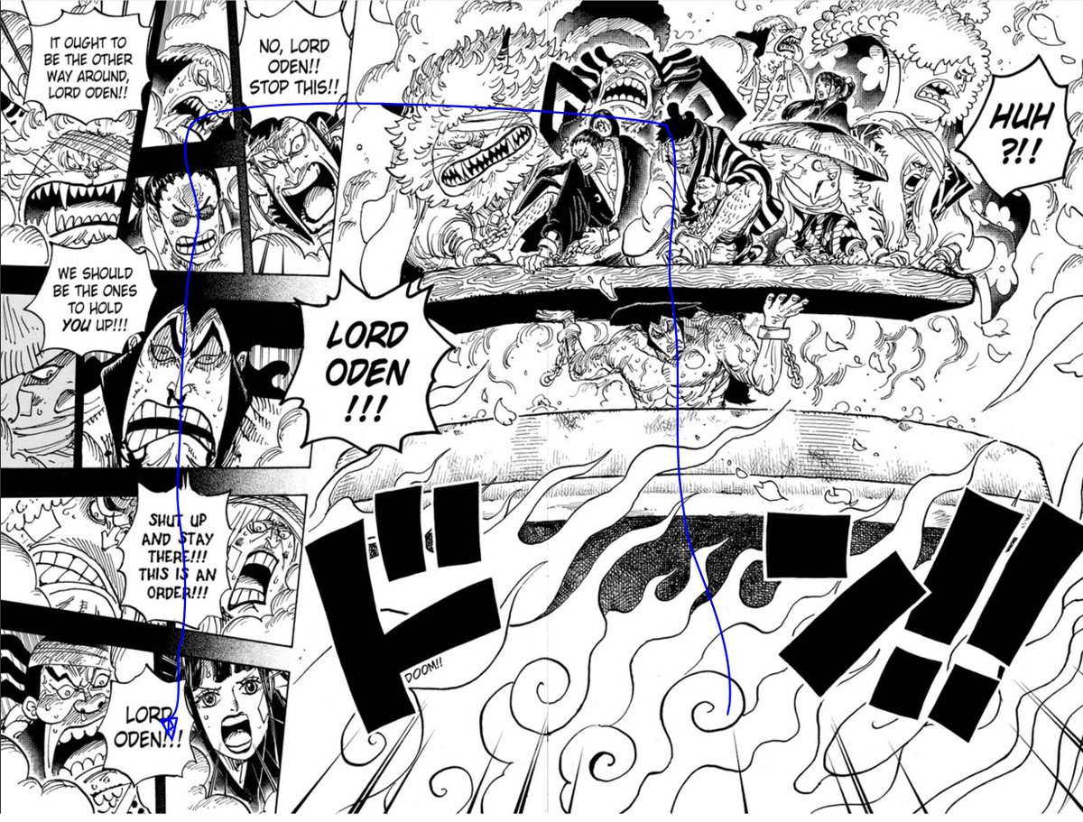
It& #39;s like gutters as visual "highways" that lead you thought the page and makes panel order more natural. In this case, of course there& #39;s an initial panel order, but because of gutters representing time, you can come up with simultaneous groups all tying back into the main image
It& #39;s all cause of how all the page breaks cross back into the main diagonal hwy drawn by the main spread image.
He& #39;s also strengthening this by doing some gutter breaks with speech bubble overlaps too.
Main point: the pin up is STRENGTHENED by these panels (vis/contextually)
He& #39;s also strengthening this by doing some gutter breaks with speech bubble overlaps too.
Main point: the pin up is STRENGTHENED by these panels (vis/contextually)
Ok, visuals getting messy so time to wrap up: How does he make it all work together visually aside from a writing contextual position?
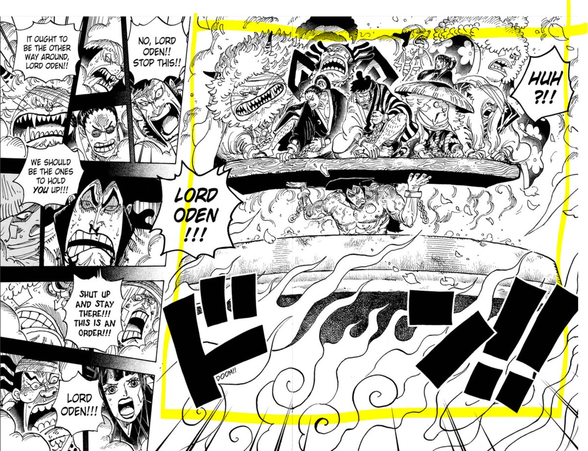
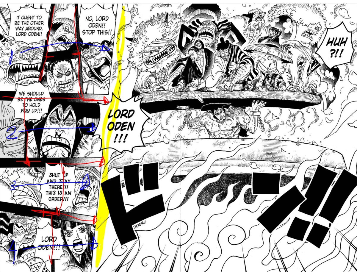
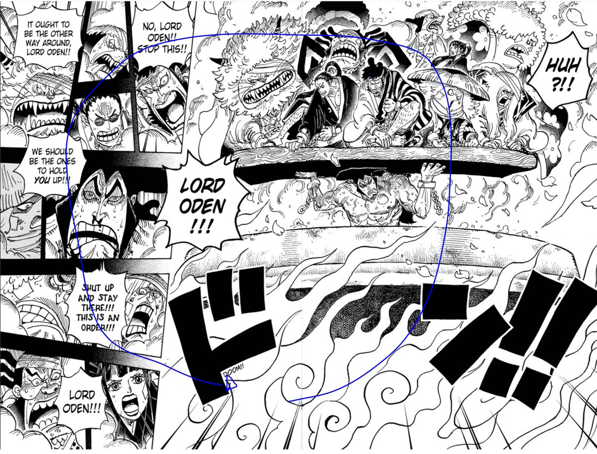
Well first off, despite many jaunts, there is no "half split" (compositional no no, otherwise, just do one page)
There is golden thirds tho
Well first off, despite many jaunts, there is no "half split" (compositional no no, otherwise, just do one page)
There is golden thirds tho
Oda often splits up many of his spreads like this, a good compositional rule of thumb to fall back on. Sometimes its other fractions, but big idea is that he anchors a big moment to part of the page and then balances them asymmetrically.
I feel this works on various levels. It allows him to more easily structure various panels with their own levels of detail/composition in a way that makes sense. Two, it grounds the page layout as a whole keeping it interesting not just alone but in entire issue context.
He also does this within the smaller panel group. Normally fours in a vertical format is kinda pushing it, but works here because one: not all equivalent in space (top few take up a bit more than bottom and narrows down). Two, all anchored by much larger pinup.
Much needed conclusions (I know I& #39;ve rambled for a while)
I think it& #39;s amazing how Oda structures spreads. In a way I& #39;d argue he& #39;s more conservative with how much space he takes up for eye candy to stay more true to the science of pg layout and how that contributes to experience
I think it& #39;s amazing how Oda structures spreads. In a way I& #39;d argue he& #39;s more conservative with how much space he takes up for eye candy to stay more true to the science of pg layout and how that contributes to experience

 Read on Twitter