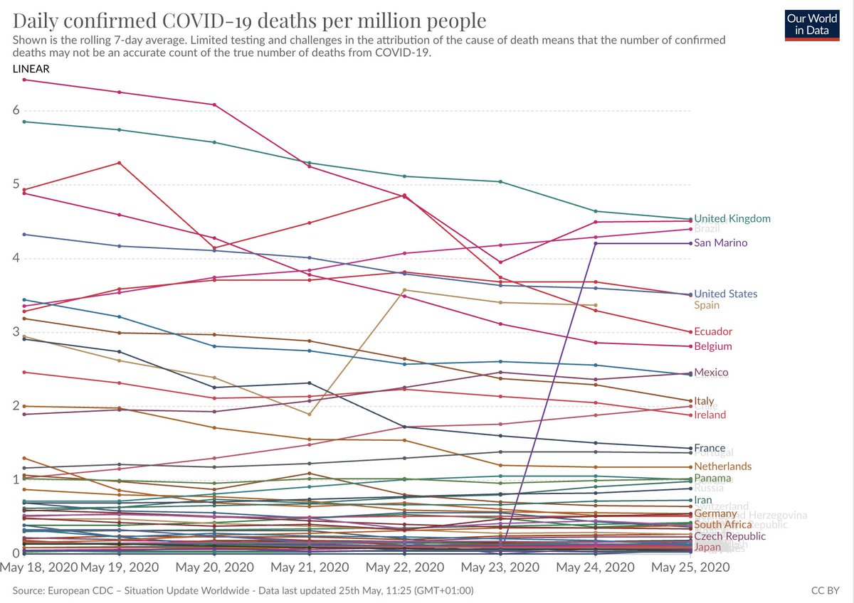
The UK that has now the highest rate of confirmed deaths from #COVID19 worldwide.
[Link to the source: https://ourworldindata.org/coronavirus-data-explorer?zoomToSelection=true&time=latest&deathsMetric=true&dailyFreq=true&perCapita=true&smoothing=7&country=ARG+BOL+BRA+CHL+COL+ECU+PER+URY+AUT+BEL+BGR+BIH+BLR+CHE+CZE+DEU+DNK+ESP+EST+FRA+GBR+GRC+HRV+IRL+ITA+NLD+NOR+POL+PRT+RUS+SMR+SWE+DZA+EGY+GAB+LBR+SDN+ZAF+ARM+BGD+BHR+IDN+IND+IRN+IRQ+ISR+JPN+PAK+PHL+TUR+CAN+DOM+HND+MEX+PAN+ALB+SGP+GIN+USA]">https://ourworldindata.org/coronavir...
[Link to the source: https://ourworldindata.org/coronavirus-data-explorer?zoomToSelection=true&time=latest&deathsMetric=true&dailyFreq=true&perCapita=true&smoothing=7&country=ARG+BOL+BRA+CHL+COL+ECU+PER+URY+AUT+BEL+BGR+BIH+BLR+CHE+CZE+DEU+DNK+ESP+EST+FRA+GBR+GRC+HRV+IRL+ITA+NLD+NOR+POL+PRT+RUS+SMR+SWE+DZA+EGY+GAB+LBR+SDN+ZAF+ARM+BGD+BHR+IDN+IND+IRN+IRQ+ISR+JPN+PAK+PHL+TUR+CAN+DOM+HND+MEX+PAN+ALB+SGP+GIN+USA]">https://ourworldindata.org/coronavir...
The reporting of deaths is very irregular in many countries. Few deaths reported on one day and many reported a day later. For that reason it is useful look at the rolling seven day average as the chart above does.
At the source link you can explore the data in detail.
At the source link you can explore the data in detail.
The chart above only refers to the current situation and as the subtitle says this data suffers from limited testing and difficulties in attributing the cause of death.
One way to address this is to study the excess mortality.
Aron & Muellbauer did that. https://twitter.com/MaxCRoser/status/1262395722642731011">https://twitter.com/MaxCRoser...
One way to address this is to study the excess mortality.
Aron & Muellbauer did that. https://twitter.com/MaxCRoser/status/1262395722642731011">https://twitter.com/MaxCRoser...

 Read on Twitter


