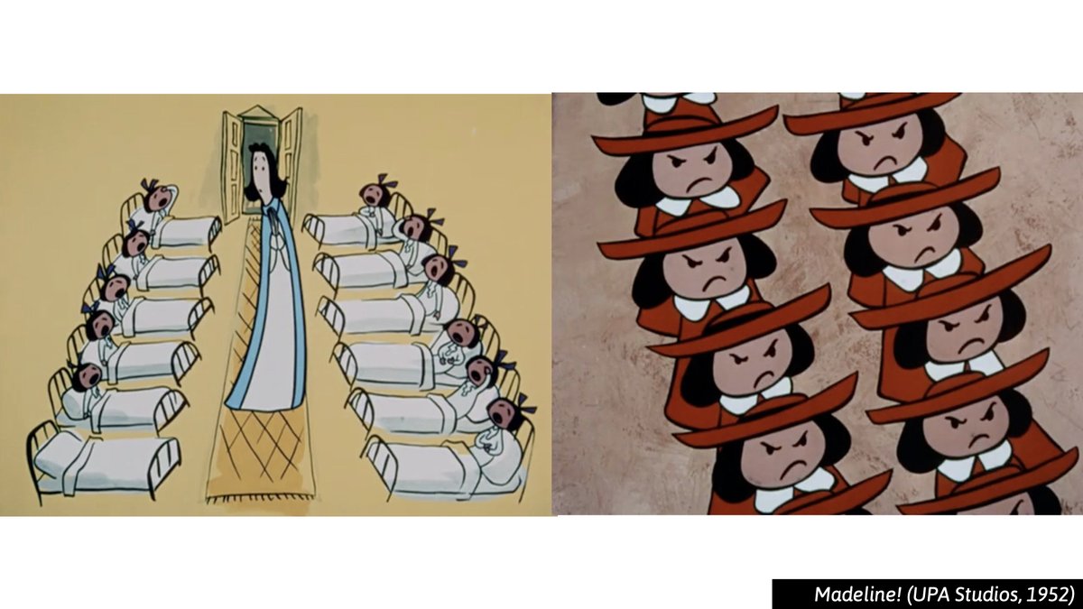
Wow! It& #39;s so nice seeing a print in it& #39;s intended colors. That yellow especially! Thanks, @ani_obsessive  https://abs.twimg.com/emoji/v2/... draggable="false" alt="👍" title="Thumbs up" aria-label="Emoji: Thumbs up"> https://twitter.com/ani_obsessive/status/1264725595805679617">https://twitter.com/ani_obses...
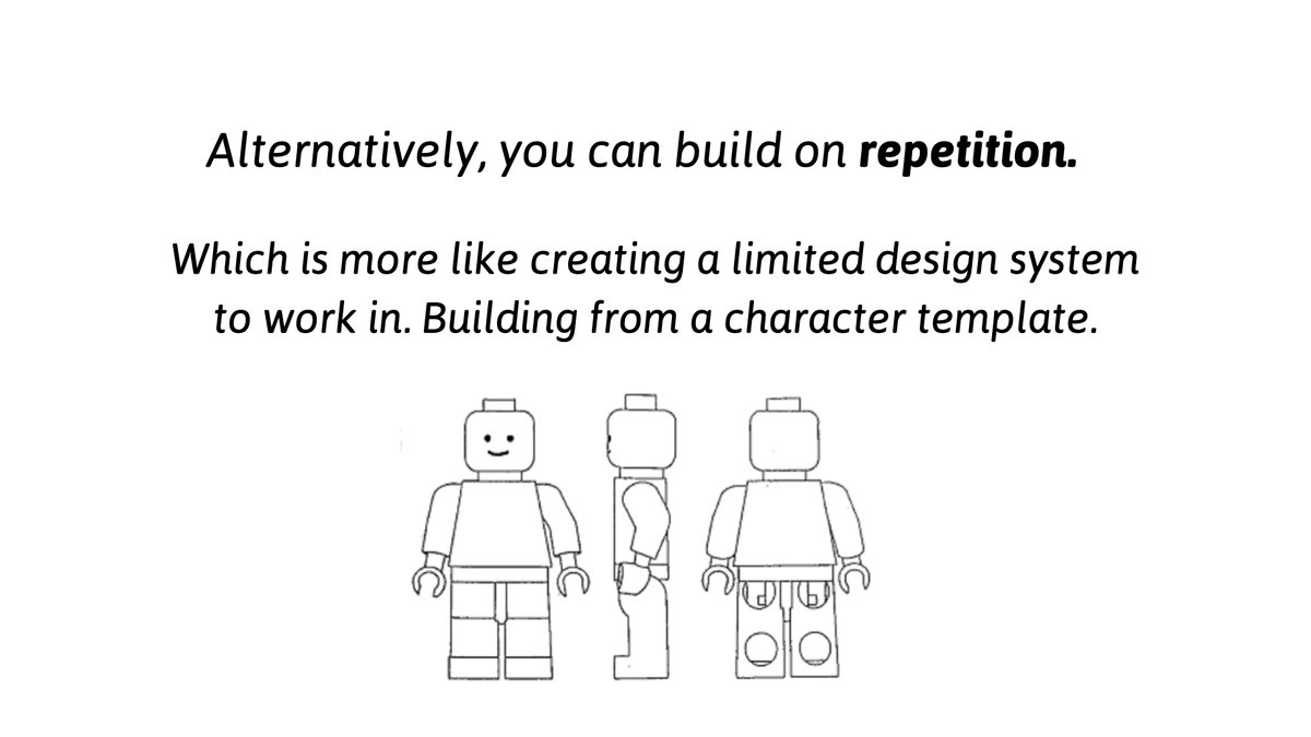
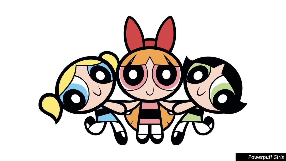
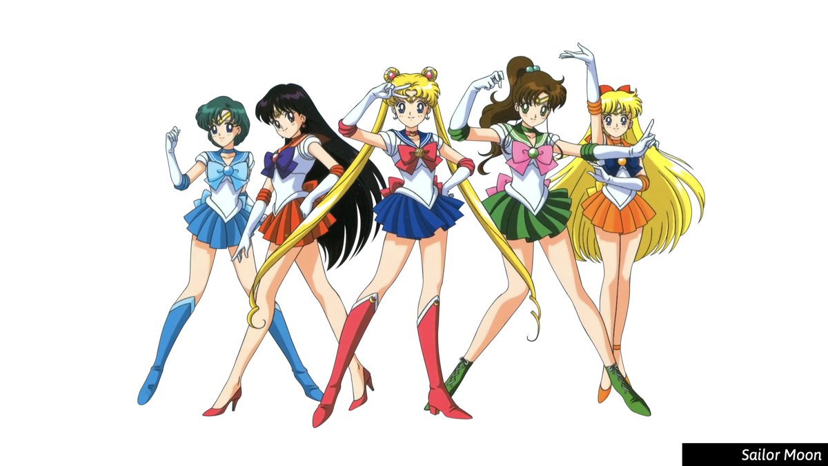
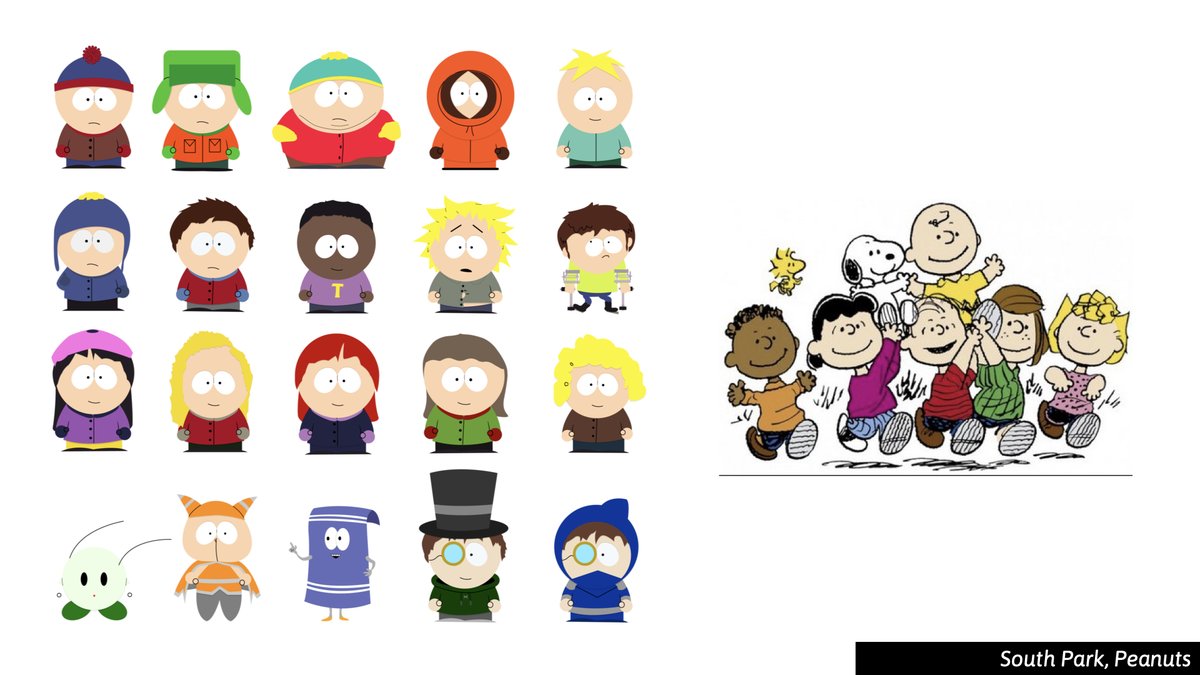
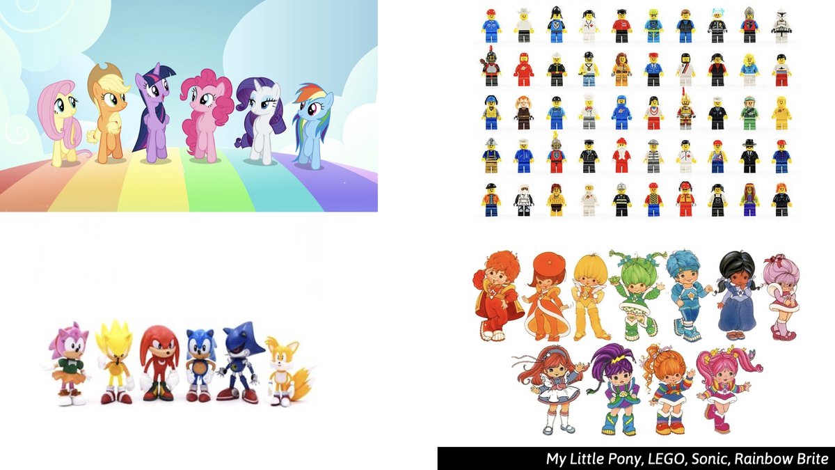
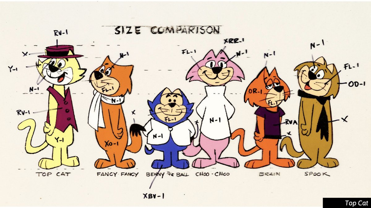
I have this as a slide in my class instruction on designing a cast a characters—making a case for the use of repetition in character design.
I love love love this UPA short. Bobe Cannon is the best.
I love love love this UPA short. Bobe Cannon is the best.
Lately I& #39;ve come to think of variety <--> repetition as a spectrum. Like so many things in design...
(volumetric <--> flat)
Where there& #39;s no right answer. Just options!
Repetition seems be getting the short end of the stick lately, so I try to prop it up when I can.
(volumetric <--> flat)
Where there& #39;s no right answer. Just options!
Repetition seems be getting the short end of the stick lately, so I try to prop it up when I can.
I tend to favor a little of both. A think a lot of classic design follows this. Building on a system, adding variety with splashes of color, varying up proportions.
You don& #39;t have to choose one (PURE Variety VS. PURE Repetition). Instead, thinking about it as a spectrum.
You don& #39;t have to choose one (PURE Variety VS. PURE Repetition). Instead, thinking about it as a spectrum.
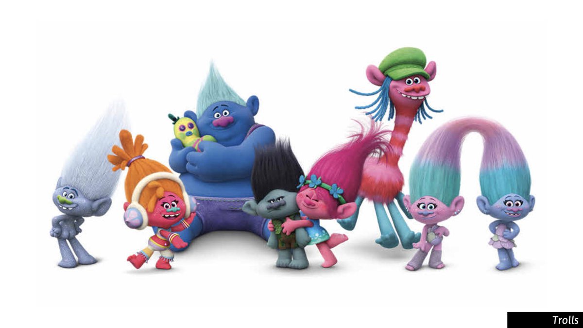
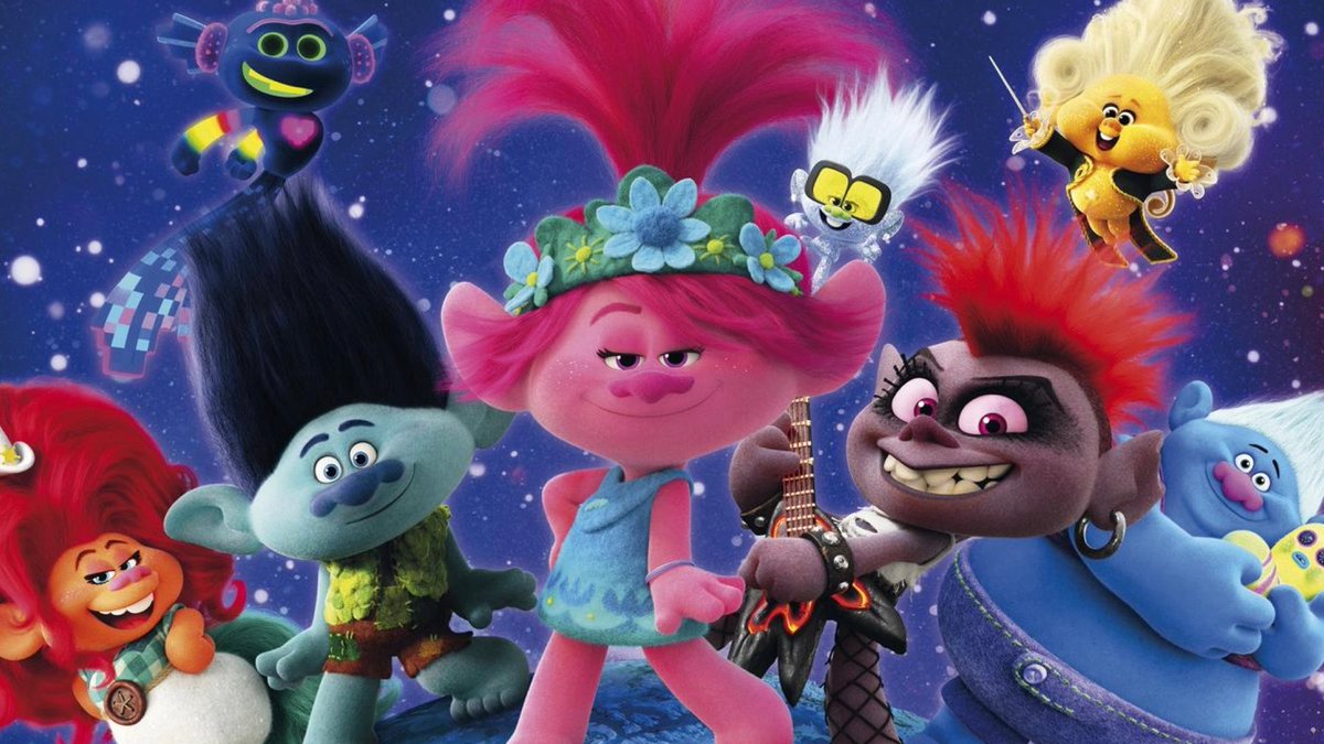
I think Trolls recently did a great job of working the full spectrum of & #39;character cast design& #39;. Some variety, some repetition.
back to Madeline, I did a design thread on it maybe a year ago. Definitely a film worth your attention and study! Check it out. https://twitter.com/bobjinx/status/1107373068345884672">https://twitter.com/bobjinx/s...
Watch it here if you don& #39;t want to dig into the thread.
https://www.youtube.com/watch?v=HHuQlcO7hyI
https://www.youtube.com/watch... href="https://twitter.com/ani_obsessive">@ani_obsessive may know of a more color accurate print, but I think resolution-wise this is pretty decent.
https://www.youtube.com/watch?v=HHuQlcO7hyI

 Read on Twitter