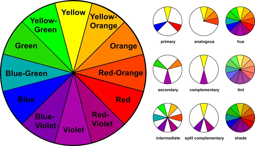
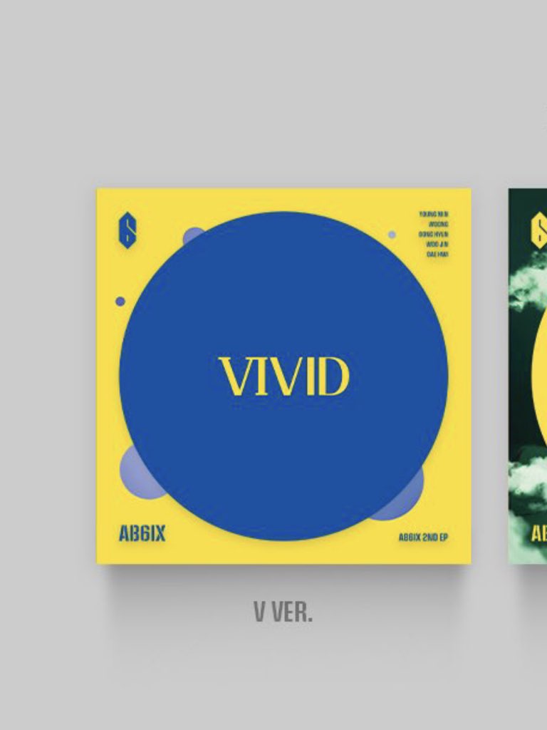
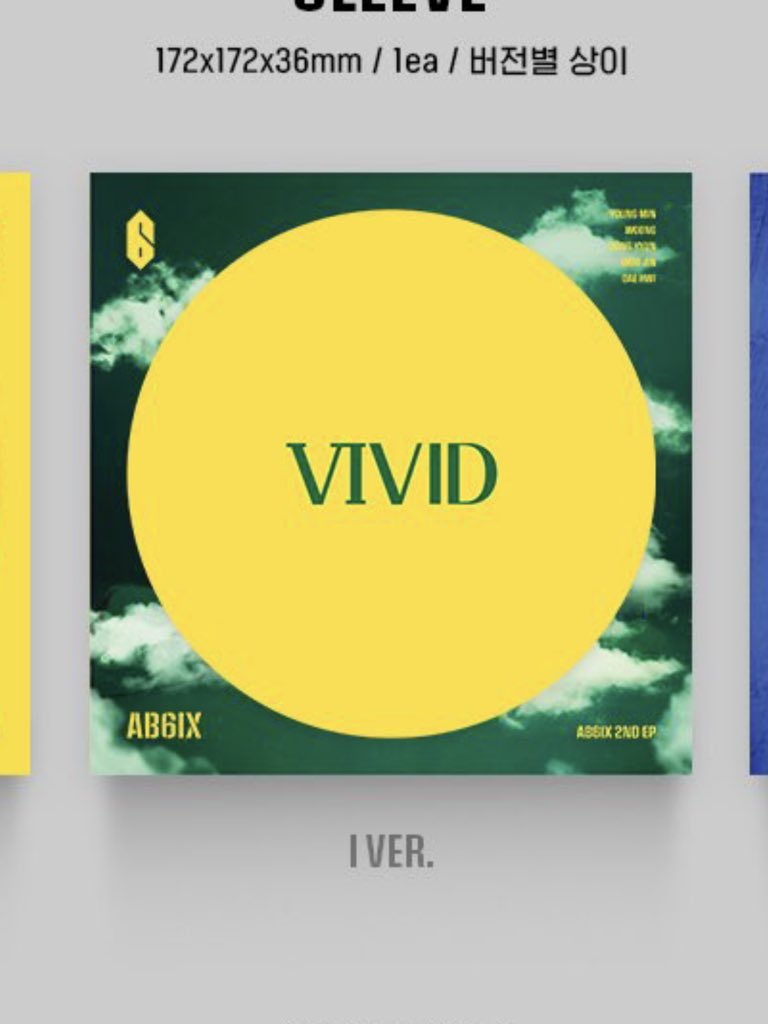
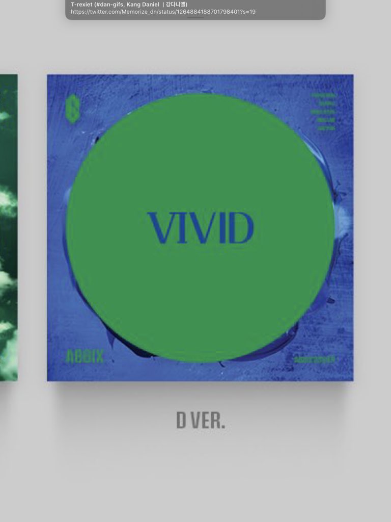
I feel like color rant tonight. Ab6ix’s turn this time. The main colours here are obvious. Let’s list them anyway: yellow, blue and green. We’re diving into some colour theory here so get yourself a some tea, coffee or whatever you fancy. This is going to be a long one. [thread/]
Now I’m not going to say that any combination of colours are bad, because honestly as with anything with life this topic is also subjective. It just caught my eye because there is something that needed to be pointed out here.
Whenever one has to choose a colour scheme to use for anything you normally have a guideline that is taught whenever you end up in a job that involves visualisation. Here they are in a nutshell.
Version V. I love this combo. It’s so bright but it works. This is formed by two of the three primary colours. It’s a classic combination if you want to bring attention to all colours used without making your eyes hurt.
Version I. I live in Australia and you’ll this combination in every Olympic Games. It’s also just as bold as in version v but with a different flair. Yellow and green are close enough in the colour wheel that you can make a colour palette out of them. Aka the analogous principle.
Lucky version D. This why i wanted to make this thread. This is where my personal taste comes in. IMO this really doesn’t work. The colours don’t really clash to stand out nor does harmonise with each other. So it starts to look gray and flat. A different hue or shade of green...
...makes a world of difference. In theory it should work. However it depends on what you’re applying the colours to. Since this is an album cover you need to strike the balance of a visually appealing colour scheme and legibility. This version has lost the latter big time.
If you made it here you’re a trooper. I don’t have a prize for you unfortunately, but ty for allowing me to rant. I had fun.

 Read on Twitter
![I feel like color rant tonight. Ab6ix’s turn this time. The main colours here are obvious. Let’s list them anyway: yellow, blue and green. We’re diving into some colour theory here so get yourself a some tea, coffee or whatever you fancy. This is going to be a long one. [thread/] I feel like color rant tonight. Ab6ix’s turn this time. The main colours here are obvious. Let’s list them anyway: yellow, blue and green. We’re diving into some colour theory here so get yourself a some tea, coffee or whatever you fancy. This is going to be a long one. [thread/]](https://pbs.twimg.com/media/EY3tJiiUEAImCBt.jpg)


