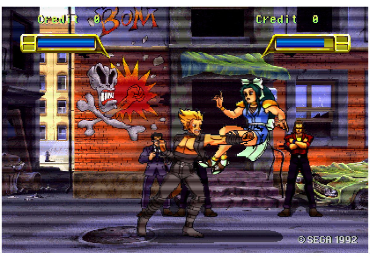
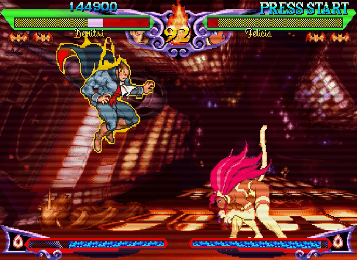
Sega is always so far ahead of the pack! (often to their own detriment!) Here& #39;s an HD(ish) 2D fighting game with anime style hand drawn cel animation that Sega released in 1993! https://twitter.com/SandwichColonel/status/1264856679834927104">https://twitter.com/SandwichC...
Sega& #39;s "Burning Rival" game came out in 1993!! The copyright is even earlier, from 1992! This looks way better than most 32-bit era anime fighters!
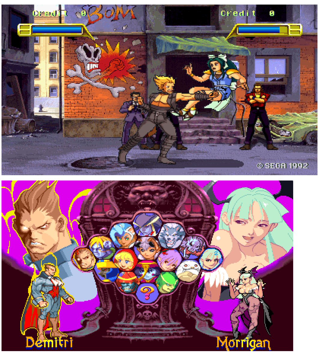
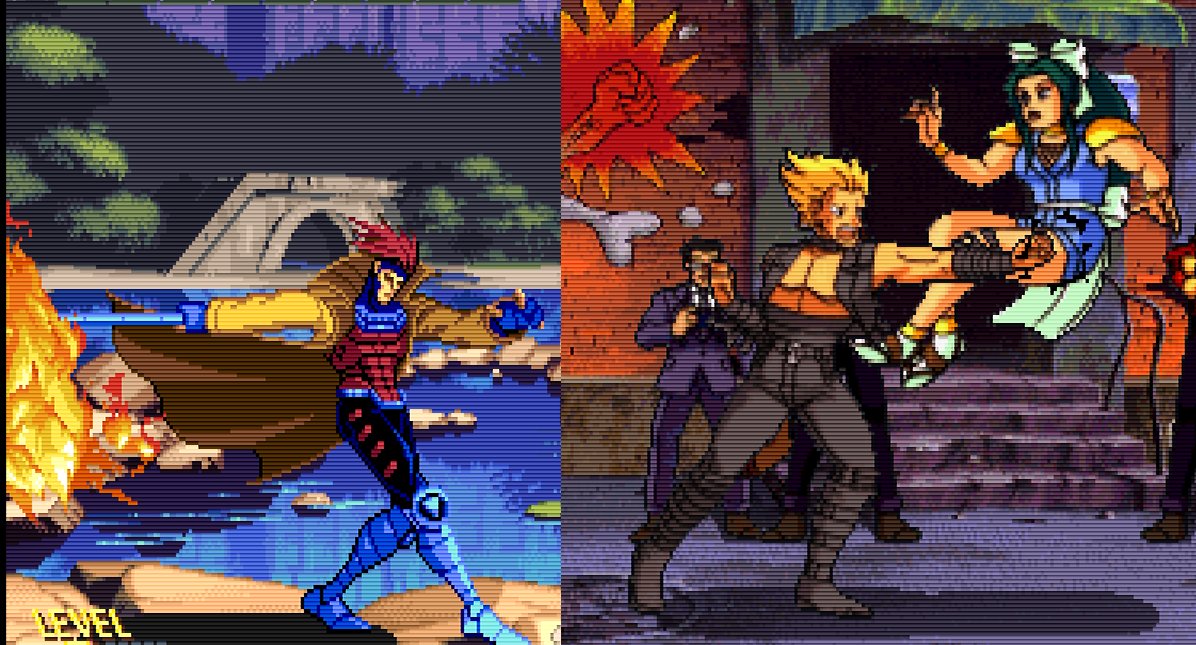
OK, just made this gif comparing Darkstalkers and Burning Rival at their native resolutions. Capcom& #39;s CPS2 board ran at 384x224 resolution. Burning Rivals runs at 416x224, so it& #39;s only got slightly more horizontal resolution.
You& #39;ll notice that both games look stretched out horizontally. This is because they were meant to be displayed with non square, narrow pixels. The reason for this is kind of obscure.
At the time, having a greater than 224 pixel vertical resolution would have resulted in a lower framerate overall due to hardware restrictions. But if devs only increased the horizontal resolution, they could still get silky smooth 60fps (someone please correct me if I& #39;m wrong!)
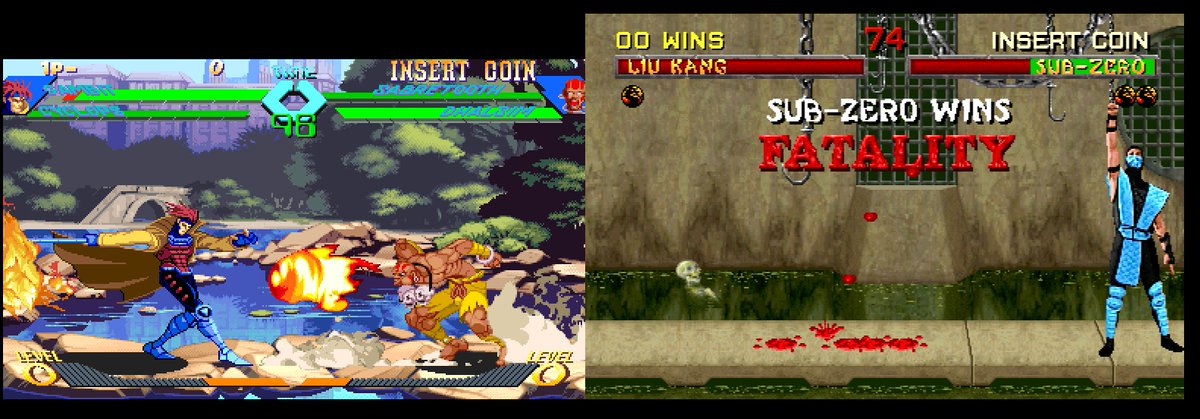
So that& #39;s why so many arcade games are like this! Some devs sacrificed frame rate for resolution (Midway& #39;s MK games run at a higher resolution than Street Fighter). Capcom settled for only increasing the horizontal resolution, hence the "fat" looking sprites at native resolution!

 Read on Twitter