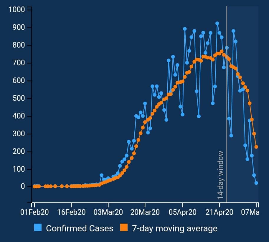
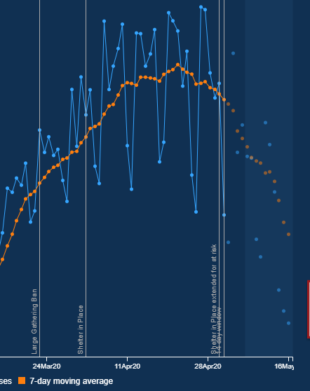
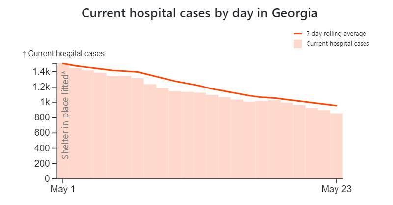
The Georgia COVID-19 website has raised some questions at times, as the display often makes it seem like the number of cases are dropping. First graphic from early May
Second graphic from May 16. You can see how the orange dots (7-day moving average) drop precipitously after you get within two weeks of the current date in the first two slides.
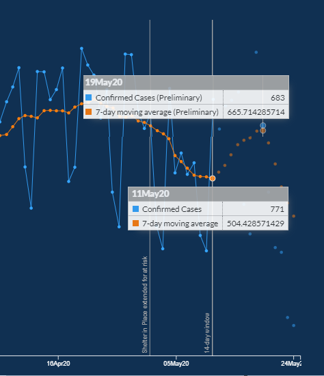
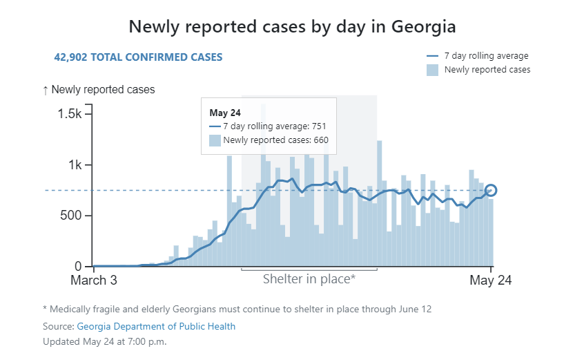
In tonight& #39;s screenshot, you can see how the 7-day moving average of new virus cases has gone up in Georgia between May 11 (504.4) and May 19 (665.7). Unlike before, there was no dramatic drop off.

 Read on Twitter