Yesterday was the 60th anniversary of the largest earthquake ever recorded, the 1960 Valdiva (Chile) M9.5. On this occasion I want to try to explain just how REALLY REALLY BIG big earthquakes are. Check out the figure below, and buckle up.
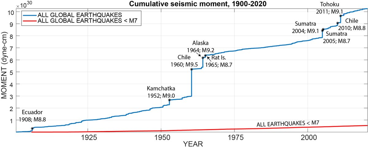
The blue line in this figure shows the total amount of energy (well, seismic moment, but these are similar so we& #39;re going with it), released by earthquakes between 1900 and 2020. The figure shows cumulative energy--total released over time--which is why it constantly increases.
The blue line generally increases smoothly, as earthquakes pop off all over the globe on an annual basis. But sometimes a really big one happens and you see the line suddenly jump up.
Those jumps are big earthquakes...like REALLY big earthquakes. If you can see a bump in the line it& #39;s probably >M8. Magnitude 8 quakes occur about once per year--in fact, in the past 120 years there have been 94 events >= M8.
The really big jumps are even bigger. I& #39;ve labeled the 9 events >M8.7. You can see that even the M8.7 quakes (which are monstrous) barely show up on the curve.
On this figure you can see how much more energy is released by a magnitude 9 quake than a magnitude 8. In fact, an M9 is 32 x greater than an M8, and ~1000 x greater than an M7.
Now go back and check out the Great Chile quake again. Look at the size of that thing! Over 20% of all of the seismic energy over 120 years was released in that one earthquake.
Even the Great Alaska Earthquake (1964, M9.2) looks small in comparison.
Have you ever felt an earthquake? Maybe you live in California and you felt the Loma Prieta (1989) or Northridge (1994) quakes? How about the recent Nevada, Idaho, or Utah events? Those were 6.5, 6.5, and 5.7, respectively.
Now, look at the figure again and focus in on the red line...the one down near the bottom.
That shows the total energy released by all earthquakes smaller than 7, including Loma Prieta, Nevada, etc. They contribute almost nothing to the total amount of energy released over the century.
Of the >11,400 quakes used to make this figure, over 10,000 are smaller than M7. Those 10,000 quakes make up less than 7% of the seismic energy budget over that time.
Almost ALL of the energy released in this time was from really big quakes. There aren& #39;t nearly as many such event (thank goodness), but dang, they are big.
So here& #39;s the lesson: big quakes are really, really big. That& #39;s why we have use a logarithmic scale to describe their size.
Second, people often think that small quakes are good because they "take the pressure off of the fault" and lower the chances of a large quake. This is (very unfortunately) wrong. It would literally take thousands of M6s and M7s to alleviate the stress released by a 9.
No one wants to suffer through thousands of M7 quakes, right?

 Read on Twitter


