sweden, UK, and netherlands adopted widely varying policies on covid lockdown.
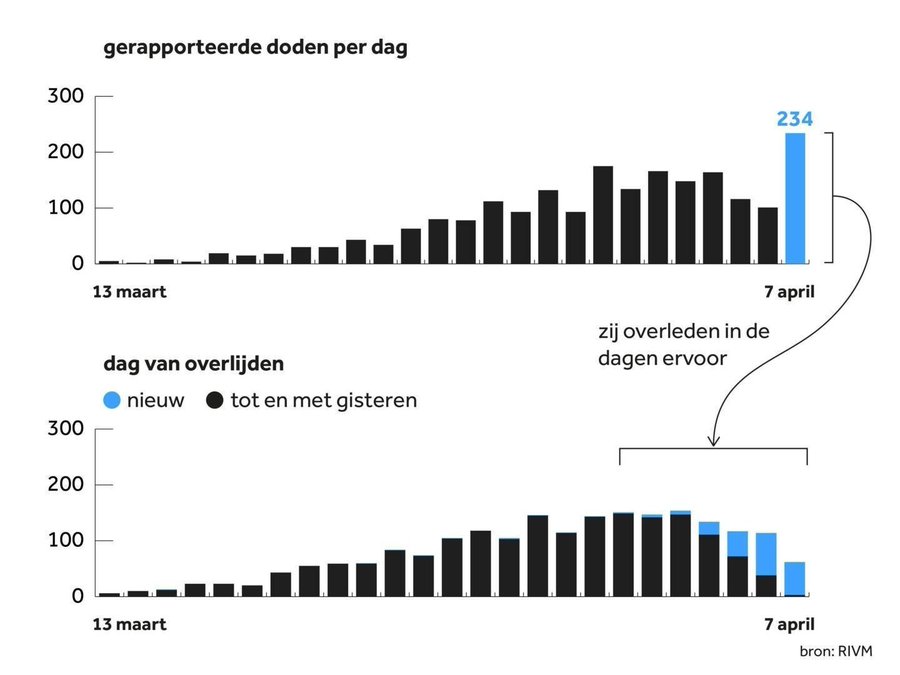
all 3 report actual day of death instead of the day the test came back (like worldometer etc)
this lets us look at their disease curves MUCH more precisely and calculate Rt for deaths precisely.
all 3 report actual day of death instead of the day the test came back (like worldometer etc)
this lets us look at their disease curves MUCH more precisely and calculate Rt for deaths precisely.
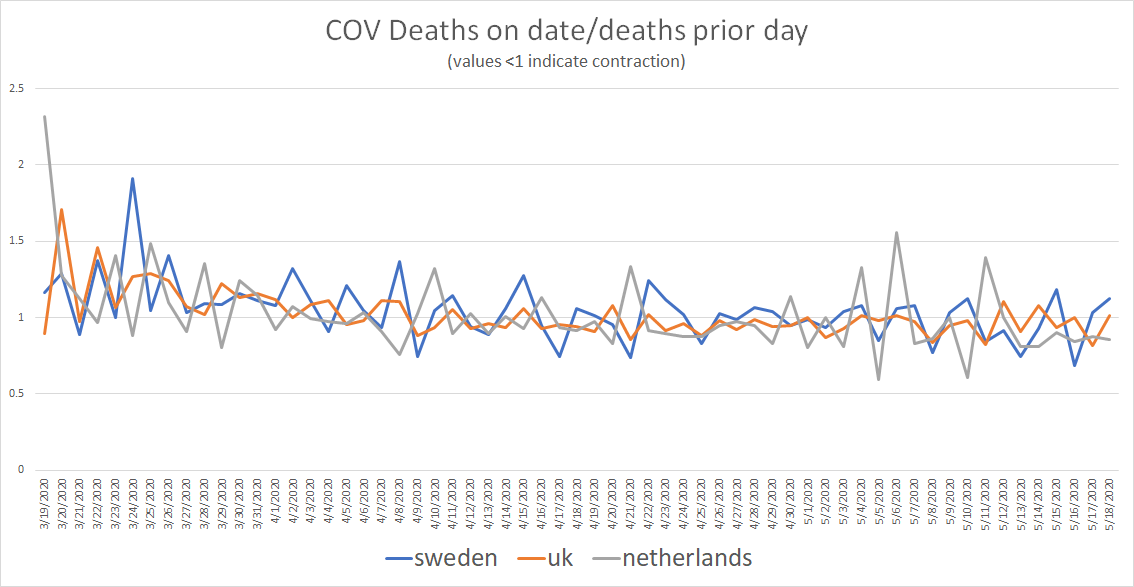
the above chart is the ratio of deaths on the day to deaths the prior day. (deaths on day 2/deaths on day 1)
values >1 indicate a rise in deaths, values <1 show decline.
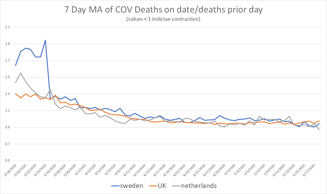
we can smooth this using a 7 day moving average to filter out noise and make it easier to see.
values >1 indicate a rise in deaths, values <1 show decline.
we can smooth this using a 7 day moving average to filter out noise and make it easier to see.
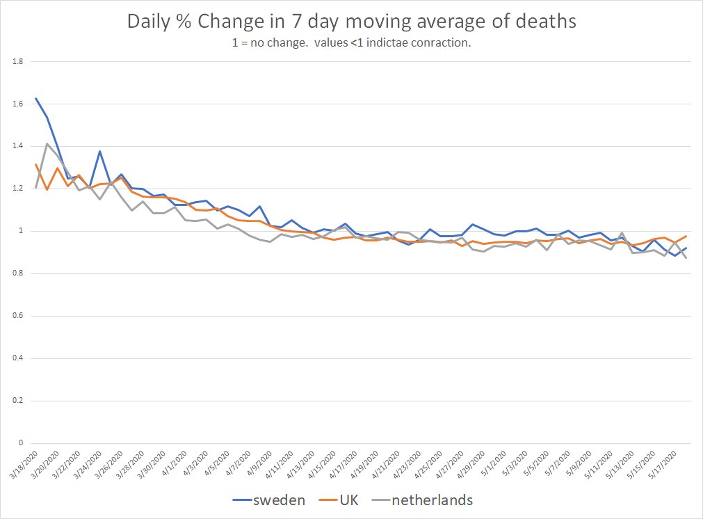
we can also look at the daily % change (again as a ratio) of that 7 day moving average.
the results are really quite striking.
there is very little difference in the 3 countries, just a little time shift.
the results are really quite striking.
there is very little difference in the 3 countries, just a little time shift.
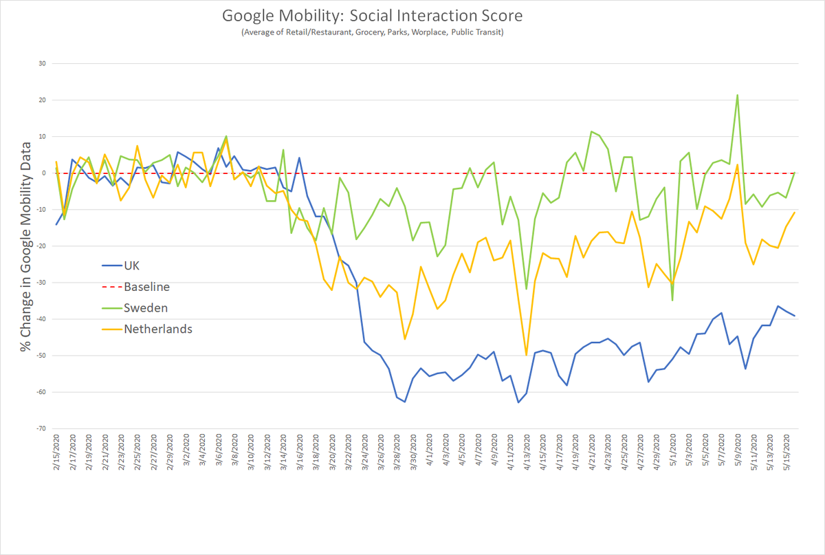
this is despite wide variance in behavior as shown by google mobility data.
this seems to cast serious doubt on the idea that lockdowns that forced people out of bars and restaurants and workplaces had any material effect.
it looks like you got the same curve regardless.
this seems to cast serious doubt on the idea that lockdowns that forced people out of bars and restaurants and workplaces had any material effect.
it looks like you got the same curve regardless.
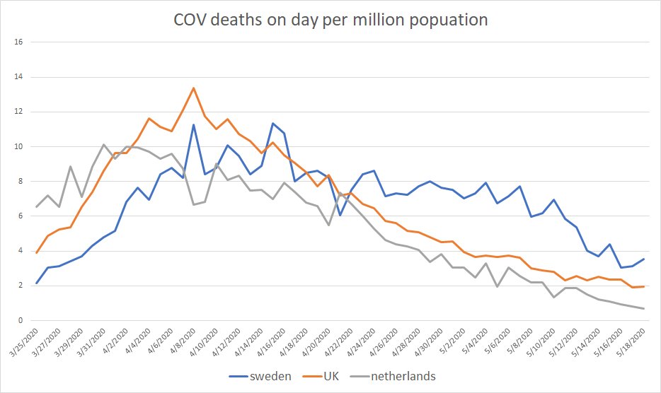
we can also plot real curves for deaths per million population per day.
(this is not possible with date of report data.)
this again looks very similar.
to look at area under curve, total deaths/mm are
netherlands: 340
sweden: 396
UK: 541
(per worldometer, 5/25)
(this is not possible with date of report data.)
this again looks very similar.
to look at area under curve, total deaths/mm are
netherlands: 340
sweden: 396
UK: 541
(per worldometer, 5/25)
sweden trailed the other 2 by 4-6 days in terms of curve, but the shapes are very similar.
sweden actually had the flattest curve of the 3 with 24 days from 1 death per million to peak deaths per million
the peaks were also VERY similar and showed no clear pattern to lockdown
sweden actually had the flattest curve of the 3 with 24 days from 1 death per million to peak deaths per million
the peaks were also VERY similar and showed no clear pattern to lockdown
all in all, it looks like the lockdown/distancing response had no discernible effect on the shape of the disease curves in these 3 countries.
their curves are incredibly similar despite very different approaches and outcomes do not correlate to lockdown intensity.
their curves are incredibly similar despite very different approaches and outcomes do not correlate to lockdown intensity.
this should leave us asking some VERY pointed questions about the purported benefits of lockdown as policy.
its cost has been extreme and its benefits look non existent.
this was not what health guidelines called for.
it was lemming behavior.
its cost has been extreme and its benefits look non existent.
this was not what health guidelines called for.
it was lemming behavior.
models that were so bad they literally could not replicate their own results, much less predict the future, were substituted for science and sound judgement and most governments succumbed to hysteria and mass delusion.
governments became super-spreaders of panic and ruin.
governments became super-spreaders of panic and ruin.
i know i keep harping on this, but this message needs to land because governments WILL try to do this again, and we need to learn the lesson and build the societal immunity to this sort of panic driven charlatanry.
only that will save us from falling prey to it again.
only that will save us from falling prey to it again.

 Read on Twitter