I& #39;m not an expert, but I have taken the time to fact check this tweet because it’s doing numbers – by actually reading the studies/articles it links to – and I& #39;m troubled by how misleading it is.
Here& #39;s why: https://twitter.com/k_g_andersen/status/1263246859054641152">https://twitter.com/k_g_ander...
Here& #39;s why: https://twitter.com/k_g_andersen/status/1263246859054641152">https://twitter.com/k_g_ander...
These figures have been extracted from an array of disparate sources and contexts, with some relating to completely different variables from the others. They also reflect different moments in time across the countries – some even as much as *months* apart.
The fact they were all released this week does *not* make them comparable; not one of these figures is comparable with any of the others (without a great deal of supplementary analysis). Some of the figures are also just wrong. Let’s look at that them one by one.
The figure of 5.0% in Spain is the result from the first round of their government’s longitudinal sero-epidemiological study (essentially – testing a representative population sample for the presence of antibodies).
https://www.mscbs.gob.es/gabinetePrensa/notaPrensa/pdf/13.05130520204528614.pdf">https://www.mscbs.gob.es/gabineteP...
https://www.mscbs.gob.es/gabinetePrensa/notaPrensa/pdf/13.05130520204528614.pdf">https://www.mscbs.gob.es/gabineteP...
The data relates to tests taken between April 27 and May 11, and only provides results for the presence of IgG antibodies.
This is really important – most serological tests seek to identify 2 different types of antibody:
– Immunoglobulin G (IgG)
– Immunoglobulin M (IgM)
The period after infection during which each antibody type is detectable by serological test is vastly different.
– Immunoglobulin G (IgG)
– Immunoglobulin M (IgM)
The period after infection during which each antibody type is detectable by serological test is vastly different.
IgM:
– from 5 to 7 days after the initial onset of symptoms
– until 14 to 21 days from symptom onset
IgG:
– from around day 14 after symptom onset
– until months or even years after the resolution of infection https://www.ncbi.nlm.nih.gov/pmc/articles/PMC7184973/">https://www.ncbi.nlm.nih.gov/pmc/artic...
That& #39;s worth restating:
– IgM antibodies can only be detected ~1-3 weeks after infection
– IgG antibodies can only be detected from 2 weeks after infection (and then for much longer thereafter)
– IgM antibodies can only be detected ~1-3 weeks after infection
– IgG antibodies can only be detected from 2 weeks after infection (and then for much longer thereafter)
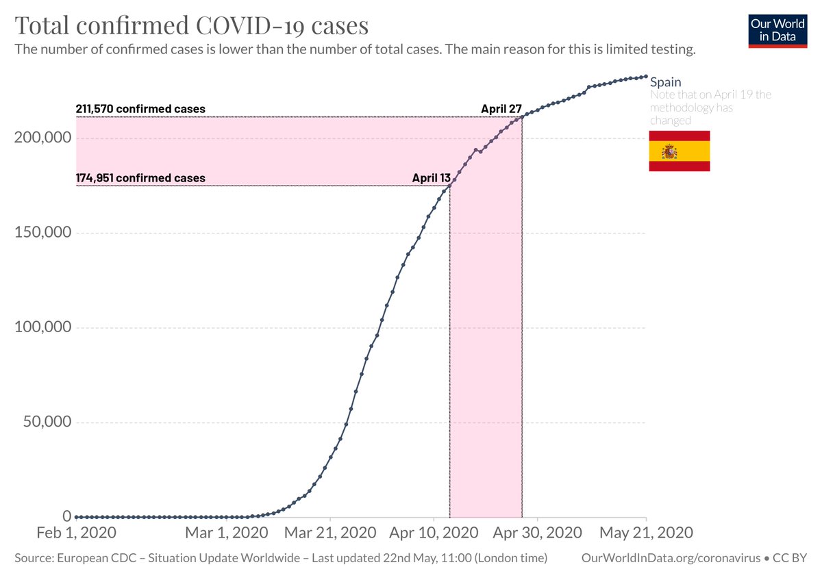
This means that the 5.0% of Spaniards who tested positive for IgG between April 27 and May 11 would all have become infected *at least* two weeks earlier than that – and possibly much earlier still.
Let& #39;s keep things simple and assume they all became infected exactly two weeks earlier: between April 13 and 27.
At the start of that window, the number of known COVID-19 cases in Spain was 75.07% of the total as of 21 May. By the end of that window, this had risen to 90.79%.
At the start of that window, the number of known COVID-19 cases in Spain was 75.07% of the total as of 21 May. By the end of that window, this had risen to 90.79%.
Essentially: fewer than 10% of the total known infections in Spain have happened since these tests’ infection window.
Case data is not hugely reliable – but the important thing to takeaway is that Spain had only achieved ~5.0% immunity by very late in its epidemic curve.
Case data is not hugely reliable – but the important thing to takeaway is that Spain had only achieved ~5.0% immunity by very late in its epidemic curve.
Now let& #39;s look at Italy.
This figure is different from the Spanish one for a number of reasons.
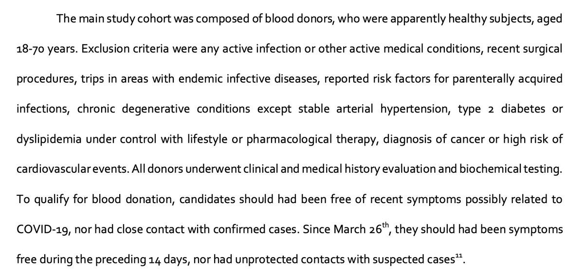
Firstly, it’s the result of testing plasma samples from blood donors, and not a study set-up specifically to measure seroprevalence. https://www.medrxiv.org/content/10.1101/2020.05.11.20098442v1">https://www.medrxiv.org/content/1...
This is crucial because it excludes anybody with certain underlying health conditions – including any COVID-19 symptoms, or recent contact with confirmed COVID-19 cases.
For obvious reasons, this is likely to produce an artificially low figure.
For obvious reasons, this is likely to produce an artificially low figure.
Secondly, it only covers Milan. Since Milan has been one of the most severely hit areas in Italy, this is likely to produce a figure much higher than would be representative of Italy as a whole.
It& #39;s impossible to disentangle these two factors and accurately estimate the combined inflationary/deflationary effect on the data – so it must be treated with care.
Thirdly, the blood samples were collected between February 24 and April 8 – a substantially different period to that covered in the Spanish data.
Now, these samples were tested for both IgG *and* IgM.
For the sake of simplicity, let& #39;s assume infections happened 2 weeks prior (mid-point for IgM detectability, earliest point for IgG).
For the sake of simplicity, let& #39;s assume infections happened 2 weeks prior (mid-point for IgM detectability, earliest point for IgG).
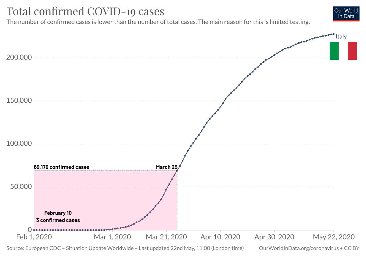
That would mean the donors of any positive samples became infected between February 10 and March 25.
During that time, seroprevalence rose from 4.6% in samples of donors infected between February 10 and 16;
During that time, seroprevalence rose from 4.6% in samples of donors infected between February 10 and 16;
…peaked at 7.1% in samples of donors infected between March 2 and 15; and then fell slightly to 6.7% in samples of donors infected between March 16 and 25.
By that time, only 30.43% of the 227,364 total known COVID-19 cases (as of May 21) had been identified.
Essentially, Milan had achieved ~7% seroprevalence at a time when Italy was only ~30% of the way into its first wave.
Essentially, Milan had achieved ~7% seroprevalence at a time when Italy was only ~30% of the way into its first wave.
Now let& #39;s look at Sweden, which – given Kristian& #39;s “Let& #39;s end the discussion about miracles and natural herd immunity?" plea – is clearly the most relevant figure in this set.
N.B. I don’t know where he& #39;s got the figure of “~5%” (likewise for Italy, where it& #39;s wrong – see above)
N.B. I don’t know where he& #39;s got the figure of “~5%” (likewise for Italy, where it& #39;s wrong – see above)
The Swedish study only provides a figure of 7.3% seroprevalence for Stockholm (plus 4.2% and 3.7% for Skåne and Västra Götaland respectively); no figure is provided for the nation as a whole. https://www.folkhalsomyndigheten.se/nyheter-och-press/nyhetsarkiv/2020/maj/forsta-resultaten-fran-pagaende-undersokning-av-antikroppar-for-covid-19-virus/">https://www.folkhalsomyndigheten.se/nyheter-o...
No information is given about whether subjects were tested for IgM, IgG or both.
Let& #39;s proceed on the basis that they were (likely) tested for both, therefore assuming an infection window of two weeks prior (for the same reasons as Italy – see above).
Let& #39;s proceed on the basis that they were (likely) tested for both, therefore assuming an infection window of two weeks prior (for the same reasons as Italy – see above).
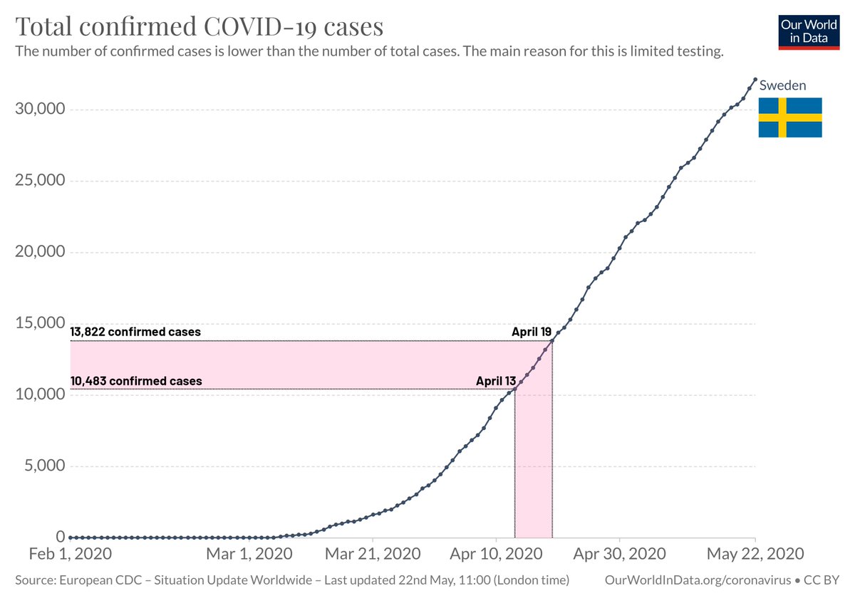
The results relate to samples collected between April 27 and May 3, which corresponds to an infection window of between April 13 and April 19.
So the period in which the population of Stockholm had 7.3% seroprevalence:
– began when 33.26% of the country& #39;s total known cases (31,523 as of May 21) had been identified
– ended when 43.85% had been identified
Sweden was less than half way up its curve.
– began when 33.26% of the country& #39;s total known cases (31,523 as of May 21) had been identified
– ended when 43.85% had been identified
Sweden was less than half way up its curve.
The figure of 1.1% seroprevalence for Denmark comes in a press release that says nothing about which antibodies participants tested positive for, not about when the samples were collected. It’s useless to compare it with other figures without first knowing these details.
The figure of 0.58-0.71% for Norway doesn’t even come from a serological study; it’s from a model. It’s an update to a model based on an updated French model. Comparing this with studies based on empirical data from real-world blood tests is irresponsible af.
So disregarding those two, let& #39;s revisit the others.
1. Spain, 5.0% seroprevalence
2. Milan, 6.7% seroprevalence
3. Stockholm, 7.3% seroprevalence
Do the corresponding charts – illustrating the respective infection windows – look comparable to you?
1. Spain, 5.0% seroprevalence
2. Milan, 6.7% seroprevalence
3. Stockholm, 7.3% seroprevalence
Do the corresponding charts – illustrating the respective infection windows – look comparable to you?
No, they obviously aren’t. That& #39;s before one even takes into consideration all the other differences I’ve pointed out above.
It seems people are desperate to deal a fatal blow to the Swedish model so that life can be simpler in ‘knowing& #39; they made a mistake…
It seems people are desperate to deal a fatal blow to the Swedish model so that life can be simpler in ‘knowing& #39; they made a mistake…
...and it& #39;s producing all sorts of sloppy takes and bad science. Sweden might well have been ill-judged in the path it& #39;s taken, but why don’t we wait until the evidence actually proves (or disproves) that?
As I said at the start, none of this is even close to any of my areas of (partial) expertise. I know very little about most scientific fields and I would be hugely appreciative if anybody who actually knows what they’re talking about chimed in here…
...to correct any errors I& #39;ve made and impart their superior knowledge (including @K_G_Andersen). However I& #39;m confident that I know enough about interpreting data and statistics to know that uncritically comparing these figures was utterly ridiculous.
The seroprevalence figure for Stockholm comes from the first week of an 8-week long study. In two weeks& #39; time we will presumably have figures from weeks 2 and 3 – enough data points to start analysing trend. *Then* we can start drawing conclusions of real value.

 Read on Twitter


