1/4 How many Ontarians are getting COVID-19 in the community?
The answer: Far more than we& #39;ve known.
It& #39;s taken @KenyonWallace and I a long time to be able to come up with this: https://www.thestar.com/news/canada/2020/05/23/far-more-ontarians-are-catching-covid-19-in-community-settings-than-previously-known-star-analysis-finds.html">https://www.thestar.com/news/cana...
2/ So far, it has been impossible to answer this question — despite it being the No. 1 thing *everyone* asks:
"Is this all in seniors homes or what?"
The province doesn& #39;t publish the data. There are serious delays.
Our explanation from a month ago: https://www.thestar.com/news/gta/2020/05/06/how-many-ontarians-are-still-getting-covid-19-in-the-community-heres-why-the-province-cant-say-for-sure.html">https://www.thestar.com/news/gta/...
3/ But: The local health units are increasingly making the data public in .csv files (kudos Simcoe Muskoka) or in interactive charts I can tabulate by hand.
The result: We can put the largest units representing about 80% of cases in one chart that *can* answer that question.
The result: We can put the largest units representing about 80% of cases in one chart that *can* answer that question.
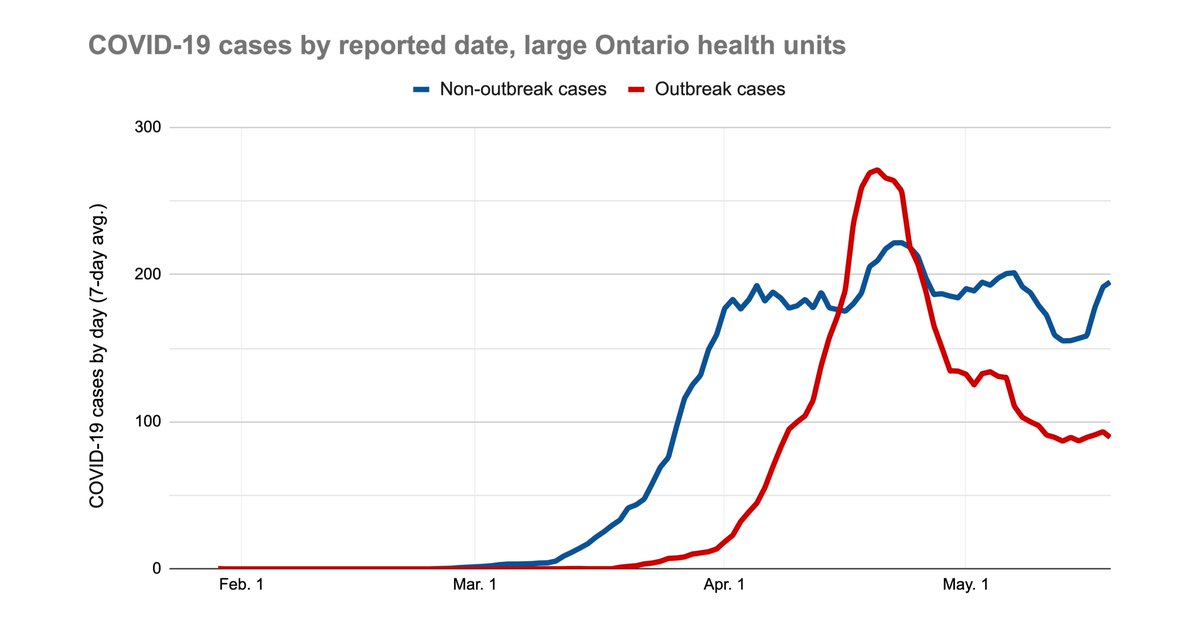
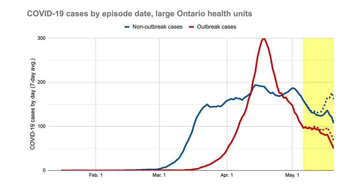
4/ That& #39;s this chart:
Red are cases in institutional outbreaks, mostly the wave of long-term care home cases.
Blue is everything else.
What this means: Seniors home infections have fallen way down in Ontario since mid-April, but not in the broader community.
Red are cases in institutional outbreaks, mostly the wave of long-term care home cases.
Blue is everything else.
What this means: Seniors home infections have fallen way down in Ontario since mid-April, but not in the broader community.

 Read on Twitter


