Just had another masterclass in @ICNARC report interpretation by @ActuaryByDay
As I was reading the report, I noticed a couple of things too
Reports here
https://www.icnarc.org/Our-Audit/Audits/Cmp/Reports
Both">https://www.icnarc.org/Our-Audit... national, and regional network reports available on this page
1/ https://twitter.com/actuarybyday/status/1264109818312372228">https://twitter.com/actuaryby...
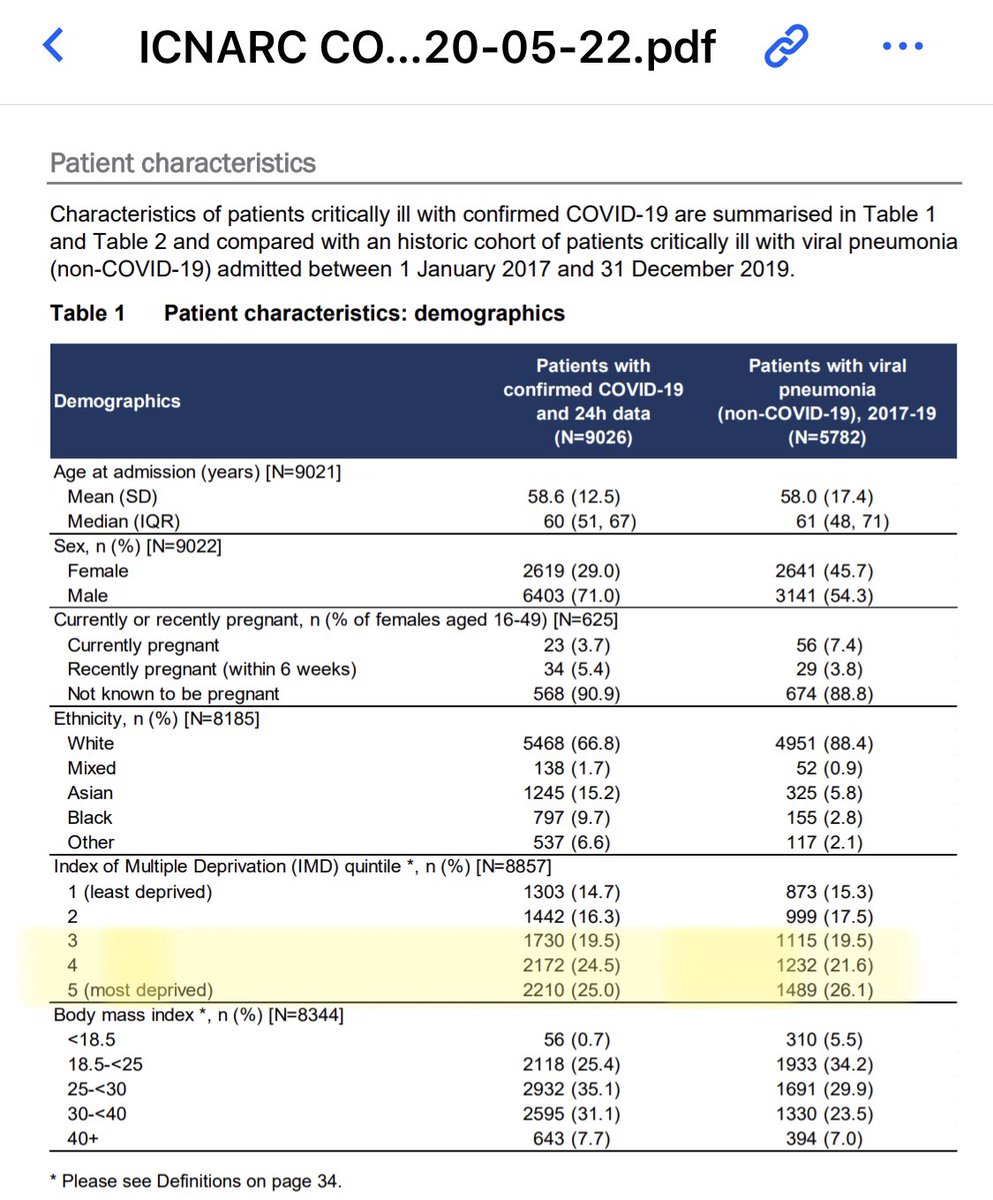
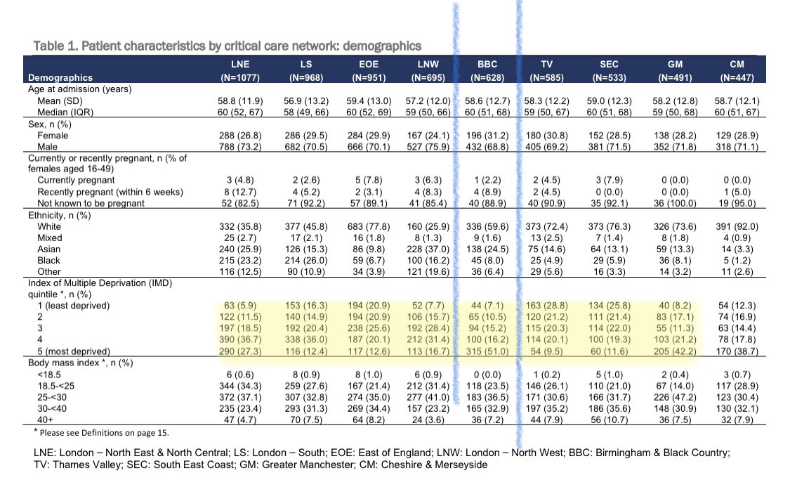
One of the things that’s apparent when you read the report is the distribution of the disease with social deprivation- the bottom 2 quintiles nationally have nearly 50% of ICU patients
@ActuaryByDay has analysed this, and ethnicity in his thread
2/
@ActuaryByDay has analysed this, and ethnicity in his thread
2/
Mortality is definitely coming down.
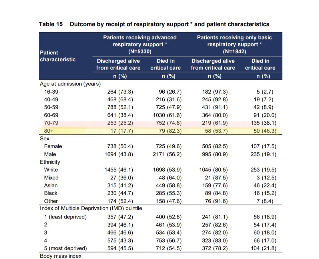
But look at mortality by age
If ventilated, >80s had 80% mortality. >70s not much better
However even <40s has a significant chance of dying if needing ventilation
3/
But look at mortality by age
If ventilated, >80s had 80% mortality. >70s not much better
However even <40s has a significant chance of dying if needing ventilation
3/
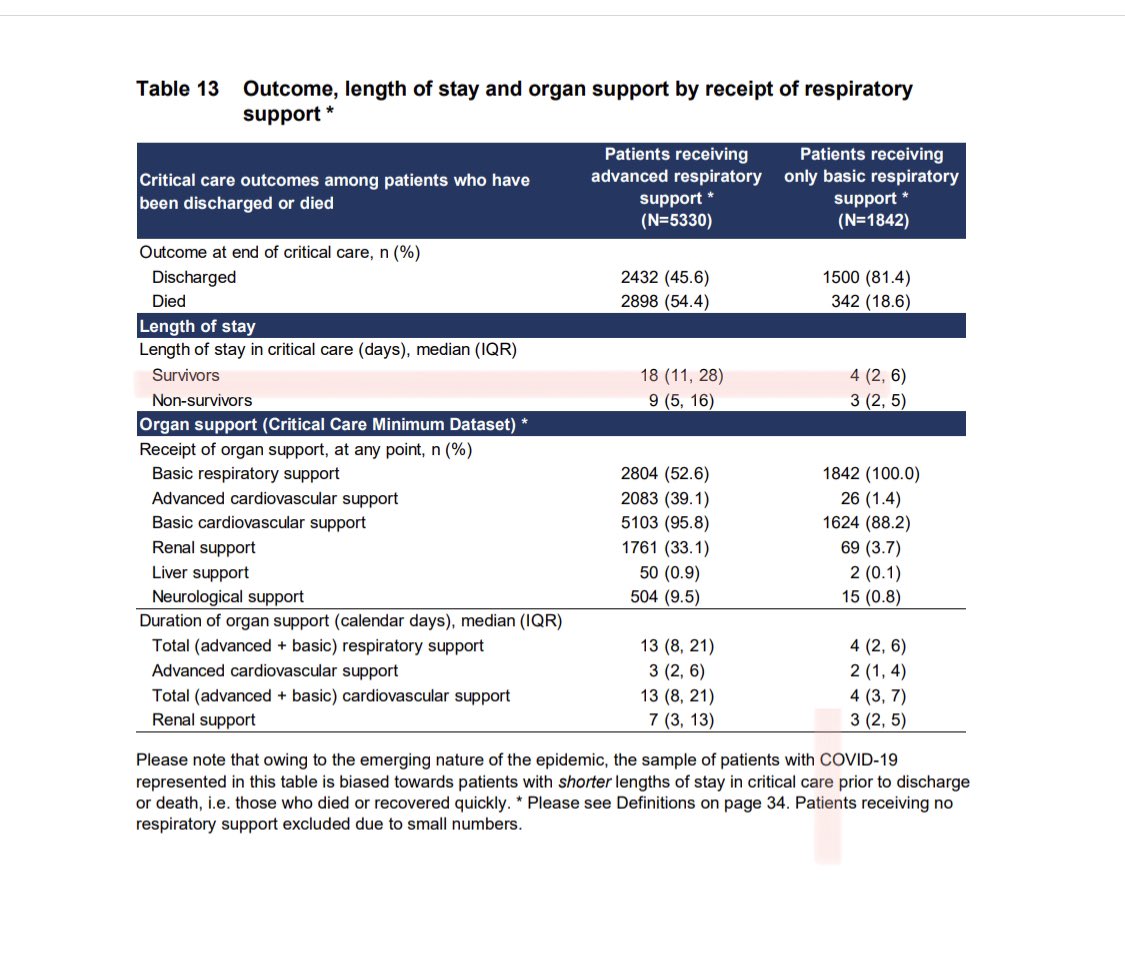
Of course, as we get more survivors, our length of ICU stay keeps increasing
As you can see here, survivors who needed ventilation had a LOS nearly 3x the average before COVID
Thus they’re needing a lot more bed days/resources
4/
As you can see here, survivors who needed ventilation had a LOS nearly 3x the average before COVID
Thus they’re needing a lot more bed days/resources
4/
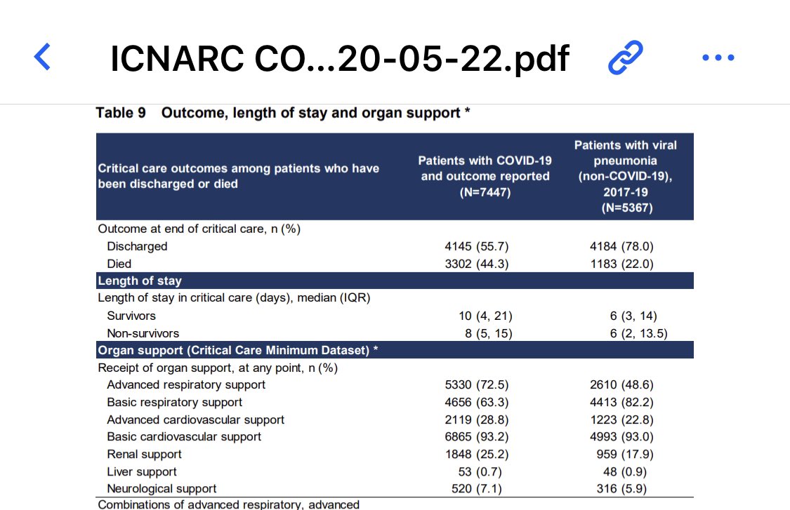
If you needed another organ support, in addition to ventilation, mortality was markedly higher
As you can see in this table
5/
As you can see in this table
5/

 Read on Twitter