A short thread of musings on the fonts used in the 1963 #DoctorWho logo. It’s difficult to be 100% certain because of the distortion introduced by a) videoing a printed caption card, b) mixing that into another video feed to add howlround, then c) telerecording that onto film
1/6
1/6
It’s also possible that Bernard Lodge hand-painted the logo, merely basing it on particular typefaces. Even if he didn’t, the differences between old ‘physical’ typefaces and their modern digitised equivalents adds a whole new layer of difficulty 2/6
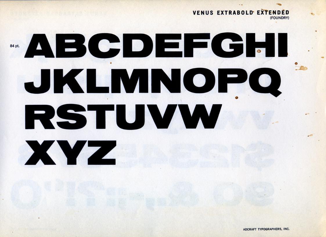
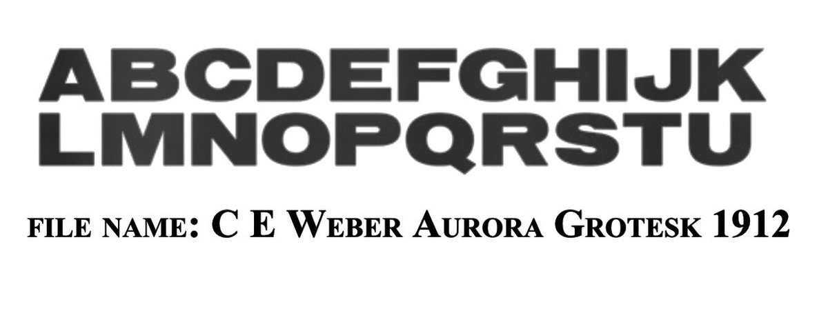
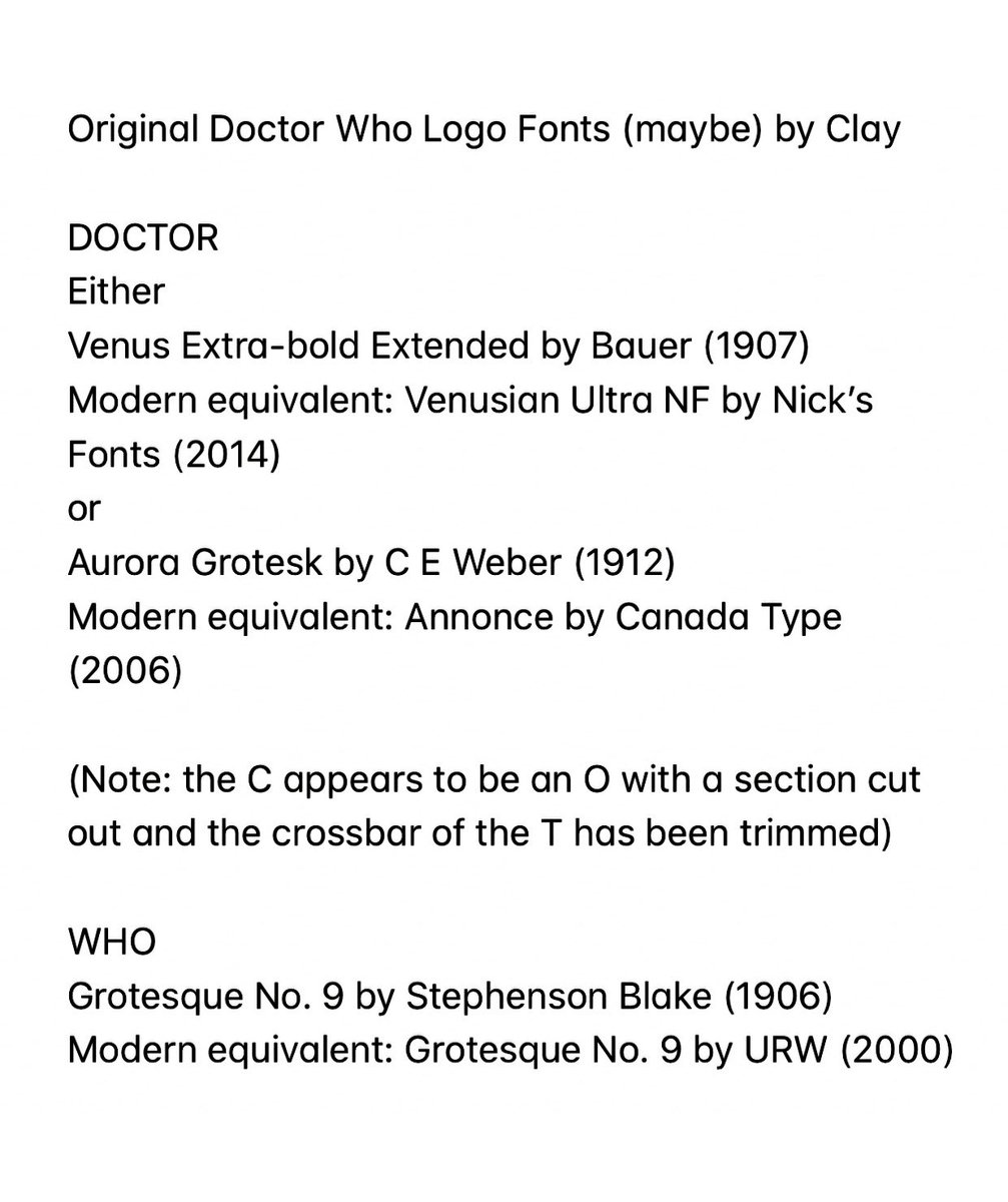
My suspicion is that the DOCTOR line has been slightly distorted vertically, adding height to the letters. If that is the case then that suggests it’s probably (or at least closely based upon) either Venus Extrabold Extended or Aurora Grotesk 3/6
It’s probably Venus, but I *really* want it to be Aurora just for the delicious coincidence that it was designed in 1912 by a man called C.E. Weber! Either way, I suspect the C is actually an O with a bit cut out, and the crossbar of the T has been trimmed down 4/6
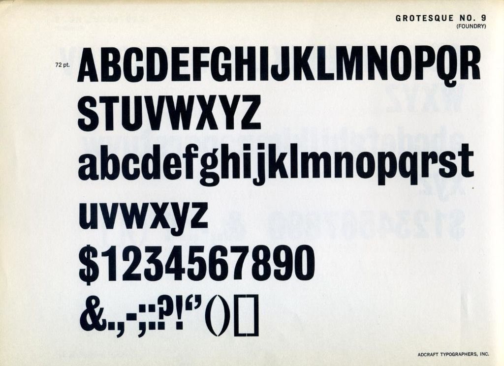
The WHO is a bit easier - it’s almost certainly Grotesque No. 9 by Stephenson Blake (1906), possibly with a thin painted outline added to thicken it up. The asymmetrical W is the giveaway. 5/6
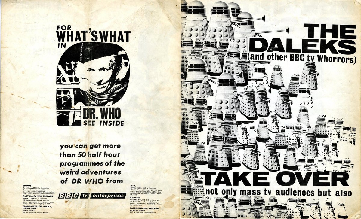
As a final aside, both Grot. 9 & Venus XBE are used extensively on this 1964(?) BBC promo booklet, so they were definitely knocking around the design department Attached is a list of all the fonts I mentioned plus their closest modern equivalent. Hope it wasn’t too boring  https://abs.twimg.com/emoji/v2/... draggable="false" alt="😅" title="Smiling face with open mouth and cold sweat" aria-label="Emoji: Smiling face with open mouth and cold sweat"> 6/6

 Read on Twitter

 6/6" title="As a final aside, both Grot. 9 & Venus XBE are used extensively on this 1964(?) BBC promo booklet, so they were definitely knocking around the design department Attached is a list of all the fonts I mentioned plus their closest modern equivalent. Hope it wasn’t too boring https://abs.twimg.com/emoji/v2/... draggable="false" alt="😅" title="Smiling face with open mouth and cold sweat" aria-label="Emoji: Smiling face with open mouth and cold sweat"> 6/6">
 6/6" title="As a final aside, both Grot. 9 & Venus XBE are used extensively on this 1964(?) BBC promo booklet, so they were definitely knocking around the design department Attached is a list of all the fonts I mentioned plus their closest modern equivalent. Hope it wasn’t too boring https://abs.twimg.com/emoji/v2/... draggable="false" alt="😅" title="Smiling face with open mouth and cold sweat" aria-label="Emoji: Smiling face with open mouth and cold sweat"> 6/6">


