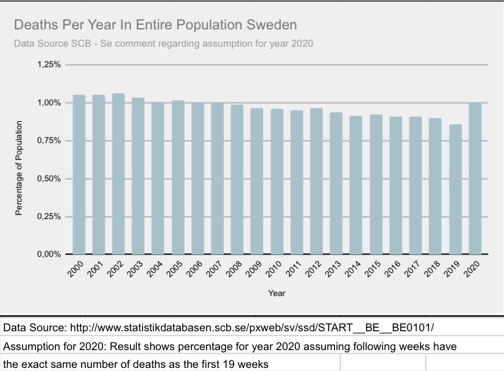
1/7  https://abs.twimg.com/emoji/v2/... draggable="false" alt="🇸🇪" title="Flag of Sweden" aria-label="Emoji: Flag of Sweden">- A few more graphs coming up. This time comparing previous years & the death distribution by age group i.e how many age 0-64 die each year as a percentage of that subgroup. Also making an assumption regarding 2020, that the rest of y2020 will have same amount of deaths...
2/7 ...as the first 19 weeks https://abs.twimg.com/emoji/v2/... draggable="false" alt="🤔" title="Thinking face" aria-label="Emoji: Thinking face"> This is just to get an idea so keep that in mind. Since the data is availiable I though it would be interesting to find out. At any rate, first graph shows deaths as a percentage of the entire population. A steady decline below 1%...
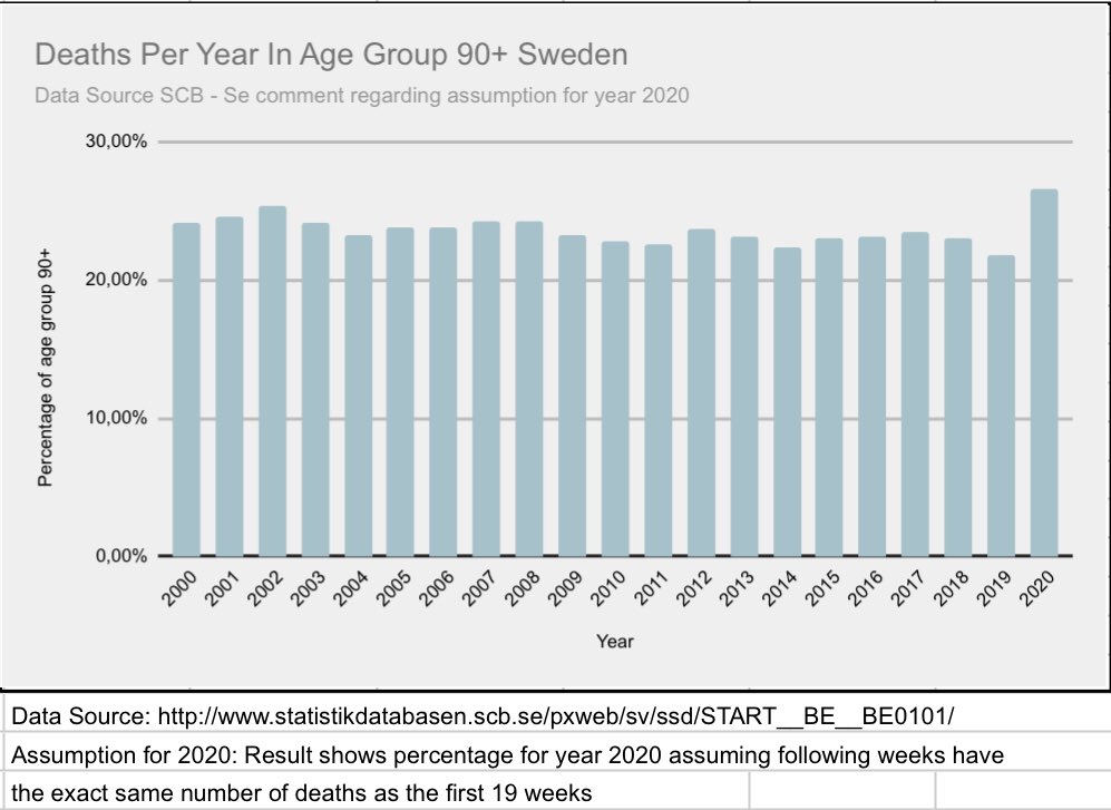
3/7 Second graph shows the age group 90+, here we see a somewhat more steady rate, but also (using assumption) an increase y2020 compared with previous years likely because of #covid19. What about the other age groups?..
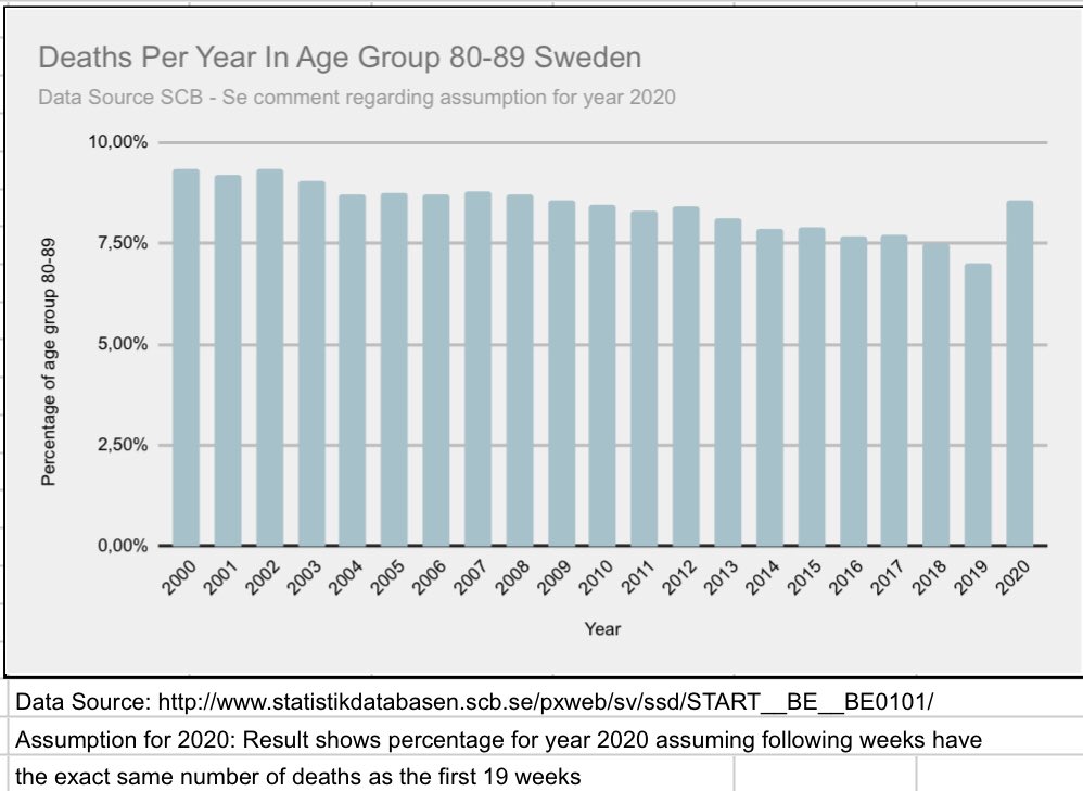
4/7 age group 80-89 is also declining, people are getting older but we see a slight increase y2020 using assumption for y2020 as mentioned above...
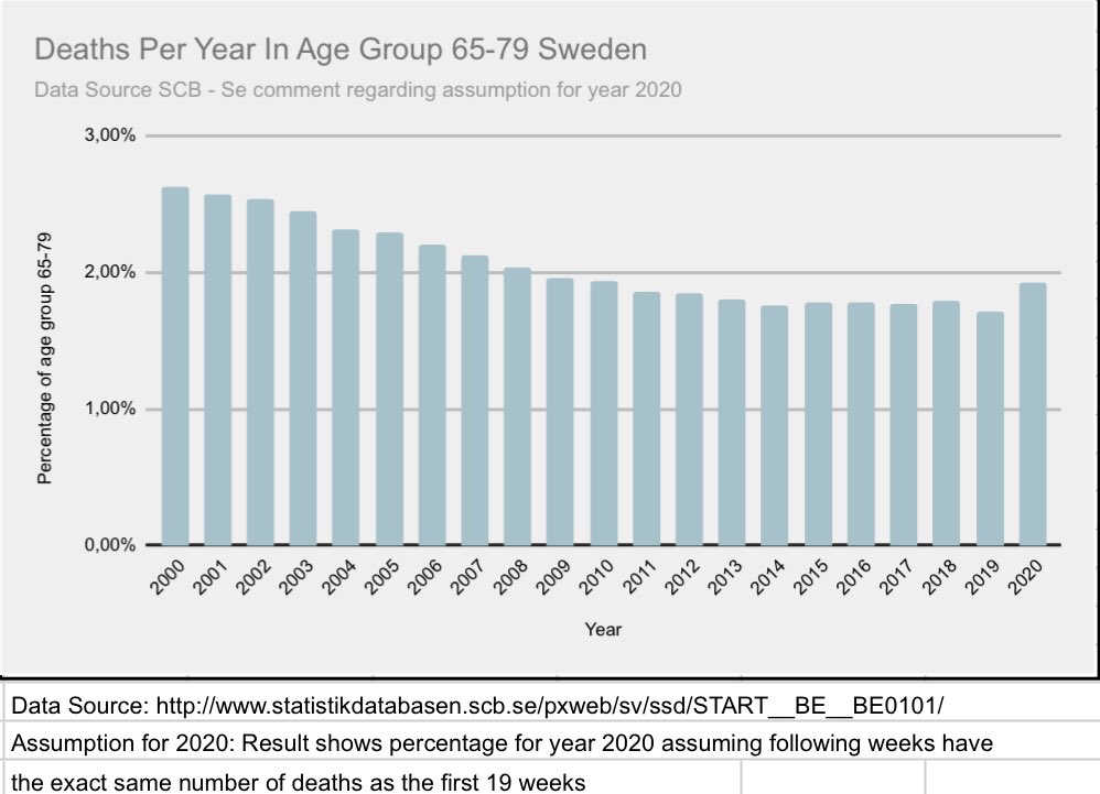
5/7 Further proof of an aging population? With a slight increase 2020 (using assumptions as mentioned above).
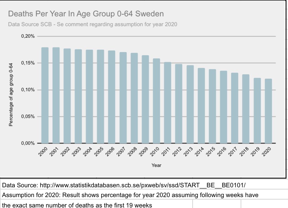
6/7 the largest subgroup however, is actually still declining (using assumptions as mentioned above). Is it fair to say that people are getting older and that it looks to be a fairly normal year for subgroup 0-64? #covid19sweden
7/7 Hope these graphs gave some perspective or perhaps even clarity/END PS, inspiration from @boriquagato  https://abs.twimg.com/emoji/v2/... draggable="false" alt="🙏🏾" title="Folded hands (medium dark skin tone)" aria-label="Emoji: Folded hands (medium dark skin tone)">

 Read on Twitter
 This is just to get an idea so keep that in mind. Since the data is availiable I though it would be interesting to find out. At any rate, first graph shows deaths as a percentage of the entire population. A steady decline below 1%..." title="2/7 ...as the first 19 weekshttps://abs.twimg.com/emoji/v2/... draggable="false" alt="🤔" title="Thinking face" aria-label="Emoji: Thinking face"> This is just to get an idea so keep that in mind. Since the data is availiable I though it would be interesting to find out. At any rate, first graph shows deaths as a percentage of the entire population. A steady decline below 1%..." class="img-responsive" style="max-width:100%;"/>
