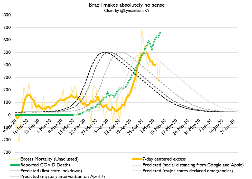
Someone explain Brazil to me. Excess deaths *fell* early in the epidemic, and no metric of any policy or social distancing behaviors predicts the peak in excess deaths now occurring. They had a big excess death spike which began after a MONTH of social distancing.
cc @Comparativist I think Brazil kinda explodes both of our theories about how this all works. Brazil& #39;s state level lockdowns were implemented epidemiologically "early" yet didn& #39;t prevent a major outbreak.... but also nothing else did either.
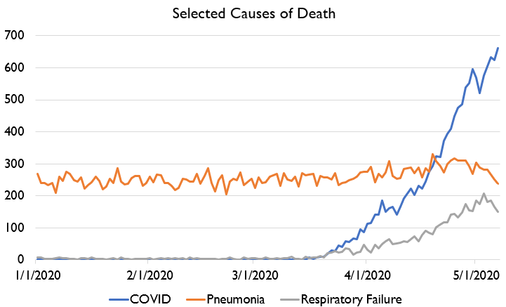
Note that there& #39;s maybe possibly some evidence of COVID over-classification in Brazil. COVID deaths spiking even as pneumonia and respiratory failure deaths drop is... odd. Not impossible! But... odd.
I don& #39;t know if the data I& #39;m using is classifying COVID, pneumonia, and respiratory failure *exclusively* or if there& #39;s overlap between them. I& #39;m also pretty weirded out by the stability of reported pneumonia deaths.
Note as well that I& #39;m dropping the latest week or two of data because it& #39;s clearly incomplete. I don& #39;t have past vintages of this data, so I have no way of knowing if the revisions I& #39;ve made are correct. I& #39;ll collect more of this data in the future and hopefully get a better idea
Lots of folks responding "favelas are hard to control."
And yet, empirically, Brazil did much better than e.g. the US in terms of excess deaths in March and early April!
And yet, empirically, Brazil did much better than e.g. the US in terms of excess deaths in March and early April!
And meanwhile, excess deaths now appear to be in decline! They ARE controlling it!
The weird thing is that the entire epidemic course occurred post-social-distancing!
The weird thing is that the entire epidemic course occurred post-social-distancing!
Okay.
At some point in the next few hours, we SHOULD get updated US all-cause mortality data.
Until then, let& #39;s review other data! We& #39;ll start with excess deaths in other countries.
At some point in the next few hours, we SHOULD get updated US all-cause mortality data.
Until then, let& #39;s review other data! We& #39;ll start with excess deaths in other countries.
First of all, here& #39;s the Big Messy Line Graph of epidemics in countries with good excess mortality data. I really want Italy to publish data for all of April.
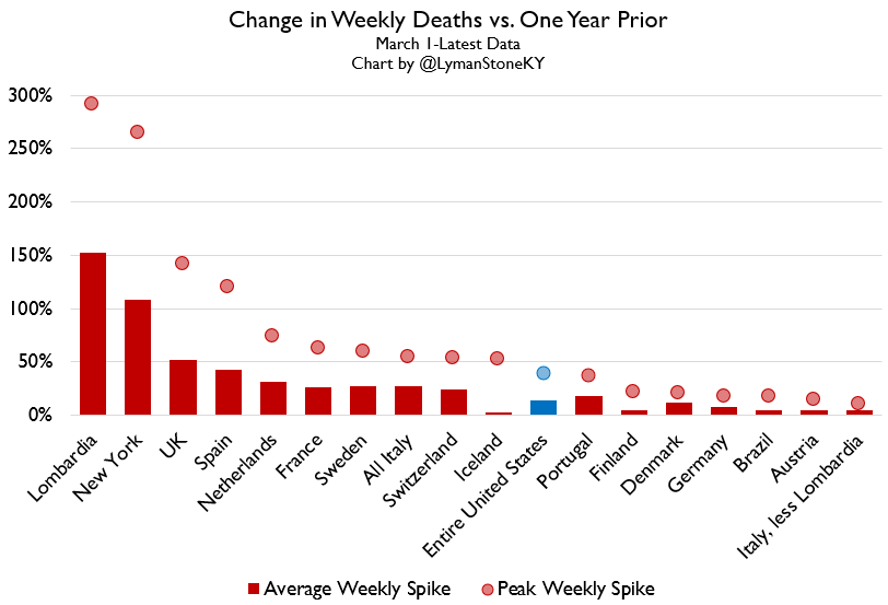
And here& #39;s a summary of that data, peaks & averages.
Note that the US and Brazil look quite good compared to a lot of the European countries.
Note that the US and Brazil look quite good compared to a lot of the European countries.
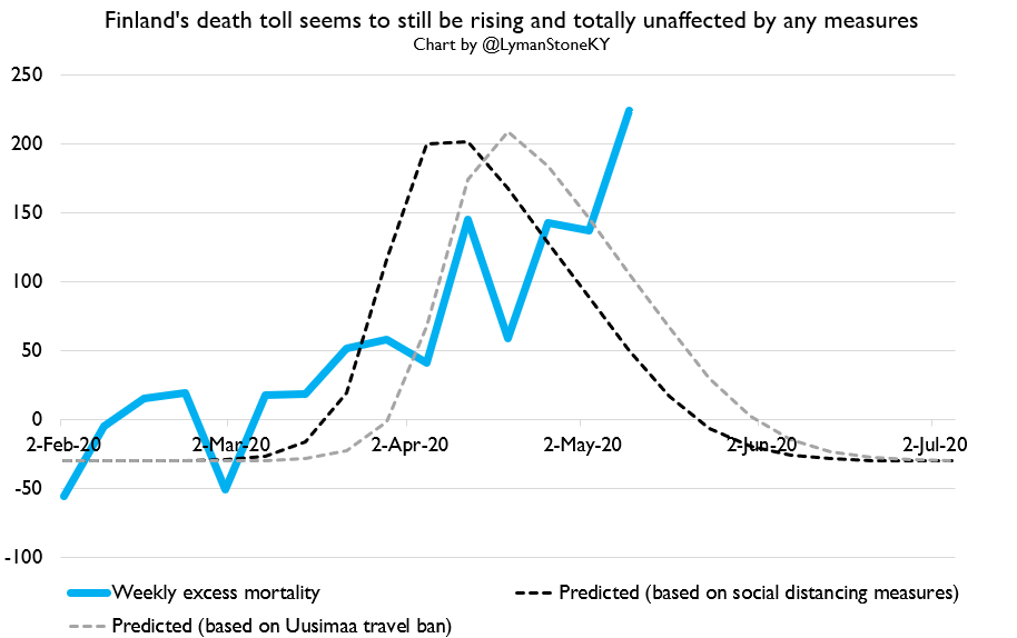
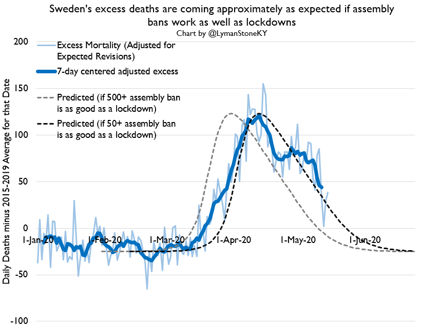
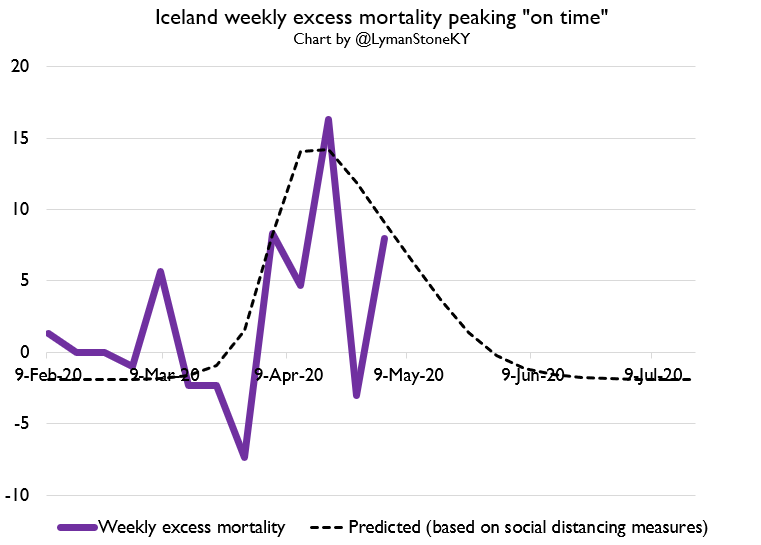
Now we can turn to specific countries. We& #39;ll start with Scandis which did not impose widespread lockdown: Iceland, Sweden, and Finland. Of those, Finland seems most at risk of spiraling out of control.
Note that Sweden& #39;s performance is not great, but they& #39;re following more-or-less the trajectory you& #39;d expect if they had imposed a lockdown on the date they restricted a 50-person assembly limit.
Iceland is very noisy but appears to be on a normal path. Finland is really the odd man out here. I& #39;m keeping my eye on it. My revision adjustments might be messed up as well.
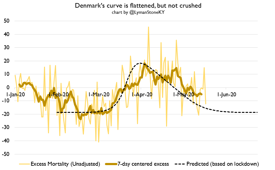
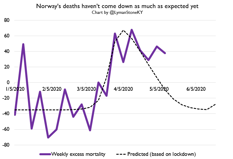
Then we have lockdown Nordics: Norway and Denmark. Their mortality paths are interesting. Neither of them are experiencing as aggressive a downslope in excess mortality as one would expect.
It& #39;s possible what we& #39;re seeing here is the dark side of "flattening the curve": the curve extends.
Now, this data is quite provisional, and I should emphasize the total number of excess deaths per population in Norway and Denmark is a LOT lower than in e.g. Sweden.
Now, this data is quite provisional, and I should emphasize the total number of excess deaths per population in Norway and Denmark is a LOT lower than in e.g. Sweden.
But the Nordic lockdowns do NOT appear to have crushed their curves.
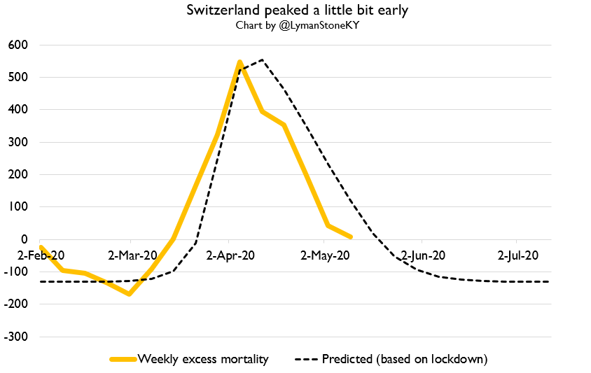
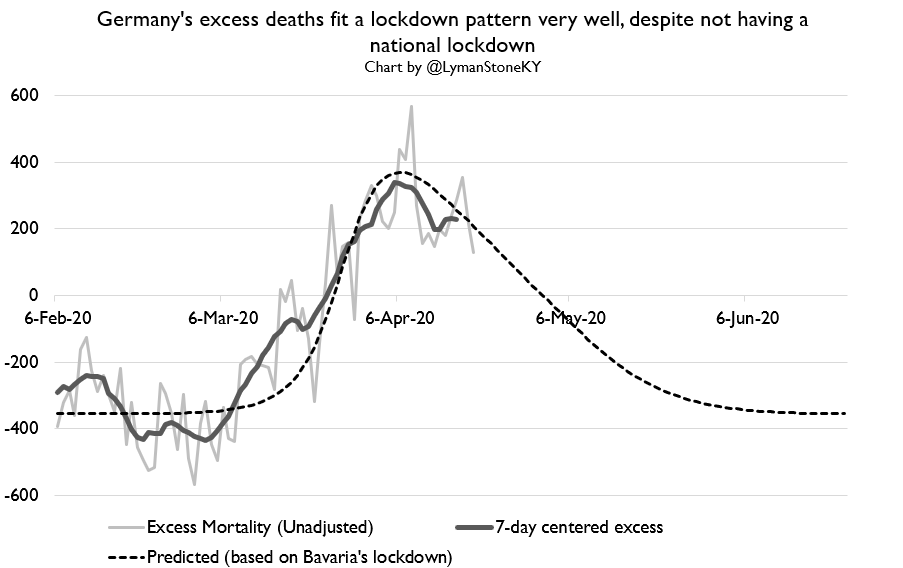
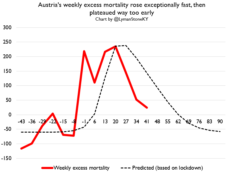
Then we have central Europe. Germany has a lockdown-ish curve even though they didn& #39;t have a country-wide lockdown, while Austria and Switzerland both saw death peaks "too early" for the lockdowns to fully explain the trend.
By the way, the graphs that are chunkier with less variability are for countries where I have only weekly mortality data, while the graphs with the daily/average lines are countries with daily data.
Also I& #39;ve said this like a million times but I will explain again: I calibrate the predicted curve height to the observed height of excess mortality, the curve is ONLY there to show is if the relative SHAPE of the curve is consistent with effective suppression, not the height.
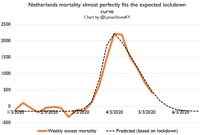
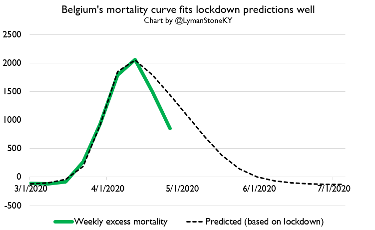
Turning west, we have 3 countries where the "effective lockdown" hypothesis fits INCREDIBLY well: the UK, Belgium, and the Netherlands. In all three, curve shapes are precisely what we& #39;d expect if lockdowns work.
Why does the lockdown model fit those countries well and not other countries? I dunno! But it does!
(also, note that Belgium and the UK are unadjusted for revisions, as I have no useful revision history data for them)
(also, note that Belgium and the UK are unadjusted for revisions, as I have no useful revision history data for them)
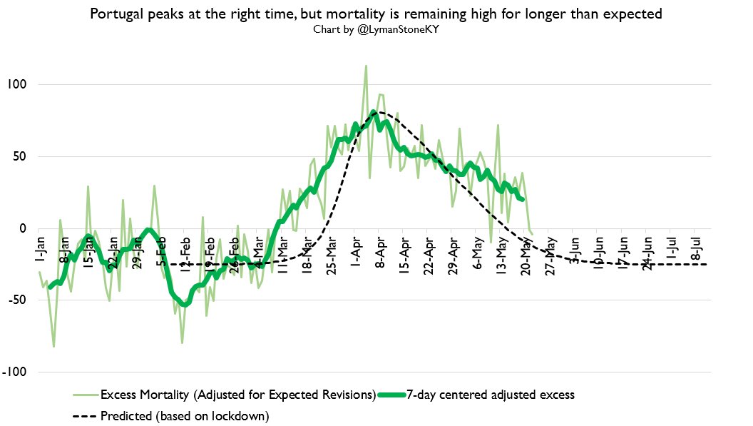
Then we turn to southern Europe. France, Spain, Italy, and Portugal were all hit significantly, and all imposed lockdowns. None have had as tidy a fit to the model as UK/Bel/NED.
Spain, France, and Italy all had peaks which came "too early." In Spain, excess deaths are remaining elevated above pre-COVID trends for the year. Same in Portugal.
And I REALLY want updated daily Italian data!!
And I REALLY want updated daily Italian data!!
Then, I& #39;ll post Brazil here again, though it& #39;s at the top of the thread too. Very hard to say what& #39;s going on with Brazil. Timing of the epidemic rise, peak, and fall are all wrong vs. policy variables, and excess deaths are reliably BELOW COVID deaths, which is rare.
When we get updated US all-cause data, I& #39;ll do some US state mortality graphs.
In the meantime let& #39;s get updated on some social distancing trends!
How are we doing on the avoiding-other-people front?
Well.... it depends.
How are we doing on the avoiding-other-people front?
Well.... it depends.
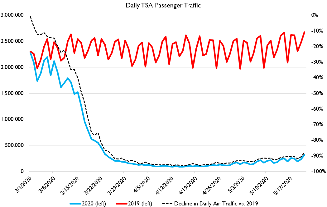
Air travel in the US is still waaaaaaay down. Ruth and I are coming back this summer and yeah, no kidding.
Note that US air traffic was already running below trend on March 1, and a LOT below trend by March 15, before there was practically ANY serious lockdown effort in the US. Social distancing on a large scale PREDATES lockdowns.
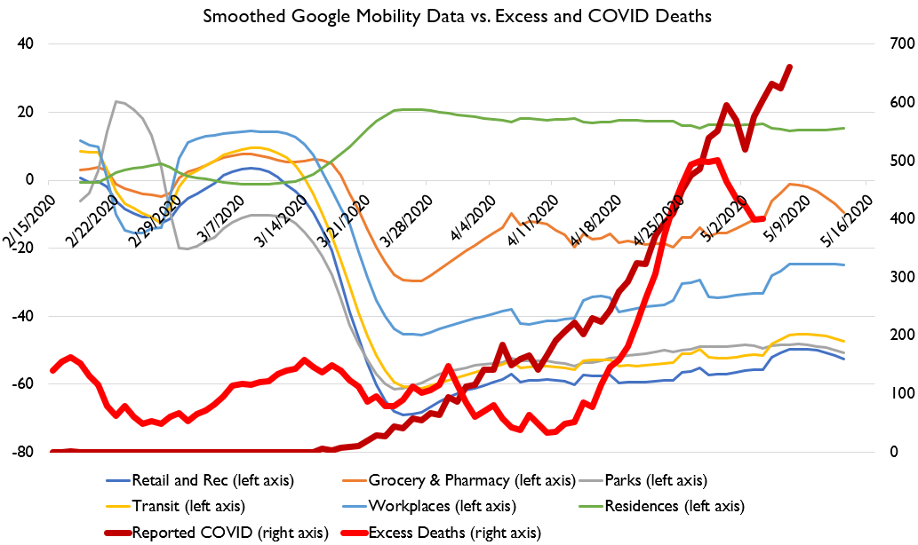
And here we can use an weighted and smoothed index of Google Community Mobility data to compare different places social distancing behaviors.
Here what I want to point out is that the UK has done more social distancing than any other place in this sample. And also had one of the worst outbreaks.
This doesn& #39;t mean distancing doesn& #39;t work, however. Note that the UK& #39;s distancing is *later* than elsewhere.
This doesn& #39;t mean distancing doesn& #39;t work, however. Note that the UK& #39;s distancing is *later* than elsewhere.
MEanwhile, distancing in Denmark was actually LESS extensive than in most US states. Danes have distanced about as much as non-locked-down US states. A Danish lockdown is a "light touch" US policy.
And yet Denmark has had very low deaths!
Because their distancing was EARLY.
And yet Denmark has had very low deaths!
Because their distancing was EARLY.
Across all US states, social distancing is wearing off. But in the last week or so, return to normal has slowed down in a lot of the less-distancing states. It may be that US states end up looking like Hong kong and Korea: long term 5-25% activity declines.
But again, it is NOT the intensity of social distancing that is well-correlated with epidemic outcomes.
It& #39;s the *timing*. Acting early saves lives and also saves businesses by reducing the necessary intensity and duration of activity reductions.
It& #39;s the *timing*. Acting early saves lives and also saves businesses by reducing the necessary intensity and duration of activity reductions.
This is something to keep in mind, a huge lesson to learn for the future.
It& #39;s not about imposing the harshest policies.
It& #39;s about implementing reasonable policies at the very earliest warning signs.
It& #39;s not about imposing the harshest policies.
It& #39;s about implementing reasonable policies at the very earliest warning signs.
In other words.
A little bit of paranoia is just good sense.
A little bit of paranoia is just good sense.
Have to pause for a bit while Ruth forces me to do a Sworkit because apparently I& #39;ve "been sitting there all day and you& #39;re gonna die before you walk Suzie down the aisle and that& #39;ll be SO inconvenient"
All right folks, I& #39;m back, and CDC& #39;s mortality update has been released!
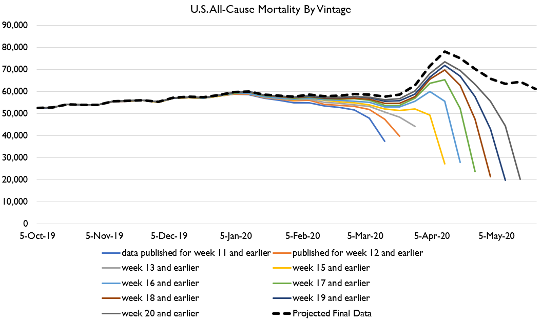
Here& #39;s U.S. all-cause mortality.
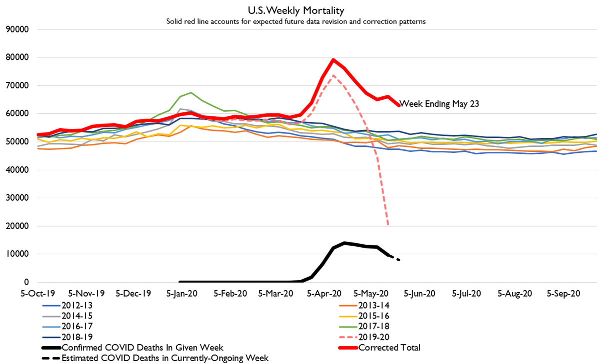
Bad news folks. My expectations for the latest weeks were a bit too optimistic.
Here& #39;s U.S. all-cause mortality.
Bad news folks. My expectations for the latest weeks were a bit too optimistic.
Here it is compared to recent years. For the last two weeks I& #39;ve been forecasting a return to normal mortality by June. That no longer appears to be the most likely scenario, although it remains a possibility.
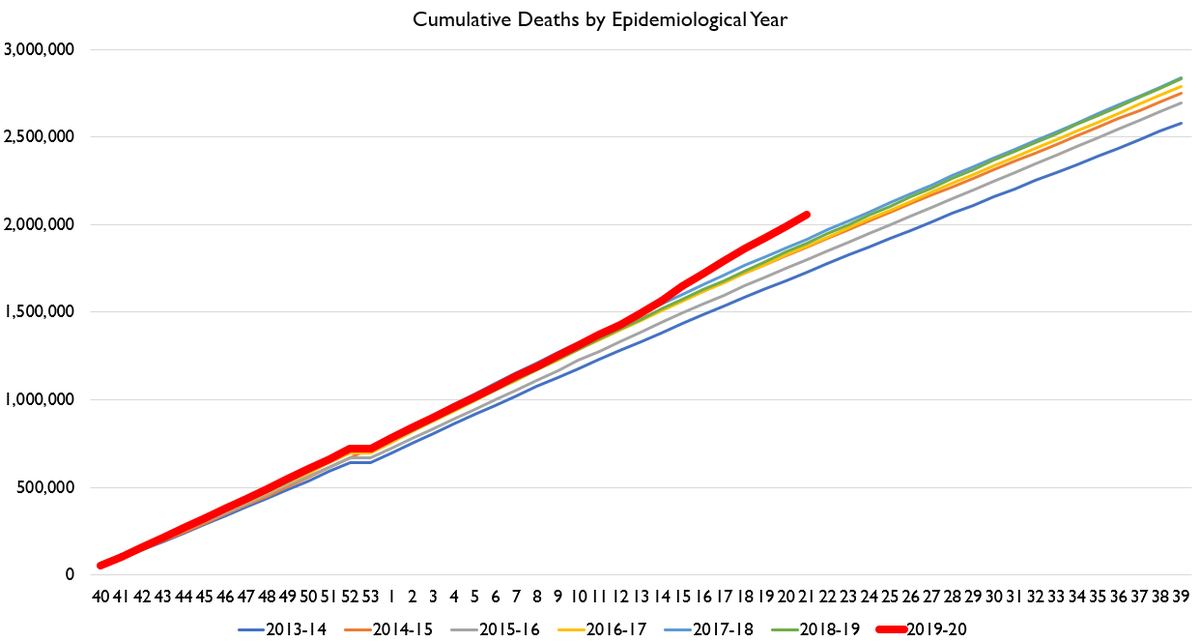
Here& #39;s cumulative deaths and cumulative excess deaths. That& #39;s a lot of deaths. When it& #39;s all said and done, nobody& #39;s gonna be figuring US deaths from COVID at under 100k. And we may already be spittin& #39; distance from 200k, depending on your baseline.
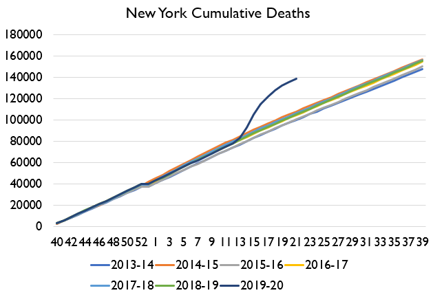
Here& #39;s New York excess mortality. NY looks to be returning to trend death rates.
Also notice that for all that, yes, COVID reporting has a time delay... it was a pretty decent estimate of the shape and scale of excess mortality! It undershot and was a bit late, but close!
Also notice that for all that, yes, COVID reporting has a time delay... it was a pretty decent estimate of the shape and scale of excess mortality! It undershot and was a bit late, but close!
Here& #39;s Washington state. Even modestly-sized outbreaks show up in excess deaths!
One thing I& #39;m very interested in is illuminating to people that there really isn& #39;t any evidence that "the cure is worse than the disease." i.e. I don& #39;t buy that there are a lot of lockdown deaths.
Here& #39;s Nebraska: no lockdown, modest COVID outbreak, still has excess deaths!
Here& #39;s Nebraska: no lockdown, modest COVID outbreak, still has excess deaths!
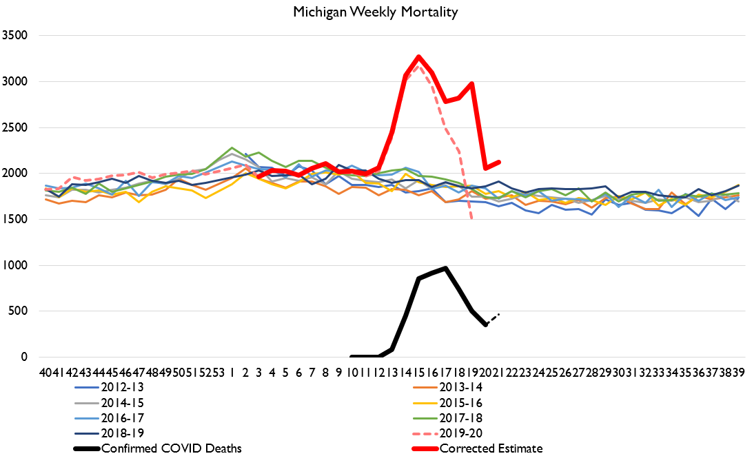
Michigan& #39;s death totals are pretty weird lookin& #39;. I think Michigan& #39;s revision pattern may be unusually irregular, and that may be driving some of the large estimate.
We can also look at a case of a state with a lockdown but not a big COVID outbreak. ANd to steelman it: a state that& #39;s fairly chilly, and close to NY/Boston: Maine!
No excess deaths! So lockdowns don& #39;t cause death spikes.
No excess deaths! So lockdowns don& #39;t cause death spikes.
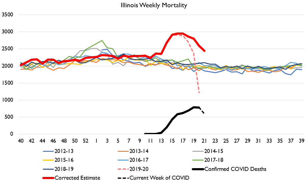
I know there& #39;s interest in whether Illinois is turning into a hot spot. Here& #39;s excess deaths in IL. It got pretty bad for a bit but seems to be getting better now.
Lots of people jumping to interpret the excess deaths two different ways:
1. "There are tons of non-COVID deaths! The cure is worse than the disease!"
2. "Excess deaths are so high, we must be undercounting COVID deaths!"
Either of these could be true in theory.
1. "There are tons of non-COVID deaths! The cure is worse than the disease!"
2. "Excess deaths are so high, we must be undercounting COVID deaths!"
Either of these could be true in theory.
However, as I& #39;ve shown, excess deaths are spatially and temporally correlated with COVID deaths, not with e.g. policy responses like lockdowns. So it is most likely that we are UNDERCOUNTING COVID DEATHS, not that there& #39;s some other cause of death spiking.
However, the extent of undercount and the scale of change in other causes of death will vary across different places and times, so there& #39;s no point in trying to say in a general sense what share of COVID deaths are/are not being counted.
Rather, confirmed COVID deaths are one way to guess at the real-world impact of an epidemic. Excess deaths are another way to guess at that impact. We don& #39;t have access to the pure, objective truth of the matter. We never will. That& #39;s life. All data collection has limitations.
The desire for perfect understanding is a cognitive weakness and should be discarded as soon as possible. The world is full of mysteries, many of them dangerous and terrible.
No, even the state numbers are useless. Give up hope. You will never know "true" deaths. Epidemics are in the eye of the beholder; "what counts" as a death in an epidemic is a social choice, not an empirical fact. There& #39;s no underlying reality there. https://twitter.com/VictorB123/status/1263877974127898625">https://twitter.com/VictorB12...
Anyways.
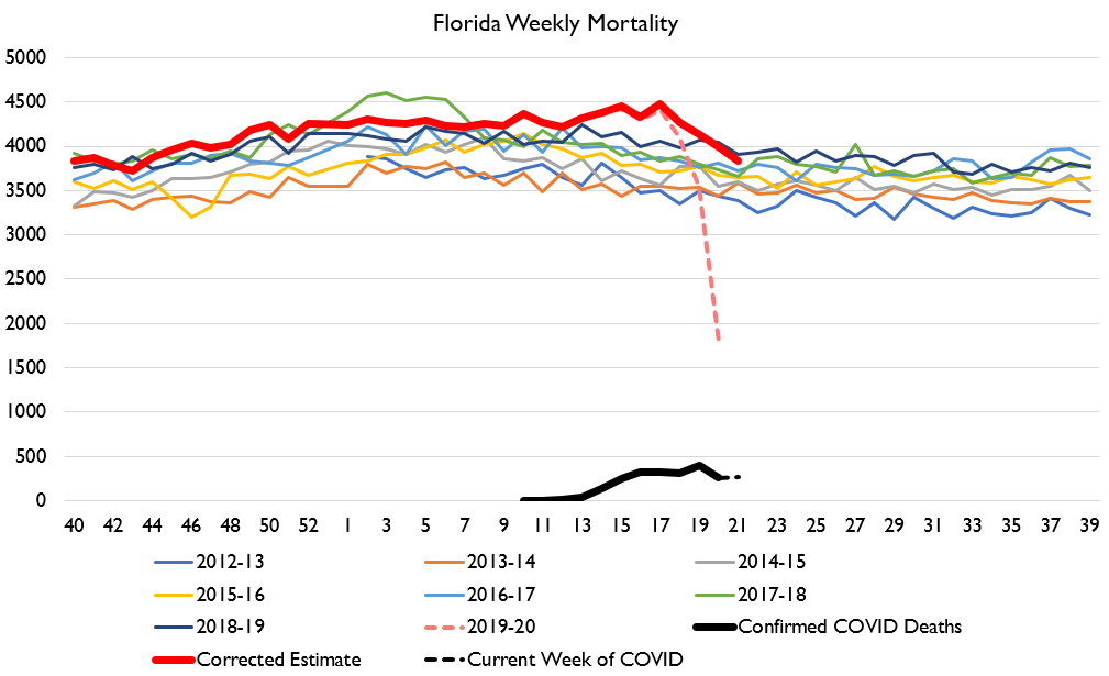
Florida is of interest. Did the beaches kill everyone? Is DeSantis a murderer? What is Florida man up to? Are they reopening too fast and hiding data?
Florida has been unfairly maligned and is doing JUST FINE.
Florida is of interest. Did the beaches kill everyone? Is DeSantis a murderer? What is Florida man up to? Are they reopening too fast and hiding data?
Florida has been unfairly maligned and is doing JUST FINE.
Florida had a modestly sized outbreak and thus a modest death spike. For the last two weeks deaths have been back at normal levels. We& #39;ll see what the future holds of course, and that doesn& #39;t mean they should get cocky.... but Apocalypse Florida isn& #39;t happening.
Georgia looks worse. Deaths in Georgia haven& #39;t returned to normal yet and they& #39;re already reopening.
But "looks worse" still isn& #39;t "as bad as New York and Massachusetts."
But "looks worse" still isn& #39;t "as bad as New York and Massachusetts."
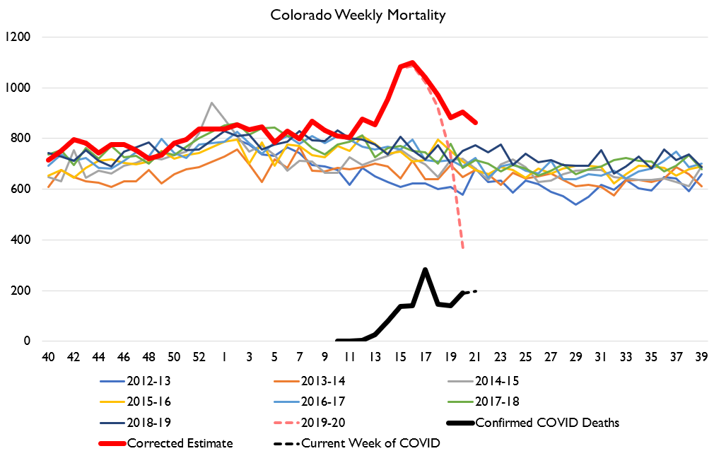
I& #39;ll end with Colorado, where death counts still seem to be accelerating in terms of COVID confirms, and excess deaths don& #39;t seem to be rapidly converging. Not a great situation!
Okay, it& #39;s way past my bedtime here in HK. I don& #39;t plan to do much/any work Sat/Sun, maybe even Monday... so if you send me any rude @ s don& #39;t worry you have a couple days to repent of your sins and even go to church and get absolution on Sunday. Highly recommend that last item!
Oh, also, 5 demands not one less, down with communism, Xi Jinping looks like Winnie the Pooh, etc, etc

 Read on Twitter