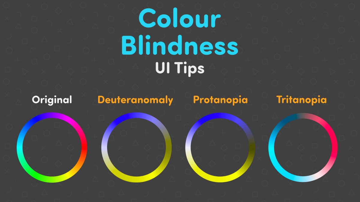
Missed out on the last one, so for this year’s #GAAD I wanted to highlight colourblindness and how to better tailor game UI for it with a couple of tips, tricks and examples #gamedev #ui
Thread (1/4)
Thread (1/4)
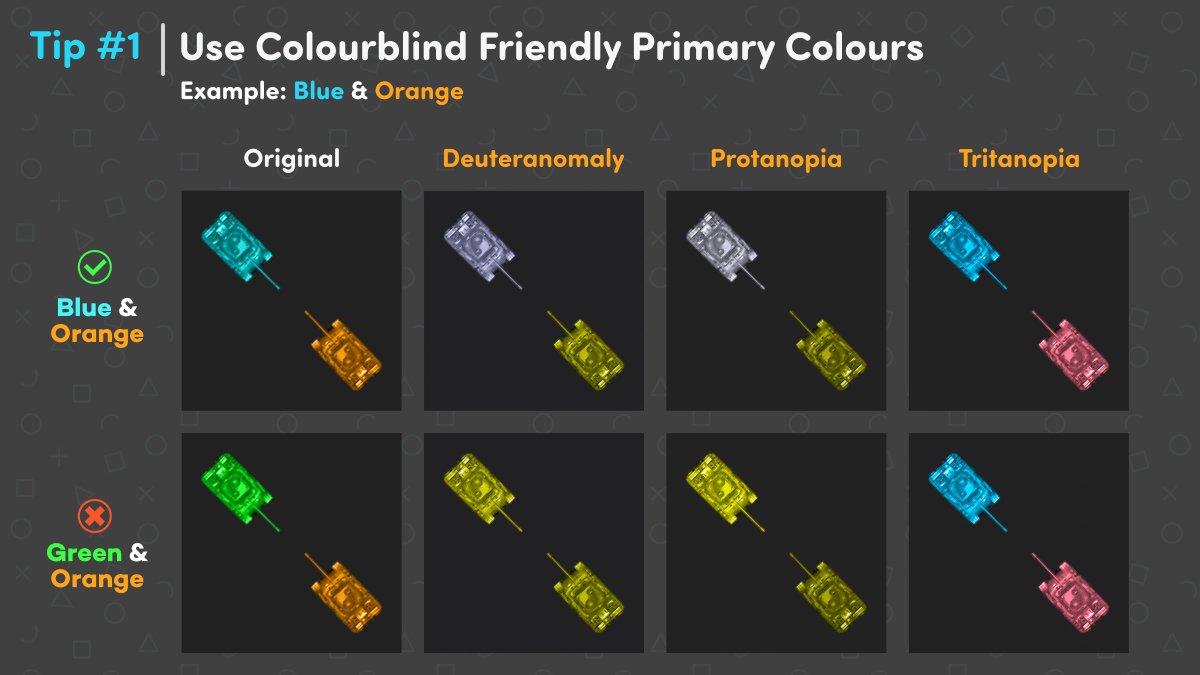
When displaying two opposing teams and only colours can be used to tell them apart, aim for ones that sit opposite one another on the colour spectrum. Orange and blue being the two most distinguishable options when accommodating for the most common colourblindness types.
(2/4)
(2/4)
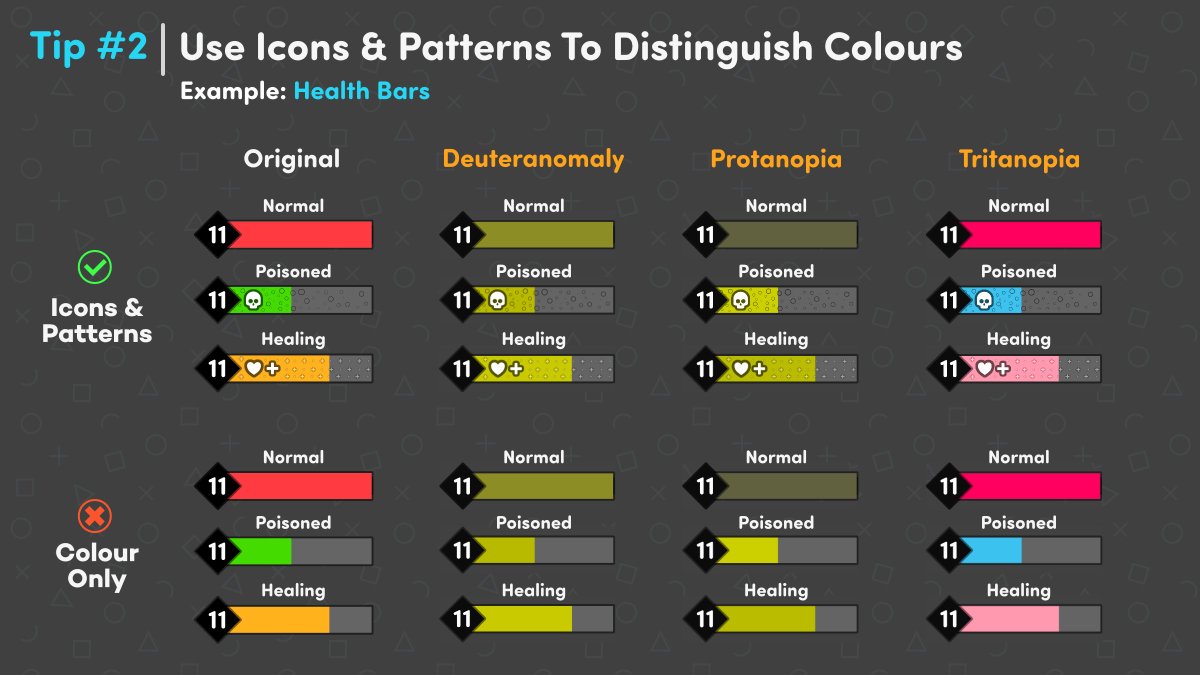
When working with a variety of different colour states for similar elements it’s worth considering using icons and/or patterns as a way of indicating what each state mean.
Can have the added effect of strengthen the intent for non-colourblind users too; win-win.
(3/4)
Can have the added effect of strengthen the intent for non-colourblind users too; win-win.
(3/4)

 Read on Twitter


