NEW: Tonight the @CareQualityComm has published new analysis of the covid-19 crisis in care.
You can read the full report below, but there are some important insights on the way #covid19 has affected the sector. 1/6
https://www.cqc.org.uk/sites/default/files/20200501%20COVID%20IV%20update%20number%201%20ACCESSIBLE.pdf">https://www.cqc.org.uk/sites/def...
You can read the full report below, but there are some important insights on the way #covid19 has affected the sector. 1/6
https://www.cqc.org.uk/sites/default/files/20200501%20COVID%20IV%20update%20number%201%20ACCESSIBLE.pdf">https://www.cqc.org.uk/sites/def...
Firstly, look at how there is no rhyme or reason to the way the virus has spread in care homes.
There is some evidence of regional clustering, but this map shows councils have experienced totally different levels of outbreaks. Care homes don& #39;t behave like general population 2/6
There is some evidence of regional clustering, but this map shows councils have experienced totally different levels of outbreaks. Care homes don& #39;t behave like general population 2/6
Again, this graph shows the regional variation too. The North East, North West and London have been especially badly hit.
The South West has been spared the worst of the crisis in care - half the number of outbreaks of the North East. 3/6
The South West has been spared the worst of the crisis in care - half the number of outbreaks of the North East. 3/6
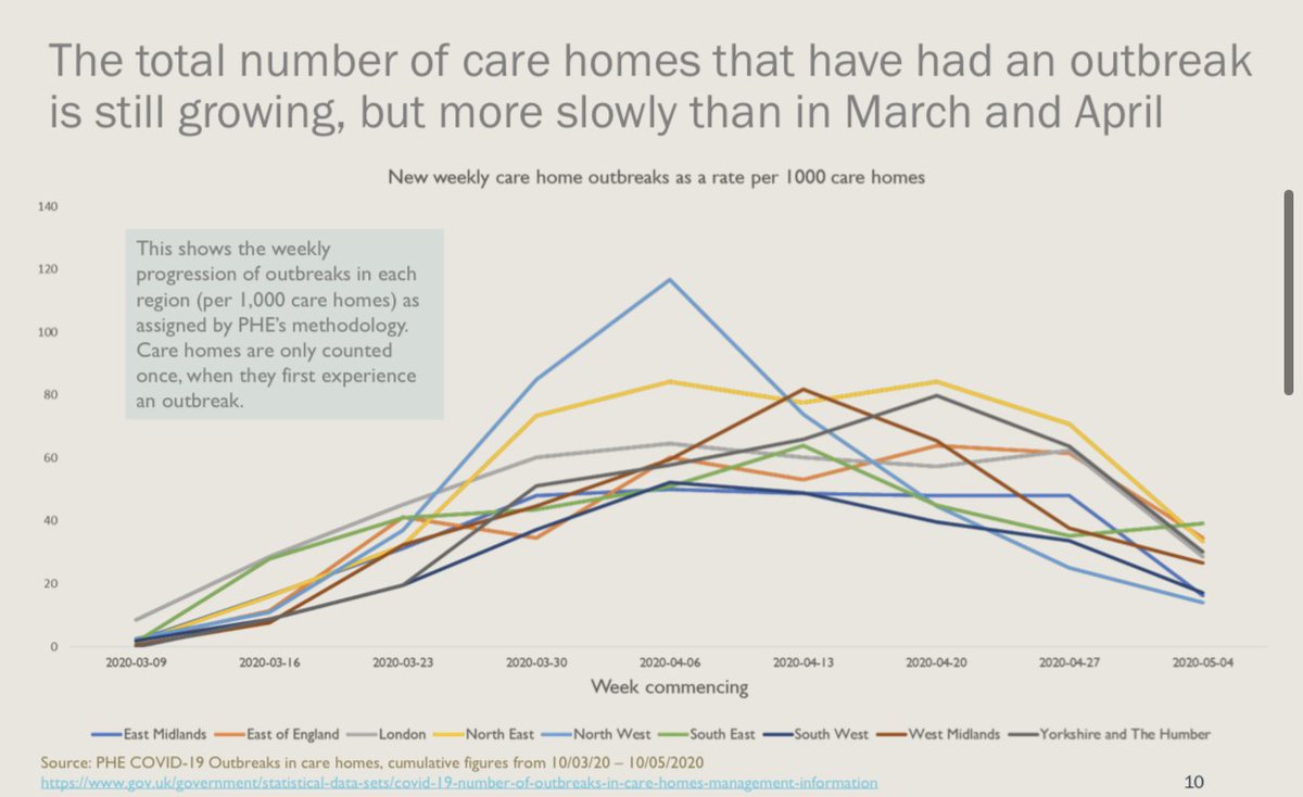
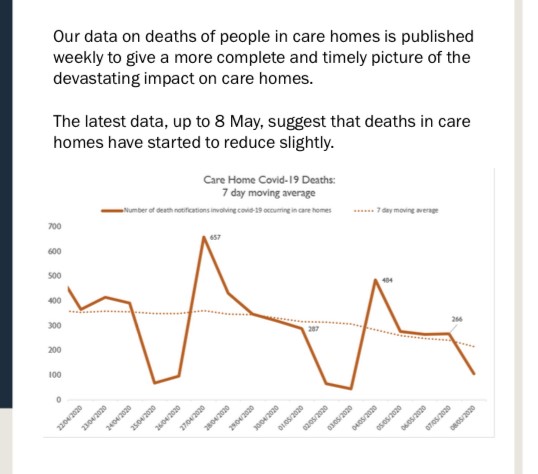
These graphs presents some good news.
The number of care homes reporting an outbreak of #covid19 is still growing, but at a much slower rate now.
New deaths reported are also declining in care. 4/6
The number of care homes reporting an outbreak of #covid19 is still growing, but at a much slower rate now.
New deaths reported are also declining in care. 4/6
Worryingly, PPE remains a persistent problem.
28% of domiciliary care providers in London and the North West will run out of PPE within a week if new supplies don& #39;t arrive. 5/6
28% of domiciliary care providers in London and the North West will run out of PPE within a week if new supplies don& #39;t arrive. 5/6

 Read on Twitter


