Have you ever asked yourself "how did research get done before LateX?!"
Oh boy do I have the thread for you… (1/?)
Oh boy do I have the thread for you… (1/?)
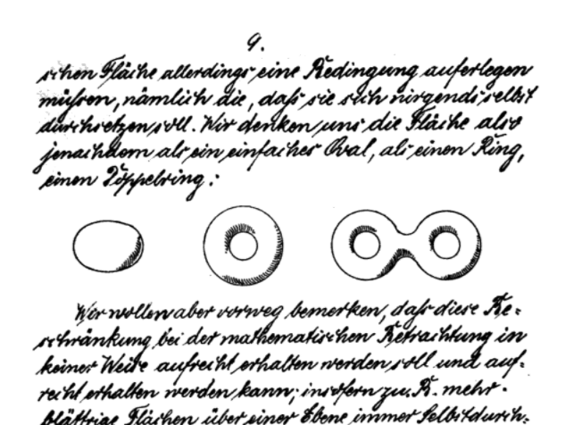
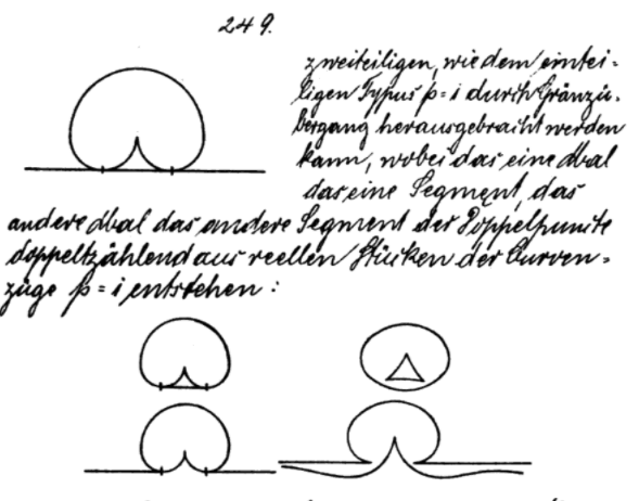
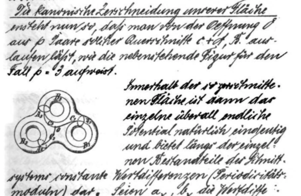
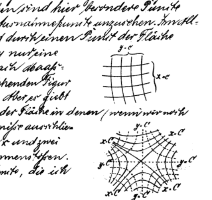
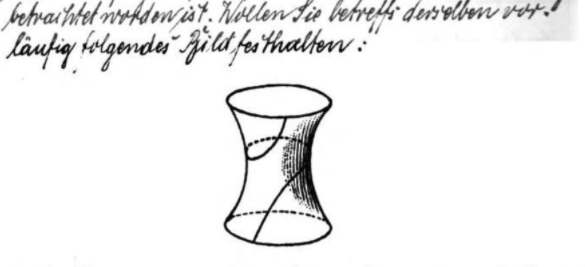
These are scans of Felix Klein’s “Riemann Surfaces” (1891/92), more than 450 years after the Gutenberg printing press was invented.
The more I dig in this rabbit hole, the more I find the prevalence (and beauty) of hand drawing and art in western science communication.
The more I dig in this rabbit hole, the more I find the prevalence (and beauty) of hand drawing and art in western science communication.
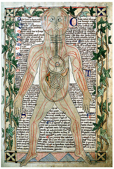
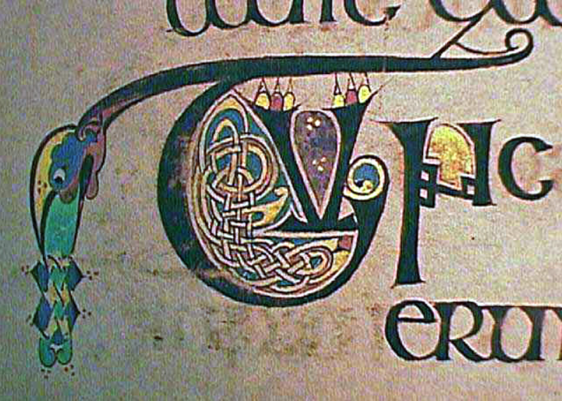
Of course, before the printing press, books simply had to be transcribed (and illustrated) by hand.
Fig: Ashmole Manuscript, 13th century.
Fig: Ashmole Manuscript, 13th century.
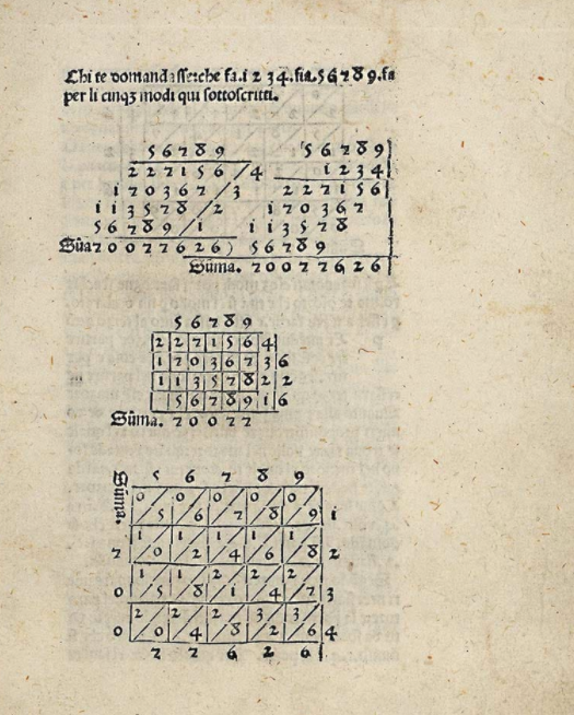
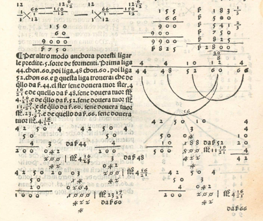
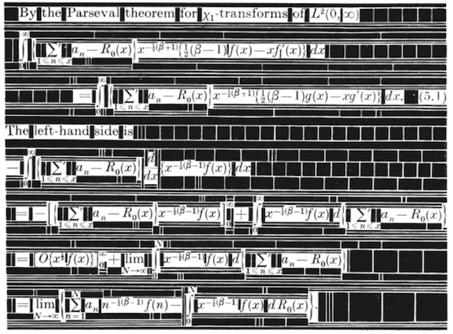
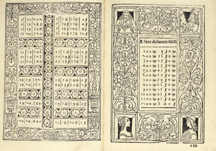
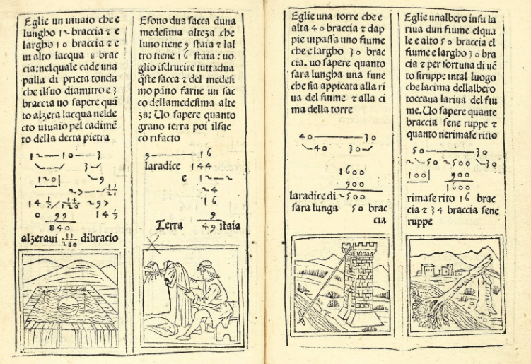
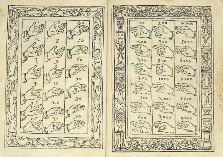
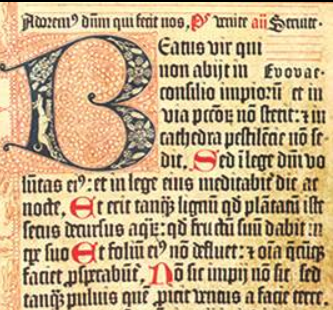
Treviso Arithmetic (1478, left) was the first printed math book. Only 500 copied were made and only 2 survived time. Aritmetica mercantile (1484, right) was typeset in a similar fashion.
These texts look visually much simpler, but they were still incredibly complex to produce.
These texts look visually much simpler, but they were still incredibly complex to produce.
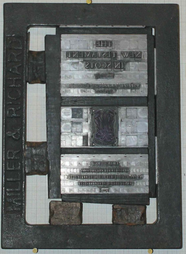
Imagine creating each individual diagram/line/special character with molten metal, then aligning all pieces in a wooden board before inking and pressing each page separately. That’s pretty much how each custom figure had to be made before modern printing.
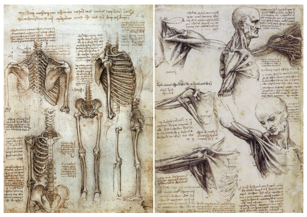
It was a laborious (and expensive) process, which explains why many works had to be hand drawn. Here’s Leonardo da Vinci’s “Human Body Sketches” (c. 1510)
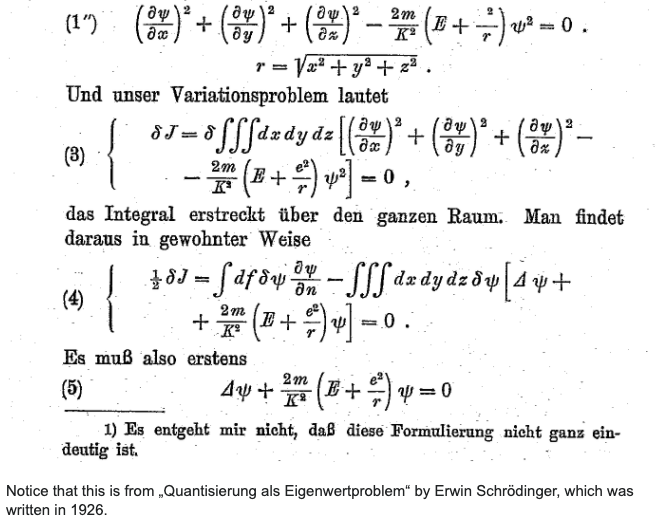
It also explains why even into the 20th century we see scientific works being partially (or fully) handwritten, like Richard Feynman’s PhD thesis (1942)
If you wanted your work typeset, you had to go through many back-and-forths with the typesetting artist, who would sometimes have to create those custom metal plates for your diagrams.
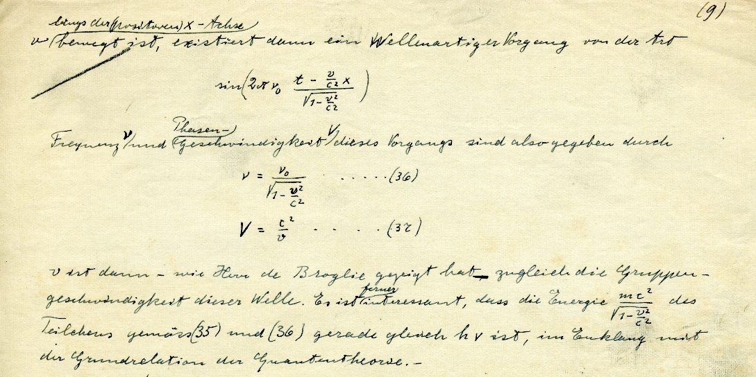
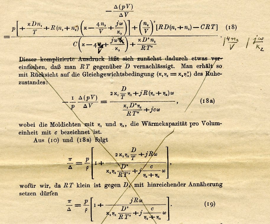
Here is one of Einstein’s works, at three different stages of the process.
Here is one of Einstein’s works, at three different stages of the process.
Mathematical works cost extra (what used to be called “penalty copy”) because all these symbols required much more thought, time, and metal to get right.
You know what the kicker is? All of these difficulties did not stop authors from making BEAUTIFUL figures.
Here’s Filippo Calandri’s Aritmetica printed in Florence, 1491/92.
That’s right: Fourteen-ninety-two.
Here’s Filippo Calandri’s Aritmetica printed in Florence, 1491/92.
That’s right: Fourteen-ninety-two.
This beautiful style is the one that Knuth was trying to re-create in his 1978 project which now takes the form of LaTeX.
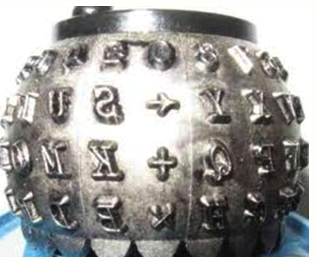
At the time, the explosion of scientific works made it impossible to typeset each article individually. So compromises were made, such as this typewriter ball attachment with some standard math symbols.
Needless to say, the visual quality was simply not the same.
Needless to say, the visual quality was simply not the same.
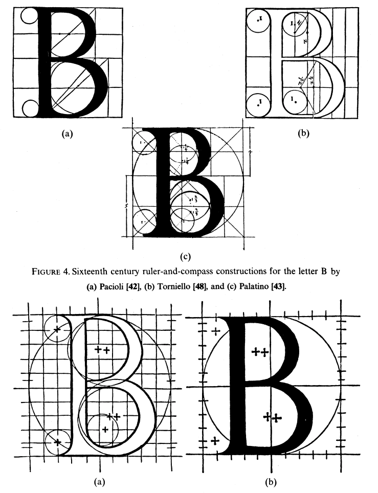
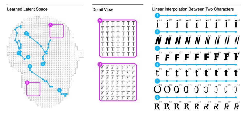
“Mathematical Typography” (1978) was about using math to describe shapes, which were used to reproducibly create icons that were then used to describe math.
It’s all very loopy and elegant, and Knuth hoped it could bring back the aesthetic beauty of artisanal typesetting.
It’s all very loopy and elegant, and Knuth hoped it could bring back the aesthetic beauty of artisanal typesetting.
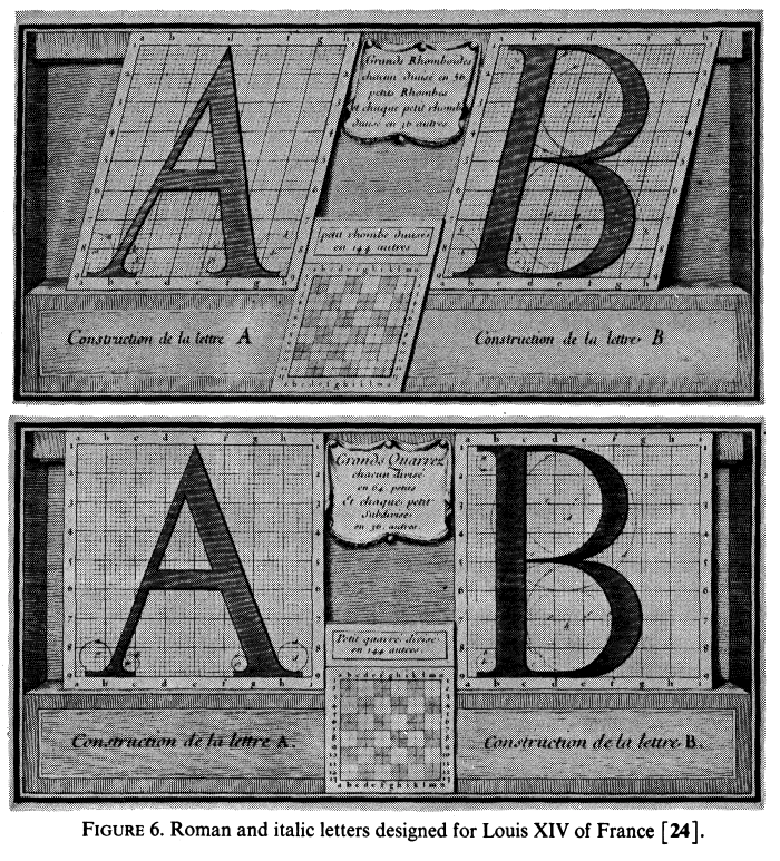
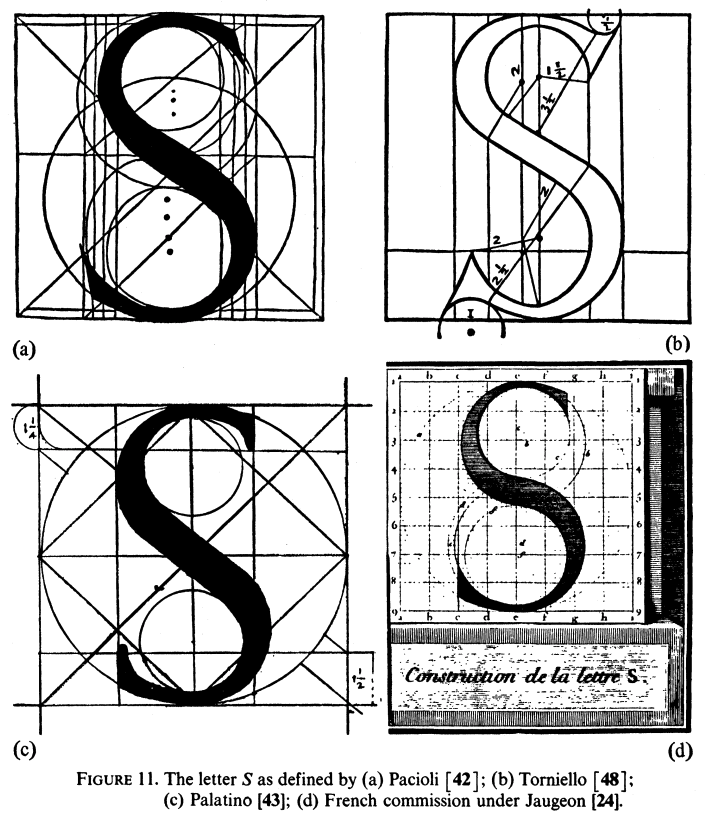
This idea was not new. Centuries before, artists were trying to use simple shapes to describe typefaces. One particular famous example was that of Romain du Roi, a typeface commissioned by Louis XIV of France to be the definitive typeface of the monarchy.
At the time, Romain du Roi was widely criticized for lacking the charm and elegance of human-made types of the time. History repeats itself huh?
Side note: Romain du Roi was only designed to include drop caps (those big initial letters at the top of paragraphs)
Side note: Romain du Roi was only designed to include drop caps (those big initial letters at the top of paragraphs)
Nowadays I think we reached a similar time. LaTeX is the de-facto tool for typesetting papers. Matplotlib is the go-to for making figures and charts. This makes iterating through styles and figures faster and easier than ever!
And yet...
And yet...
I’ve seen many papers that are just… ugly. And that makes people not want to read your work!
It may sound shallow but communication is hard as it is. Your figures should make it _easier_ to convey your ideas and findings. Not create another barrier that needs to be deciphered.
It may sound shallow but communication is hard as it is. Your figures should make it _easier_ to convey your ideas and findings. Not create another barrier that needs to be deciphered.
I’ve been complimented in the past about figures in my papers. I do think I spend more than average making them pretty, thinking about colorschemes, etc, but I think that’s only because the average is so low.
I know our current deadline-chasing climate does not let us spend more than 2 minutes drawing figures.
But what is an extra hour of work compared to the months of back-and-forth we used to have to go through just last century?
But what is an extra hour of work compared to the months of back-and-forth we used to have to go through just last century?
I’ll end with the disclaimer that I am not an expert in typesetting, and most of this “research” was done with heavy google-fu and wikipedia, so take it with a grain of salt.
Now go make pretty figures!
Now go make pretty figures!
Sources:
http://cds.cern.ch/record/101498/files/Thesis-1942-Feynman.pdf?version=1
https://cds.cern.ch/record/10... href=" #v=onepage&q&f=false">https://books.google.com/books?id=VpptAAAAMAAJ&printsec=frontcover& #v=onepage&q&f=false">https://books.google.com/books...
https://ilovetypography.com/2019/03/14/the-first-printed-math-books/
https://ilovetypography.com/2019/03/1... href=" https://www.encyclopedia.com/science/encyclopedias-almanacs-transcripts-and-maps/printing-important-mathematics-texts-leads-way-scientific-revolution
https://www.encyclopedia.com/science/e... href=" https://ilorentz.org/history/Einstein_archive/
https://ilorentz.org/history/E... href=" http://www.hoechst-schoen.de/bleisatz-raritaeten/
https://www.hoechst-schoen.de/bleisatz-... href=" https://hsm.stackexchange.com/questions/2279/writing-mathematical-symbols-in-20th-century
https://hsm.stackexchange.com/questions... href=" http://ultrasparky.org/school/pdf/Rhatigan_Monotype_4-line_math.pdf">https://ultrasparky.org/school/pd...
http://cds.cern.ch/record/101498/files/Thesis-1942-Feynman.pdf?version=1
https://ilovetypography.com/2019/03/14/the-first-printed-math-books/
Sources (cont.):
http://en.wikipedia.org/wiki/Monotype_System">https://en.wikipedia.org/wiki/Mono...
#244126">https://tex.stackexchange.com/questions/244082/typesetting-before-tex-and-computers/244126 #244126">https://tex.stackexchange.com/questions...
http://www.math.lsa.umich.edu/~millerpd/docs/501_Winter13/Knuth79.pdf">https://www.math.lsa.umich.edu/~millerpd...
http://www.practicallyefficient.com/2017/10/13/from-boiling-lead-and-black-art.html">https://www.practicallyefficient.com/2017/10/1...
Good morning! Thanks for all the nice replies! Glad everyone is enjoying beautiful scientific art as much as me!
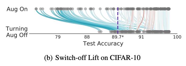
I don’t have a SoundCloud but I do have a new preprint out on how data augmentation works. I promisse it’s pretty to look at as well https://abs.twimg.com/emoji/v2/... draggable="false" alt="😛" title="Face with tongue" aria-label="Emoji: Face with tongue">:
https://twitter.com/iraphas13/status/1232027125714051073?s=20">https://twitter.com/iraphas13... https://twitter.com/iraphas13/status/1232027125714051073">https://twitter.com/iraphas13...
I don’t have a SoundCloud but I do have a new preprint out on how data augmentation works. I promisse it’s pretty to look at as well
https://twitter.com/iraphas13/status/1232027125714051073?s=20">https://twitter.com/iraphas13... https://twitter.com/iraphas13/status/1232027125714051073">https://twitter.com/iraphas13...

 Read on Twitter