One useful strategy for starting to learn R is to focus on mastering a simple goal. This will build confidence and lead to immediate improvement in current workflows. In this tweetorial, I will illustrate how easy it is to build and customize scatterplots in R. #rstats
Step 1: Preparation (i.e., install and load required R packages).
install.packages("ggplot2")
install.packages("dplyr")
install.packages("gghighlight")
install.packages("ggeasy")
library(ggplot2)
library(dplyr)
library(gghighlight)
library(ggeasy)
install.packages("ggplot2")
install.packages("dplyr")
install.packages("gghighlight")
install.packages("ggeasy")
library(ggplot2)
library(dplyr)
library(gghighlight)
library(ggeasy)
Step 2: Load and prepare mtcars dataset (a famous dataset available in R).
# load dataset
data(mtcars)
# convert the gear variable to a categorical variable
# with categories 3, 4 and 5
mtcars <- mutate(mtcars, gear = factor(gear))
# load dataset
data(mtcars)
# convert the gear variable to a categorical variable
# with categories 3, 4 and 5
mtcars <- mutate(mtcars, gear = factor(gear))
Step 3: Create a "base" graph which will be used as the initial starting point for our scatterplots. This will be an empty canvass showing what variable will be plotted on the x-axis (wt; car weight) and what variable will be plotted on the y-axis (mpg; miles per gallon).
Step 3 ctd: The R code for creating the "base" graph is:
g0 <- ggplot(data = mtcars, aes(x = wt, y = mpg))
g0
g0 <- ggplot(data = mtcars, aes(x = wt, y = mpg))
g0
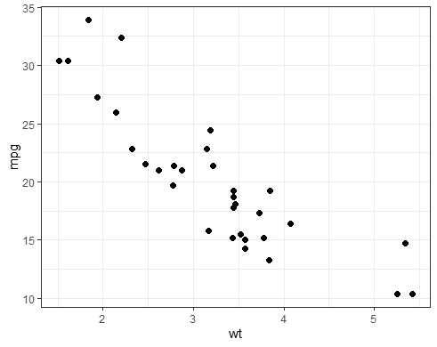
Step 4: Now it becomes easy to add layers to the "base" graph. Let& #39;s add the actual observations corresponding to (wt, mpg) values in the dataset.
g1 <- g0 +
geom_point(size = 2)
g1
g1 <- g0 +
geom_point(size = 2)
g1
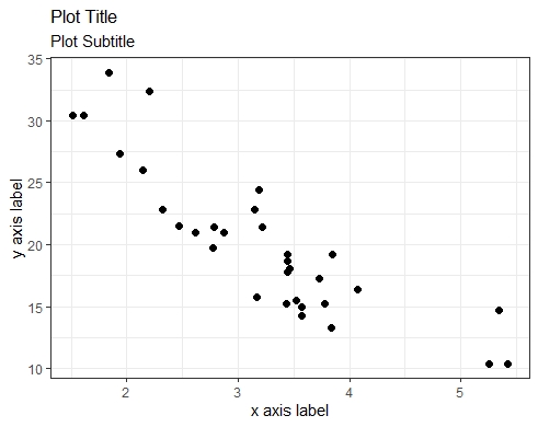
Step 5: We can beautify the current scatterplot, g1, by adding a title, subtitle and axis labels.
g1 <- g1 +
easy_labs(title = "Plot Title",
subtitle = & #39;Plot Subtitle& #39;,
x = & #39;x axis label& #39;,
y = & #39;y axis label& #39;)
g1
g1 <- g1 +
easy_labs(title = "Plot Title",
subtitle = & #39;Plot Subtitle& #39;,
x = & #39;x axis label& #39;,
y = & #39;y axis label& #39;)
g1
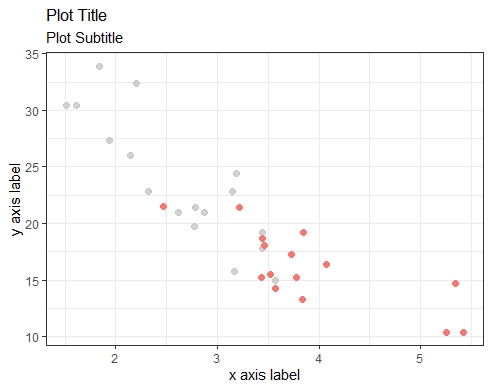
Step 6: We can highlight observations in the scatterplot (e.g., observations for cars with gear == "3").
g1 <- g1 +
aes(colour = gear) +
gghighlight(gear == "3", use_direct_label = FALSE) +
easy_remove_legend()
g1
g1 <- g1 +
aes(colour = gear) +
gghighlight(gear == "3", use_direct_label = FALSE) +
easy_remove_legend()
g1
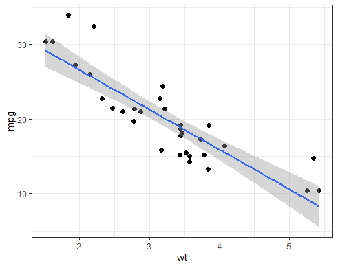
Step 7: We can add a regression line and associated 95% pointwise confidence band through the scatterplot observations.
g1 <- g0 +
geom_point(size = 2) +
geom_smooth(method = "lm", se = TRUE)
g1
Set se = FALSE to suppress the confidence band.
g1 <- g0 +
geom_point(size = 2) +
geom_smooth(method = "lm", se = TRUE)
g1
Set se = FALSE to suppress the confidence band.
Step 8: We can use grouping by gear in our scatterplot, to see how mpg varies with wt by gear.
g2 <- g0 +
geom_point(aes(group = gear, colour = gear),
size = 2) +
geom_smooth(aes(group = gear, colour = gear,
fill = gear), method = "lm", se = TRUE)
g2
g2 <- g0 +
geom_point(aes(group = gear, colour = gear),
size = 2) +
geom_smooth(aes(group = gear, colour = gear,
fill = gear), method = "lm", se = TRUE)
g2
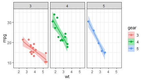
Step 9: We can show the relationship between mpg and wt in separate panels - one per gear (rather than in the same panel, as done with grouping). Both panelling and grouping achieve the same thing, except they display results differently: multiple panels vs single panel.
Step 9 - Ctd.: The R code for panelling by gear is:
g3 <- g0 +
geom_point(aes(colour = gear), size = 2) +
geom_smooth(aes(colour = gear, fill = gear),
method = "lm", se = TRUE) +
facet_wrap(~gear)
g3
Can also use facet_grid() here.
g3 <- g0 +
geom_point(aes(colour = gear), size = 2) +
geom_smooth(aes(colour = gear, fill = gear),
method = "lm", se = TRUE) +
facet_wrap(~gear)
g3
Can also use facet_grid() here.
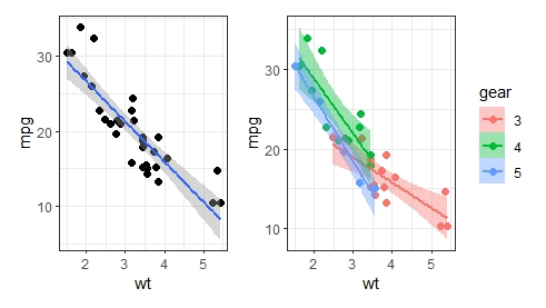
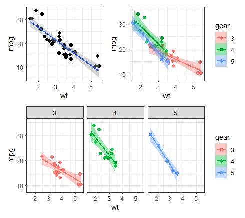
Step 10: Finally, we can combine two or more scatterplots in the same graphical window with patchwork.
install.packages("patchwork")
library(patchwork)
g1 + g2 # combine 2 graphs
(g1 + g2)/g3 # combine 3 graphs
install.packages("patchwork")
library(patchwork)
g1 + g2 # combine 2 graphs
(g1 + g2)/g3 # combine 3 graphs
Step 10 Ctd.: With patchwork, you can combine your graphs in any way you want:
g1/g2/g3 # g1 on top row; g2 on middle row;
# g3 on bottom row
g1/(g2 + g3) # g1 at the top in its own row;
# g1 and g3 at the bottom in same row
g1/g2/g3 # g1 on top row; g2 on middle row;
# g3 on bottom row
g1/(g2 + g3) # g1 at the top in its own row;
# g1 and g3 at the bottom in same row

 Read on Twitter
