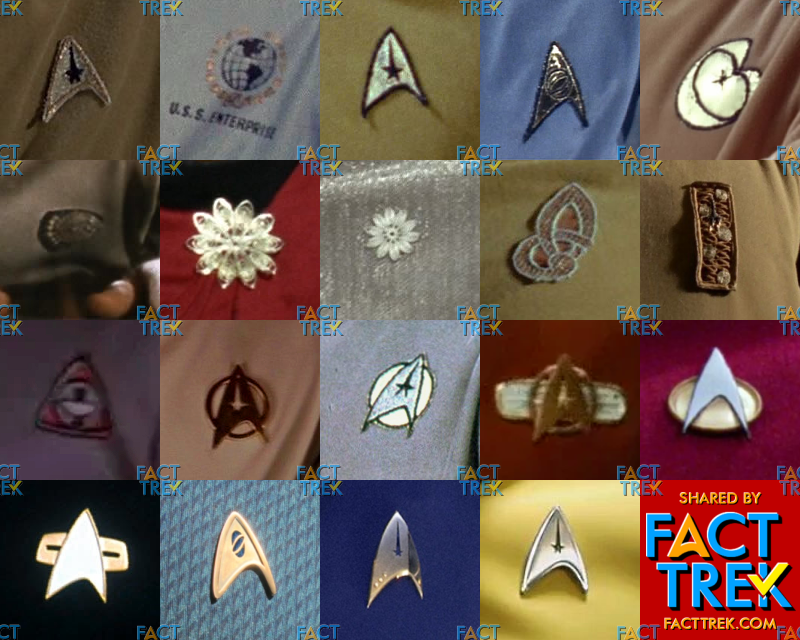
WHAT IN THE FLYING A!? Over the years, many assumptions have been made about the various #Starfleet insignia worn on the original #StarTrek and beyond thru to #StarTrekSNW . Follow Us as we take a deep dive into the show’s most distinctive emblems and the intentions behind them.
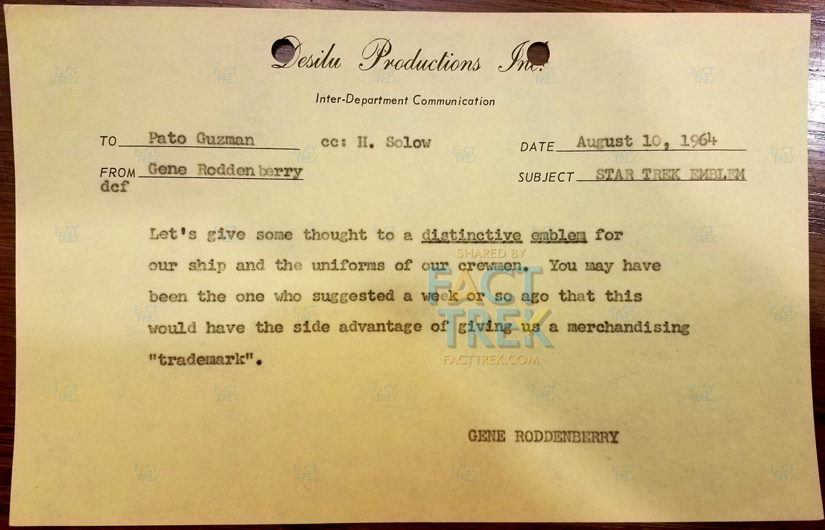
It begins with Gene #Roddenberry wanting #StarTrek to have a “distinctive emblem,” something immediately identifiable & also with merchandising potential. Here’s a memo he sent to art director Pato Guzman about the emblem on August 10, 1964 (during pre-production on pilot #1).
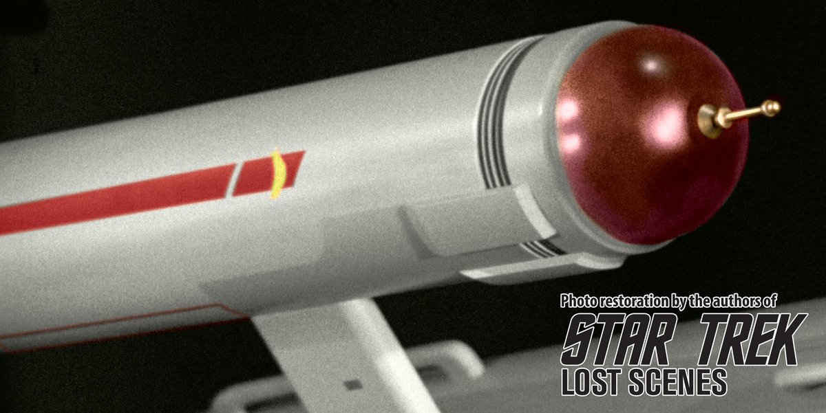
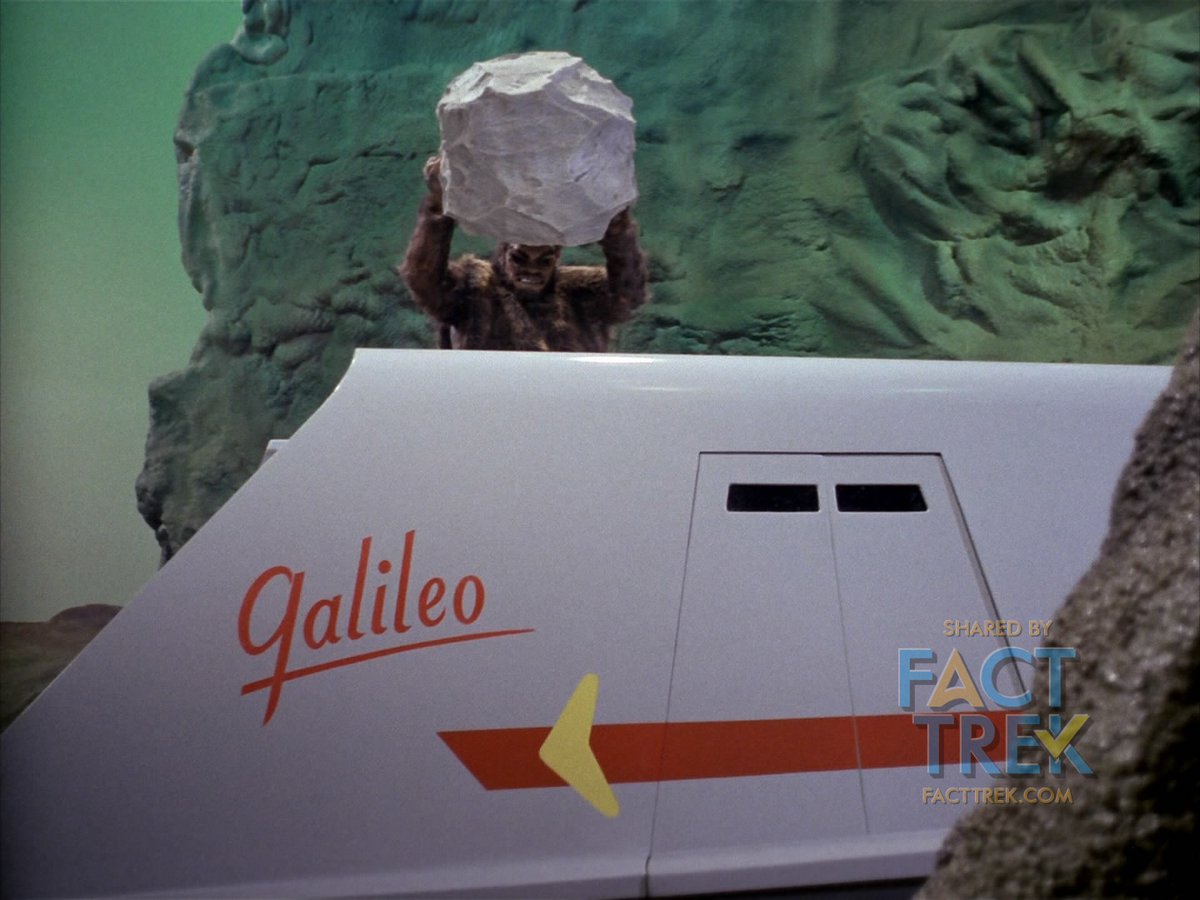
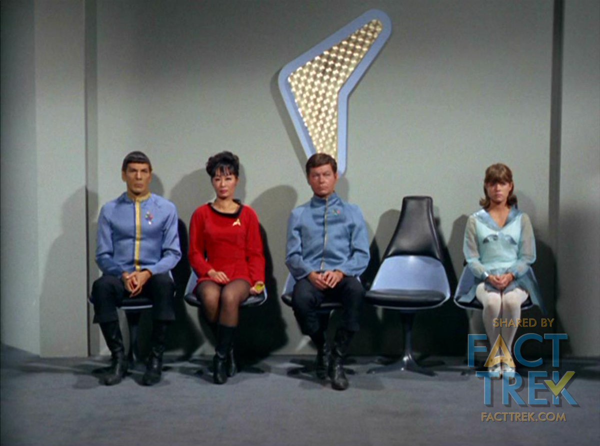
This thinking resulted in a couple of distinct #StarTrek emblems. One is the boomerang shape seen painted on the Enterprise and Galileo hulls. The boomerang also appears frequently as a piece of set decoration—most commonly behind flag officers whenever Kirk gets them on Zoom.
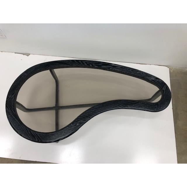
Rounded boomerangs and kidney shapes were well-established space-age design elements by the time Matt Jefferies first employed the former on the Enterprise pennants in 1964. Such rounded boomerangs appeared on The Jetsons (1962–63) over two years before the starship’s design.
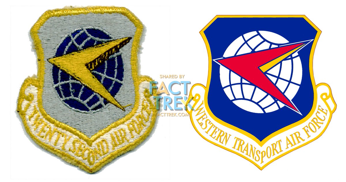
But both the #Starfleet boomerang and uniform insignia are likely based on common symbols—often called “darts”—of military air groups, as seen on the Western Transport Air Force shield, adopted c1958 and used through its re-designation as the 22nd Air Force in 1966.
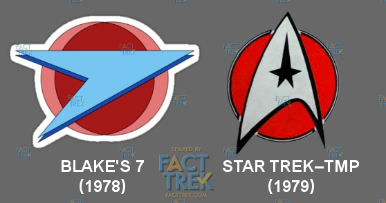
Note the resemblance of the 22nd Air Force’s dart to the Terran Federation logo from 1978’s Blake’s 7, which was likely drawn from the same sources, and which predated by over a year the use of a circle behind the dart as seen first seen in #StarTrek—The Motion Picture in 1979.

 Read on Twitter