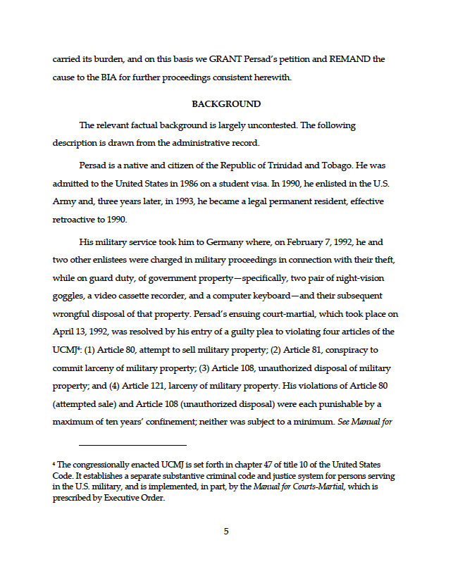
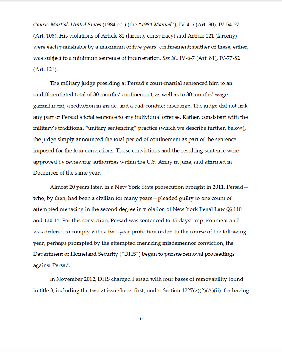
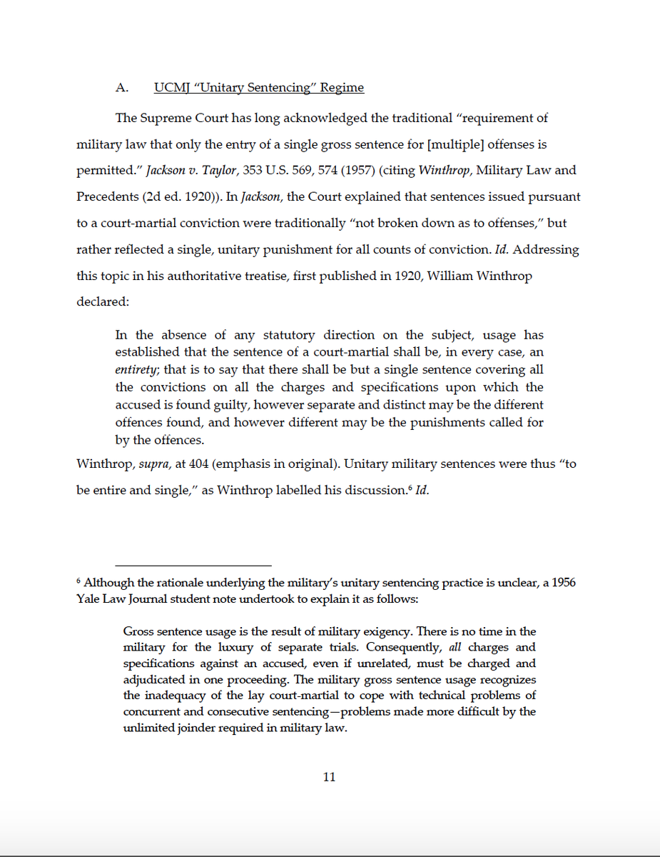
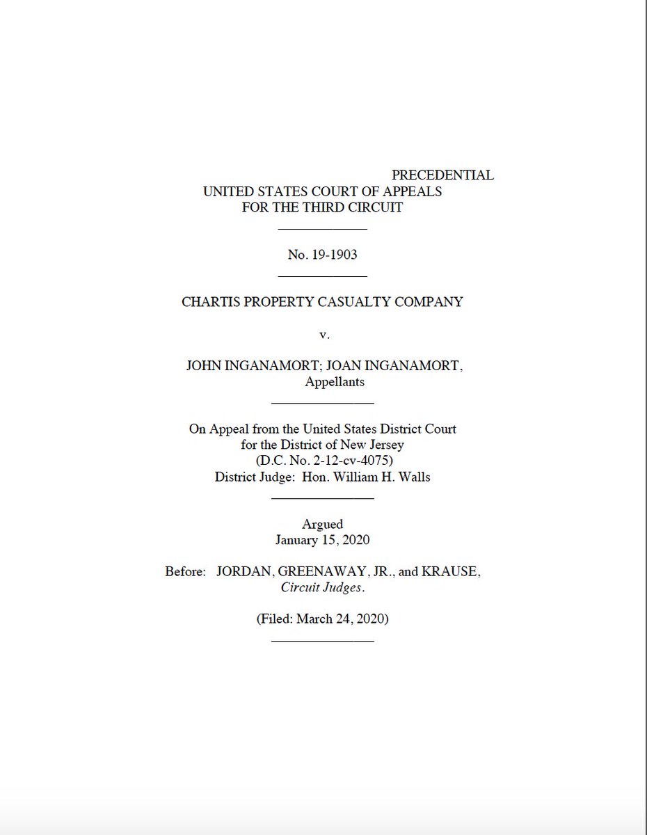
(Thread) There’s been a lot of #legalwriting typography content lately. After seeing @BobLoeb’s great graphic showing font choices by federal circuit, I wanted to explore each circuit’s formatting choices in more detail, and, hopefully, draw out some broader themes.
So over the next week or so, I’ll be breaking down one or two circuits per day & sharing some thoughts on the formatting of their slip opinions. I hope the #legalwriting/ #AppellateTwitter community enjoys it, & I hope it spurs some healthy debate.
What am I looking at primarily? It’s not just about which opinions are “prettier.” I’m mostly focused on aesthetic choices that impact readability. The substance of judicial opinions can make them hard enough to read on its own—we don’t need poor formatting compounding things.
That said, purely aesthetic choices also have their place. Judicial opinions are important government documents that carry force—both for the parties involved & for the public, at large. So I don’t think it’s crazy to think they should have a look that conveys authority.
At the same time, opinions should look inviting and encourage members of the public to pick them up and read them (or at least not dissuade them from doing so). Readers should see a slip opinion and think, “This looks interesting and important. I’d like to read that.”
Specifically, I’m looking at a few things:
First, text format: font choice, size, use of small caps, all caps, underlines, bold, and italics.
Second, page layout: margins, spacing, & alignment. Large gaps can disrupt the reader’s ability to find the next word or line.
First, text format: font choice, size, use of small caps, all caps, underlines, bold, and italics.
Second, page layout: margins, spacing, & alignment. Large gaps can disrupt the reader’s ability to find the next word or line.
Oh, and it’s probably obvious, but I’m passing no judgment on the merits of the their legal reasoning. (I haven& #39;t even read these opinions for substance.) This is purely about formatting w/ the goal of making them as inviting and easy to read as possible.
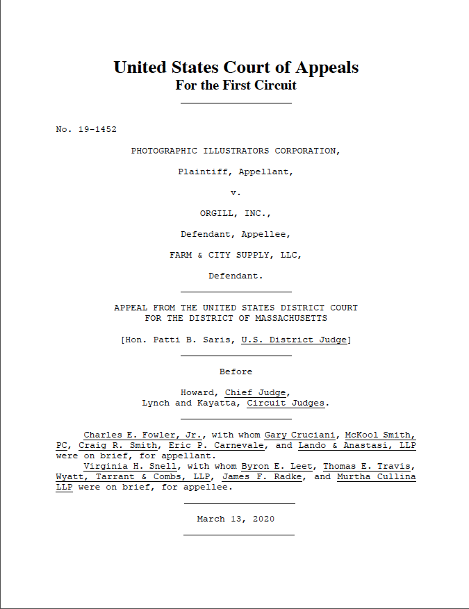
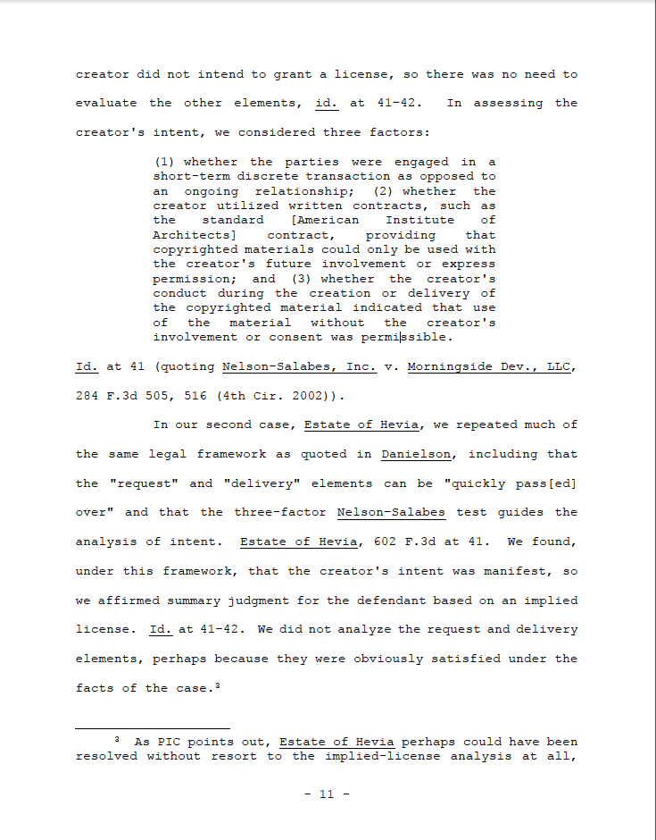
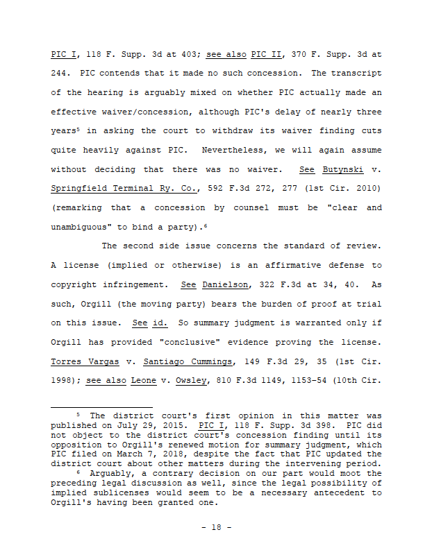
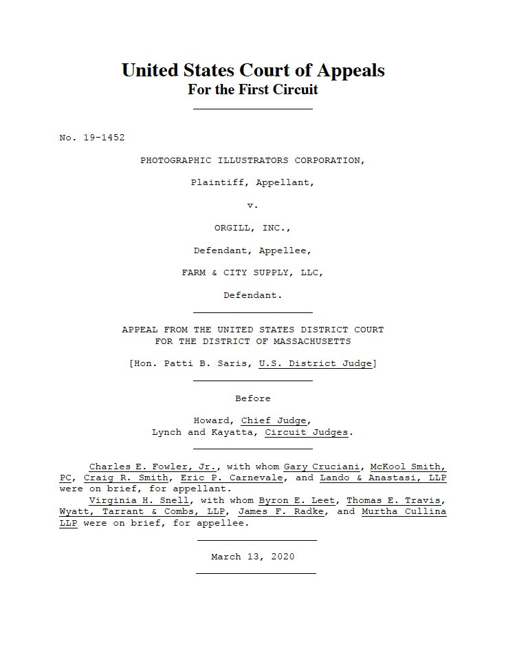
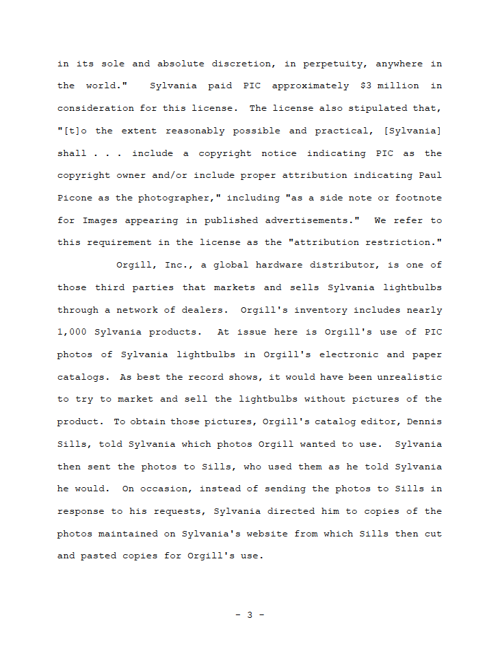
With those out of the way, let’s take a look at the First Circuit. Here are some representative pages:
Text format:
Courier New font. Just…why? @mbutterick explains that “[c]ompared to proportional fonts, monospaced fonts are harder to read….In standard body text, there are no good reasons to use monospaced fonts. So don’t.” https://typographyforlawyers.com/monospaced-fonts.html.">https://typographyforlawyers.com/monospace... Agreed.
Courier New font. Just…why? @mbutterick explains that “[c]ompared to proportional fonts, monospaced fonts are harder to read….In standard body text, there are no good reasons to use monospaced fonts. So don’t.” https://typographyforlawyers.com/monospaced-fonts.html.">https://typographyforlawyers.com/monospace... Agreed.
The document underlines, rather than italicizes for emphasis and citations--probably because italics are pretty hard to see in Courier. But it can really disrupt reading. Just look at all the underlining for the attorney/firm names on the cover page.
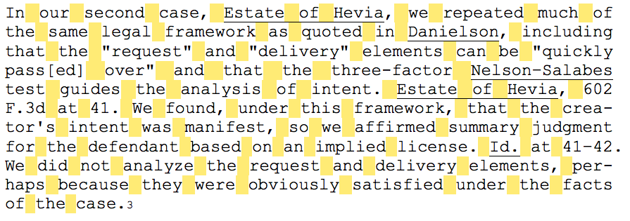
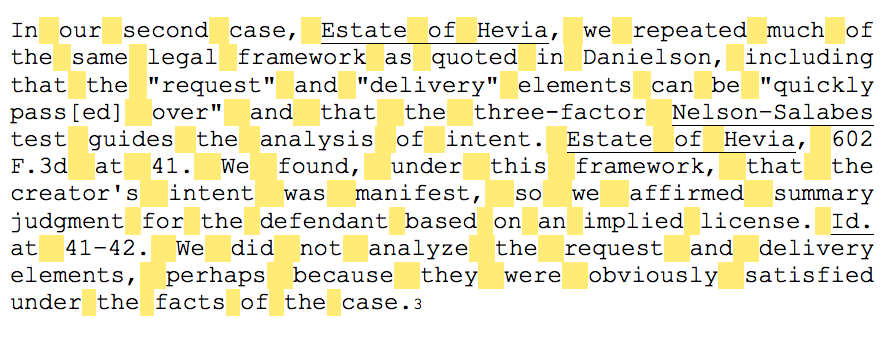
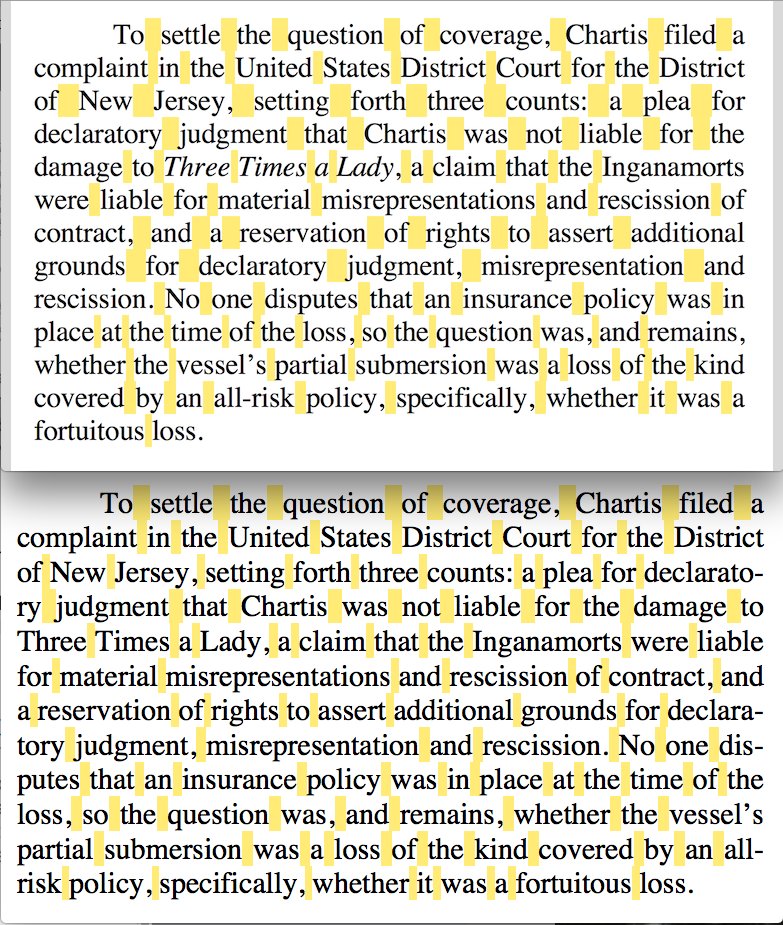
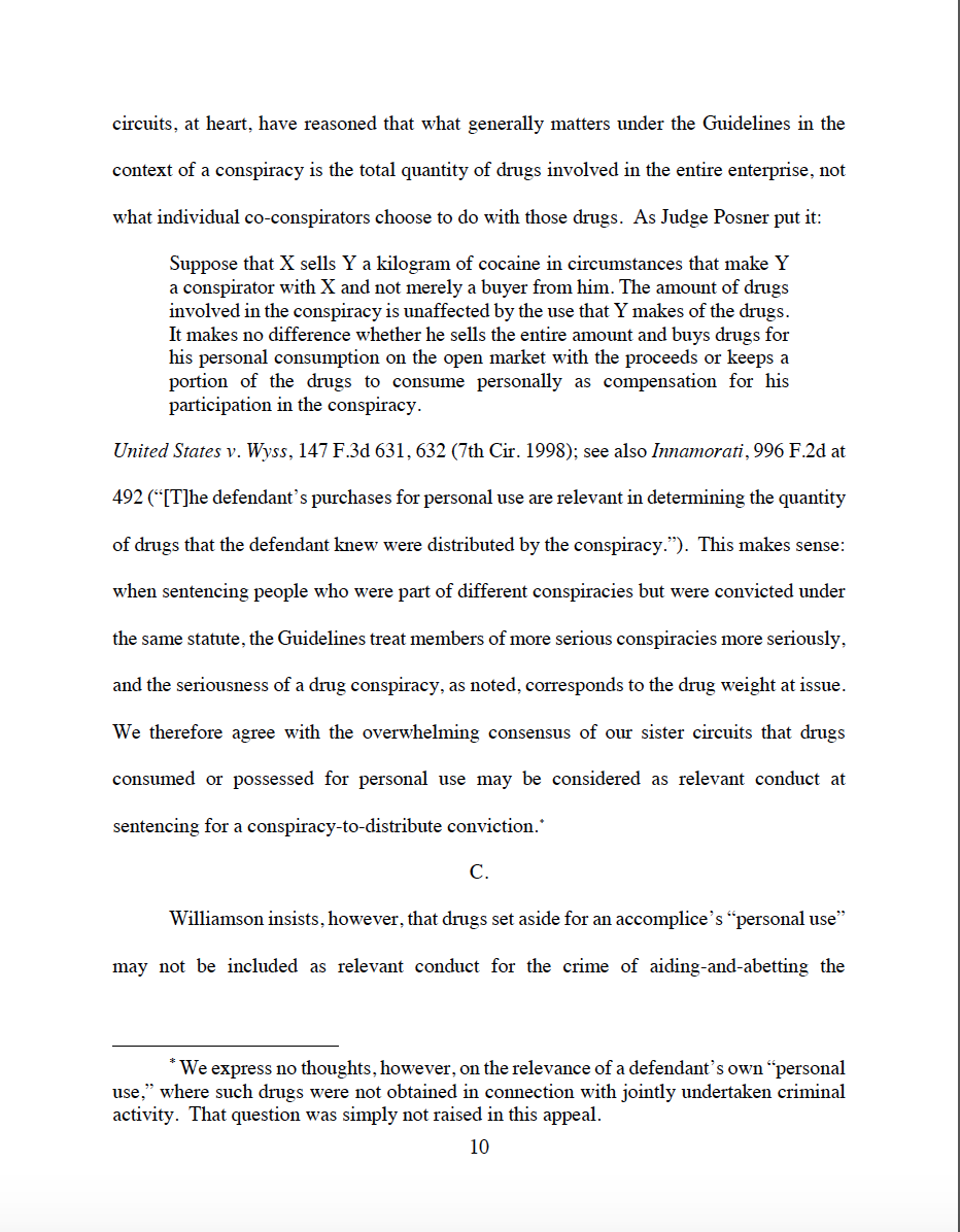
Full justification is a good choice: I think adds a nice bit of formality to opinions. But it doesn’t appear that the document is hyphenated, so the wide swaths of white space running through the paragraphs are even larger and more random than they need to be.
I reformatted one paragraph w/ hyphenation (left) & highlighted the spaces to show the difference. Notice how the spacing, as a whole, is smaller, and more even in the bottom half of the paragraph, after the hyphenated word. It’s a subtle—but appreciable—difference.
Spacing:
- 1” margins all around is good—not great. But there’s so much white space between lines and words. Double-spacing just spaces out the text so much. And that’s on top of the intra-sentence spacing due to no hyphenation and two spaces after periods.
- 1” margins all around is good—not great. But there’s so much white space between lines and words. Double-spacing just spaces out the text so much. And that’s on top of the intra-sentence spacing due to no hyphenation and two spaces after periods.
- The 1” indents at the start of paragraphs could be at least .5" smaller so your eye isn’t having to jump a huge gap before starting the next line. Similarly, there’s no need to indent the footnote numbers at the bottom of the page; I’d left-align those.
A small, random positive: I rather like the placement and formatting of the page #& #39;s (the dashes to set off the pages are a nice touch). The page numbers are convenient yet unobtrusive.
First Circuit summary:
- Overall impressions: Highly questionable font choice. Too much space between, within, and around text.
- Wholly Subjective Numerical Formatting Score: 2/10
- Overall impressions: Highly questionable font choice. Too much space between, within, and around text.
- Wholly Subjective Numerical Formatting Score: 2/10
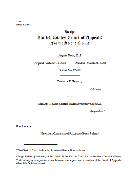
Next up: The Second Circuit. Looking recent opinions, there’s A LOT of variability in opinion formatting. This inconsistency is its own issue, and it makes it hard to draw broad conclusions. I’m going to look at one, randomly drawn opinion. Here are some representative pages:
Text format: Palatino Linotype: a terrific choice. A sophisticated, easy-to-read font w/ gorgeous italics and small caps. Speaking of—small caps for party/judge names looks great. I wish the section headings (e.g., DISCUSSION) were also in small caps instead of bold all caps.
Bonus points for putting the court’s name in Old English. Some may find it cheesy, but I think it’s a nice historical nod that adds a bit of flair to the document.
Page layout:
Decent, 1” margins all around, but the bottom is measured from the page #—not from the last line of text. I think that makes the page look a bit unbalanced. I’d probably move everything down .5”—or just shrink the bottom margin.
Decent, 1” margins all around, but the bottom is measured from the page #—not from the last line of text. I think that makes the page look a bit unbalanced. I’d probably move everything down .5”—or just shrink the bottom margin.
The main text would look better single-spaced & wouldn’t sacrifice readability (indeed, it would likely improve it). Just compare the footnotes/block quotes to the body text.
The .5” indents at the start of each paragraph are a bit bigger than necessary but not nearly as distracting as the 1st Cir’s. I love the spacing on the footnote text—putting the footnote number right up against the left margin, followed by a single space is great.
Overall impressions for the 2d Cir (at least this format): Page layout could be tweaked—single spacing & full-justify would help. But the font choices & type formatting are on point. Consistency across opinions would be good.
Wholly Subjective Numerical Formatting Score: 7/10
Wholly Subjective Numerical Formatting Score: 7/10
Text format:
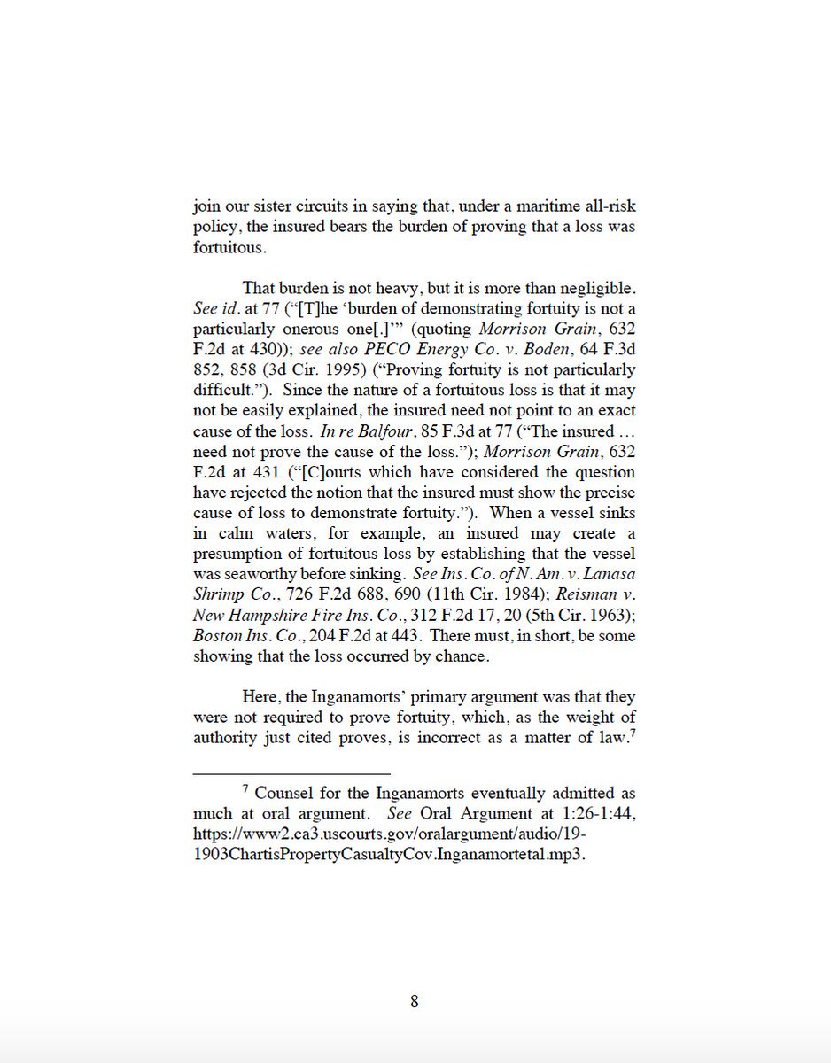
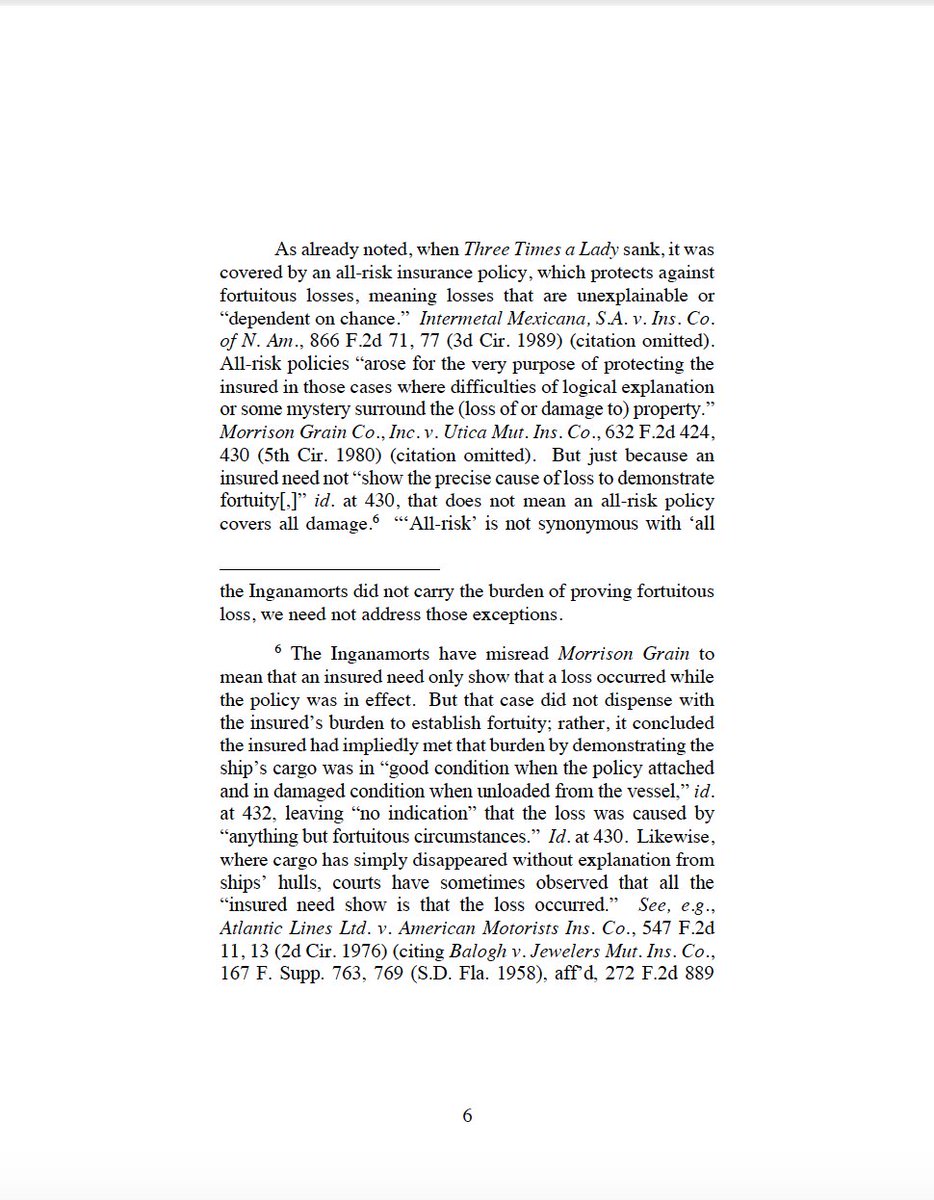
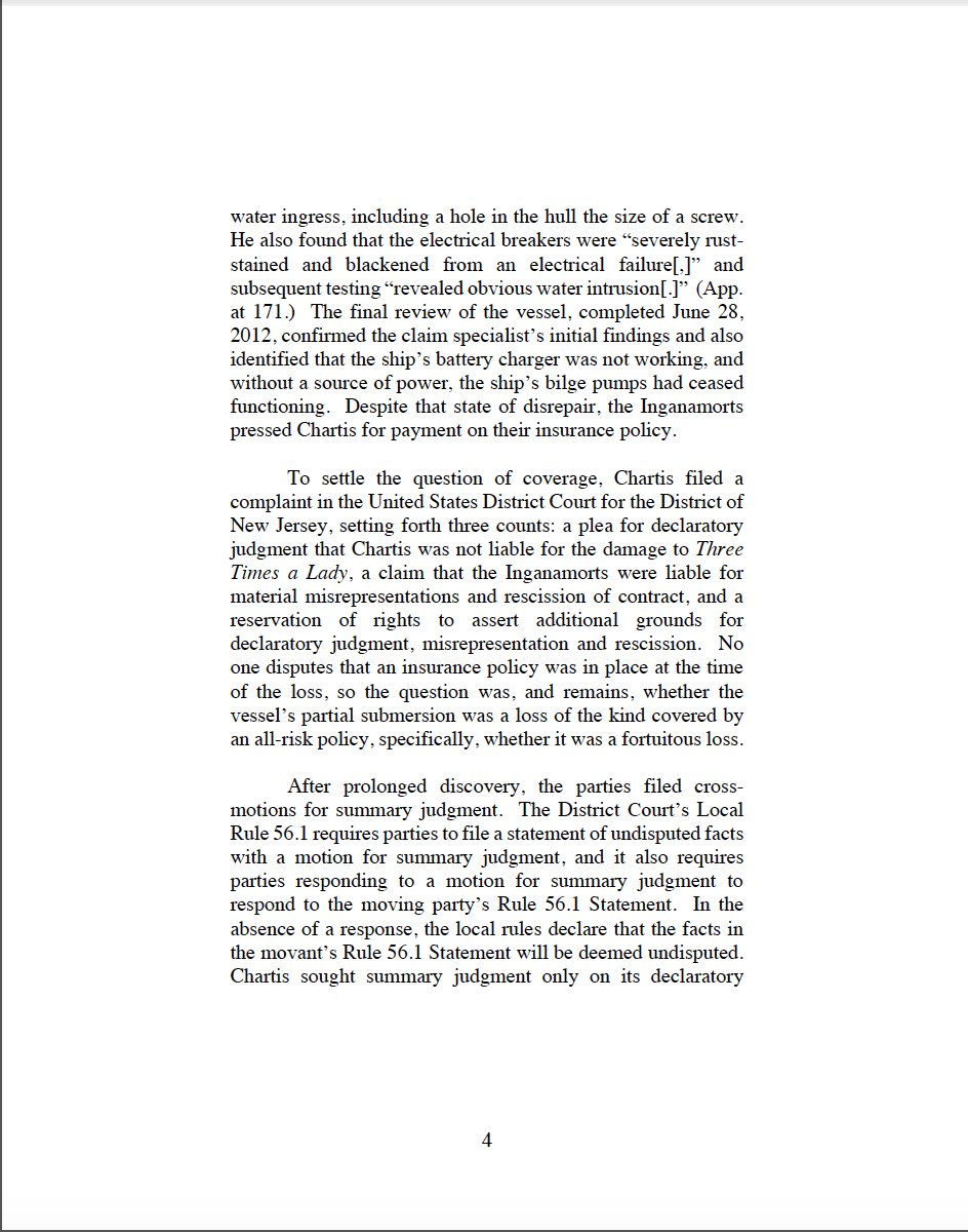
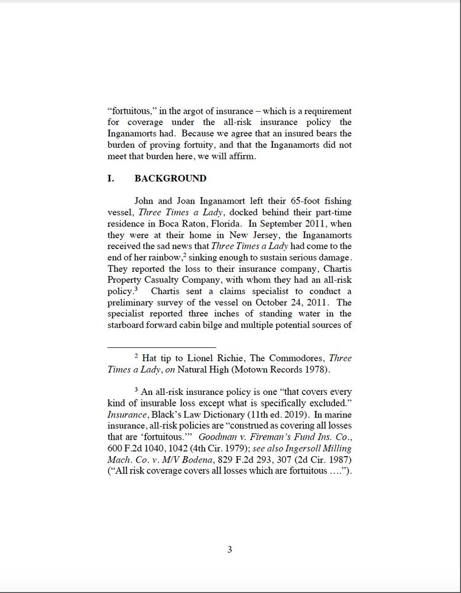
Times New Roman is a divisive choice, but this document shows how even TNR can look good w/ a thoughtful layout (more later). 13-point font gives a slightly different look than the standard 12-point (or 14-point mandated by FRAP 32). Italics for citations is good.
Times New Roman is a divisive choice, but this document shows how even TNR can look good w/ a thoughtful layout (more later). 13-point font gives a slightly different look than the standard 12-point (or 14-point mandated by FRAP 32). Italics for citations is good.
Footnoted text is the same size as the main body, which can make lengthy FNs look like they& #39;re dominating the page (like this one). I think I’d make the footnoted text slightly smaller (maybe 11) to more clearly delineate footnote text from main text.
The caption page is, perhaps, a bit too plain—all in the same font and size. In particular, the court name and “PRECEDENTIAL” don’t stand out as much as they probably should. They could be set in a different font, made larger, or put in bold so they stand out more.
Small caps instead of all caps for the party, judge, and court names would create a more sophisticated look and be slightly easier to read.
Page layout:
2” margins all the way around make the page look very inviting. Single spacing and full-justification give a clean, formal look, even with the TNR. I want to pick this up and read it.
2” margins all the way around make the page look very inviting. Single spacing and full-justification give a clean, formal look, even with the TNR. I want to pick this up and read it.
Here, the section headings (BACKGROUND, DISCUSSION) are all left-aligned, making them even easier to read than if they were centered. (Though that doesn’t appear to be a universal choice among different 3d Cir opinions.)
But there are a couple of issues with the spacing. First, while full-justification is (in my opinion) the right choice, it doesn’t appear the document is hyphenated, creating the same intra-line spacing issues I mentioned with the First Circuit.
I’ve reformatted this paragraph and highlighted the spaces to show the difference. Notice how the spacing, as a whole, is smaller, and more even in the hyphenated version (bottom). It’s a subtle—but appreciable—difference.
(Here, the spacing problem is exacerbated b/c the document uses two spaces after a period. I know, I know: that& #39;s going to raise some hackles. But this just highlights the issues that can arise any time you create more/uneven space in and between lines.)
Skipping a line between paragraphs isn’t terrible, but isn’t really necessary. Eliminating the extra line wouldn’t hurt readability and would help condense the text.
The default .5” indents at the start of paragraphs are a bit too big; .25” would look better and would be perfectly easy to read (especially if keeping the skipped lines between paragraphs). Footnote numbers could be flush with left margin, rather than indented .5”.
Overall impressions for the 3d Cir: Don’t judge a judicial opinion by its cover. A rather boring caption page gives way to an inviting layout (even with Times New Roman).
Wholly Subjective Numerical Formatting Score: 7/10
Wholly Subjective Numerical Formatting Score: 7/10
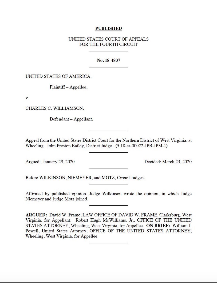
Next up in our #legalwriting formatting series: the Fourth Circuit. Here are some representative pages:
Text format:
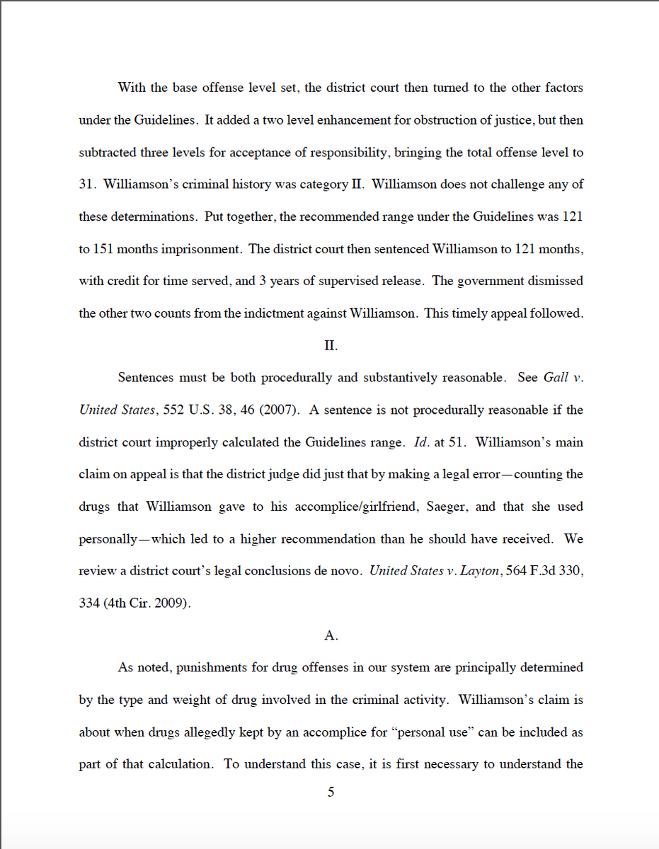
Another Times New Roman court. But unlike the Third Circuit, which used fully justified, single-spaced paragraphs to improve the look of its TNR, the spacing in this document doesn’t do TNR any favors. Italics for citations; again, the right choice.
Another Times New Roman court. But unlike the Third Circuit, which used fully justified, single-spaced paragraphs to improve the look of its TNR, the spacing in this document doesn’t do TNR any favors. Italics for citations; again, the right choice.
Much like the 3d Cir., the caption page is a bit plain. Left-aligning the info below the court’s name and case # is a bit easier to read than centering the text. (Though jumping from centered text at the top to left-aligned is a bit disconcerting.)
But, while the font choices are relatively simple, it’s a very crowded page—all of the horizontal dividers between each element are a bit disruptive, and the list of attorneys/offices is very difficult to read. It would be helpful to separate out that list onto different lines.
The court’s name is the same font and size—just in all caps (like party/judge/firm names)—which makes it get lost in the shuffle a bit. Using a different font, making it larger, or putting in bold would be an upgrade.
Putting PUBLISHED in bold, underlined all caps, by contrast, might be overkill (esp. w/ all of the other horizontal lines on the page). Cutting the underlining & increasing size would be effective. I’m not sure the case # needs to be bolded; draws unnecessary attention.
Small caps instead of all caps for the party, judge, and court names would add a more sophisticated look and be slightly easier to read.
Page layout:
1” margins all the way around are a bit too small, making the page seem a bit crowded. One small quirk: most of the page #’s are a bit too close to the last line of text, making them a bit hard to locate & giving the bottom margin an unbalanced look.
1” margins all the way around are a bit too small, making the page seem a bit crowded. One small quirk: most of the page #’s are a bit too close to the last line of text, making them a bit hard to locate & giving the bottom margin an unbalanced look.
Again, full-justification is a good choice. But the document’s not hyphenated, leading to the same intra-line spacing issues I’ve mentioned before.
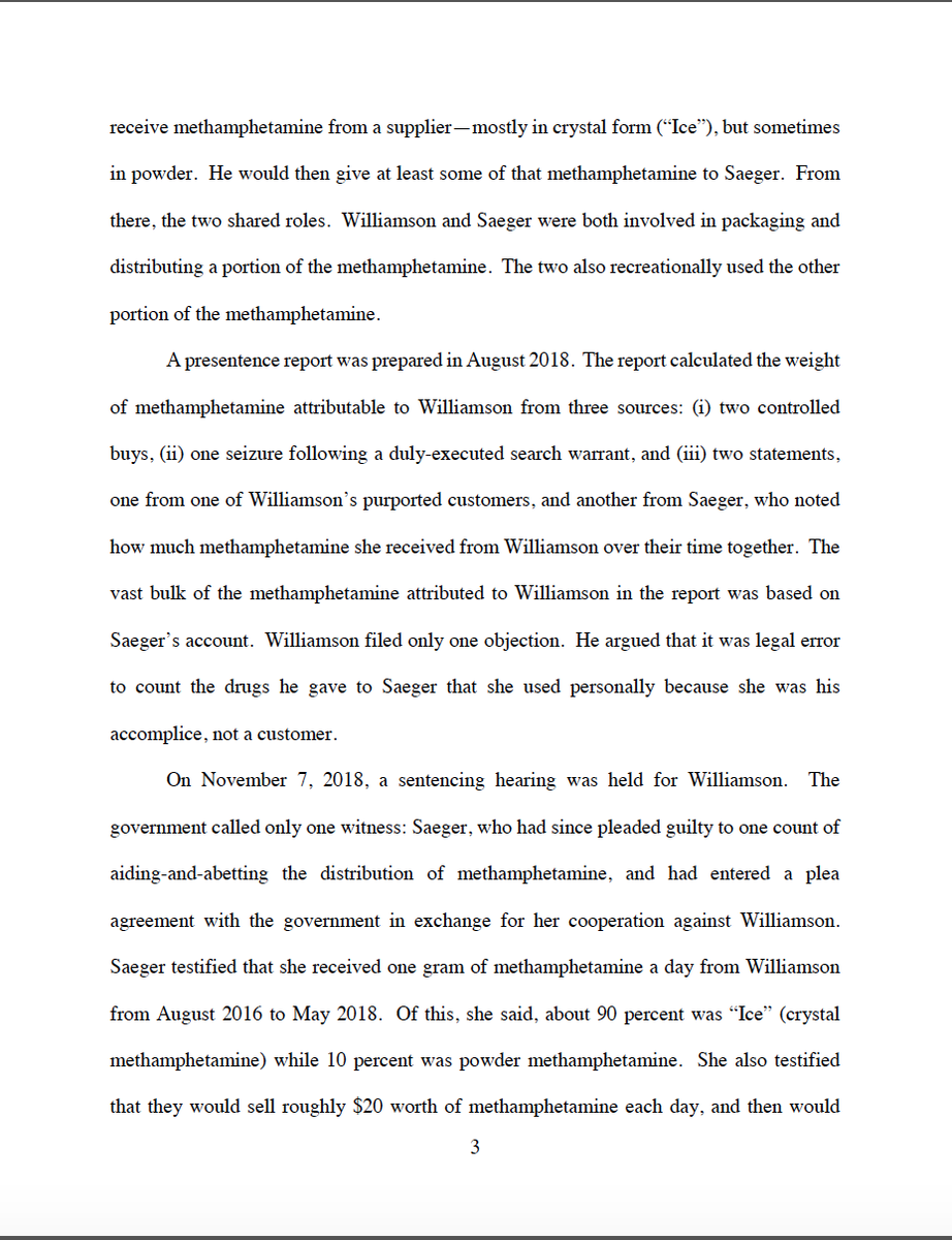
Failing to hyphenate leads to uneven spacing. Look at all the variability in spacing within lines, even though there’s “one space” between words. The effect is even worse on the spaces between sentences, even though the document uses just one space after a period.
Overall, the document really sticks to default settings: double-spaced Times New Roman with .5” indents. It reminds me of every paper I wrote in college. Single-spacing, smaller indents, and left-aligning footnotes would all help.
Look, it’s not that this format is the worst possible choice; it’s not. The bigger issue--as @mbutterick explains with respect to TNR--is that relying on defaults "is not a [ ] choice so much as the absence of a [ ] choice.”
I& #39;m a firm believer that formatting choices should be made with purpose--similar to how the words & sentences that fill the page are chosen with purpose. Sticking with default settings doesn& #39;t convey that sense of deliberation.
Overall impressions for the 4th Cir: A busy caption page and heavy reliance on default settings. Not the worst, but more deliberate choices would help immensely.
Wholly Subjective Numerical Formatting Score: 4/10
Wholly Subjective Numerical Formatting Score: 4/10

 Read on Twitter