Hue to brightness relation (hue shift)
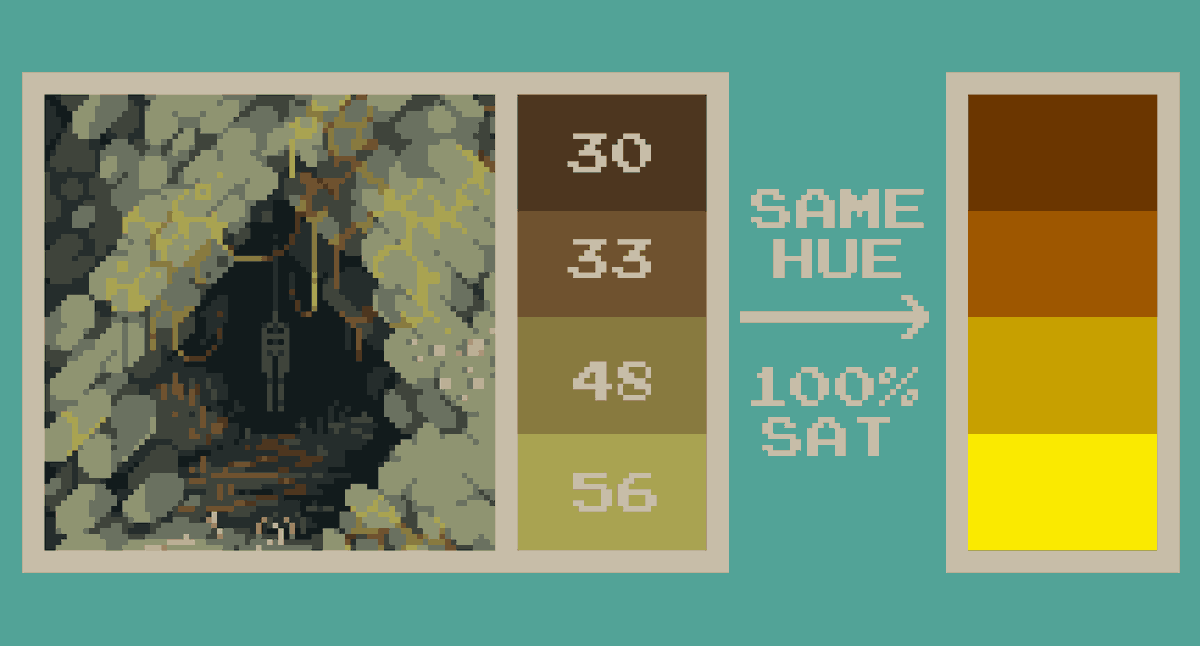
A simple way to keep this stuff coherent is to move brighter shades to warmer hues (yellow/orange) and darker shades to colder hues (blue/purple)
It usually works for outdoor daytime stuff
A simple way to keep this stuff coherent is to move brighter shades to warmer hues (yellow/orange) and darker shades to colder hues (blue/purple)
It usually works for outdoor daytime stuff
The more advanced and probably correct way is to keep in mind the lightsources and their colours in your pieces and hue shift in the correct way based on that.
Red light - hueshift shit into red
Blue light - hueshift shit into blue etc, pretty straightfoward
Red light - hueshift shit into red
Blue light - hueshift shit into blue etc, pretty straightfoward
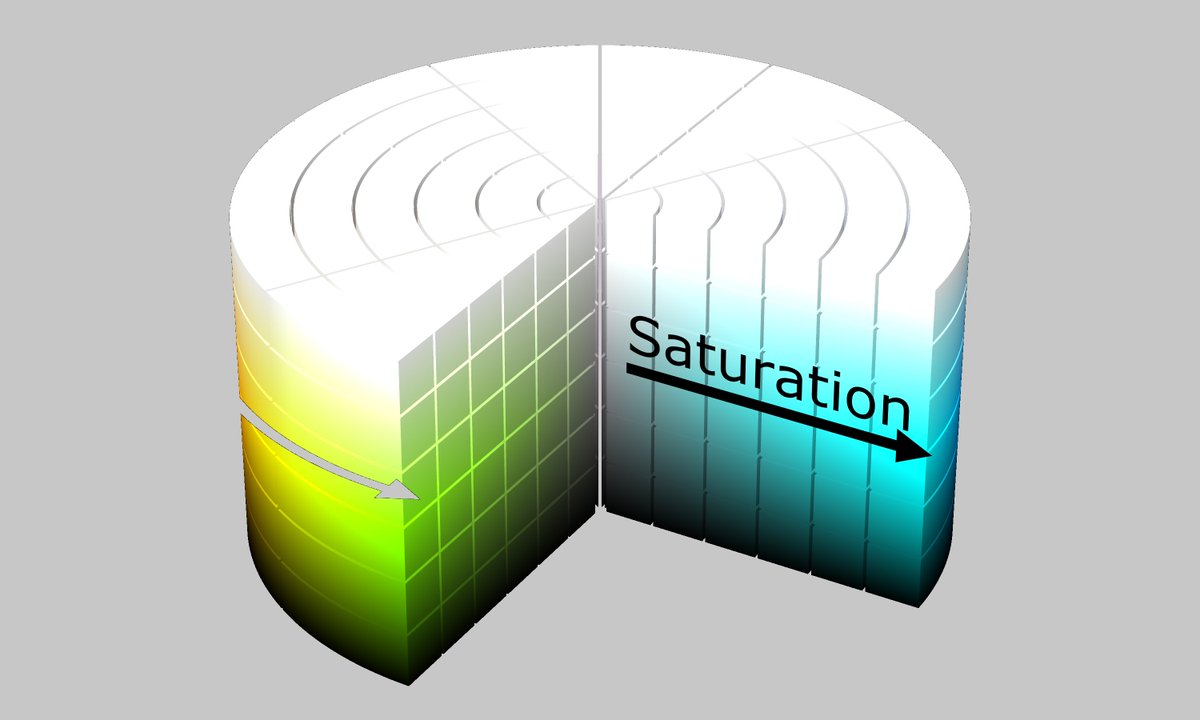
Saturation to brightness relation
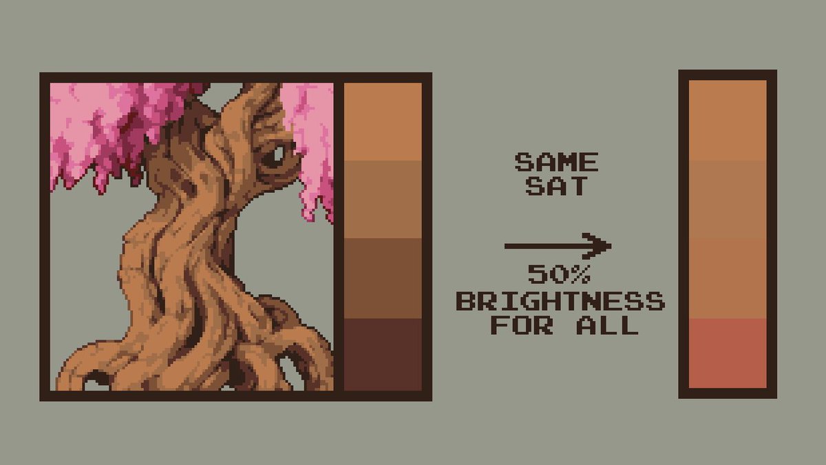
Simple way: make brighter shades less saturated and darker shades more saturated.
Simple way: make brighter shades less saturated and darker shades more saturated.
Again, advanced and probably proper way is taking into account the colour of the light in your piece.
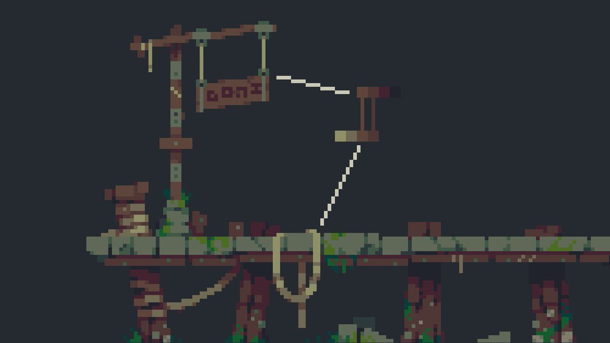
In the tree example I made it so the light is saturated orange/yellow. Therefore the brightest shade is actually more saturated than the shade under it.
In the tree example I made it so the light is saturated orange/yellow. Therefore the brightest shade is actually more saturated than the shade under it.
Dont oversaturate, it’s about contrast
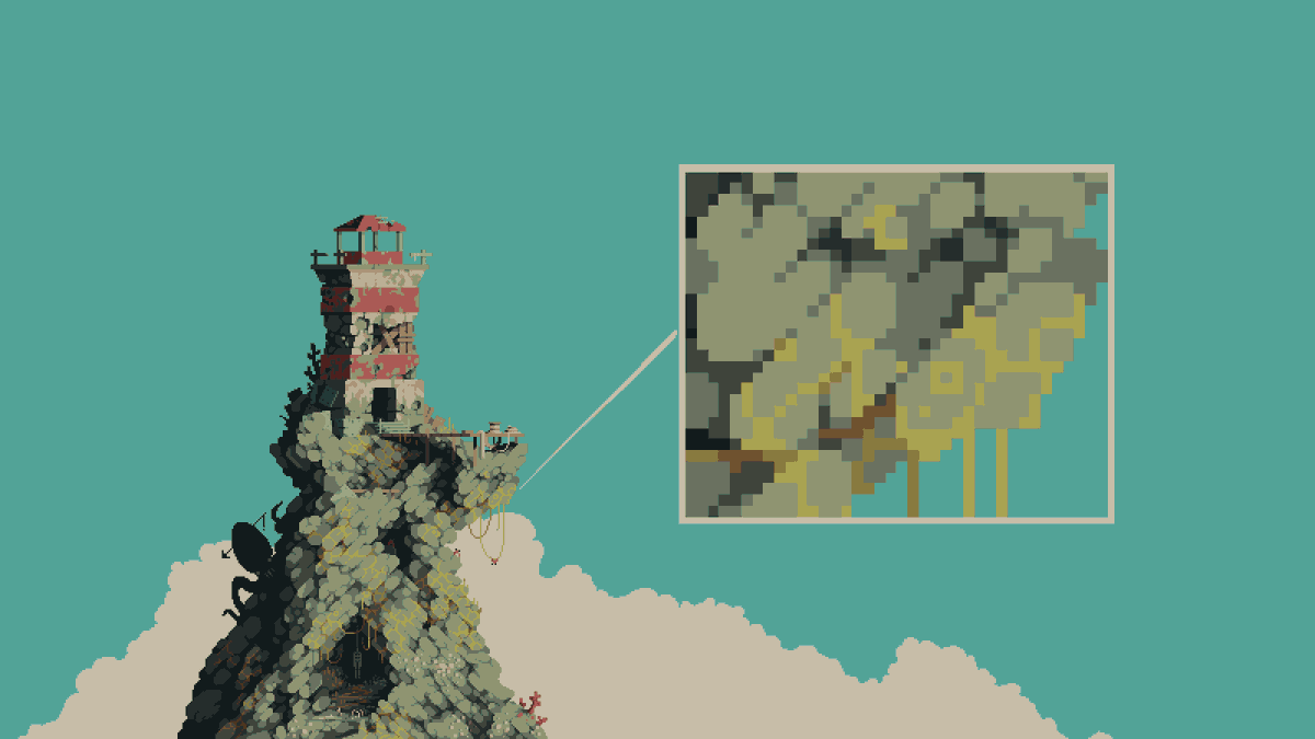
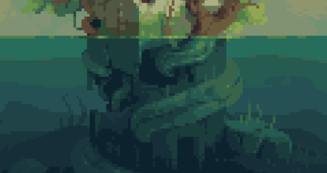
In the lighthouse example none of the colours are more than 50% saturated.
(Most saturated colour stands at 42%) while the the whole image still seems colourful.
In the lighthouse example none of the colours are more than 50% saturated.
(Most saturated colour stands at 42%) while the the whole image still seems colourful.
It seems obvious but if you put 30% saturated yellow plants against 10% saturated rock the yellow will seem super lively.
If you keep saturation super high for everything your piece will end up looking like candyland (not the Django one)
If you keep saturation super high for everything your piece will end up looking like candyland (not the Django one)
Don& #39;t go over the top with brightness
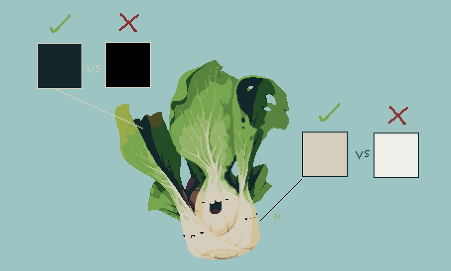
Same as with saturation. It’s about contrast. If there’s no good reason for it, don’t use 100% whites and 100% blacks. It just looks off. Don’t ask me why lol
Same as with saturation. It’s about contrast. If there’s no good reason for it, don’t use 100% whites and 100% blacks. It just looks off. Don’t ask me why lol
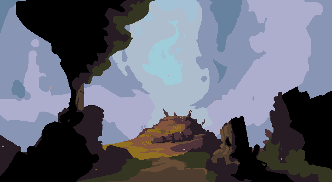
Start your sketches with a lot of near black/dark colours and work your way up from there. It’s easier to achieve more depth that way
Keep it simple
The less colours the better usually. Minimalistic art forms such as pixelart go well with simple palettes.
I’m not saying go with 4 colours for the whole piece everytime but try to optimize and reuse colours as much as possible.
The less colours the better usually. Minimalistic art forms such as pixelart go well with simple palettes.
I’m not saying go with 4 colours for the whole piece everytime but try to optimize and reuse colours as much as possible.
Usually it& #39;s pretty intuitive but try to keep in mind that humans see less detail in dark areas when the whole image is bright and less detail in light areas when the image is dark.
(i keep forgetting that)
It should influence how your palette looks.
(i keep forgetting that)
It should influence how your palette looks.
Start your sketches in greyscale
I don& #39;t always do that but it really helps the clarity of the piece from the get go
I don& #39;t always do that but it really helps the clarity of the piece from the get go
Keep I mind I never went to any art school, have no idea what I’m talking about and I probably don& #39;t even follow my own rules most of the time.
You can do whatever with your pixels, but this is how i do it.
Thx bye :^)
You can do whatever with your pixels, but this is how i do it.
Thx bye :^)
I feel like I forgot the most important tip
USE REFERENCE DAMMIT
Pixelart, photos, digital art, Bob Ross, just steal it all. Hell, you can even look outside if you& #39;re feeling adventurous
USE REFERENCE DAMMIT
Pixelart, photos, digital art, Bob Ross, just steal it all. Hell, you can even look outside if you& #39;re feeling adventurous
Hopefully one last thing that I forgot to mention:
I use something between 35%-75% grey for the canvas colour at the start. Most of the time I go with under 50% juz coz i like
I think @cyangmou mentioned something about 50% for interior and 60%. for outdoors somewhere.
I use something between 35%-75% grey for the canvas colour at the start. Most of the time I go with under 50% juz coz i like
I think @cyangmou mentioned something about 50% for interior and 60%. for outdoors somewhere.

 Read on Twitter