one of the key questions today is "does social distancing work to stop covid deaths?"
i& #39;ve done a lot of work on this in recent months.
the answer looks to be an extremely clear "no".
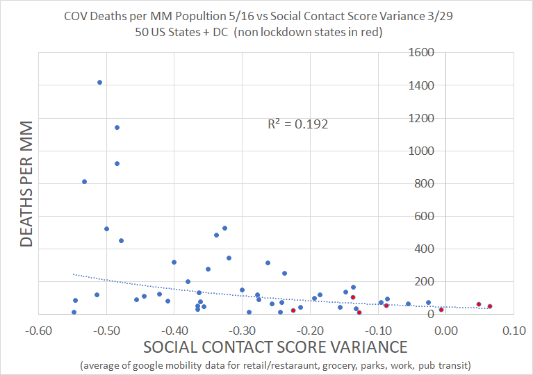
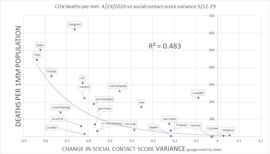
if it did, we& #39;d expect less social interaction to correlate to fewer deaths.
but it doesn& #39;t.
i& #39;ve done a lot of work on this in recent months.
the answer looks to be an extremely clear "no".
if it did, we& #39;d expect less social interaction to correlate to fewer deaths.
but it doesn& #39;t.
as every 1st year stats student knows, you can have correlation without causality.
BUT causality without correlation is deeply implausible. how do you cause something and not show a relationship to it?
this is a severe problem for the idea that distancing worked.
BUT causality without correlation is deeply implausible. how do you cause something and not show a relationship to it?
this is a severe problem for the idea that distancing worked.
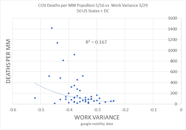
correlation is inverse to prediction. more distancing is associated with more deaths, not fewer. we see this in every individual series in the google data
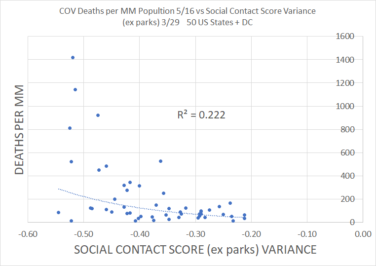
some have argued that parks are an issue and should be treated separately
i tried that. it makes no material difference
some have argued that parks are an issue and should be treated separately
i tried that. it makes no material difference
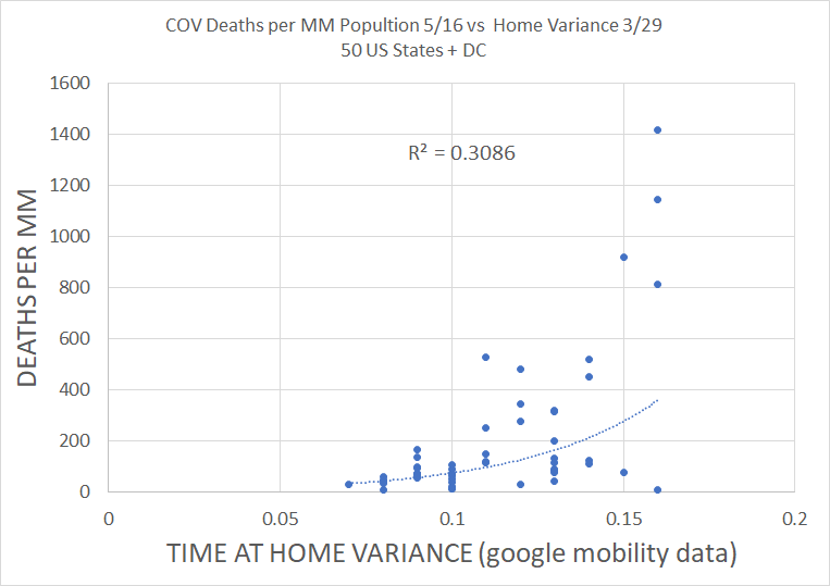
we can also check time at home as a proxy for shelter in place. if SIP works, then more time at home should lead to fewer deaths. but, again, we see a solidly inverse correlation: more SIP is associated with more deaths.
this is evidence that SIP has not worked.
this is evidence that SIP has not worked.
someone always asks (and it& #39;s a good question) so please read this.
this inverse relationship to hypothesis is not predominantly driven by stronger outbreaks leading to stricter policy.
it may have had some effect, but not enough to invert R2. https://twitter.com/boriquagato/status/1255553218014109696?s=20">https://twitter.com/boriquaga...
this inverse relationship to hypothesis is not predominantly driven by stronger outbreaks leading to stricter policy.
it may have had some effect, but not enough to invert R2. https://twitter.com/boriquagato/status/1255553218014109696?s=20">https://twitter.com/boriquaga...
a word here on what this does and does not mean
this data proves the claim that SD/SIP did not work
causality without correlation is all but impossible
it does NOT prove that SD caused more deaths
it is consistent w/ that hypothesis, but does not rise to the standard of proof
this data proves the claim that SD/SIP did not work
causality without correlation is all but impossible
it does NOT prove that SD caused more deaths
it is consistent w/ that hypothesis, but does not rise to the standard of proof
this result holds all over the world and in every component data series there as well.
(i have not updated this chart because i& #39;ve become focused on the US and i& #39;m lazy. but the relationship was, up until 4/29, highly stable over time. i suspect it looks similar today)
(i have not updated this chart because i& #39;ve become focused on the US and i& #39;m lazy. but the relationship was, up until 4/29, highly stable over time. i suspect it looks similar today)
i have tried to work out lots of ways to check this result as, honestly, it surprised me.
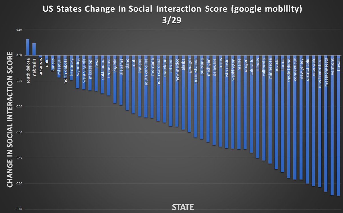
one method is to look at the relative performance of US states.
their responses varied widely
NE and SD were up 5 and 6%
HI and VE were -55%
avg was -28.5, median -29%
one method is to look at the relative performance of US states.
their responses varied widely
NE and SD were up 5 and 6%
HI and VE were -55%
avg was -28.5, median -29%
we can now look at what the US did.
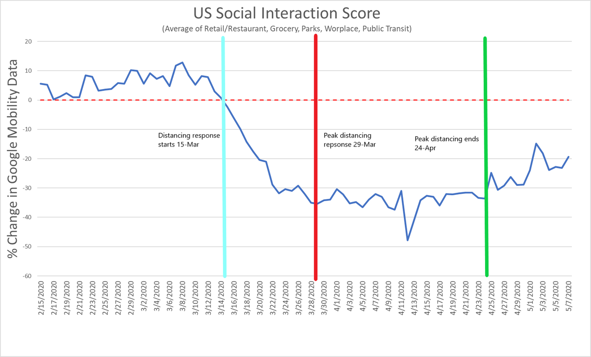
social distancing began on 3/15 when the SIS ticked negative for the first time.
on 3/29, peak response was reached. this is why i have chosen 3/29 for my reference date for policy.
peak response continued at very consistent levels to 4/24
social distancing began on 3/15 when the SIS ticked negative for the first time.
on 3/29, peak response was reached. this is why i have chosen 3/29 for my reference date for policy.
peak response continued at very consistent levels to 4/24
states all largely follow this pattern.
this gives us an interval of 27 days of peak response.
time from infection to death is ~24 days +/- 5, so this is perfect.
24 days from 3/15 is 4/7.
24 days from 3/29 is 4/22
24 days from 4/24 is 5/17
this gives us an interval of 27 days of peak response.
time from infection to death is ~24 days +/- 5, so this is perfect.
24 days from 3/15 is 4/7.
24 days from 3/29 is 4/22
24 days from 4/24 is 5/17
we can expect the data from 4/7 to not yet see much effect from policy.
we can expect data by 4/22 to be showing response to policy.
we can expect data on 5/16 to not yet be showing response from the end of distancing but capture the whole of distancing response.
so:
we can expect data by 4/22 to be showing response to policy.
we can expect data on 5/16 to not yet be showing response from the end of distancing but capture the whole of distancing response.
so:
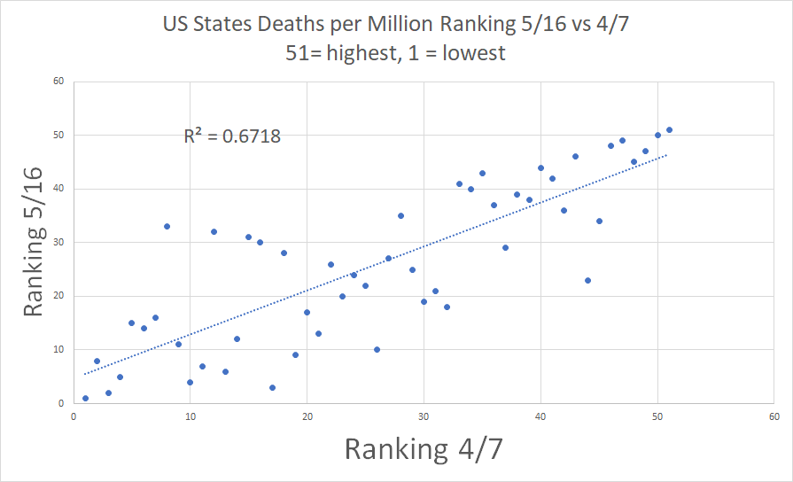
we can plot state rankings on 5/16 vs those on 4/7.
to the extent that policy has effect, we should see rankings change. but 67% of position on 5/16 is predicted by position on 4/7.
that& #39;s strongly suggestive of a driver other than distancing for outcomes.
to the extent that policy has effect, we should see rankings change. but 67% of position on 5/16 is predicted by position on 4/7.
that& #39;s strongly suggestive of a driver other than distancing for outcomes.
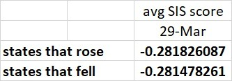
i also checked all states that rose in ranking (got worse) vs those that dropped (got better).
i averaged the social distancing response on 3/29 for those states.
they are literally identical.
you have to go 4 decimal places deep to find any variance at all.
i averaged the social distancing response on 3/29 for those states.
they are literally identical.
you have to go 4 decimal places deep to find any variance at all.
so there is zero predictive ability on rise or fall in ranking based on distancing response. (actually states that worsened were 0.0003478 more locked down)
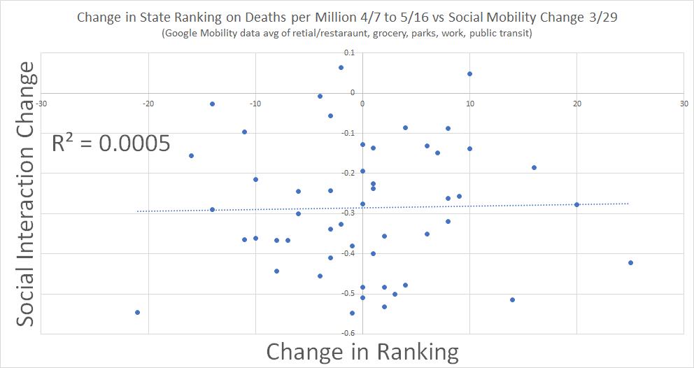
we can see this another way by looking at change in rank vs distancing response.
again, basically zero correlation.
we can see this another way by looking at change in rank vs distancing response.
again, basically zero correlation.
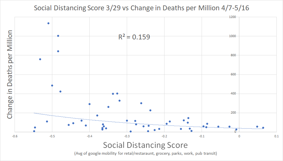
change in deaths per million from 4/7 to 5/16, like the other distancing data, rose with more distancing.
this is inverse to prediction if SD worked.
but i don& #39;t love this measure. it means that a rise from 1000 to 1200 looks worse than one from 50 to 150.
this is inverse to prediction if SD worked.
but i don& #39;t love this measure. it means that a rise from 1000 to 1200 looks worse than one from 50 to 150.
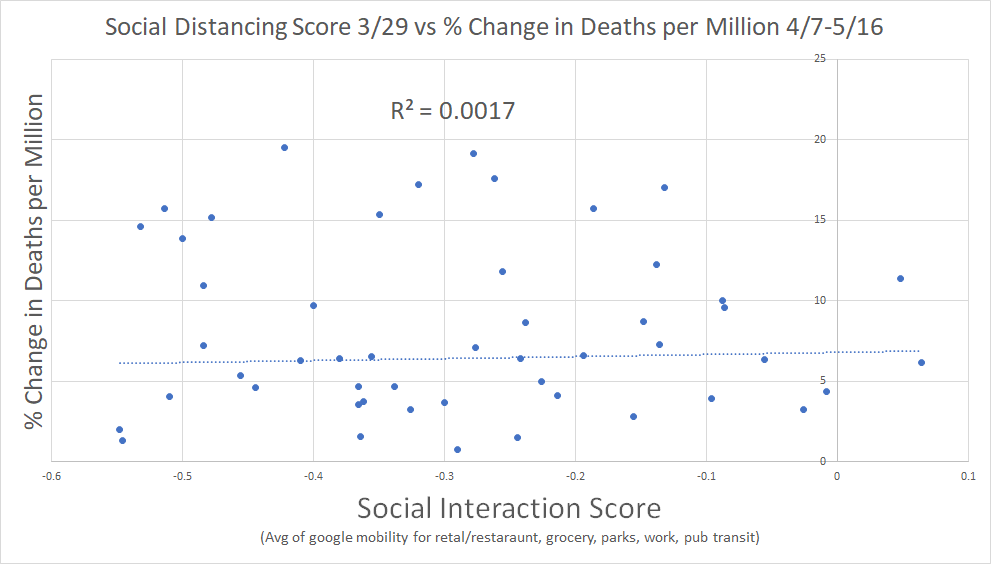
we can look at % change as well. (WY omitted b/c of divide by 0 issue)
here we see near zero correlation where we would expect to see strong correlation if SD were highly effective
i do not like this measure either as it means going from 2 to 10 is worse than from 300 to 1000
here we see near zero correlation where we would expect to see strong correlation if SD were highly effective
i do not like this measure either as it means going from 2 to 10 is worse than from 300 to 1000
but the two together sort of bracket the issue and both are saying the same thing: there is no evidence that distancing works.
(sidenote: if someone has a clever way to measure this variance to avoid these issues, i& #39;d love to see it)
(sidenote: if someone has a clever way to measure this variance to avoid these issues, i& #39;d love to see it)
a word on why i chose the metrics i did.
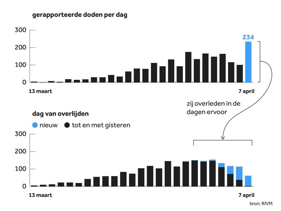
cases are not useful as a metric. they are too related to changes in testing levels and that leads to the issue shown below.
most states report cases on the day the test comes back, not date of infection or testing.
cases are not useful as a metric. they are too related to changes in testing levels and that leads to the issue shown below.
most states report cases on the day the test comes back, not date of infection or testing.
that top graph is what is reported, the bottom is what happened.
this has gotten MUCH worse as antibody tests started being added to case totals.
it takes 2 weeks for IgG to even show up. so every one of those "cases" is at least 2 weeks old. they could be 3 months old.
this has gotten MUCH worse as antibody tests started being added to case totals.
it takes 2 weeks for IgG to even show up. so every one of those "cases" is at least 2 weeks old. they could be 3 months old.
it& #39;s also not even clear that cases are bad. you WANT mild cases. that is how you breed herd immunity and it makes it easier to protect the vulnerable later.
so i just see no useful way to use it as a metric.
so i just see no useful way to use it as a metric.
the point of flattening the curve was supposed to be sparing hospitals from being overwhelmed and saving lives.
ICU data is too siloed, inconsistent, and poorly sanitized.
i could not find a good way to work with it
that left deaths.
ICU data is too siloed, inconsistent, and poorly sanitized.
i could not find a good way to work with it
that left deaths.
deaths/day is not useful because it has the same date of report vs date of death issue shown above. you cannot tell if you& #39;re measuring disease curve or a rise in testing.
that left deaths per million, which seems a great metric for policy success once you account for lag.
that left deaths per million, which seems a great metric for policy success once you account for lag.
i just cannot find any way to cut this data that makes it look like distancing/lockdown did anything at all.
and this actually fits with the CDC& #39;s own assessment in their pandemic guidelines for non pharmaceutical intervention. https://twitter.com/boriquagato/status/1259142805105938432?s=20">https://twitter.com/boriquaga...
and this actually fits with the CDC& #39;s own assessment in their pandemic guidelines for non pharmaceutical intervention. https://twitter.com/boriquagato/status/1259142805105938432?s=20">https://twitter.com/boriquaga...
once disease prevalence exceeds 1%, the efficacy of quarantine and distancing falls apart.
we were likely past that in most metro areas by 3/15.
this was known to the "experts". it was in their own guidelines.
yet they pushed for something radically different.
why?
we were likely past that in most metro areas by 3/15.
this was known to the "experts". it was in their own guidelines.
yet they pushed for something radically different.
why?

 Read on Twitter