Right here& #39;s the threat that (only like nine) people voted for - but here& #39;s my ranking of European flags! I& #39;m including microstates and Kosovo in this ranking, so sit back and enjoy a complete randomer& #39;s ranking for no reason!
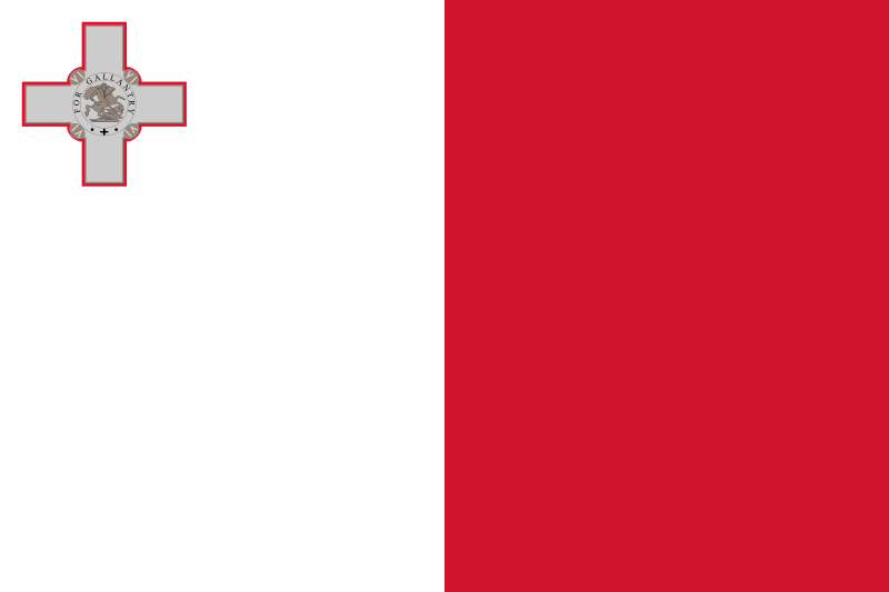
51. Malta
This flag is just somewhat basic, and while red and white is a good colour combo, the vertical combo looks really...uncomfortable? the grey victoria cross doesn& #39;t really do it any favours either...
This flag is just somewhat basic, and while red and white is a good colour combo, the vertical combo looks really...uncomfortable? the grey victoria cross doesn& #39;t really do it any favours either...
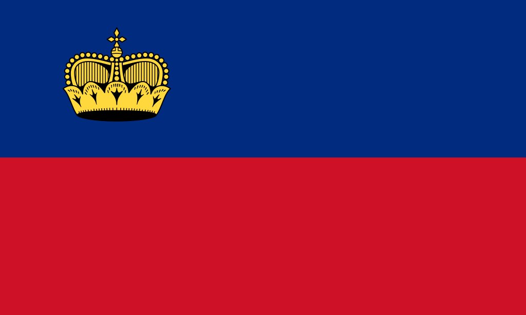
50. Liechtenstein
It& #39;s a shame I& #39;m putting this so low, because we don& #39;t see the flag that often. The blue looks nice on the top, but the crown in the top left makes it look very Malta-esque and I& #39;m not sure I can vibe with that..maybe centre it and it& #39;ll rise for sure!
It& #39;s a shame I& #39;m putting this so low, because we don& #39;t see the flag that often. The blue looks nice on the top, but the crown in the top left makes it look very Malta-esque and I& #39;m not sure I can vibe with that..maybe centre it and it& #39;ll rise for sure!
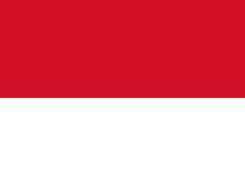
49. Monaco
I swear I do like some two-colour flags, but the ratio of this flag just doesn& #39;t do it for me. Also when your flag blatantly copies another flag (and Monaco& #39;s not the only guilty party here), it doesn& #39;t hold you in good stead, does it?
I swear I do like some two-colour flags, but the ratio of this flag just doesn& #39;t do it for me. Also when your flag blatantly copies another flag (and Monaco& #39;s not the only guilty party here), it doesn& #39;t hold you in good stead, does it?
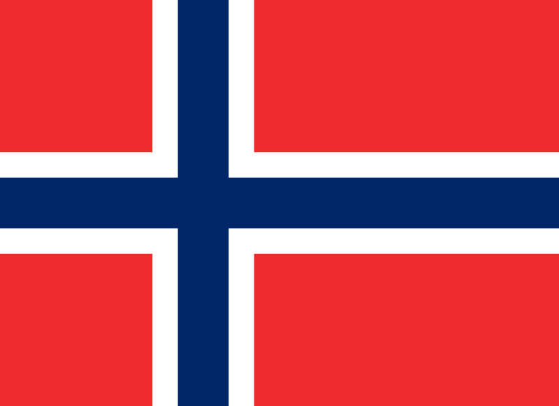
48. Norway
I know - controversial choice, but the red-white-blue -white red combo is very...aggressive? There& #39;s something about this flag that almost makes me not want to look at it, but it& #39;s saving grace is the white, because if it was just red and blue - it would be HIDEOUS
I know - controversial choice, but the red-white-blue -white red combo is very...aggressive? There& #39;s something about this flag that almost makes me not want to look at it, but it& #39;s saving grace is the white, because if it was just red and blue - it would be HIDEOUS
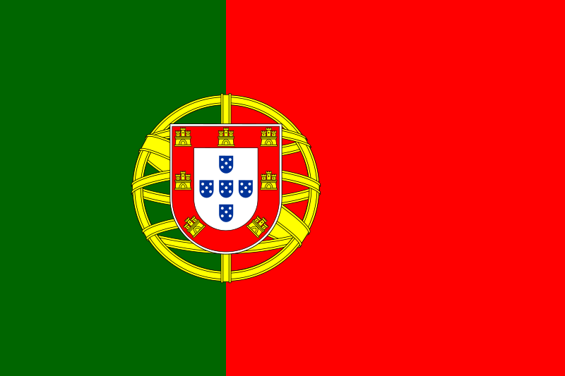
47. Portugal
This flag is lovely but also at the same time very messy. I& #39;m not too sure why the red section has to be so big, but at the same time - the green is very off-putting. The coat of arms is nice but the gold circle bit loses it points... SORRY PORTUSTANS!
This flag is lovely but also at the same time very messy. I& #39;m not too sure why the red section has to be so big, but at the same time - the green is very off-putting. The coat of arms is nice but the gold circle bit loses it points... SORRY PORTUSTANS!
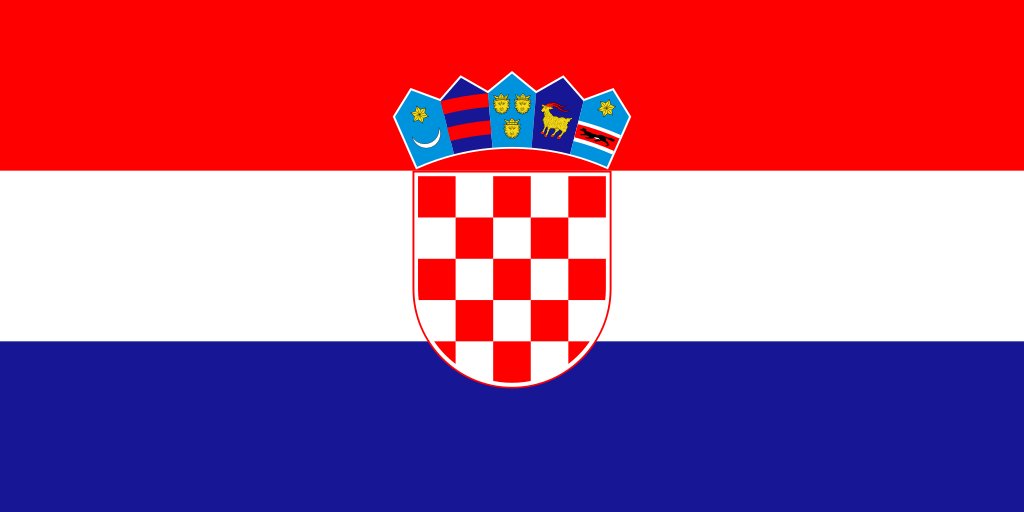
46. Croatia
Again, I like the idea of the flag, but the overall layout is quite messy. The five points of the crown with all sorts of shades and depictions on top of the checkered shield makes it immediately distinctive, but the bands are quite derivative
Again, I like the idea of the flag, but the overall layout is quite messy. The five points of the crown with all sorts of shades and depictions on top of the checkered shield makes it immediately distinctive, but the bands are quite derivative
45. Belgium
Okay but why did they have to choose *that* ratio for this flag when a normal 3:2 ratio would do just as well? I do like what they were trying to do with the colour scheme - however, I feel like they need a bit of a darker yellow and richer red just to oomph it
Okay but why did they have to choose *that* ratio for this flag when a normal 3:2 ratio would do just as well? I do like what they were trying to do with the colour scheme - however, I feel like they need a bit of a darker yellow and richer red just to oomph it
44. Austria
I like the simplicity of this flag, but it& #39;s just kind of there? Also, in a rare switch up, I think having the coat of arms would actually elevate this flag and make it a bit more interesting.
I like the simplicity of this flag, but it& #39;s just kind of there? Also, in a rare switch up, I think having the coat of arms would actually elevate this flag and make it a bit more interesting.
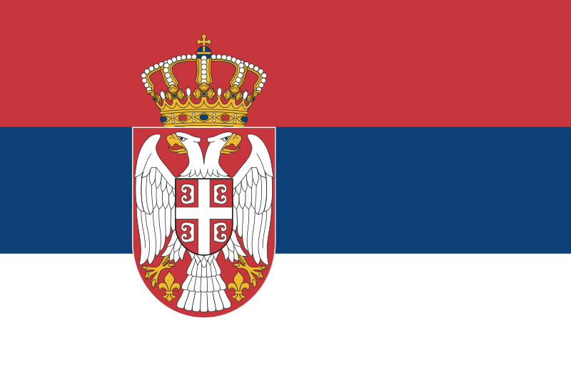
43. Serbia
In a complete switch to Austria, the coat of arms really make this flag more complicated than it needs to be. If the coat of arms got taken off, it would be so much nicer and aesthetic
In a complete switch to Austria, the coat of arms really make this flag more complicated than it needs to be. If the coat of arms got taken off, it would be so much nicer and aesthetic
42. Netherlands
One of many flags that looks like a mix of other flags, so not really original but I do like what they have done. Instantly recognisable, and conjures up good times and stability, you can& #39;t go wrong! Also, that shade of blue is https://abs.twimg.com/emoji/v2/... draggable="false" alt="😩" title="Weary face" aria-label="Emoji: Weary face">
One of many flags that looks like a mix of other flags, so not really original but I do like what they have done. Instantly recognisable, and conjures up good times and stability, you can& #39;t go wrong! Also, that shade of blue is
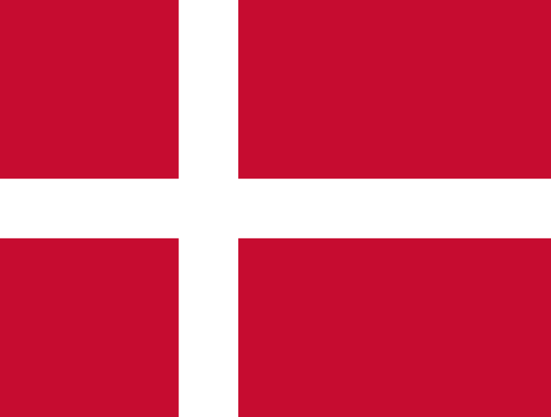
41. Denmark
Ratio again plays a part in the reason this is so low, but also the white cross is quite thin? if the cross was thicker and the ratio was a bit more conventional, this would have go up massively in this ranking
Ratio again plays a part in the reason this is so low, but also the white cross is quite thin? if the cross was thicker and the ratio was a bit more conventional, this would have go up massively in this ranking
40. United Kingdom
This flag is one of the most aggressive flags I& #39;ve ever seen in my life. The crosses upon crosses makes it very intimidating (which i guess in the olden days was the point), but nowadays it is iconic for its impact on other flags
This flag is one of the most aggressive flags I& #39;ve ever seen in my life. The crosses upon crosses makes it very intimidating (which i guess in the olden days was the point), but nowadays it is iconic for its impact on other flags
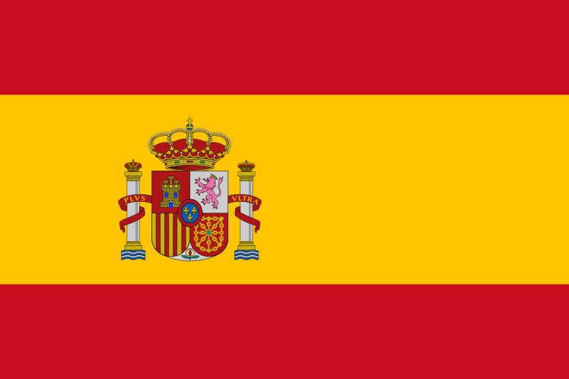
39. Spain
We& #39;re back to the need to remove the coat of arms, the way in which the red bands are spaced apart, alongside the golden yellow tinge, I would have this in the top 10, just get on removing those coat of arms Spain, simplicity works!
We& #39;re back to the need to remove the coat of arms, the way in which the red bands are spaced apart, alongside the golden yellow tinge, I would have this in the top 10, just get on removing those coat of arms Spain, simplicity works!
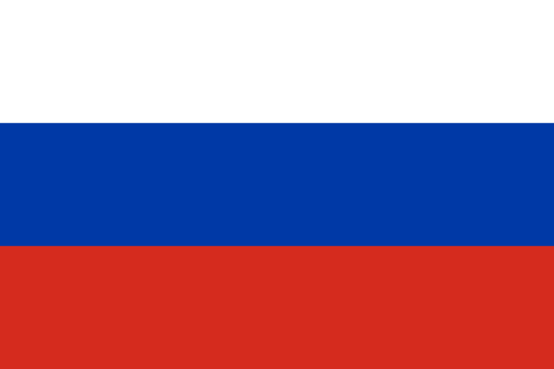
38. Russia
Again, another iconic flag that inspired many of the flags that we have today! There& #39;s not really much you could do to improve that iconicness, although I would like to darken that blue a little bit and that& #39;ll just be a true finishing touch
Again, another iconic flag that inspired many of the flags that we have today! There& #39;s not really much you could do to improve that iconicness, although I would like to darken that blue a little bit and that& #39;ll just be a true finishing touch
37. Slovenia
One of the aforementioned inspired pan-Slavic colour flags, I like it for what it is, but if I could really change one thing, I& #39;d make the coat of arms a little bigger and make the overall flag look a little more Slovakia-esque? Am I making sense?
One of the aforementioned inspired pan-Slavic colour flags, I like it for what it is, but if I could really change one thing, I& #39;d make the coat of arms a little bigger and make the overall flag look a little more Slovakia-esque? Am I making sense?
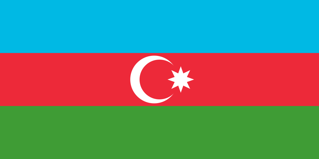
36. Azerbaijan
I like the cresent moon and the eight-pointed star in the flag, and the colour scheme for the bands are definitely distinctive. A little unsure of the shade of blue, but there& #39;s a striking style for sure
I like the cresent moon and the eight-pointed star in the flag, and the colour scheme for the bands are definitely distinctive. A little unsure of the shade of blue, but there& #39;s a striking style for sure
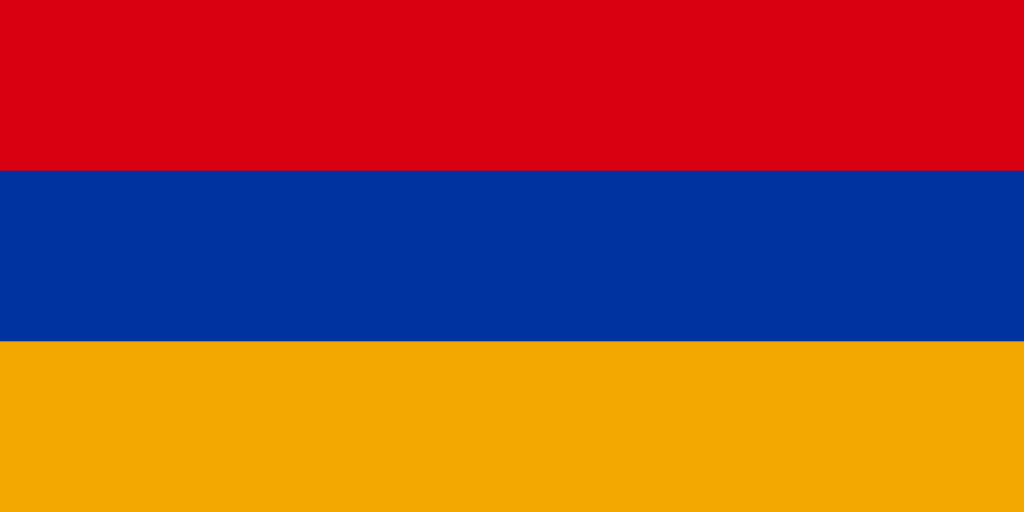
35. Armenia
I think this flag has a nice warm aura to it, the orange in bottom complements the blue in the middle and the sharpness of the red. A little basic for my liking but I couldn& #39;t see anything else elevating it? Just a good halfway flag
I think this flag has a nice warm aura to it, the orange in bottom complements the blue in the middle and the sharpness of the red. A little basic for my liking but I couldn& #39;t see anything else elevating it? Just a good halfway flag
34. Sweden
The shade of blue in this flag is absolutely gorgeous, but the yellow brings it down a little; if it was to be more gold or dulled, it would have been so much higher. Iconic in a way, and a flag representing so many lovely people - we stan Sverige
The shade of blue in this flag is absolutely gorgeous, but the yellow brings it down a little; if it was to be more gold or dulled, it would have been so much higher. Iconic in a way, and a flag representing so many lovely people - we stan Sverige
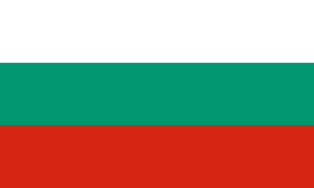
33. Bulgaria
In a similar vein to the Pan-Slavic flags, but just different enough with the green stripe instead. I like character of the flag; and you can easily recognise it too. Also that gradient from light to dark, faded to sharp, it& #39;s a nice flag!
In a similar vein to the Pan-Slavic flags, but just different enough with the green stripe instead. I like character of the flag; and you can easily recognise it too. Also that gradient from light to dark, faded to sharp, it& #39;s a nice flag!
32. Hungary
I don& #39;t really know how people get this confused with Bulgaria& #39;s flag (although Ukraine got it wrong in 2005), but the look of the flag just looks intriguing and I want to know more. Similar to Bulgaria that it just diverges enough to have its own identity.
I don& #39;t really know how people get this confused with Bulgaria& #39;s flag (although Ukraine got it wrong in 2005), but the look of the flag just looks intriguing and I want to know more. Similar to Bulgaria that it just diverges enough to have its own identity.
31. Romania
This is ultimately a Chad copy so I should really tank the shit out of this, but there& #39;s something about the use of the primary colour scheme and we have to appreciate that. But one of you two needs to change the flag, idc who...
This is ultimately a Chad copy so I should really tank the shit out of this, but there& #39;s something about the use of the primary colour scheme and we have to appreciate that. But one of you two needs to change the flag, idc who...
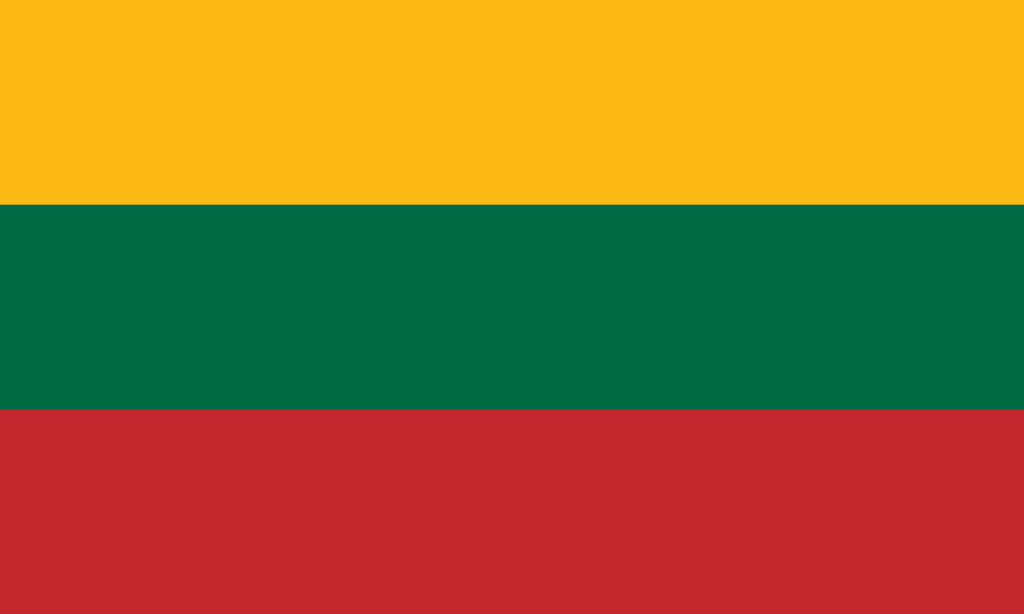
30. Lithuania
I like the audacity Lithuania had to put these colours together, and in comparison to the other Baltic nations it does stand out! The darkness of the green helps the lightness of the yellow, so they have done pretty well here, there& #39;s just others I like more.
I like the audacity Lithuania had to put these colours together, and in comparison to the other Baltic nations it does stand out! The darkness of the green helps the lightness of the yellow, so they have done pretty well here, there& #39;s just others I like more.
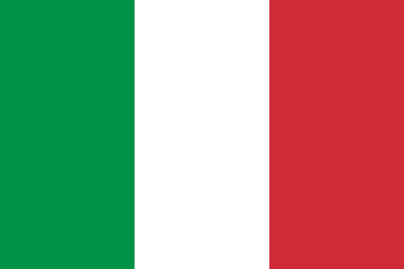
29. Italy
An iconic flag for sure, and I LIKE the divergence from the French tricolour with the green stripe instead. Again, a little basic but it& #39;s this high because of how recognisable it is, and the lovely people the flag represents
An iconic flag for sure, and I LIKE the divergence from the French tricolour with the green stripe instead. Again, a little basic but it& #39;s this high because of how recognisable it is, and the lovely people the flag represents
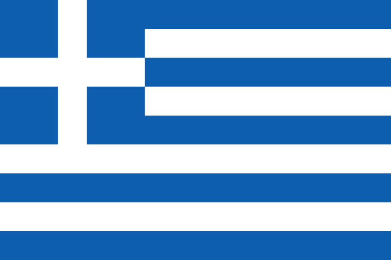
28. Greece
This is definitely an improvement from the abomination of a single white cross on blue background, so this has a bit more culture to it. The white contrasting with the sea/sky blue just brings a sense of sun, warmth and refreshment, and that& #39;s what we need in a flag!
This is definitely an improvement from the abomination of a single white cross on blue background, so this has a bit more culture to it. The white contrasting with the sea/sky blue just brings a sense of sun, warmth and refreshment, and that& #39;s what we need in a flag!
27. Switzerland
Who would think that having such a basic flag would work so perfectly? We have to love the shade of red and the white cross just almost gives off the positive, neutral vibes Switzerland exudes. Iconic flag, can& #39;t deny it
Who would think that having such a basic flag would work so perfectly? We have to love the shade of red and the white cross just almost gives off the positive, neutral vibes Switzerland exudes. Iconic flag, can& #39;t deny it
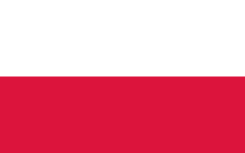
26. Poland
I told you I like two-colour flags! There& #39;s something that just works having this design, like the light white contrasting with the heavy red, it gets right what Monaco gets wrong. No need to include the coat of arms on the top though, simplicity works remember!
I told you I like two-colour flags! There& #39;s something that just works having this design, like the light white contrasting with the heavy red, it gets right what Monaco gets wrong. No need to include the coat of arms on the top though, simplicity works remember!
Okay i& #39;m gonna take a break on this thread; who do you think is going to come out on top?  https://abs.twimg.com/emoji/v2/... draggable="false" alt="🇦🇱" title="Flag of Albania" aria-label="Emoji: Flag of Albania">
  https://abs.twimg.com/emoji/v2/... draggable="false" alt="🇦🇩" title="Flag of Andorra" aria-label="Emoji: Flag of Andorra">
  https://abs.twimg.com/emoji/v2/... draggable="false" alt="🇧🇾" title="Flag of Belarus" aria-label="Emoji: Flag of Belarus">
  https://abs.twimg.com/emoji/v2/... draggable="false" alt="🇧🇦" title="Flag of Bosnia & Herzegovina" aria-label="Emoji: Flag of Bosnia & Herzegovina">
  https://abs.twimg.com/emoji/v2/... draggable="false" alt="🇨🇾" title="Flag of Cyprus" aria-label="Emoji: Flag of Cyprus">
  https://abs.twimg.com/emoji/v2/... draggable="false" alt="🇨🇿" title="Flag of Czech Republic" aria-label="Emoji: Flag of Czech Republic">
  https://abs.twimg.com/emoji/v2/... draggable="false" alt="🇪🇪" title="Flag of Estonia" aria-label="Emoji: Flag of Estonia">
  https://abs.twimg.com/emoji/v2/... draggable="false" alt="🇫🇮" title="Flag of Finland" aria-label="Emoji: Flag of Finland">
  https://abs.twimg.com/emoji/v2/... draggable="false" alt="🇫🇷" title="Flag of France" aria-label="Emoji: Flag of France">
  https://abs.twimg.com/emoji/v2/... draggable="false" alt="🇬🇪" title="Flag of Georgia" aria-label="Emoji: Flag of Georgia">
  https://abs.twimg.com/emoji/v2/... draggable="false" alt="🇩🇪" title="Flag of Germany" aria-label="Emoji: Flag of Germany">
  https://abs.twimg.com/emoji/v2/... draggable="false" alt="🇮🇸" title="Flag of Iceland" aria-label="Emoji: Flag of Iceland">
  https://abs.twimg.com/emoji/v2/... draggable="false" alt="🇮🇪" title="Flag of Ireland" aria-label="Emoji: Flag of Ireland">
  https://abs.twimg.com/emoji/v2/... draggable="false" alt="🇮🇱" title="Flag of Israel" aria-label="Emoji: Flag of Israel">
  https://abs.twimg.com/emoji/v2/... draggable="false" alt="🇰🇿" title="Flag of Kazakhstan" aria-label="Emoji: Flag of Kazakhstan">
  https://abs.twimg.com/emoji/v2/... draggable="false" alt="🇽🇰" title="Flag of Kosovo" aria-label="Emoji: Flag of Kosovo">
  https://abs.twimg.com/emoji/v2/... draggable="false" alt="🇱🇻" title="Flag of Latvia" aria-label="Emoji: Flag of Latvia">
  https://abs.twimg.com/emoji/v2/... draggable="false" alt="🇱🇺" title="Flag of Luxembourg" aria-label="Emoji: Flag of Luxembourg">
  https://abs.twimg.com/emoji/v2/... draggable="false" alt="🇲🇩" title="Flag of Moldova" aria-label="Emoji: Flag of Moldova">
  https://abs.twimg.com/emoji/v2/... draggable="false" alt="🇲🇪" title="Flag of Montenegro" aria-label="Emoji: Flag of Montenegro">
  https://abs.twimg.com/emoji/v2/... draggable="false" alt="🇲🇰" title="Flag of Macedonia" aria-label="Emoji: Flag of Macedonia">
  https://abs.twimg.com/emoji/v2/... draggable="false" alt="🇸🇲" title="Flag of San Marino" aria-label="Emoji: Flag of San Marino">
  https://abs.twimg.com/emoji/v2/... draggable="false" alt="🇸🇰" title="Flag of Slovakia" aria-label="Emoji: Flag of Slovakia">
  https://abs.twimg.com/emoji/v2/... draggable="false" alt="🇹🇷" title="Flag of Turkey" aria-label="Emoji: Flag of Turkey">
  https://abs.twimg.com/emoji/v2/... draggable="false" alt="🇺🇦" title="Flag of Ukraine" aria-label="Emoji: Flag of Ukraine">
IT& #39;S ANOTHER FRIDAY WHICH MEANS IT& #39;S TIME TO CONTINUE THIS (apparently popular????) THREAD
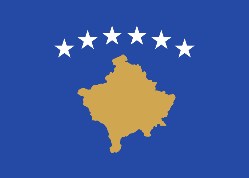
25. Kosovo
Of course this is a controversial flag, due to the country& #39;s status, but it& #39;s recognised in my country sooo...I like the gold and blue combination, and the map too! Like a mix of Cyprus and Bosnia, and we have to stan that combo
Of course this is a controversial flag, due to the country& #39;s status, but it& #39;s recognised in my country sooo...I like the gold and blue combination, and the map too! Like a mix of Cyprus and Bosnia, and we have to stan that combo
24. San Marino
I really like the white mix with the light blue shade on the bottom, almost symbolising the sky and clouds. The coat of arms has the potential to look a little dated, but it shows the history of the country in a simple way
I really like the white mix with the light blue shade on the bottom, almost symbolising the sky and clouds. The coat of arms has the potential to look a little dated, but it shows the history of the country in a simple way
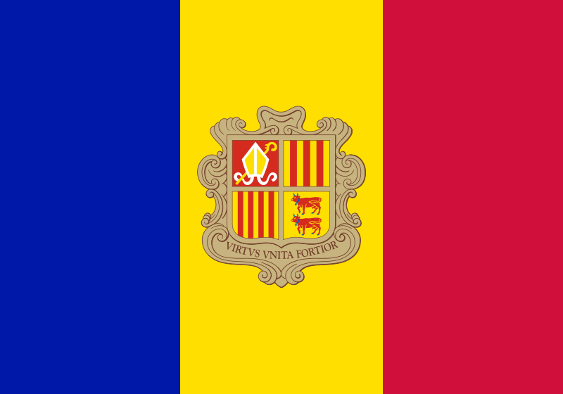
23. Andorra
A strangely perfect mix of France and Spain, with the inclusion of Catalonia in its coat of arms, I probably have this quite high because - let& #39;s be real - how often do we ever see Andorra& #39;s flag... but the shade of blue is https://abs.twimg.com/emoji/v2/... draggable="false" alt="👌" title="Ok hand" aria-label="Emoji: Ok hand">
A strangely perfect mix of France and Spain, with the inclusion of Catalonia in its coat of arms, I probably have this quite high because - let& #39;s be real - how often do we ever see Andorra& #39;s flag... but the shade of blue is
22. France
Such an iconic flag that still carries across the world today! I like the contrast with the blue and red with the white separating the two...I do realise that it& #39;s essentially the vertical version of the Dutch flag, but it& #39;s my ranking so shh
Such an iconic flag that still carries across the world today! I like the contrast with the blue and red with the white separating the two...I do realise that it& #39;s essentially the vertical version of the Dutch flag, but it& #39;s my ranking so shh
21. Ireland
My own country! I really appreciate the symbolism of the colours and I think the colour combination is gorgeous. I do wish that it wasn& #39;t the 2:1 ratio, but Ireland& #39;s very slow in places so with time hopefully they& #39;ll correct it
My own country! I really appreciate the symbolism of the colours and I think the colour combination is gorgeous. I do wish that it wasn& #39;t the 2:1 ratio, but Ireland& #39;s very slow in places so with time hopefully they& #39;ll correct it
20. Turkey
Again, another iconic flag that carries a lot of history behind it, with lots of changes and variants along the way. The cresent really fits with the colour and I love the tilted star too, it really spices things up
Again, another iconic flag that carries a lot of history behind it, with lots of changes and variants along the way. The cresent really fits with the colour and I love the tilted star too, it really spices things up
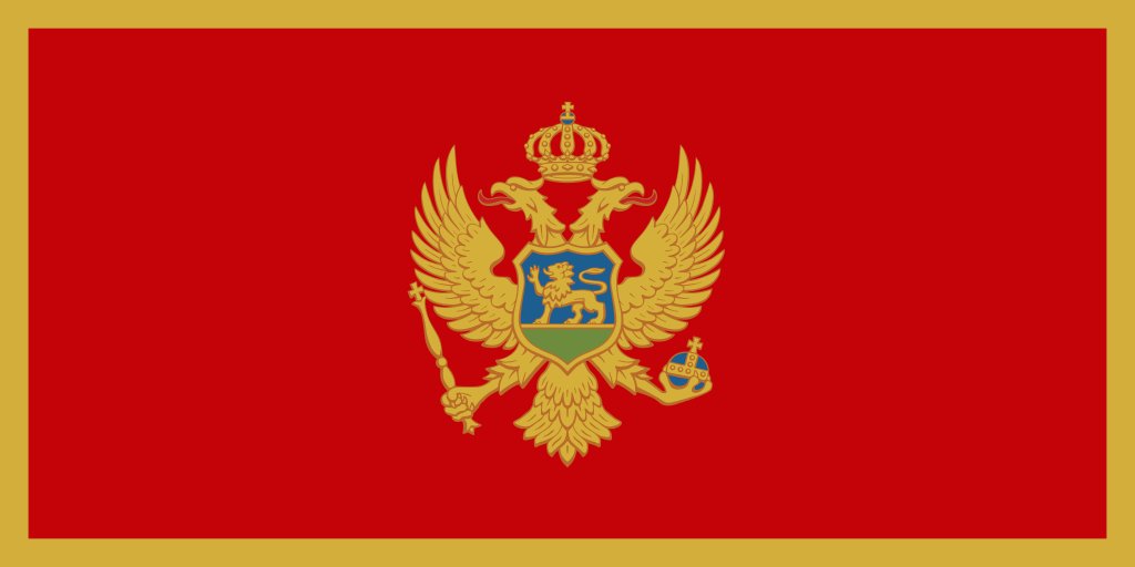
19. Montenegro
It& #39;s a really strange thinking that this flag is so controversial and polarising? The gold frame and vermillion field on the inside is just a classic combination that you never see anymore! The double headed eagle is a lovely touch - also Happy Independence Day!
It& #39;s a really strange thinking that this flag is so controversial and polarising? The gold frame and vermillion field on the inside is just a classic combination that you never see anymore! The double headed eagle is a lovely touch - also Happy Independence Day!
18. Germany
A gorgeous use of colours that Belgium is using wrongly! The black in contrast with the gold stripe at the bottom, it looks both intimidating and progressive, as a true leader
A gorgeous use of colours that Belgium is using wrongly! The black in contrast with the gold stripe at the bottom, it looks both intimidating and progressive, as a true leader
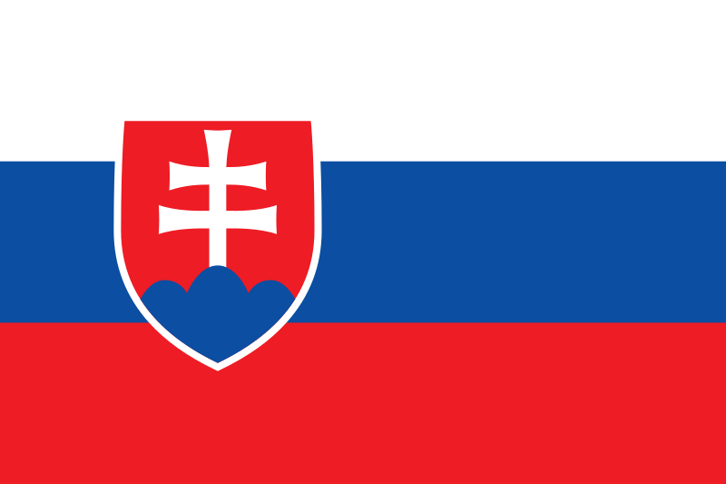
17. Slovakia
This is the best use of the Russia-inspired flags, and gets right what flags like Slovenia and Serbia get wrong. The coat of arms is simple, yet steeped in history and perfectly proportioned so it doesn& #39;t take up a lot of the space. Overall a lovely flag to look at!
This is the best use of the Russia-inspired flags, and gets right what flags like Slovenia and Serbia get wrong. The coat of arms is simple, yet steeped in history and perfectly proportioned so it doesn& #39;t take up a lot of the space. Overall a lovely flag to look at!
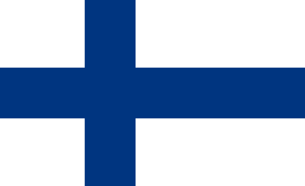
16. Finland
Finland& #39;s flag really sums up the overall landscape of the country - the white for the snow, and the blue representing the thousands of lakes..however, it still fits with the Scandi motif and we have to love them for it
Finland& #39;s flag really sums up the overall landscape of the country - the white for the snow, and the blue representing the thousands of lakes..however, it still fits with the Scandi motif and we have to love them for it
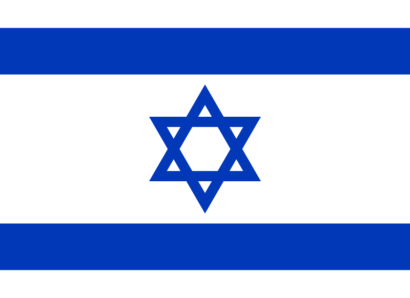
15. Israel
I really like the way this flag is designed - yes it does employ only two colours but the two lines on the top/bottom of the flag and the Star of David, it& #39;s an incredibly unique flag and an interesting way to contribute to the star design!
I really like the way this flag is designed - yes it does employ only two colours but the two lines on the top/bottom of the flag and the Star of David, it& #39;s an incredibly unique flag and an interesting way to contribute to the star design!
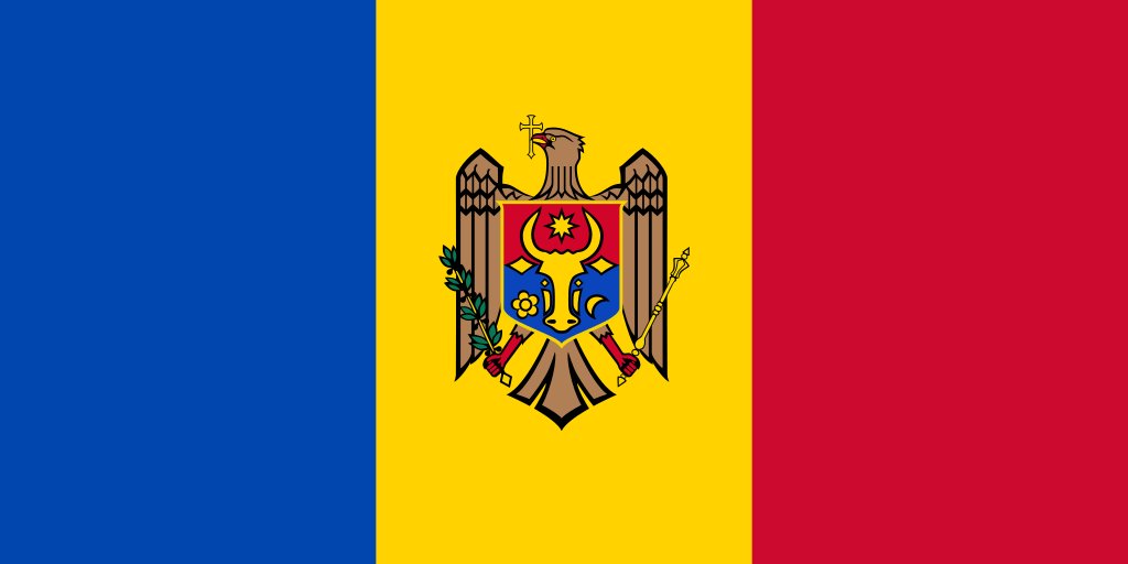
14. Moldova
This is the best attempt at the blue-yellow-red combo (at least in Europe), the coat arms makes things incredibly diverse and intriguing, and while it could come across as busy or messy...it doesnt? It& #39;s just enough
This is the best attempt at the blue-yellow-red combo (at least in Europe), the coat arms makes things incredibly diverse and intriguing, and while it could come across as busy or messy...it doesnt? It& #39;s just enough
13. Kazakhstan
This could be a controversial choice, but the delicate balance between the golden yellow and the turquoise/cyan blue make the flag look really majestic. Plus it includes an eagle flying! And a band on the left that shows the cultural heritage, I& #39;m in love!
This could be a controversial choice, but the delicate balance between the golden yellow and the turquoise/cyan blue make the flag look really majestic. Plus it includes an eagle flying! And a band on the left that shows the cultural heritage, I& #39;m in love!
12. Estonia
I love it when nature manages to find a way into a flag and this is a fantastic example, you can really see the black trees in contrast to the snow and the dark skies above. Not to mention a unique combination, that also exudes modernity
I love it when nature manages to find a way into a flag and this is a fantastic example, you can really see the black trees in contrast to the snow and the dark skies above. Not to mention a unique combination, that also exudes modernity
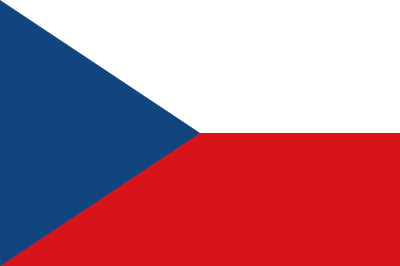
11. Czechia
Just missing out on the top 10 is this amazingly abstract take on the blue-white-red combo. Steeped in history and recognisable, you can& #39;t deny this is an aesthetic flag, and the best part is that if you cut a rectangle of the tripoint, you still have the same flag!
Just missing out on the top 10 is this amazingly abstract take on the blue-white-red combo. Steeped in history and recognisable, you can& #39;t deny this is an aesthetic flag, and the best part is that if you cut a rectangle of the tripoint, you still have the same flag!
So we& #39;re in the top 10! Who& #39;s going to make it to #1? We& #39;re down to  https://abs.twimg.com/emoji/v2/... draggable="false" alt="🇦🇱" title="Flag of Albania" aria-label="Emoji: Flag of Albania">,
  https://abs.twimg.com/emoji/v2/... draggable="false" alt="🇧🇾" title="Flag of Belarus" aria-label="Emoji: Flag of Belarus">,
  https://abs.twimg.com/emoji/v2/... draggable="false" alt="🇧🇦" title="Flag of Bosnia & Herzegovina" aria-label="Emoji: Flag of Bosnia & Herzegovina">,
  https://abs.twimg.com/emoji/v2/... draggable="false" alt="🇨🇾" title="Flag of Cyprus" aria-label="Emoji: Flag of Cyprus">,
  https://abs.twimg.com/emoji/v2/... draggable="false" alt="🇬🇪" title="Flag of Georgia" aria-label="Emoji: Flag of Georgia">,
  https://abs.twimg.com/emoji/v2/... draggable="false" alt="🇮🇸" title="Flag of Iceland" aria-label="Emoji: Flag of Iceland">,
  https://abs.twimg.com/emoji/v2/... draggable="false" alt="🇱🇻" title="Flag of Latvia" aria-label="Emoji: Flag of Latvia">,
  https://abs.twimg.com/emoji/v2/... draggable="false" alt="🇱🇺" title="Flag of Luxembourg" aria-label="Emoji: Flag of Luxembourg">,
  https://abs.twimg.com/emoji/v2/... draggable="false" alt="🇲🇰" title="Flag of Macedonia" aria-label="Emoji: Flag of Macedonia"> and
  https://abs.twimg.com/emoji/v2/... draggable="false" alt="🇺🇦" title="Flag of Ukraine" aria-label="Emoji: Flag of Ukraine">
10. Luxembourg
I know, I& #39;m surprised this flag has made it so high too, but the reason that this flag makes it so high is the shades of red and blue, the red is almost like a pink, while the blue is a true cyan and having pink and cyan is such an incredibly unique choice, ugh https://abs.twimg.com/emoji/v2/... draggable="false" alt="😍" title="Smiling face with heart-shaped eyes" aria-label="Emoji: Smiling face with heart-shaped eyes">
I know, I& #39;m surprised this flag has made it so high too, but the reason that this flag makes it so high is the shades of red and blue, the red is almost like a pink, while the blue is a true cyan and having pink and cyan is such an incredibly unique choice, ugh
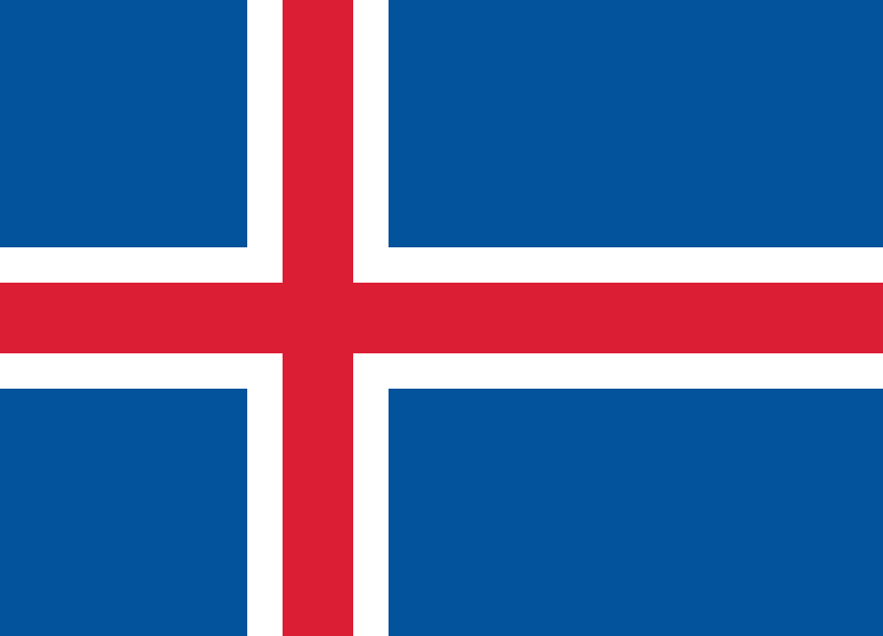
9. Iceland
This is hands down the best design to incorporate red, white and blue of every world flag. Some people might take issue with Iceland being so high and Norway being so low, but this is a lot more aesthetically pleasing, and how recognisable the flag is, don& #39;t deny it..
This is hands down the best design to incorporate red, white and blue of every world flag. Some people might take issue with Iceland being so high and Norway being so low, but this is a lot more aesthetically pleasing, and how recognisable the flag is, don& #39;t deny it..
8. Ukraine
Yet another fantastic example of how nature finds a way into flags, the fact that the blue sky and yellow fields are so common in Ukraine makes it a true representation of the country, not to mention its simplicity! Absolutely gorgeous
Yet another fantastic example of how nature finds a way into flags, the fact that the blue sky and yellow fields are so common in Ukraine makes it a true representation of the country, not to mention its simplicity! Absolutely gorgeous
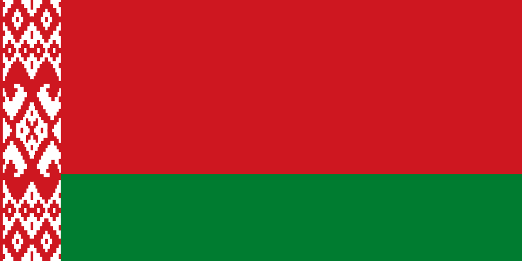
7. Belarus
If you understood why Kazakhstan was so high, this will come as no surprise. Green and red usually would look quite harsh but the accents of white on the vyshyvanka on the left help to make the flag look more palatable. Also, points for including ethnic elements!
If you understood why Kazakhstan was so high, this will come as no surprise. Green and red usually would look quite harsh but the accents of white on the vyshyvanka on the left help to make the flag look more palatable. Also, points for including ethnic elements!
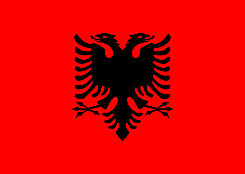
6. Albania
This flag is incredibly iconic, historic and every other type of -ic you can think of, the aesthetic pleasure from it symmetry is gorgeous, and black/red as a colour combination will never go out of style. Never change Albania https://abs.twimg.com/emoji/v2/... draggable="false" alt="❣️" title="Heart exclamation" aria-label="Emoji: Heart exclamation">
This flag is incredibly iconic, historic and every other type of -ic you can think of, the aesthetic pleasure from it symmetry is gorgeous, and black/red as a colour combination will never go out of style. Never change Albania
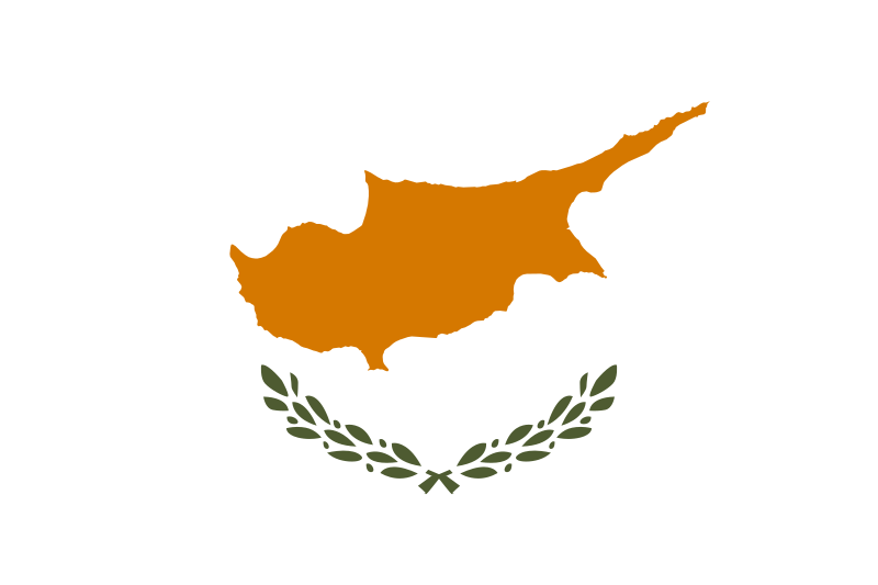
5. Cyprus
The OG Kosovo flag, this just gives off nothing but happy and lovely vibes! The peaceful white, coupled with the olive branches shows its location, but also the metaphorical peace! The gold of the country& #39;s outline, Y& #39;ALL ARE SLEEPING ON THIS FLAG OMG
The OG Kosovo flag, this just gives off nothing but happy and lovely vibes! The peaceful white, coupled with the olive branches shows its location, but also the metaphorical peace! The gold of the country& #39;s outline, Y& #39;ALL ARE SLEEPING ON THIS FLAG OMG
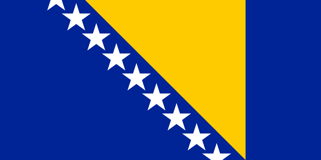
4. Bosnia & Herzegovina
This is the most abstract way to represent a country, but I really love what it tries to do. The shade of blue with the yellow triangle compliment each other really well, and the illusion of a never ending path of stars shows how much BiH has to offer https://abs.twimg.com/emoji/v2/... draggable="false" alt="😍" title="Smiling face with heart-shaped eyes" aria-label="Emoji: Smiling face with heart-shaped eyes">
This is the most abstract way to represent a country, but I really love what it tries to do. The shade of blue with the yellow triangle compliment each other really well, and the illusion of a never ending path of stars shows how much BiH has to offer
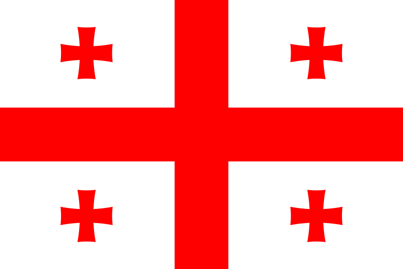
3. Georgia
I was a fan of Georgia& #39;s flag pre-2004, but this was such a step up! The number of individual crosses fills the flag but doesn& #39;t impose on each other. Simple, but effective, also incredibly iconic - remember when The Shin remade this WITH WINE?! y& #39;all aint ready..
I was a fan of Georgia& #39;s flag pre-2004, but this was such a step up! The number of individual crosses fills the flag but doesn& #39;t impose on each other. Simple, but effective, also incredibly iconic - remember when The Shin remade this WITH WINE?! y& #39;all aint ready..
So we& #39;re down to two countries! Who do you think is gonna win?
2. Latvia
This flag is amazing. As far as I& #39;m aware, this is the only flag that uses crimson as a colour, and that in itself makes it an incredibly unique flag. The Baltic trio just wouldn& #39;t be the same without Latvia& #39;s flag, and I think it& #39;s so criminally underrated; I love it
This flag is amazing. As far as I& #39;m aware, this is the only flag that uses crimson as a colour, and that in itself makes it an incredibly unique flag. The Baltic trio just wouldn& #39;t be the same without Latvia& #39;s flag, and I think it& #39;s so criminally underrated; I love it
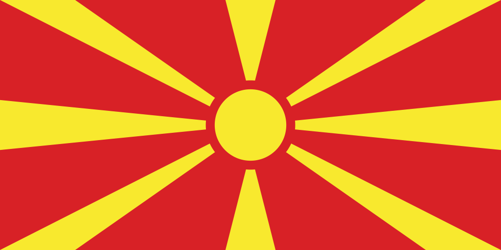
1. North Macedonia
Absolutely superb. In this flag, you have happiness in the fact it& #39;s a sun, the history of Macedonia as a region (Greece included), and the colour combination. NM& #39;s EU campaign is even called "The Sun, too, is a star", and that is...stellar. Best flag: 12/10
Absolutely superb. In this flag, you have happiness in the fact it& #39;s a sun, the history of Macedonia as a region (Greece included), and the colour combination. NM& #39;s EU campaign is even called "The Sun, too, is a star", and that is...stellar. Best flag: 12/10
And that brings us to the end of this thread (joy for some, sorrow for others)! Thanks so much for joining me, if you had made it this far!  https://abs.twimg.com/emoji/v2/... draggable="false" alt="💝" title="Heart with ribbon" aria-label="Emoji: Heart with ribbon"> let me know what your opinions are!

 Read on Twitter


 " title="42. NetherlandsOne of many flags that looks like a mix of other flags, so not really original but I do like what they have done. Instantly recognisable, and conjures up good times and stability, you can& #39;t go wrong! Also, that shade of blue is https://abs.twimg.com/emoji/v2/... draggable="false" alt="😩" title="Weary face" aria-label="Emoji: Weary face">" class="img-responsive" style="max-width:100%;"/>







 " title="23. AndorraA strangely perfect mix of France and Spain, with the inclusion of Catalonia in its coat of arms, I probably have this quite high because - let& #39;s be real - how often do we ever see Andorra& #39;s flag... but the shade of blue is https://abs.twimg.com/emoji/v2/... draggable="false" alt="👌" title="Ok hand" aria-label="Emoji: Ok hand">" class="img-responsive" style="max-width:100%;"/>





 " title="10. LuxembourgI know, I& #39;m surprised this flag has made it so high too, but the reason that this flag makes it so high is the shades of red and blue, the red is almost like a pink, while the blue is a true cyan and having pink and cyan is such an incredibly unique choice, ugh https://abs.twimg.com/emoji/v2/... draggable="false" alt="😍" title="Smiling face with heart-shaped eyes" aria-label="Emoji: Smiling face with heart-shaped eyes">" class="img-responsive" style="max-width:100%;"/>

 " title="6. AlbaniaThis flag is incredibly iconic, historic and every other type of -ic you can think of, the aesthetic pleasure from it symmetry is gorgeous, and black/red as a colour combination will never go out of style. Never change Albania https://abs.twimg.com/emoji/v2/... draggable="false" alt="❣️" title="Heart exclamation" aria-label="Emoji: Heart exclamation">" class="img-responsive" style="max-width:100%;"/>
 " title="4. Bosnia & HerzegovinaThis is the most abstract way to represent a country, but I really love what it tries to do. The shade of blue with the yellow triangle compliment each other really well, and the illusion of a never ending path of stars shows how much BiH has to offer https://abs.twimg.com/emoji/v2/... draggable="false" alt="😍" title="Smiling face with heart-shaped eyes" aria-label="Emoji: Smiling face with heart-shaped eyes">" class="img-responsive" style="max-width:100%;"/>
