Time for an update on COVID data!
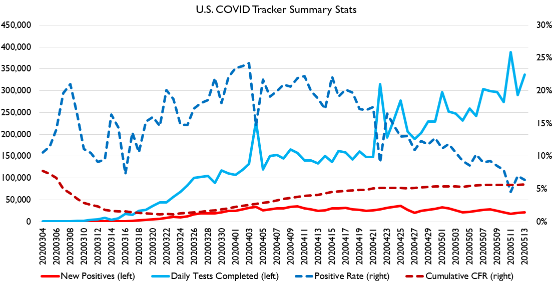
US test count and positive rate continues to fall.
That& #39;s great news!
However, some news reports claim this may be because states are reporting serology results alongside PCR tests.... which would mean these numbers are meaningless.
That& #39;s great news!
However, some news reports claim this may be because states are reporting serology results alongside PCR tests.... which would mean these numbers are meaningless.
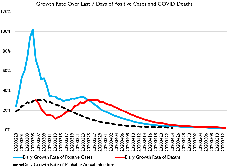
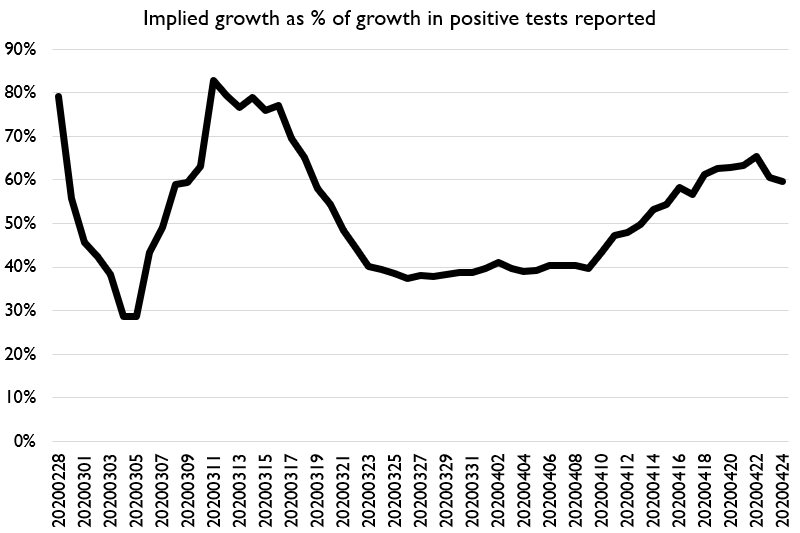
We can use this chart to check and see if serology tests are being reported in a large amount. If the black line gets to be an unusually large ratio of the blue line for a considerable period of time, then it is likely that lots of serology tests are being reported too.
The reason for this is serology tests are not going to turn up many/any positives in the sense that PCR test kits would. So they should cause the growth rate in cases to appear slower if a lot of the tests being reported are actually not PCRs.
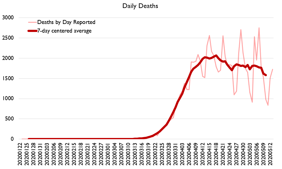
The death-based retrospective data should not be subject to this issue.
Here& #39;s the relevant ratio.
It has risen, but is not at unusual or concerning levels.
Probably, serology tests are not being reported alongside PCRs at a large scale yet.
Here& #39;s the relevant ratio.
It has risen, but is not at unusual or concerning levels.
Probably, serology tests are not being reported alongside PCRs at a large scale yet.
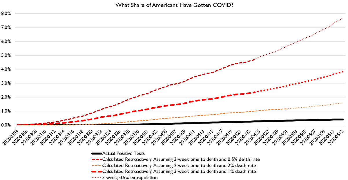
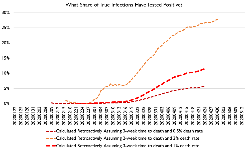
So, how many people have been infected?
Well, using plausible time-to-death estimates and IFRs, it is EXTREMELY UNLIKELY that more than 10% of Americans have gotten COVID.
Folks, this thing is just beginning (unless we can beat it fast).
Well, using plausible time-to-death estimates and IFRs, it is EXTREMELY UNLIKELY that more than 10% of Americans have gotten COVID.
Folks, this thing is just beginning (unless we can beat it fast).
We are nowhere close to herd immunity no matter what creative math you prefer about heterogenous agents. The cost of trying to achieve herd immunity would be incredibly high. It& #39;s a dumb strategy.
Using this data, we can guess what share of cases we are catching with positive tests.
Almost certainly fewer than 15%.
Folks, test and trace is not gonna be in operation any time soon. We gotta do large-scale quarantine. It& #39;s the only hammer big enough.
Almost certainly fewer than 15%.
Folks, test and trace is not gonna be in operation any time soon. We gotta do large-scale quarantine. It& #39;s the only hammer big enough.
We don& #39;t need test-trace-isolate.
We already have a bunch of positive cases we can already use to launch a tracing operation!
Isolate!
Then trace!
Then isolate more!
Then test!
Then trace!
Then isolate more!
We already have a bunch of positive cases we can already use to launch a tracing operation!
Isolate!
Then trace!
Then isolate more!
Then test!
Then trace!
Then isolate more!
Waiting for testing is extremely foolish.
Contact isolation (thanks @goofrider ) is the only thing that works at this scale.
Contact isolation (thanks @goofrider ) is the only thing that works at this scale.
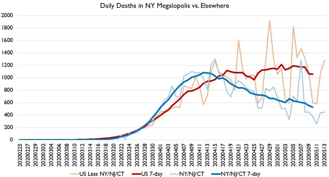
Also wow those symmetrical back-side-of-the-curve assumptions are looking pretty bad right now.
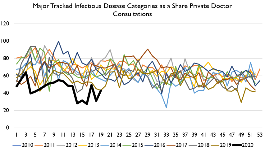
Let& #39;s turn now to one of my favorite measures: Hong Kong disease surveillance!
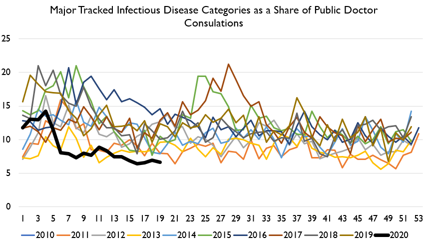
HK continues to enjoy one of the healthiest periods of time on record. Here& #39;s gastro, pinkeye, and ILI consultations as a share of all public and private doctor visits.
HK continues to enjoy one of the healthiest periods of time on record. Here& #39;s gastro, pinkeye, and ILI consultations as a share of all public and private doctor visits.
Same trend shows up in emergency room data and Chinese medicine data. Elder homes seem to be having a bad run of gastro stuff right now but ILI remains low there.
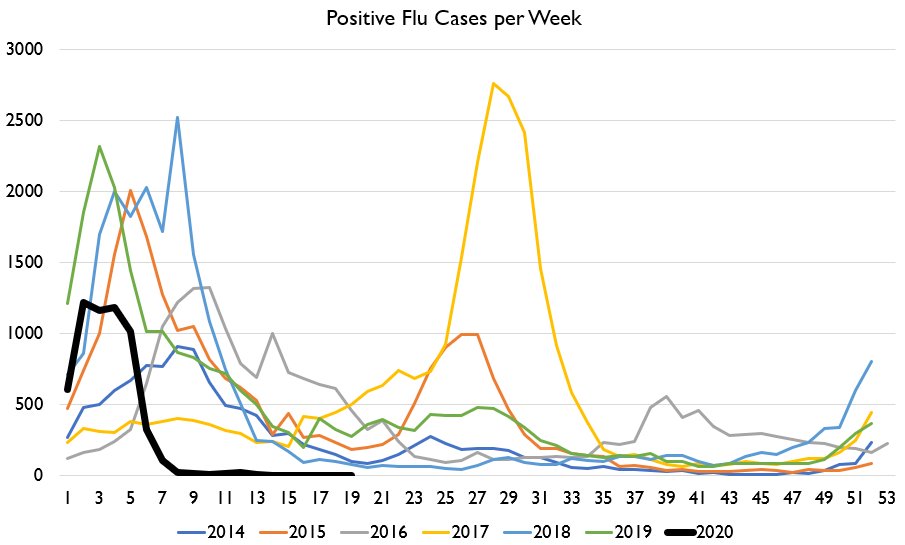
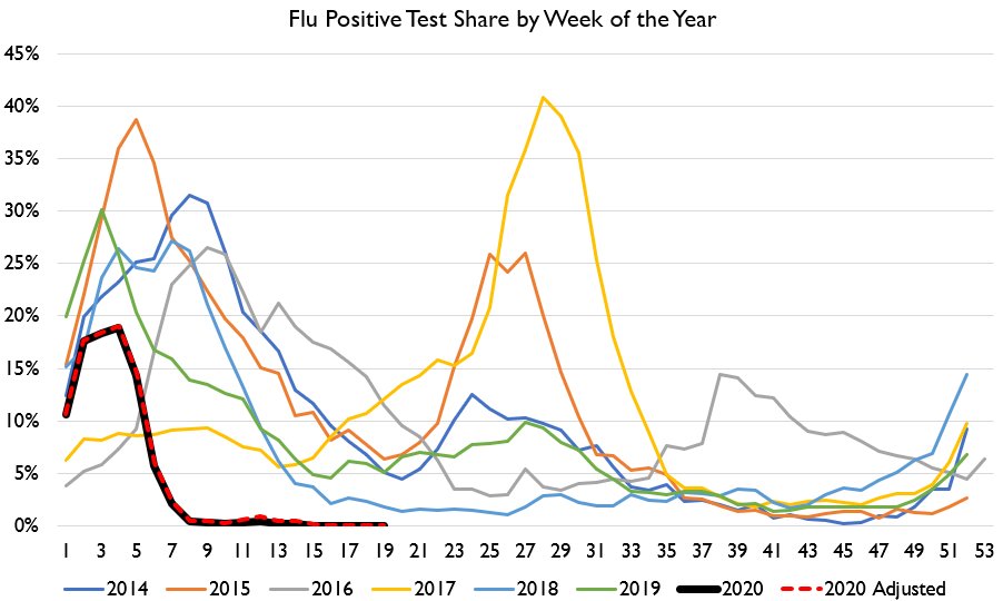
Here& #39;s the data on flu tests.
We are now onto 3 weeks with ***zero*** positive flu tests in Hong Kong.
What& #39;s especially interesting about this is we actually did just have 2 new COVID cases yesterday!
We are now onto 3 weeks with ***zero*** positive flu tests in Hong Kong.
What& #39;s especially interesting about this is we actually did just have 2 new COVID cases yesterday!
Evidently, it& #39;s easier to beat the flu than it is to beat COVID.
Hong Kong is not now and never has been on lockdown. This is a story about wearing masks and cancelling school, not lockdown. https://twitter.com/IronEconomist/status/1260901731371810818">https://twitter.com/IronEcono...
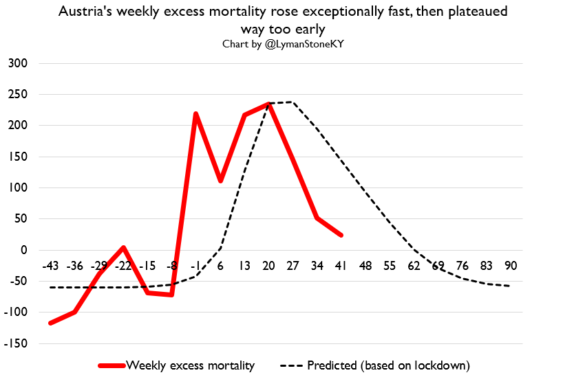
Okay now onto excess mortality!
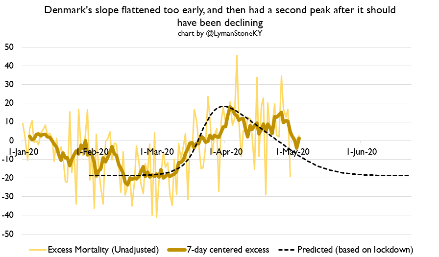
Denmark had a two-peaked excess mortality curve, which is kinda funny lookin& #39;.
Denmark had a two-peaked excess mortality curve, which is kinda funny lookin& #39;.
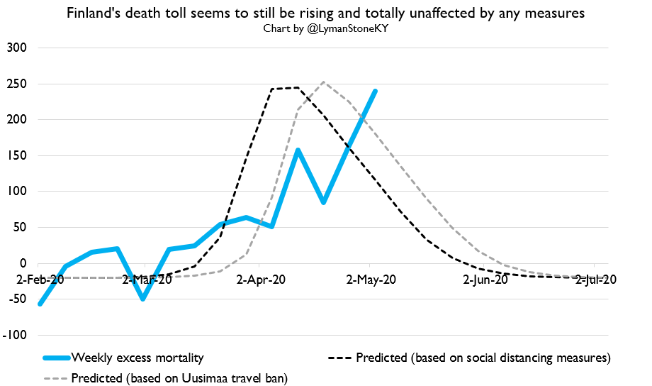
Finland... is just off in the arctic circle doing its own thing. They never fully locked down, but they did put in place a bunch of social distancing measures (more than Sweden). And yet....
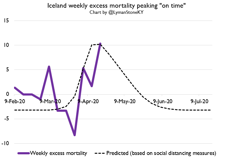
Here& #39;s Iceland. It is a good candidate for an "on time" peak, although FWIW Iceland never actually fully locked down either.
This next one is almost trollish but I mean it sincerely.
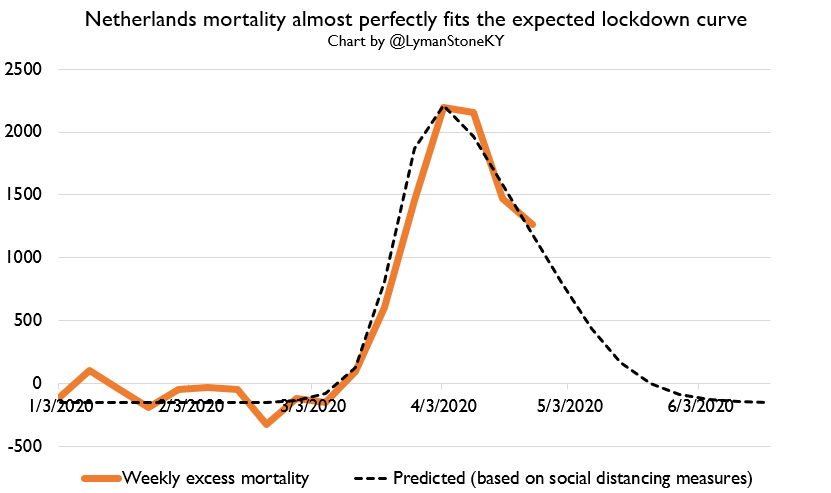
If you want a country where you have a really really clean case of mortality patterns being EXACTLY what a standard "effective lockdown" would predict, look no further than...
The Netherlands!
If you want a country where you have a really really clean case of mortality patterns being EXACTLY what a standard "effective lockdown" would predict, look no further than...
The Netherlands!
For all the talk about the Netherlands pursuing herd immunity or whatever it seems clear from reviewing their actual policies that imposed a lockdown at about the same time as everybody else, and their mortality curve is exactly what a theoretical model would predict!
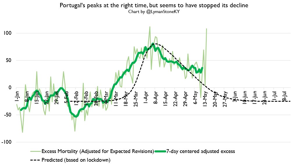
Here& #39;s Portugal where we have daily data. Latest data is very noisy so take it with some salt, but still, suggests Portugal& #39;s decline may have plateaued.
BY THE WAY, Portugal wins my prestigious award for "highest quality mortality reporting."
Daily data.
Download it in a small, tidy .csv.
Updated extremely frequently.
Revision scales are modest and pretty stable.
Daily data.
Download it in a small, tidy .csv.
Updated extremely frequently.
Revision scales are modest and pretty stable.
I would not have bet money on Portugal being the best reporter at the start of all this.
On the other hand, South Africa& #39;s weekly deaths are running BELOW trend...
.... because their lockdown has led to a large number of their statistics field offices just closing up shop and stopping their counting. Whoops. https://www.samrc.ac.za/reports/report-weekly-deaths-south-africa?bc=254">https://www.samrc.ac.za/reports/r...
.... because their lockdown has led to a large number of their statistics field offices just closing up shop and stopping their counting. Whoops. https://www.samrc.ac.za/reports/report-weekly-deaths-south-africa?bc=254">https://www.samrc.ac.za/reports/r...

 Read on Twitter