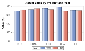
Scrolling through some SAS help pages for their different graphics and laughed out loud at this:
"When used in the business domain, often there is a desire for a graph with a flashy appearance."
"When used in the business domain, often there is a desire for a graph with a flashy appearance."
(I& #39;m sure this will start a variety of sub-arguments on this thread about quality of graphics in the different statistical softwares and at least one R user will make an animated ggplot to respond)
Also, if you& #39;re wondering about the graphic with a "flashy appearance" that suits the business domain, I& #39;m happy to report that it& #39;s every bit as flashy as you might hope:
Remember, I& #39;m allowed to make cracks about SAS because I use it. If some R jackwagon shows up here to make fun of SAS, though...

 Read on Twitter


